
Key Takeaways
- Turning a PSD into a solid HTML email requires a different approach than typical web design due to the limitations and incompatibilities of email clients. The use of old-school HTML tables is often the most reliable method for creating a structure that holds together across different platforms.
- The design process involves planning the basic structure, setting explicit margins and padding on paragraphs, using nested tables for consistent spacing, and adding final touches. Each step is crucial in ensuring that the HTML email renders well in today’s most popular email clients.
- Top tips for bulletproof HTML emails include using tables with fixed pixel widths, defining your font-stack in the body and table cells, setting margins and padding explicitly on paragraphs, and using nested tables for consistent spacing. These strategies can help create an HTML email that maintains its design integrity across various email clients.
Turning a Photoshop file into a living web page is a common task for web designers. We all have our own processes for extracting visual elements, grabbing colors, and building layouts in lovely, standards-compliant HTML and CSS.
HTML email is a different—and darker—story. Modern web standards apply to only a few of the most popular email clients. If you are planning on sending your email to a list of confirmed Apple Mail users, any layout that works in Webkit will probably be fine, but otherwise, a different approach is needed.
In this tutorial, we’ll step through the process of taking a PSD mockup from a designer, and turning that into a dependable HTML email that renders well in today’s most popular email clients. Warning: there will be tables.
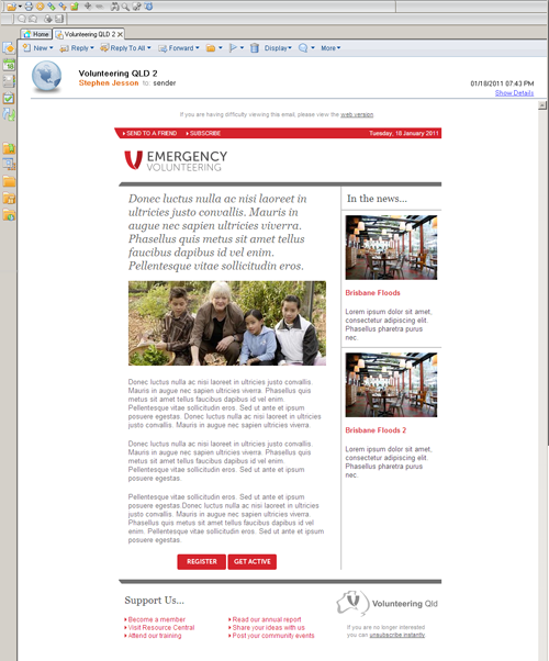
Meet the Client
You’ve probably seen the devastating photos of the flooding that has overwhelmed a huge area of Queensland, Australia recently. As an enormous rebuilding operation starts up, we were approached by Volunteering Queensland for assistance with emailing the huge number of people who’d put their hands up to help.
We offered to help with the sending itself, and also by creating a simple HTML email template the organization could use for their email campaigns. Volunteering Queensland already had a design and provided us with the Photoshop file.
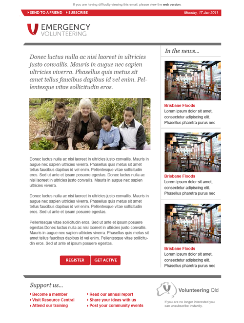
Here’s the original layout as an image:
Our job was to take that PSD and turn it into a template that worked well within the limitations and incompatibilities of the email client world. The task was taken up by Stephen Jesson, one of our excellent support team members who has created many email designs in his time.
Plan the Basic Structure
The unfortunate reality of email design is that table-based layouts are still the best option in most cases. Email clients like Outlook 2007/2010 don’t support floats, so CSS positioning is unreliable.
Instead, we’ll rely on old-school HTML tables to create a structure that will hold together almost everywhere. At this point, we need to make a philosophical decision: aim for an email layout that’s as close as possible to the original design, or aim for markup that’s as modern and clean as possible.
While both approaches are valid—depending on your ultimate goal—as a general rule, less markup is better because the point of email is the content. HTML is just a way of presenting that content.
Sometimes matching a design as closely as possible is important, and it’s useful to know the tricks and hacks that help us achieve that. So in this tutorial we’ll explore those dirty little secrets of email design.
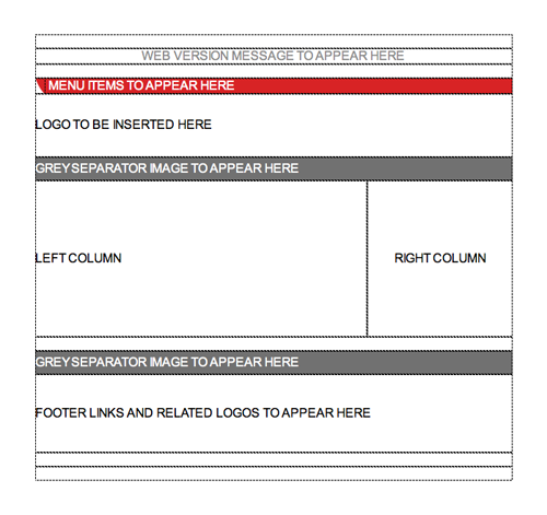
Here’s our basic top-level table structure:
This table will hold the whole design, and it will be centered inside the <body>; using an align=center parameter. That’s the most reliable way to center a table, and it works just about everywhere.
The body of our email uses margin=0 and padding=0 to reset everything, and we’ll set the font size and the font family on both the body tag and the <td> table cells to make sure they are applied.
Setting a fixed pixel width on the outer table makes everything much simpler, and 600px is about as wide as you’d want to go for an email. If you accept that your layout may change quite a bit in different email clients, you could set a percentage width, but that would make it much harder to keep the columns a consistent width.
Set Explicit Margins and Padding on Your Paragraphs
Padding and margins are the bane of an email designer’s existence, because they’re so inconsistently supported across the major email clients. Most notably, Yahoo! Mail removes all spacing from the default <p> tag, so you should define it yourself to prevent your paragraphs squishing together like commuters on a Japanese subway.
Returning to the PSD, we can measure the widths of individual columns and the spacing between content elements. Whereas a modern web design would use divs and margins to create that layout, we’ll be using a combination of tables and table cells.
Tables All the Way Down
Our original design has some nice column gutters that we want to match. Unfortunately, Lotus and Outlook give us particular trouble when we try to create consistent spacing around content.
Rather than leave each client to apply its own interpretation of the padding and margins, we’ll measure up the column sizes and gutters, and nest a table inside each column.
In this case, the left and right gutters are, conveniently, the same size, so the calculation becomes:
Total column width of Npx – (left gutter of 20px + right gutter of 20px) = nested table width
By nested tables, I’m talking about a whole table contained inside a <td> element. So, inside the left column, we’d place a nested table of Npx and add an align=center attribute to it. Now we have a container for our content that sits in the middle of the column, and the centering creates the gutters on either side.
This nesting technique will be used in the right column too, and in the footer. Any time you want to maintain consistent spacing around a block or element, you can eliminate a lot of the possible variations by nesting tables.
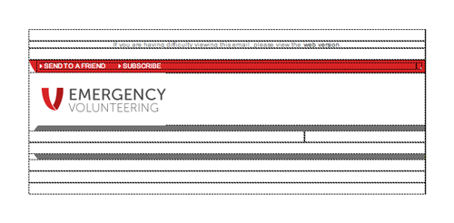
“Empty” table cells can be used for spacing, too. For example, look at the spacing around the line of text at the top of our design here:
You do end up with a lot more HTML code than you may be used to, but if the occasion calls for a bulletproof layout, tables are your friends.
Sometimes you can avoid relying on the rendering engine for spacing by including the required space on your image. Including the space around the logo and photos in the image file means you can rely on it being there, and fit your table cell to known dimensions.
If your production process prevents you from easily adding the space to the image, consider a CSS or HTML border instead. They work just about everywhere.
Finishing Touches
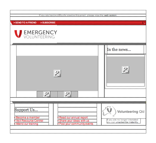
With a solid table structure in place, we can safely add content without blowing the layout apart in an email client. Here’s a screen grab of the final layout in Dreamweaver, so you can easily see the tables.
You’ll notice that even the footer items are contained in separate cells. This might be excessive in many cases, because a simple paragraph might display well enough. In this case, however, we’ve gone all out just to show what’s required for maximum consistency in spacing and item height.
List bullets can behave oddly in email clients, so use inline images instead. Again, the spacing between the bullet image and the item is built into the image itself, and there’s no need to try to match them up.
The dividing lines use images of a defined size, but they also specify a background color in case the images are blocked.
At this point, the bulk of the coding is done. We have an HTML file that will hold together for as many major email clients as we can hope for. To confirm that, you could add some content and run your file through an email testing service like Litmus—or one that your email service provider offers.
Here’s how our template looks in the notoriously picky Lotus Notes 8 client.
Job done! If you hand your work over to the content editors at this point, be sure to test again before you send the email, in case they’ve added formatting that may cause problems. The process we went through mitigates most of those problems, but they could still arise.
Top 10 Tips for Bullet Proof HTML Emails
- Use tables with fixed pixel widths for a solid structure.
- Use the
align=centerparameter to center your main table, if required. - Define your font-stack in the body, and in your table cells.
- Use inline CSS to avoid it being stripped out.
- Remember to set
border:0;on the image tags. - Set margins and padding explicitly on your paragraphs.
- Include spacing inside your images where you can.
- A border in the background color can also act like a margin, but renders more consistently.
- Use nested tables for consistent spacing elsewhere.
- Think about what happens if your images fail to load, or if a cell is rendered at the incorrect height or width, and code a backup option.
Extra Resources for Email Building
Over on the Campaign Monitor site, we have general design guidelines and CSS support charts, or you can read my SitePoint book for more on HTML email design.
If you’re a graphic designer, and this all sounds a bit painful, I can recommend Brian Thies as an expert in the field. He’s a magician at turning graphic designs into rock-solid HTML emails and he also provides help in the email design forums.
Next time you need to go from PSD to HTML email, and you want to avoid stopping off at Hair Pulling and Silent Despair City, I hope this tutorial does the trick for you.