There are a lot of articles that have appeared over the last few years, showing us all sorts of cool things that can be done with CSS3. However, one aspect of CSS3 that is often overlooked is CSS3 backgrounds.
With CSS3, we have a range of new properties and values to give us more control over our background images. However, before we talk about these new properties and values, we need to understand three important boxes.
Key Takeaways
- CSS3 introduces enhanced control over background styling, including new properties such as `background-size`, `background-origin`, `background-clip`, and the ability to use multiple backgrounds.
- The `background-origin` property specifies the positioning area of the background image, with options like `content-box`, `padding-box`, and `border-box`.
- `Background-size` can be set using specific dimensions or through keywords `cover` and `contain`, allowing for more responsive background images.
- Multiple backgrounds can be layered within a single element using comma-separated values, providing complex visual designs without additional markup.
- New `background-repeat` values, `space` and `round`, offer more flexibility in how background images are tiled within an element.
Three special boxes
The content-box
Let’s start with a simple container with some content inside. Although we cannot see it, there is an invisible box around the content called the content-box.
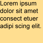
Diagram of content-box
The padding box
If we were to add padding to all sides of this element, we would then have our second box, called a padding-box.
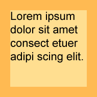
Diagram of padding-box
The border-box
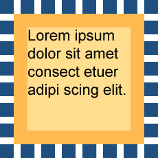
If we add a border around the padded-box, we would then have the third box, called a border-box.
Why should we care about these boxes? These boxes are used to define where background images are initially placed into boxes by browsers, how we can reposition these background images, and even how we can crop these background images.
The background-position property
By default, background images are placed in the top left corner of the padding-box.
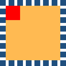
Diagram of initial background image position
We can change this default position by using the background-position property. In CSS2.1, we can use two values to determine the position of the background image in relation to the element. The first value represents the horizontal position and the second value represents the vertical axis.
p { background-position: 10px 10px; }Types of values
We can use length values, percentage values or keywords to define the horizontal and vertical axis.
p { background-position: 10px 10px; }
p { background-position: 20% 50%; }
p { background-position: left bottom; }
Length values can include em, ex (height of a lower-case “x”), px (pixels), in (inches), cm (centimetres), mm (millimetres), pt (points) or pc (picas).
p { background-position: 1em 1em; }
p { background-position: 2ex 2em; }
p { background-position: 3px 3px; }
p { background-position: 4in 4in; }
p { background-position: 5cm 5cm; }
p { background-position: 6mm 6mm; }
p { background-position: 7pt 7pt; }
p { background-position: 8pc 8pc; }
If we use a length or percentage value, these are taken from the top left corner of the element.
Positive and negative values
We can use both positive or negative values to determine the position of background images.
Positive values will move the background image to the right and down – inside the background area of the element.
p { background-position: 5px 9px; }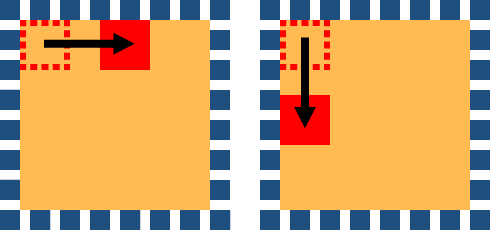
Diagram showing background-image positioned using positive values
Negative values will move the background image to the left and up – out of the background area of the element.
p { background-position: -5px -9px; }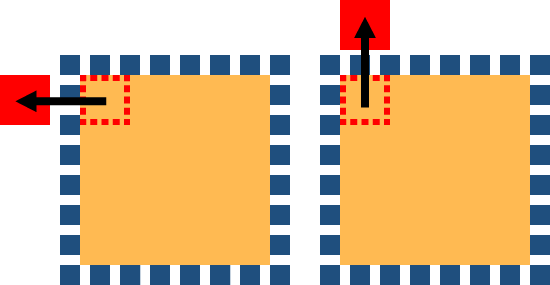
Diagram showing background-image positioned using negative values
CSS3 additions
In CSS3, we can specify up to four values for background-position. The first two values represent the horizontal axis. The second two values represent the vertical axis.
p { background-position: left 10px top 15px; }This is a powerful addition, as it means we can position images using length values or percentage values in relation to any of the four corners of elements, not just the top left corner. However, Opera 11 is the only browser that currently supports the use of four values for background-position.
The background-repeat property
By default, images will repeat along both the x and y axis – starting from the top left corner of the padding-box. Even though the background images start in the top left corner of the padding-box, they will repeat outwards in all directions, including into the border-box area. In CSS2.1, we could change the repeat behaviour using four different keywords.
p { background-repeat: repeat; }
p { background-repeat: repeat-x; }
p { background-repeat: repeat-y; }
p { background-repeat: no-repeat; }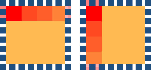
Diagram showing repeat-x and repeat-y
In CSS3, we can now define background-repeat using two values instead of one. The first of these two values represents the horizontal axis. The second value represents the vertical axis. If we use one value only, the browsers will interpret this as a double value. This allows the background-repeat value to be backwards compatible.
p { background-repeat: repeat repeat; }
p { background-repeat: repeat [repeat]; }
New background-repeat values – space and round
CSS3 also allows us to use two new values with the background-repeat property – they are space and round.
The space value sets the image to repeat as often as will fit within the background area and then the images are spaced out to fill the area. The first and last images touch the edges of the area.
p { background-repeat: space; }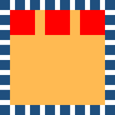
Diagram showing background-image set with space value
The round value sets the image to repeat as often as will fit within the background area. If it doesn’t fit a whole number of times, it is rescaled so that it will fit into the container’s dimensions. Be aware that the background images may be stretched or distorted using this method.
p { background-repeat: round; }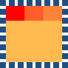
Diagram showing background-image set with round value
These new values give us much more flexibility when laying out background-images. For example, we can now use two values to define different horizontal and vertical behaviour.
p { background-repeat: space no-repeat; }Three new properties
In CSS3, we can also use three entirely new background properties: background-origin, background-clip and background-size.
The background-origin property
The background-origin property is used to determine where background images are positioned inside a box. We can position our background images using three possible values:
p { background-origin: content-box; }
p { background-origin: padding-box; }
p { background-origin: border-box; }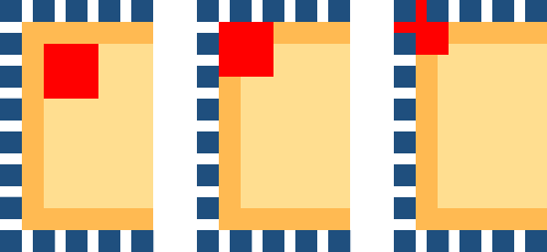
Diagram showing background images positioned in relation to the content-box, padding-box and border-box
| Firefox 3.6, 4 | Yes |
|---|---|
| Safari 4, 5 | Yes |
| Chrome 10, 11 | Yes |
| IE 6, 7, 8 | No |
| IE 9 | Yes |
| Opera 10, 11 | Yes |
The background-clip property
The background-clip property is used to determine where and if background images are clipped (or cut off) inside the background area. We can clip our background images using three possible values:
p { background-clip: content-box; }
p { background-clip: padding-box; }
p { background-clip: border-box; }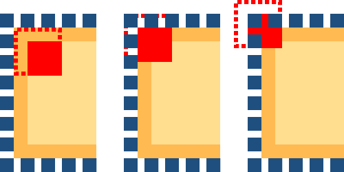
Diagram showing background-image clipped inside content-box, padding-box and border-box
| Firefox 3.6 | Supports older syntax of border and padding but not content |
|---|---|
| Firefox 4 | Yes |
| Safari 4, 5 | -webkit-background-clip |
| Chrome 10, 11 | Yes |
| IE 6, 7, 8 | No |
| IE 9 | Yes |
| Opera 10, 11 | Yes |
The background-size property
In CSS.1, we could apply background images to elements, but we had no way to control the size of these background images. CSS3 allows us to set the size of our background images using the background-size property. We can set the size using length values, percentage values or two new keywords: cover and contain.
p { background-size: 10px 20px; }
p { background-size: 10% 20%; }
p { background-size: cover; }
p { background-size: contain; }| Firefox 4 | Yes |
|---|---|
| Safari 5 | Yes |
| Chrome 11 | Yes |
| IE 9 | Yes |
| Opera 11 | Yes |
Length values
The length value sets the height and width of the background image. The first value sets the width; the second value sets the height. If only one length value is given, the second value is set to the ‘initial value’ of auto.
p { background-size: 10px 20px; }
p { background-size: 10px [auto]; }
Percentage values
The percentage value sets the height and width to a percent of the parent element. The first value sets the width; the second value sets the height. Like length values, if only one percentage value is given, the second is set to the ‘initial value’ of auto.
p { background-size: 20% 40%; }
p { background-size: 10% [auto]; }
The contain value
The contain value will scale the image (while keeping its aspect ratio) so that the entire image can fit inside the background area.
p { background-size: contain; }
Diagram showing background-image set with contain
The cover value
The cover value will scale the image (while keeping its aspect ratio) to the smallest size that will completely cover the background area.
p { background-size: cover; }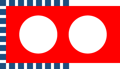
Diagram showing background-image set with cover
Multiple backgrounds
With CSS2.1, we could only add one background image to any HTML element. However, CSS3 allows us to add multiple background images to any element!
| Firefox 3.6+ | Yes |
|---|---|
| Safari 4, 5 | Yes |
| Chrome 10+ | Yes |
| IE 9 | Yes |
| Opera 10+ | Yes |
Longhand multiple background images
CSS3 allows us to place multiple, comma-separated values into any background property.
p {
	background-image:
		url(01.gif),
		url(02.gif),
		url(03.gif);
}
Below is an example of three background images inside one element – written in longhand.
p {
        background-image: url(1.gif), url(2.gif), url(3.gif);
        background-position: left center, 50% 30%, 10px 100px;
        background-size: 20px 300px, 10% auto, auto;
        background-repeat: no-repeat, repeat, repeat-y;
        background-attachment: scroll, scroll, scroll;
        background-origin: padding-box, padding-box, border-box;
        background-clip: border-box, border-box, border-box;
}
Each of the images is sized, positioned, and tiled according to the corresponding value in the other background properties. If a property doesn’t have enough comma-separated values to match the number of layers, the browser must calculate its used value by repeating the list of values until there are enough.
The background images are then displayed in layers – one on top of the other. The first image in the list is the layer closest to the user, the next one is painted behind the first, and so on.
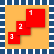
Diagram showing background images set in layers on top of each other
Using background-color
Only one background-color can be defined for any element! This background-color sits below the background image on this final layer. If more than one background-color value is assigned, all background-colors will be ignored.
p {
        background-image: url(1.gif), url(2.gif), url(3.gif);
        background-position: left center, 50% 30%, 10px 100px;
        background-size: 20px 300px, 10% auto, auto;
        background-repeat: no-repeat, repeat, repeat-y;
        background-attachment: scroll, scroll, scroll;
        background-origin: padding-box, padding-box, border-box;
        background-clip: border-box, border-box, border-box;
        background-color: yellow;
}
Shorthand multiple background images
The shorthand background property allows us to set all of the individual background properties using one rule.
In CSS2.1 we could use 5 different background properties within one background shorthand property:
[background-color]
[background-image]
[background-repeat]
[background-attachment]
[background-position]
In CSS3, we can now use eight different background properties.
[background-color]
[background-image]
[background-repeat]
[background-attachment]
[background-position]
[background-origin]
[background-clip]
[background-size]
Multiple shorthand backgrounds are written in the same way as single shorthand backgrounds – with commas separating each background value.
p {
	background:
		url(01.gif) no-repeat,
		url(02.gif) repeat left bottom,
		url(03.gif) repeat-y 10px 5px;
}
Just as with longhand multiple backgrounds, each of the background images is displayed as a layer – one on top of the other.
A note on background-color
Only the lowest layer, called the ‘final layer’, can be given a background-color. The background-color sits below the background image on this final layer only. If a background-color value is assigned to any other layer apart from the final layer, the entire rule will not be displayed.
p {
	background:
		url(01.gif) no-repeat,
		url(02.gif) repeat left bottom,
		url(03.gif) repeat-y 10px 5px yellow;
}
It may be safer to add the background-color as a separate declaration using the background-color property.
p {
	background:
		url(01.gif) no-repeat,
		url(02.gif) repeat left bottom,
		url(03.gif) repeat-y 10px 5px yellow;
	background-color: yellow;
}
Some catches with shorthand backgrounds.
If you are writing more complex shorthand rules, you have to be aware of some browser quirks and catches. Theoretically, the correct syntax for all background properties is:
p {
	background:
		[background-image]
		[background-position]
		[/ background-size]
		[background-repeat]
		[background-attachment]
		[background-origin]
		[background-clip]
		[background-color];
}
You may have noticed that there is a forward slash between background-position and background-size. Safari 5, firefox 4, and Chrome 10 all have two problems with rules written out in full like this.
Problem 1:
These browsers ignore the entire declaration when a forward slash or background-size values are included.
Problem 2:
These browsers ignore the entire declaration when two box values (background-clip and background-origin) are included. Only one value can be included.
So, at this time, shorthand rules are fine for less complex declarations, but if you want to include all seven properties, it may be better to use longhand for the present.
Multiple backgrounds and gradients
Keep in mind that gradients are a type of generated image. They can be used in place of the url() value. This means you can include gradients within multiple backgrounds.
p {
	background:
		url(demo.jpg) no-repeat 0 0,
		linear-gradient(left, blue, green);
}
Vendor-specific extensions and multiple backgrounds
What happens when you want to add vendor-specific properties into multiple backgrounds?
Browsers will ignore CSS declarations they don’t understand. Browsers only understand their own vendor-specific properties – that’s their purpose. The downside of this is that we cannot add multiple vendor-specific properties into one declaration as all browsers would then ignore the entire declaration. This means we have to rewrite the background property for each vendor-specific property. Any other background images have to be included in each declaration.
p {
	background:
		url(demo.jpg) no-repeat 0 0,
		-webkit-gradient(linear, left top, right top, from(blue), to(green));
	background:
		url(demo.jpg) no-repeat 0 0,
		-webkit-linear-gradient(left, blue, green);
	background:
		url(demo.jpg) no-repeat 0 0,
		-moz-linear-gradient(left, blue, green);
	background:
		url(demo.jpg) no-repeat 0 0,
		-ms-linear-gradient(left, blue, green);
	background:
		url(demo.jpg) no-repeat 0 0,
		-o-linear-gradient(left, blue, green);
	background:
		url(demo.jpg) no-repeat 0 0,
		linear-gradient(left, blue, green);
}
And we’re done!
While CSS3 undoubtedly offers developers and designers much greater control over backgrounds, successful implementation at this stage depends greatly on browser support.
There is, however, enough scope in the changes wrought by CSS3 to keep developers and designers busy right now – learning and experimenting – as the modern browsers capable of showing their efforts to advantage gradually become more prevalent.
Frequently Asked Questions about CSS3 Background Properties and Values
What are the new properties and values introduced in CSS3 for backgrounds?
CSS3 has introduced several new properties and values for backgrounds. These include background-size, background-origin, background-clip, and multiple backgrounds. The background-size property allows you to specify the size of the background image. The background-origin property determines the positioning area of the background images. The background-clip property defines how far the background (color or image) should extend within an element. Lastly, CSS3 allows you to apply multiple background images to an element, each with its own set of properties.
How can I use the background-size property in CSS3?
The background-size property in CSS3 allows you to control the size of the background image. You can specify the width and height of the image, or use keywords like ‘cover’ or ‘contain’. For example, ‘background-size: 50% auto;’ will scale the image to 50% of the element’s width, and adjust the height automatically to maintain the image’s aspect ratio. The ‘cover’ keyword scales the image as large as possible without stretching the image, while ‘contain’ scales the image as large as possible without cropping or stretching the image.
What is the purpose of the background-origin property in CSS3?
The background-origin property in CSS3 is used to determine the area within which the background image is positioned. It can take three values: ‘padding-box’, ‘border-box’, and ‘content-box’. ‘Padding-box’ positions the background image from the edge of the padding box, ‘border-box’ from the edge of the border, and ‘content-box’ from the edge of the content. This property gives you more control over the positioning of your background images.
How does the background-clip property work in CSS3?
The background-clip property in CSS3 defines how far the background (color or image) should extend within an element. It can take three values: ‘border-box’, ‘padding-box’, and ‘content-box’. ‘Border-box’ extends the background to the outer edge of the border, ‘padding-box’ to the edge of the padding, and ‘content-box’ to the edge of the content. This property is useful when you want to create various visual effects with backgrounds.
How can I apply multiple backgrounds to an element in CSS3?
CSS3 allows you to apply multiple background images to an element. You can do this by specifying each background image in the ‘background-image’ property, separated by commas. Each image will have its own set of properties (size, position, repeat, etc.). The first image in the list is the top layer, and subsequent images are underneath in the order they are declared.
Can I use gradients as background images in CSS3?
Yes, CSS3 allows you to use gradients as background images. You can create linear or radial gradients with multiple color stops. Gradients are created using the ‘linear-gradient()’ or ‘radial-gradient()’ function, and can be used anywhere an image can be used.
How can I control the repetition of background images in CSS3?
The ‘background-repeat’ property in CSS3 allows you to control the repetition of background images. It can take four values: ‘repeat’, ‘repeat-x’, ‘repeat-y’, and ‘no-repeat’. ‘Repeat’ tiles the image both horizontally and vertically, ‘repeat-x’ tiles the image horizontally, ‘repeat-y’ tiles the image vertically, and ‘no-repeat’ does not tile the image.
How can I position background images in CSS3?
The ‘background-position’ property in CSS3 allows you to control the position of background images. You can specify the position using keywords (top, right, bottom, left, center), percentages, or lengths. The first value represents the horizontal position and the second value represents the vertical position.
Can I use CSS3 background properties with animations?
Yes, you can use CSS3 background properties with animations. You can animate the change of a background image, its position, size, and more using keyframes and the ‘animation’ property. This allows you to create dynamic and interactive designs.
Are CSS3 background properties supported in all browsers?
Most CSS3 background properties are well supported in all modern browsers, including Chrome, Firefox, Safari, and Edge. However, some older versions of these browsers, as well as Internet Explorer, may not support all properties. It’s always a good idea to check the specific browser support for each property you use.