

A carousel is not just a list of links, it exists to display the links as items in a way that makes them more attractive. In our previous article we saw how to create a carousel, and how to display the HTML elements we need. Now it’s time to build and style our WordPress carousel plugin.
Our carousel is currently a simple list of links, by the end of this article we will have a properly formatted carousel. We’ll see how to apply the styles we need to have the result I showed you in the sample image in Part 1. Of course there are many properties that you can customize, websites don’t have to be the same around the world!
First we’ll look at how we can properly link a CSS file to a web page within WordPress. Then we’ll style our elements, which will demonstrate some CSS tricks that can be useful in many different situations.
Key Takeaways
- The WordPress carousel plugin is enhanced by linking an external CSS file, which allows for easier and more flexible styling. This includes the wp_enqueue_style() function for the inclusion of the file.
- The size of the carousel is defined in the CSS file, with each item filling the entire block created. The positioning of the links and the size of the container is also established.
- The styling of the item’s name, description, and arrows are customized using CSS properties such as display, padding, color, background-color, text-align, and text-shadow.
- The carousel plugin is completed by adding JavaScript to make the arrows functional, allowing for scrolling when the arrows are clicked. This will be covered in the next part of the tutorial.
Linking an External CSS File
To make the styling of our carousel as flexible and easy as possible, we limited the use of inline styles to only one attribute, the background of each item. For all the other styles we will use an external CSS file (stylesheet). You can chose your own name for the file (such as carousel.css) and place it in your plugin’s folder (or in a subdirectory).
To include the file we’ll use the wp_enqueue_style() function as described in our article about the right way to include a script.
We can’t call this function just anywhere, it must be called before the call of wp_head() (unlike a script, we can’t include a CSS file in the footer!). We can use wp_enqueue_scripts, which is called when WordPress includes the scripts and the styles for the current page (in the front-end), so it’s perfect for this application.
The code below must appear in your plugin’s main file.
function enqueue_carousel_style() {
    wp_enqueue_style('carousel', plugin_dir_url(__FILE__) . 'carousel.css');
}
add_action('wp_enqueue_scripts', 'enqueue_carousel_style');
The wp_enqueue_style() function accepts (at least) two parameters, the name of the style and the URI to the corresponding file. The plugin_dir_url() function will give us the URL to our plugin’s folder, as my carousel.css file is located in the root of this folder I have no subdirectory to add here, but you must concatenate it if you use one.
Note that we’re not testing anything in our function. WordPress will include our CSS file into every page. This is not a problem if you display your carousel on all pages. However, if you display your carousel only on some pages (e.g. only on the home page), you should test whether the visitor is on the right page before including the CSS file (e.g. with is_home()).
Now it’s time to edit our CSS file.
Let’s Style Our Carousel!
The Size of the Carousel
We begin with the size of the main container, the div identified by #carousel. Here you can set the size you want. As we use images that we won’t resize, a fixed size is a good idea.
#carousel {
    width: 900px;
    height: 350px;
}
Later, we will add a third property to this container, overflow. For the moment we won’t use it, that way we can see how our items are laid out across the page.
Each item will fill the entire block we just created. The following rule applies to the item itself (the a tag with the class name carousel-link) as well as its parents.
#carousel ul,
#carousel ul li,
#carousel ul li a.carousel-link {
    display: block;
    width: 100%;
    height: 100%;
}
Positioning the Links
What Happens When We Go to the Right?
Now we have to think about what we want to do. There are many possibilities when we want to build a carousel. I suggest positioning our items next to each other with a float property into a big container: it must be big enough to contain all our items in one line.
When the user wants to see another image, we move this container to align the next item with the #carousel div. This div will have the property overflow set to hidden, that way we won’t see the other links.
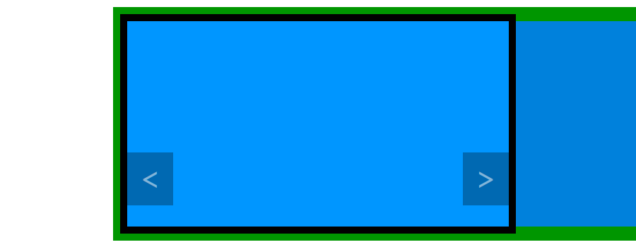
Below is a schema of what we want to make. In green you can see the big container with all our links in one line. To let us see the link on the right, the container goes to the left, and vice versa. The black frame represents the #carousel div: outside of this frame, everything is invisible.
The Size of the Container
First, the container: we won’t create another HTML element, as the ul one is perfect for our purposes. We saw that this container must be big enough to contain all our links in one line. Currently this is not the case, our items and our container both have a width of 900 pixels.
To change that, we will increase the width of the container to 500%. The div identified by #carousel has a width of 900 pixels so a width of 500% will allow us to display five links in a row.
#carousel ul {
    width: 500%;
}
A potential problem may occur to you here: the number of items can be variable, as our script can in fact display only three items for example. It’s not really an issue because we limited the number of items to a maximum of five, so even if there are only three they will all fit and the blank space won’t interfere with the operation of the carousel.
If you chose another limit you must change this width (for example to 1000% if you want to display 10). Problems appear when you don’t want any limit. In this case you will have to set the width in the style attribute of the ul tag, based on our $n variable which contains the number of items to be displayed.
<ul style="width: <?php echo $n * 100; ?>%;">Positioning the Links
Now we need to correct the width of the li tags. Currently they are set to 100% so they will take the whole width of our container which is five times too long.
#carousel ul li {
    float: left;
    width: 900px;
}
The li tags now have the right width and are floating. If you test our carousel now you will see the right result, five items next to each other. You can now add the overflow property to #carousel to hide the items which should not be visible.
#carousel {
    overflow: hidden;
}
The Item’s Name and Description
The name of the items can be styled as you desire. Here I will describe how I created the style you saw in the previous part of this tutorial.
As a reminder, the item’s name is displayed in a strong tag in the a.carousel-link element. The strip can be obtained with a background color, but we want this strip to occupy the entire width. To do that we can set display to block. padding and color properties complete the style.
#carousel ul li a.carousel-link strong {
    display: block;
    padding: 10px 20px;
    background-color: rgba(0, 0, 0, 0.3);
    color: #FFFFFF;
}
As with the name, you can personalize the item’s description. Here I chose to display it on the right, below the name, using the CSS below.
#carousel ul li a.carousel-link em {
    display: block;
    padding: 0 20px;
    text-align: right;
    color: #3D3D3D;
    text-shadow: 0 0 5px #FFFFFF;
}
The block value for the display property allows the em tag to use all of the available width. We then align the text on the right, with some padding so the text isn’t hard up against the edge. I chose here a dark grey for the text color. To be sure that the text will always be readable, even on dark images, I added a white text shadow.
Styling the Arrows
The final step is correctly displaying the arrows. You have several choices here, depending on where you want to display these arrows.
I used the properties listed below to achieve the effect on the sample item. We transform the arrows into blocks to be able to modify their sizes, we then fix this size, and we style the arrows. We also use a useful trick to vertically align the text (the arrow), we set the line-height property to the same value we gave to height, the text will then be vertically centered.
#carousel ul li a.carousel-prev,
#carousel ul li a.carousel-next {
    display: block;
    height: 75px;
    padding: 0 20px;
    background-color: rgba(0, 0, 0, 0.3);
    line-height: 75px;
    font-weight: bold;
    font-size: 45px;
    color: rgba(255, 255, 255, 0.5);
}
To reproduce the rounded corners, we will use border-radius, but not on all the corners, the ones that are on the carousel’s sides shouldn’t be rounded. That’s why we will use the ‘sub-properties’ of border-radius which allow us to select the corners to round.
#carousel ul li a.carousel-prev {
    border-top-right-radius: 10px;
    border-bottom-right-radius: 10px;
}

#carousel ul li a.carousel-next {
    border-top-left-radius: 10px;
    border-bottom-left-radius: 10px;
}
Finally, I personally like buttons and links to have a hover effect. Here I chose to only modify the color of the arrow.
#carousel ul li a.carousel-prev:hover,
#carousel ul li a.carousel-next:hover {
    color: #FFFFFF;
}
As CSS3 allows us to easily have a soft transition, why not use them?
#carousel ul li a.carousel-prev,
#carousel ul li a.carousel-next {
    transition-property: color;
    transition-duration: 0.5s;
}
Positioning the Arrows
That’s all for the style of the arrows. Now we need to place them where we want them. We will use absolute positioning, with a little trick: we don’t know the position of the carousel itself so we can’t position the arrows from the screen corners. Instead, we will use the carousel corners and, more precisely, the li tags corners.
Let’s position our arrows with position set to absolute.
#carousel ul li a.carousel-prev,
#carousel ul li a.carousel-next {
    position: absolute;
    bottom: 50px;
}

#carousel ul li a.carousel-prev {
    left: 0;
}

#carousel ul li a.carousel-next {
    right: 0;
}
If you try this, the arrows will be positioned on the screen sides. We must use a less known option of absolute positioning. The arrow element is positioned relative to its closest positioned parent. Here, our arrows do not have any positioned parent so they are positioned relative to the screen.
The problem is the arrows parents are at the right places: we don’t want to move any of them. The trick consists of using relative positioning, without changing anything else. We will apply the relative positioning to the li tags which is the closest parent of our arrows.
#carousel ul li {
    position: relative;
}
Then the arrows are positioned on the side of their closest positioned parent, the li tags, which is what we wanted.
What’s Next?
The HTML elements needed by our carousel are displayed and, now, they are also styled. The problem is that our carousel is totally useless, as it just shows the first item (it was more useful without CSS!).
That’s why we need to add one last thing: JavaScript. In the next (and last) part of this tutorial we will make our arrows function as expected, links will scroll when arrows are clicked. That’s a good thing, right?