
Key Takeaways
- Google Data Studio (GDS) is a tool that enables the creation of visually appealing, interactive reports by pulling metrics from Google’s properties and other data sources.
- GDS is particularly useful for digital marketers, as it allows complex data and statistics to be presented in a digestible, visually appealing way, aiding in the analysis of traffic, conversion rates, user location, behavior, and acquisitions.
- Despite its strengths, GDS has some limitations, including a lack of advanced data manipulation capabilities and real-time data updates. Alternatives offering these features include Looker, Tableau, and Power BI.
- GDS is a free tool, making it an accessible choice for individuals and small businesses. It supports a wide range of data types and offers customization options to match branding or personal style. Reports can be easily shared via direct link or embedded on a webpage.
As a digital marketer, you can often be overwhelmed with the amount of information and data needed to be analyzed in order to evaluate your efforts. Traffic, conversion rate, user location, behavior and acquisitions — just to name a few — all have to be examined to define the progress of your digital marketing campaign.
Client reporting is one of the biggest challenges digital marketers face when undertaking projects. Although endless numbers and stats may make some sense to internet professionals, generally customers are not as tech savvy.
Anyone can export masses of information from Google Analytics to an excel spreadsheet, but how do you present the data in a way that’s easy to digest? The answer is — Data Visualization.
What is Data Visualization?
Data Visualization is a way of representing complex data and stats in a pleasing, visually-appealing way. Visual data may include components like pie and graph charts, maps or tables, and can be presented in different forms, such as infographics, videos, illustrations and interactive reports.
Why is it important? The answer is simple. Our brains absorb visual information better, faster, more easily.
Benefits of Data Visualization
The benefits of visualizing data include:
- providing clearer information for clients
- making it easier to view and analyze patterns and trends
- enabling interaction with the data
- allowing for more information to be absorbed, and more quickly
- better identify peaks and troughs.
In this post, we’re going to assess how a new tool, Google Data Studio, can help us build beautiful and interactive reports.
Google Data Studio
Google Data Studio (GDS) is a new tool by Google that makes it easy to create beautiful, engaging, responsive, branded and interactive reports. It does this by pulling metrics from Google’s properties, such as Google Analytics, Adwords and YouTube Analytics, as well as spreadsheets and SQL databases.
For this article, we’ll be using Data Studio to create a visual report using Google Analytics data. To do this, you first need to have an active Google Analytics property that is properly integrated with the website.
The same applies to other reports. If you wish to pull the data from your Adwords or YouTube Analytics, make sure to sign in with an appropriate Google account that has that data.
Getting started
The following 18 steps will walk you through the process of creating a visual report from your Google Analytics data.
Step 1
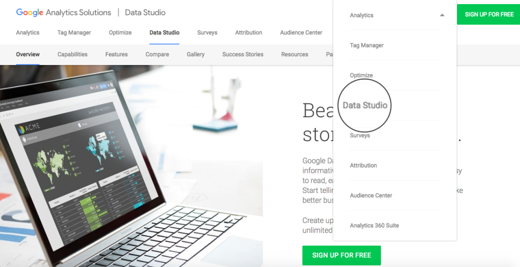
Go to Google Data Studio and log in with your Google Analytics credentials:
Step 2
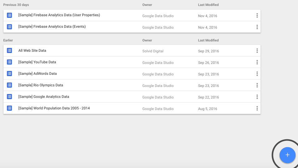
As soon as you log in, you’ll be presented with the following dashboard:
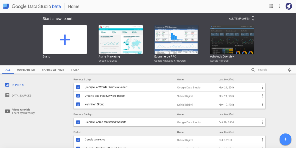
This page is a primary control panel for your GDS projects. Here you can choose a pre-designed template, create new reports from scratch, add new data sources, manage your existing projects and watch video tutorials.
One thing to note here is that, with the free version, you can only add up to 5 custom reports.
Step 3
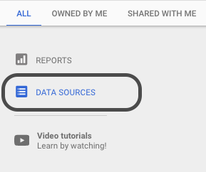
All reports start with adding a data source. In other words, providing GDS with access to the information that’s intended to be used in the report.
Let’s go ahead and add a new Google Analytics data source by clicking on a Data Sources button in the left hand side of the dashboard:
Step 4
You’ll then be directed to the screen with the list of already connected data sources. To add a new one, click on the blue “Add” (+) button.
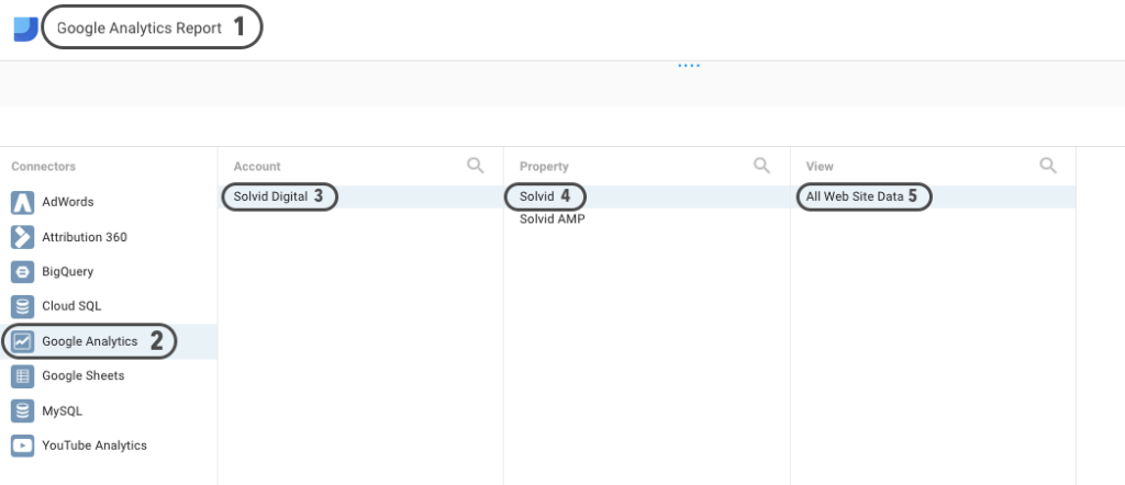
Step 5
On the next page, add a unique name to your new project, select “Google Analytics” from the list of connectors, choose the relevant account, property, and hit the Connect button in the right-hand corner of the screen:
Step 6
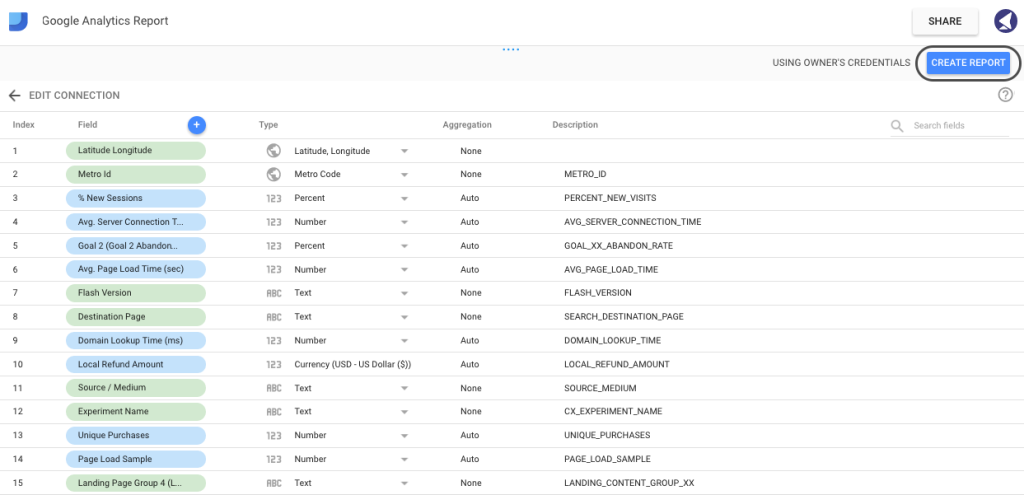
Next, you’ll be bombarded with the following screen, which, at first, may seem quite challenging to digest. However, it’s not as horrifying as it looks.
In simple terms, this is just a list of metrics and dimensions available to be used in the report. Each field is assigned a unique type: Numeric, Text, Date & Time, Boolean, Geo or Currency. When pulling data from Google’s properties (such as Google Analytics or Adwords) GDS will assign the value automatically. However, if you’re using custom data pulled from an Excel Document, you’ll have to ensure that every field is assigned an appropriate type.
In this instance, you wouldn’t need to change any fields, so it’s safe to go ahead and click Create Report in the right-hand corner of the screen.
Step 7
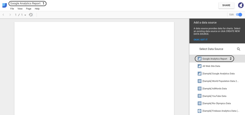
Next, you’ll be redirected to the screen with the actual design canvas. Give a name to your report and select the data source we’ve just created:
Step 8
As soon as you connect the data source with the report, you’ll notice a control panel at the top of the canvas.
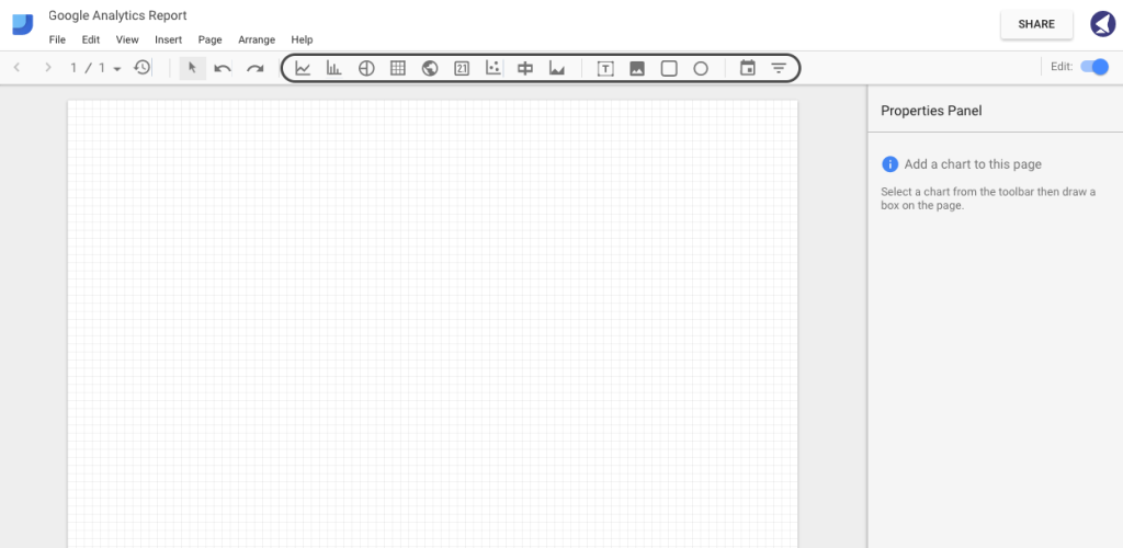
Currently, you can add the following components to your report: time series, bar chart, pie chart, table, geo map, scorecard, scatter chart, bullet chart, area chart, text, image, rectangle, circle, date range and filter control.
Step 9
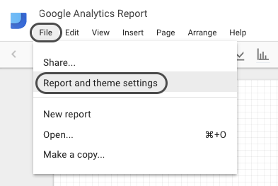
You can also change the orientation of the page to landscape. To do this, go to File > Report and theme Settings > Layout > Landscape:
However, in this guide, we’ll be using portrait orientation.
Step 10
Now that we have our canvas ready, let’s proceed with adding some branding and custom styling.
Chances are, you’re creating these reports for clients. Hence, custom branding is an essential part of making your reports visually appealing.
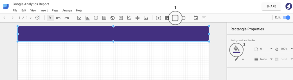
Let’s add a header by using the rectangle tool. Select the area where you want your shape to appear.
In the right sidebar, you’ll see some styling options, allowing you to choose the color, border radius, opacity, border size and color:
Step 11
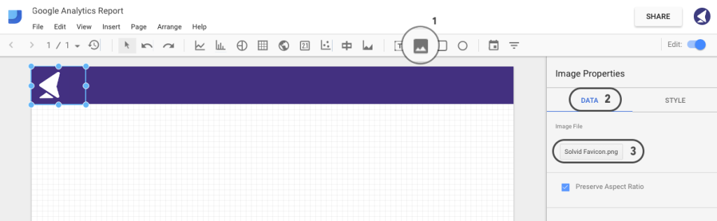
Let’s go ahead and add a logo to our report. Click on the image tab as shown below and select the area where you want your logo to appear. Then, hit the Data tab in the right sidebar and select an image file.
Step 12
What’s fascinating about Google Data Studio is that it allows adding an interactive date range, which will automatically change the graph data according to the date range.
To add one, click on the Date Range tab and select the area where you want the handle to appear. Then, choose your default date range and tailor the styling:
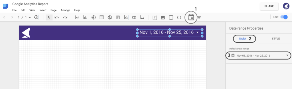
Step 13
Once we have the basics ready, we can proceed with further styling and adding the actual data to our report. Let’s start off with some general score cards.
A score card is simply a single metric that can be used to represent some general information, such as total visitors, total sessions, bounce rate, etc.
We’ll now proceed with adding four score cards, representing sessions, pageviews, users and bounce rate.
First, go ahead and add a score card using the tab as shown on the image below.
Then, in the right sidebar, select the preferred metric to be used for this particular score card. For our first example, we’ve chosen to display sessions:
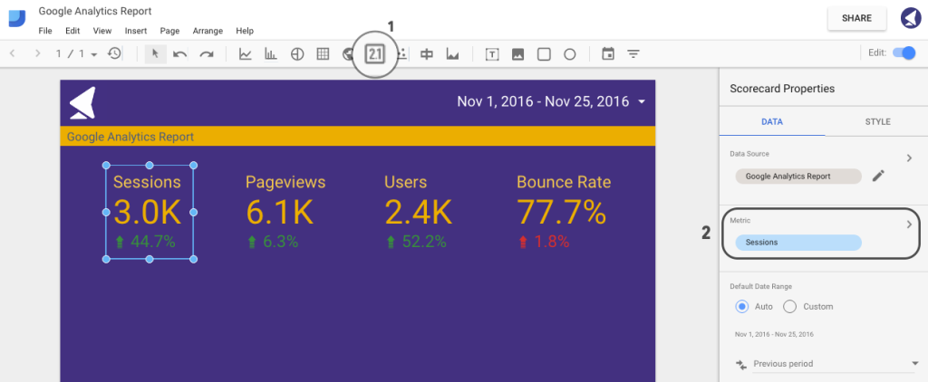
You can then copy and paste this score card, changing the metric source.
Step 14
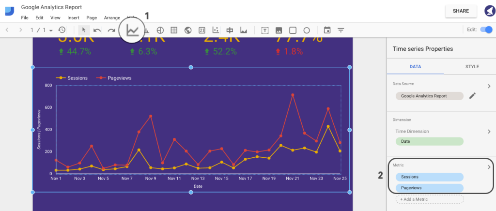
It’s now time to add a first graph that will represent a number of sessions and pageviews for our selected date range.
First, hit on the Time Series tab and select the area where you want your graph to appear. Then, select the metric sources. In this case, we’ll be using sessions and pageviews:
Step 15
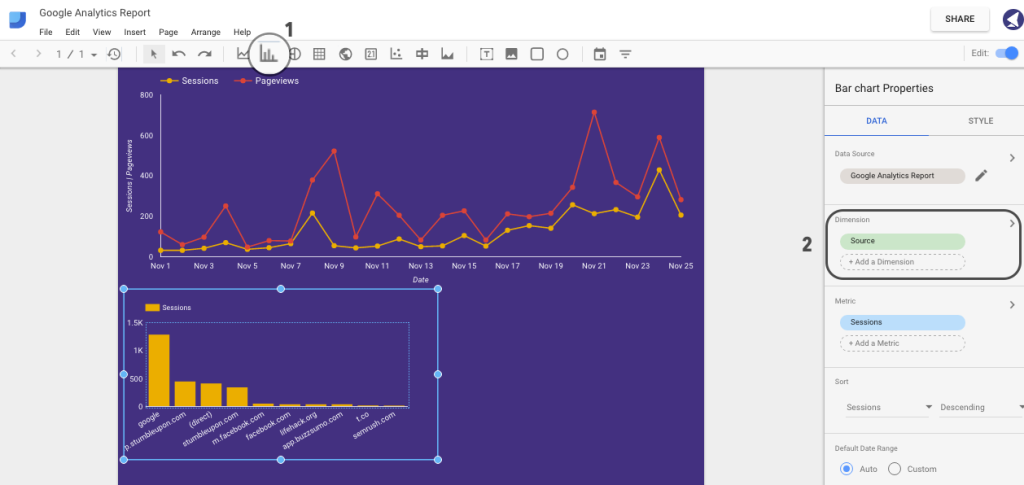
Let’s now add a bar chart representing session sources.
Click on the Bar Chart and select the area where you want it to appear. Then, select Source in Data > Dimensions:
Step 16
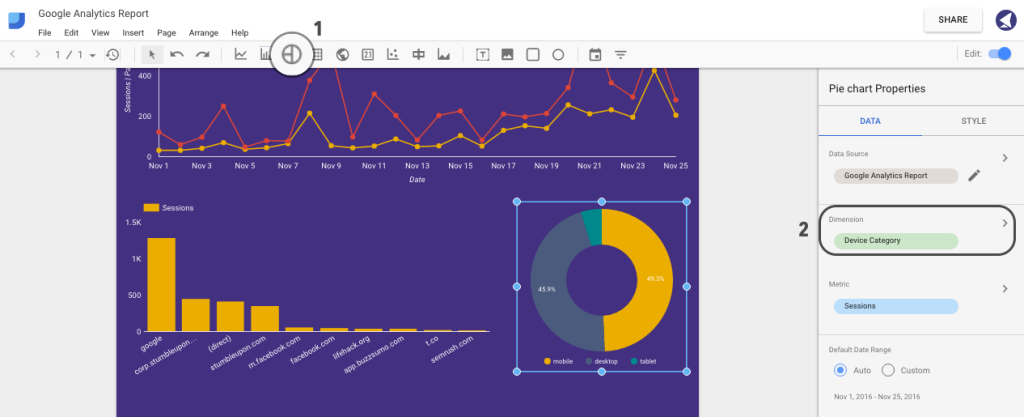
We can now add a pie chart representing a breakdown of sessions by devices (that is, desktop, mobile and tablet).
To do that, hit the Pie Chart tab and select Device Category under Dimension section in the right sidebar:
Step 17
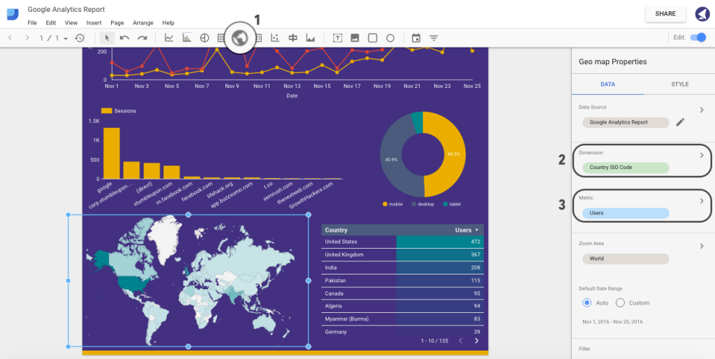
Last but not least, let’s add a geographical map and table of users. Click on Geo Map, select Country ISO Code from the dimensions list, and select users from a list of metrics.
To add a table of top countries by users, click on the Table tab and choose the same metrics as for Geo Map:
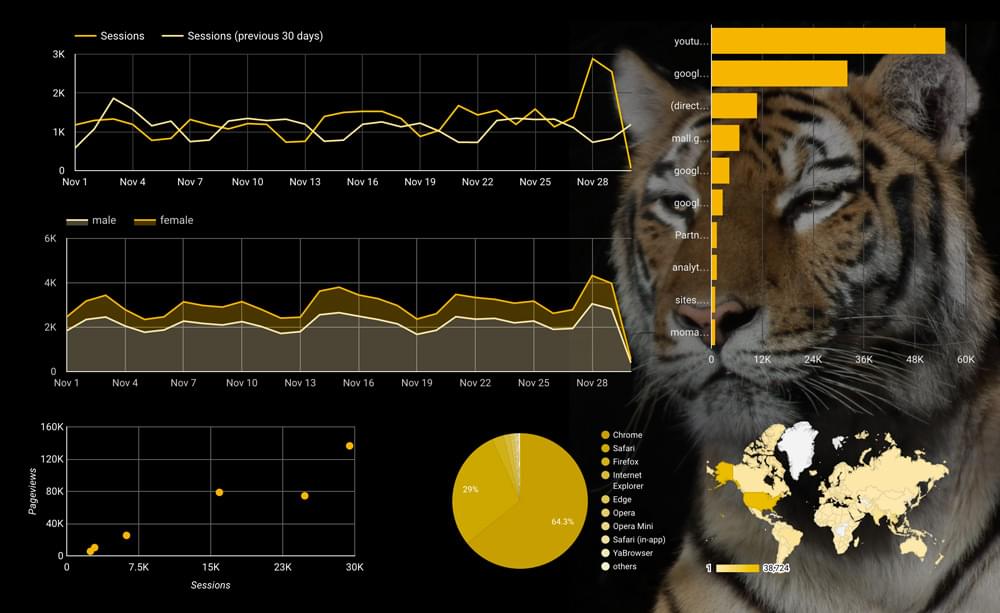
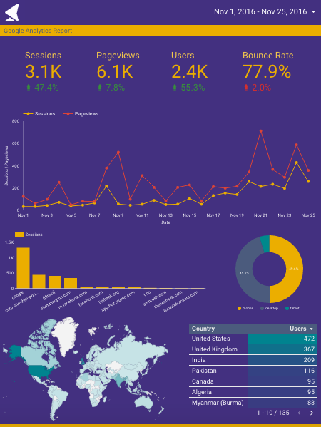
That’s it. Here is how our final version looks:
Step 18
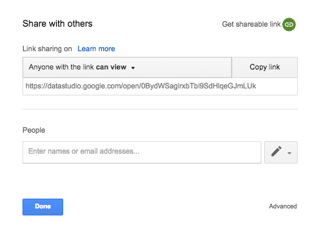
Now that we have everything ready, it’s time to go ahead and share this report with our colleagues or clients.
Tap the Share button in the top-right corner of the screen.
You can either copy the shareable link or enter email addresses of people you want to send this report to:
To Conclude
Hopefully, after reading this guide, you now have an idea of how important and powerful data visualization can be, and how to incorporate Google Data Studio to provide your clients with comprehensive, easy-to-understand interactive reports.
We’d love to hear your thoughts and any experiences you’ve had with this tool.
Frequently Asked Questions about Google Data Studio
What are some limitations of Google Data Studio?
While Google Data Studio is a powerful tool for visualizing data, it does have some limitations. For instance, it lacks advanced data manipulation capabilities, meaning you may need to pre-process your data before importing it. Additionally, it doesn’t support real-time data updates, which can be a drawback for users who need up-to-the-minute information. Lastly, while it offers a range of visualization options, it may not be as extensive as some other tools on the market.
Are there any good alternatives to Google Data Studio?
Yes, there are several alternatives to Google Data Studio that offer different features and capabilities. Some popular ones include Looker, Tableau, and Power BI. These tools offer more advanced data manipulation and visualization options, and some even support real-time data updates. However, they may also come with a steeper learning curve and higher price tag.
Can I use Google Data Studio for real-time data visualization?
Unfortunately, Google Data Studio does not currently support real-time data updates. This means that if you need to visualize data that is constantly changing, you may need to look for an alternative tool. However, Google Data Studio does allow you to refresh your data sources manually or on a set schedule, which can help keep your visualizations up-to-date.
How can I improve my data visualizations in Google Data Studio?
There are several ways to improve your data visualizations in Google Data Studio. First, make sure you’re using the right type of chart for your data. Second, use color and formatting options to make your visualizations more engaging and easier to understand. Lastly, consider adding interactive elements like filters and drop-down menus to allow users to explore the data on their own.
What types of data can I visualize in Google Data Studio?
Google Data Studio supports a wide range of data types, including numerical, categorical, and geographical data. This means you can create everything from bar charts and line graphs to heat maps and geographic maps. Additionally, you can import data from a variety of sources, including Google Sheets, Google Analytics, and SQL databases.
Is Google Data Studio free to use?
Yes, Google Data Studio is completely free to use. This makes it a great option for individuals and small businesses who need a powerful data visualization tool but don’t have a large budget.
How can I share my Google Data Studio reports?
Google Data Studio makes it easy to share your reports with others. You can send a direct link to your report, or you can embed it on a webpage. You can also control who has access to your report and whether they can view or edit it.
Can I customize the look and feel of my Google Data Studio reports?
Yes, Google Data Studio offers a range of customization options. You can change the colors, fonts, and layout of your report to match your brand or personal style. You can also add images, shapes, and text boxes to further customize your report.
Can I import data from sources other than Google products into Google Data Studio?
Yes, in addition to Google products like Google Sheets and Google Analytics, you can also import data from SQL databases, CSV files, and other third-party sources. This makes Google Data Studio a versatile tool for visualizing a wide range of data.
How does Google Data Studio compare to other data visualization tools?
Google Data Studio is a powerful and user-friendly data visualization tool. It offers a range of visualization options, supports a wide variety of data sources, and is completely free to use. However, it does have some limitations, such as a lack of real-time data updates and advanced data manipulation capabilities. Other tools like Looker, Tableau, and Power BI offer these features, but they may also come with a steeper learning curve and higher price tag.