

Key Takeaways
- Popups, when designed correctly, can benefit both the site owner and the visitor. They can be a powerful tool for targeting multiple parties in a two-sided marketplace, provided they are non-intrusive and do not repeatedly annoy the user.
- A well-crafted popup can make the act of closing it undesirable. By creating a Call-to-Action that people feel bad rejecting, the sign-up rate can be significantly increased. Timing of the popup also plays a crucial role; it should only appear after the visitor has spent some time on the site.
- Popups should be consistent with the brand voice, tone and values, and their purpose should be clear. They can also be used to offer potential customers a deal, increasing the likelihood of a purchase, or to collect valuable information about site visitors to refine product offerings and send targeted announcements.
Popup windows have a reputation for being evil.
As an Internet browser, you’ve probably closed your fair share of boxes without even pausing—so as a designer or entrepreneur, it’s understandable to resist putting them on your own site.
However, you might want to rethink that.
Popups—when done well—benefit not only you, but your site visitors as well.
Let’s look at some examples of fantastic popup windows.
1. Uber
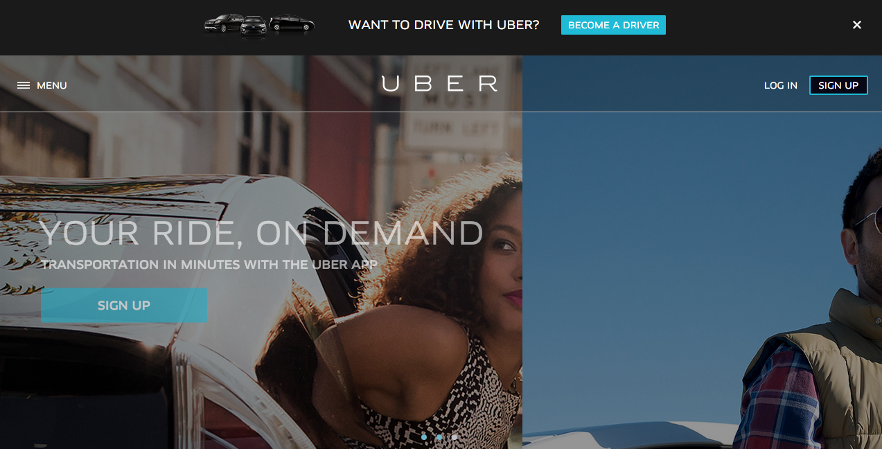
Uber’s homepage is aimed at passengers.
We’re greeted with “Your Ride, On Demand” and a button urging us to sign up for the service.
However, Uber doesn’t just need to attract users—it also needs to sign up drivers.
To that end, a small, non-intrusive black box pops up at the top of the screen asking, “Want to drive with Uber? Become a driver.”
Clicking the Call-to-Action (CTA) button will take you to a landing page explaining the benefits of becoming an Uber “partner” and the option to create a Driver account.
However, if you choose to close the window, then it won’t reappear again—at least until you’ve cleared your browsing data. This ensures that people who aren’t interested in becoming drivers don’t get annoyed by a recurring popup.
The takeaway:
If, like Uber, you’re a two-sided marketplace (meaning that you act as the middleman between consumers and producers), using a popup is a great way to target both parties while keeping your site simple and comprehensible.
Furthermore, considering using a popup that slides onto the top or bottom of the page. One of the reasons people hate popups is because they have to stop what they’re doing to close the window. But if your popup is subtle and non-interruptive, your visitors won’t be annoyed.
Lastly, if you can, create a popup that only displays itself once per user. That way, you won’t force those uninterested in the offer to cancel the window again and again.
2. Men’s Health
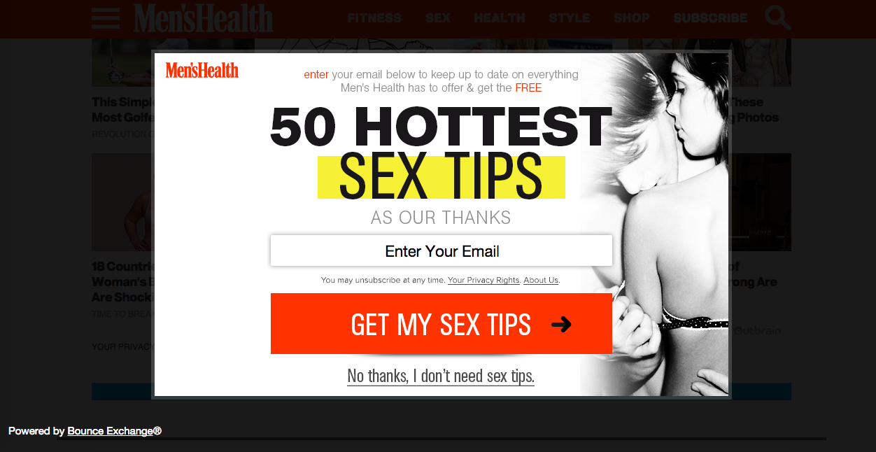
Marketers commonly use fear as an incentive. For example, Allstate shows you clips of expensive and painful accidents to get you to buy insurance, while Crest reminds you of the plaque and germs in your mouth to encourage you to buy mouthwash.
This Men’s Health popup is using the same technique to brilliant effect. To close the popup, you must reject the “free sex tips” offer—and you have to acknowledge “No, I don’t want free sex tips.”
It’s an unabashed attempt to shame you; after all, who doesn’t want to be better in bed? The implication that one is not a satisfactory lover will motivate many visitors to enter their email addresses, thereby getting access to the sex tips (and subscribing to the Men’s Health newsletter).
The takeaway:
Make clicking out of your popup undesirable. The easiest way to do this is to create a CTA people feel bad rejecting.
Let’s say your startup offers project management software. Your popup says:
Enter your email here to try our product free for 14 days, and get more done faster!
And to make the popup go away, one must click:
No thanks, I don’t want to get more done faster.
It’s not subtle, but it will increase your sign-up rate.
The Men’s Health popup is also well-done because it only shows up after a visitor has spent 5–10 seconds on the site. This gives people a chance to read a bit before they’re confronted with an ad.
And since spending 5 seconds on a page means the visitor is generally interested in the content, he or she is likelier to be interested in the popup than someone who’s only been on the page for one second.
3. Negative Underwear
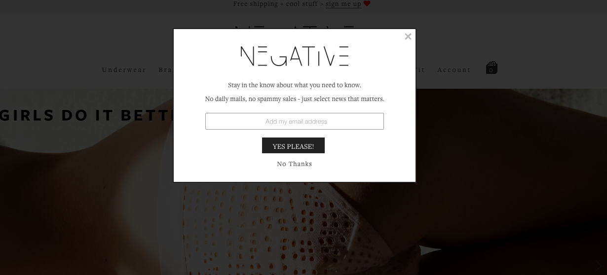
For an example of a popup that’s perfectly on-brand, look no further than Negative Underwear. This lingerie line defines itself by its minimalism and relaxed cool, saying, “In a world of pushed up and overdone, we’re not.”
Its popup extends the idea Negative is realer than other brands by promising, “No daily mails, no spammy sales – just select news that matters.”
As a result, the customer trusts Negative. Rather than feeling like she’s being manipulated and pandered to, she feels as though she’s being let into an exclusive club. And take note: the company specifically uses “news” rather than “announcements” or “updates,” as this word connotes important, serious information.
The takeaway:
When composing your popup, don’t forget it’s a component of your site like, say, your blog or About page. That means the popup should be written with the same voice, tone, and values as the rest of your copy.
In addition, to instantly establish trust with your site visitors, make the purpose of the popup clear. If you’re collecting newsletter signups, tell people what your newsletters include and approximately how often they come. If you’re giving away an ebook, include how people will access it—by downloading a PDF, by clicking through to exclusive URL, by getting an email with the ebook attached, etc. And if in exchange for the ebook, you’re going to send people weekly updates on your company, make sure to include that too.
4. General Assembly
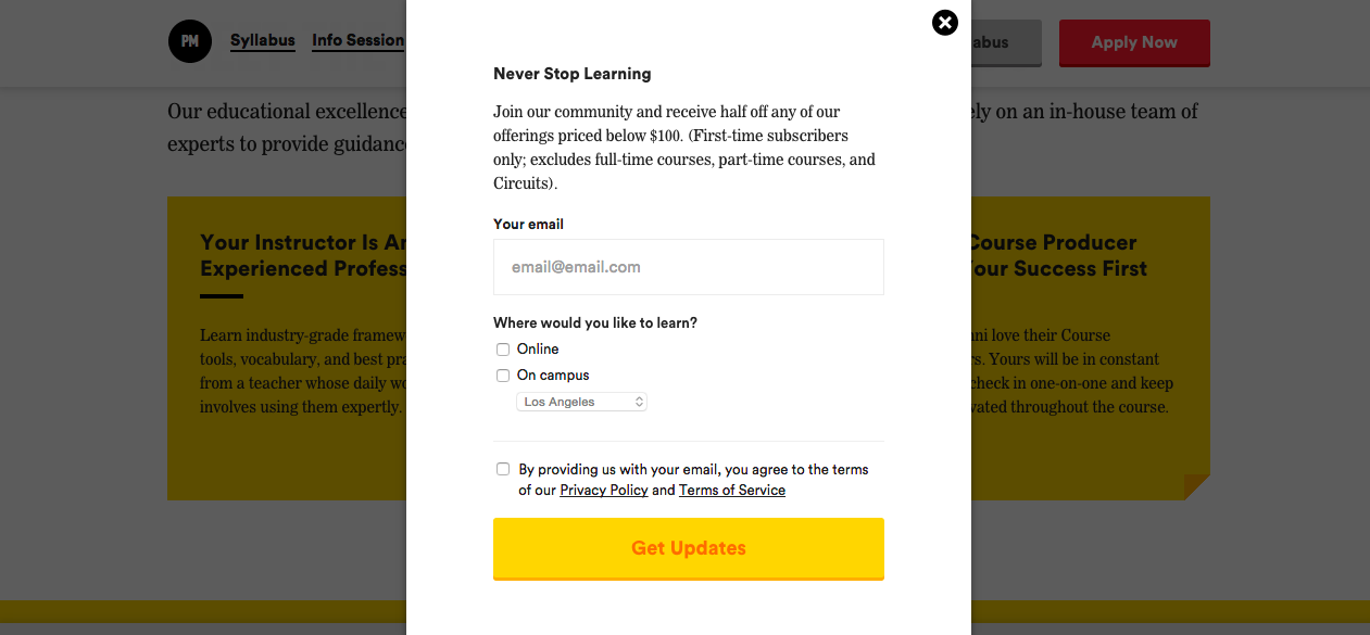
The discount or offer code popup is one of the most common, and for good reason: If someone’s interested in your product or service, he or she will likely jump at the chance to save some money.
Not only is this a good way to get qualified leads, but it also encourages purchases. A third of retailers say that these discounts are the most effective customer incentive, 83% of consumers report spontaneously buying something because they got a discount, and 68% say promotions and coupons increase their brand loyalty.
But the psychology behind promos isn’t the only reason GA’s popup works so well. The company is also using the form to collect crucial information about its visitors, including which types of courses they’d be interested in and what city they live in. GA will use these details to create personalized emails.
The takeaway:
Use your popup to give potential customers a deal. You’ll increase the likelihood they’ll click “Buy”—and even if you don’t, if you get their email address, you’ve got a shot of converting them down the road.
Popups can also be a great way to learn more about your site visitors. You can use this data to refine and improve your product or send targeted announcements and offers. The more you know about your audience, the better you can sell to them.
Putting a popup on your site doesn’t make you evil—in fact, it puts you in some pretty good company. And when you do popups right, everyone wins.
Frequently Asked Questions (FAQs) about Pop-Up Ads
What are the best practices for creating effective pop-up ads?
Creating effective pop-up ads requires a balance between grabbing the user’s attention and not being overly intrusive. The ad should be visually appealing, with clear and concise messaging. It’s also important to consider the timing of the pop-up. It shouldn’t appear immediately after a user lands on a page, but rather after they’ve had a chance to engage with the content. Additionally, the ad should be easy to close if the user isn’t interested, and it should not reappear after being closed.
How can I make my pop-up ads mobile-friendly?
To make your pop-up ads mobile-friendly, ensure they are responsive and fit well on smaller screens. The text should be large enough to read without zooming in, and any buttons or links should be easy to tap with a finger. Also, consider the load time of your pop-up ad. Mobile users often have slower internet connections, so your ad should load quickly to avoid frustrating the user.
Are pop-up ads effective for marketing?
Yes, when used correctly, pop-up ads can be an effective marketing tool. They can help increase email sign-ups, promote special offers, and drive conversions. However, they should be used sparingly and strategically to avoid annoying users and potentially driving them away from your site.
How can I prevent my pop-up ads from being blocked?
Many users employ ad blockers to prevent pop-ups, so it’s important to create ads that are less likely to be blocked. This can be achieved by ensuring your ads are relevant and valuable to the user, and not overly intrusive. Also, consider using less common ad formats that are less likely to be targeted by ad blockers.
What are some examples of effective pop-up ads?
Effective pop-up ads often have a few things in common. They offer something of value to the user, such as a discount code or free ebook. They have a clear call to action, guiding the user on what to do next. And they are visually appealing and easy to read, with a design that matches the rest of the website.
How can I measure the success of my pop-up ads?
The success of pop-up ads can be measured using various metrics, such as the conversion rate, click-through rate, and bounce rate. You can also track the number of new email sign-ups or sales generated from the ad.
Are pop-up ads bad for SEO?
Pop-up ads can potentially harm your SEO if they are intrusive and negatively affect the user experience. Google has stated that sites with intrusive interstitials may not rank as highly. However, if your pop-ups are user-friendly and provide value, they should not negatively impact your SEO.
How can I target my pop-up ads to the right audience?
To target your pop-up ads effectively, you should first understand who your audience is. Use analytics to gather data on your website visitors, such as their demographics, interests, and browsing behavior. You can then use this information to create targeted ads that will be more likely to resonate with your audience.
What is the difference between a pop-up ad and a pop-under ad?
A pop-up ad appears over the content of a webpage, while a pop-under ad opens in a new browser window underneath the current window. Pop-under ads are less intrusive as they don’t interrupt the user’s browsing, but they can also be less noticeable.
Can pop-up ads be used on any type of website?
Yes, pop-up ads can be used on any type of website, as long as they comply with the website’s advertising policies and guidelines. However, they are most commonly used on e-commerce sites, blogs, and news sites.