

In this article, we’ll explore the four broad categories of CSS sizing units. We’ll look at what the sizing units are for, where they work best, and how to choose the best ones in each scenario, so that our layouts will be optimized across a range of media and device dimensions.
Key Takeaways
- Overview of CSS Sizing Units: The article introduces the different types of CSS sizing units available, categorizing them into absolute, font-relative, viewport-relative, and container-relative units. It emphasizes understanding the distinction between specified, computed, and used values in CSS, which are key concepts in effectively applying these units in web design.
- Details on Specific Unit Types: The piece delves into the specifics of each unit category. Absolute units are fixed and consistent across mediums; font-relative units vary based on font size and type; viewport-relative units adjust according to the size of the browser window; and container-relative units are determined by the dimensions of an element’s container. Examples and use cases for each unit type are provided to illustrate their practical applications in web layouts.
- Practical Application and Best Practices: The article concludes with guidance on selecting the appropriate CSS unit for various design scenarios. It advises using absolute units for known physical dimensions, font-relative units for scalable and adaptable typography, viewport-relative units for responsive design, and container-relative units for flexible components within different layouts. The goal is to enhance the legibility, usability, and accessibility of websites across different devices and media.
About CSS Sizing Units
CSS offers several ways to specify the size or length of elements — some more intuitive than others. CSS units fall into four broad categories:
- absolute units, such as
cmandpx - font-relative units, such as
emandch - viewport-relative units, such as
vwandvmin - container-relative units, such as
cqwandcqh
We’ll look at each type of CSS unit in this piece. Before continuing, let’s refresh your memory about some terms you’ll see in this piece: specified value
, computed value
, and used value
.
- Specified value is the value of a CSS property as indicated in the document’s stylesheet.
- Computed value is the value of a property after the browser applies the rules of the cascade, inheritance, and the property’s definition.
- A used value is the value of a property after the browser makes its final adjustments and conversions. During this process, relative units get converted to absolute ones. For screened media (that is, devices with screens), physical units get converted to their pixel equivalents.
You’ll see these terms a few times in this article.
Absolute Units
Absolute units are anchored to specific, media-dependent measurements. For physical media such as paper, absolute CSS units are anchored to their corresponding physical units. For screened media, absolute units are anchored to pixels. One pixel is roughly 1/96th of an inch. Absolute units include in, cm, mm, and Q, or inches, centimeters, millimeters, and quarter-millimeters, respectively. Point (pt) and pica (pc) are also absolute units. They have their roots in physical typesetting and desktop publishing. Each pt equals 1/72th of an inch, while 1pc equals 1/6th of an inch. Table 1 shows absolute units and their equivalents.
| Unit | Name | Equivalent to |
|---|---|---|
| cm | centimeters | 1cm ≈ 37.8px |
| mm | millimeters | 1mm ≈ 3.78px |
| Q | quarter-millimeters | 1Q ≈ 0.944px |
| in | inches | 1in = 96px |
| pc | picas | 1pc = 16px (1/6 of 1 inch) |
| pt | points | 1pt ≈ 1.33px (1/72th of 1 inch) |
| px | pixels | 1px = 1/96th of 1 inch |
When the specified width of an element is 2in, its printed width will be two inches. On screens, however, 2in results in a computed value of 192px. Absolute units are not affected by font metrics, inherited property values, or the viewport. They work best when you know physical properties of the output medium, as with paged media. Avoid using absolute values with the font-size property. Some low-vision web users increase the default font size of their browser to improve legibility. Absolute values, including px, do not scale with that change. Instead, use font-relative units. We’ll discuss them in the next section.
Font-relative Units
Font-relative units use font metrics to calculate the dimensions of an element. This may be the computed value of the font-size, or line-height properties. Or they may be computed relative to the size of a particular glyph, as with the ch, ex and ic units. A word of caution when using font-relative units: they can trigger a font download if the font isn’t already loaded. This can cause layout shifts on slow networks or networks with intermittent availability. Font-relative units can be categorized into two types: local
and root-relative
.
- Local font-relative units calculate size relative to the computed value of the
font-sizeproperty for the element. Since thefont-sizeproperty is an inherited property, this usually means it’s relative to thefont-sizeproperty value of the nearest ancestor element. - Root-relative units calculate size relative to the document’s root element — typically the
font-sizevalue for thehtmlelement.
em and rem
You’re probably familiar with the em unit and its root-relative counterpart rem. The em unit represents a proportion of the computed value of the font-size property for the element. For example, 1em is 100% of the value of font-size. A value less than 1, such as 0.5em works out to 50% or half the value of font-size. Values greater than 1 act as a multiplier.
See the Pen How em units work by SitePoint (@SitePoint) on CodePen.
In the preceding example, the computed font size for h1 is 48 pixels. Its parent element, article, has a specified font-size value of 24px. The h1 inherits that value, but 2em tells the browser to make the font size of the h1 twice the proportion of article. The rem unit, on the other hand, calculates size relative to the font-size value of the root element.
See the Pen How rem units work by SitePoint (@SitePoint) on CodePen.
Here, the h1 has a computed font size of 32 pixels. Changing the font-size value for article doesn’t change the size of the h1, even though it’s a descendant. If you need a refresher on em and rem units, try The Power of em Units in CSS and Rem in CSS: Understanding and Using rem Units. Both em and rem sizes are lengths calculated relative to the document’s default font size. The ch, ex, and ic units and their root-relative counterparts rch, rex, and ic are calculated relative to the size of the zero, lowercase x, and 水 glyphs respectively.
What is a glyph?
A glyph is the visual representation of a character — literally, the shape of the letter, number or punctuation mark used by a font. A zero character may be represented by in any number of ways, as illustrated by the following image.  Glyph dimensions can vary quite a bit between fonts;
 1ch may be five pixels or 50 pixels depending on the metrics of your chosen font. As a result, specified values may be very different from used values for ch, ic, and ex units and their root-relative counterparts, rch, ric, and rex. Keep that in mind when using multiple fonts.
Zero-width units ch and rch
The ch and rch units are based on the advanced measure — the width or height — of the zero glyph in the font used to render it. When the inline axis of the document is horizontal, the calculation is based on its width. When the inline axis is vertical, the calculation is based on the height of the zero glyph. If the browser can’t determine the measure of the 0glyph, the ch unit behaves as though the zero glyph is 0.5em wide by 1em tall.
See the Pen Using ch units by SitePoint (@SitePoint) on CodePen.
Similar to rem units, rch units use the advanced measure of the zero glyph for the root element’s font.
X-height and cap height units: ex/rex and cap/rcap
In typography, the x-height refers to the height of the lowercase letter x glyph, measured from its baseline.  Sizes set using
 ex units are calculated relative to the used x-height of the first available font. The rex unit works similarly, but calculates size relative to the ex unit of the root element instead of the nearest ancestor. Cap height, on the other hand, refers to the distance from the baseline to the top of capital or uppercase letters — typically the height of letters with flat tops. Pointed or rounded capital letters such as A, O, and S may have slightly taller cap heights in some fonts.  Cap-height units (
cap) calculate lengths relative to the used cap height of the first available font for an element. Root-relative rcap units use the cap value of the root element as a basis for calculating lengths. Unfortunately, cap unit support is currently limited to Firefox, while rcap units aren’t yet supported by any browser. Some fonts do a poor job of exposing font metrics to the browser, or lack reliable metrics. Other fonts may lack a lowercase x glyph, or use a non-Latin script such as Arabic. When the x-height can’t be determined from the font itself, browsers use a fall back x-height of 0.5em.  When the browser can’t determine cap height from the font, it uses the font’s ascender value. The ascender is the portion of a lowercase letter, such as the stem of h or b, that extends above the x-height.
Ideograph units: ic and ric
The ic unit works best with Chinese, Japanese, and Korean character sets. It calculates lengths based on the used advanced measure of the 水, or water ideograph, of the font used to render it. The 水 ideograph is common to all three character sets. Glyphs in Chinese, Japanese, and Korean fonts often have the same width and height. As a result, ic units can work well to limit text to a particular number of glyphs per line for those character sets. In the demo below, the inline size for each paragraph is 20ic. That accommodates about 20 glyphs per line, depending on the font.
See the Pen Using ic units by SitePoint (@SitePoint) on CodePen.
Although 水 is a shared ideograph across Chinese, Japanese, and Korean, not every font contains a glyph representing it. When the browser can’t determine the advanced measure of 水, it assumes a measure of 1em. As with other font-relative units, ic units are calculated relative to the computed value of parent elements, and ric units are calculated relative to the computed value of the root element.
See the Pen Using ic versus ric units (Chrome and Edge only for now) by SitePoint (@SitePoint) on CodePen.
Line height units: lh and rlh
You can also set lengths using the line-height relative unit — lh — and its root-relative sibling rlh. An lh unit is equal to the computed value of the line-height property of the element on which it’s used. It’s calculated relative to the element’s immediate ancestor. The rlh unit calculates lengths relative to the line-height of the document’s root element.
See the Pen Line height (lh and rlh) units (Chrome, Edge, and Safari for now) by SitePoint (@SitePoint) on CodePen.
When the value of the line-height property is normal, the height of each line is based on the font’s own metrics. When the value is a number — such as line-height: 1.3 — the line height is the product of font-size and the multiplier, as expressed in pixels. If the value of line-height is a percentage, the computed value of line-height is the percentage value multiplied by the computed font size, in pixels. For example, if the user’s minimum font size is 18px and the specified value of line-height is 1.5, the computed line height is 27px. This computed line height is one lh or rlh unit. A declaration of inline-size: 10lh results in an element that’s 270 pixels wide (or tall, if the inline axis is vertical). Root-relative line height units — rlh units — calculate lengths using the used line height of the document’s root element. Local line height, or lh units, inherit the line-height value of ancestor elements. Units such as ex, cap, ic, and lh are particularly useful when your project uses multiple typefaces and/or languages. You can maintain vertical rhythm and size ratios, even if the user changes their font settings. Font-relative units are affected by the writing-mode, text-orientation and text-transform properties among others. You may, for example, find that CJK glyphs of some fonts occupy more pixels when the writing mode is horizontal versus vertical. Chapter 6 of CSS Master, 3rd Edition explains how writing mode affects layout. It’s available from SitePoint Premium. So far, we’ve covered absolute lengths and font-relative units. However, CSS also supports two more kinds of size units: viewport-relative units and container-relative units.
Viewport-relative Units
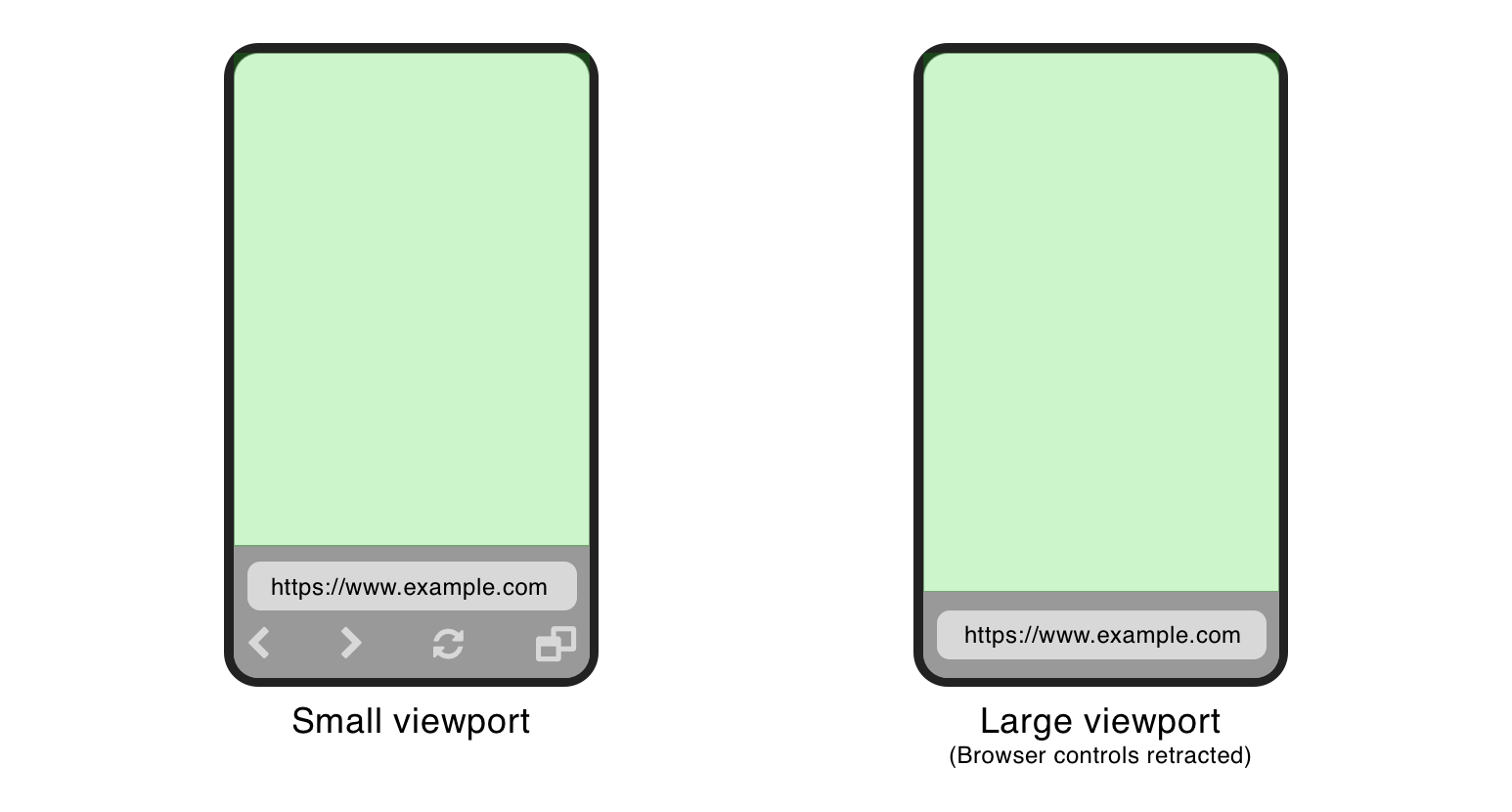
Viewport-relative units, as the name suggests, depend on the dimensions of the browser window, iframe, or device dimensions. They’re calculated relative to the size of the initial containing block — either the viewport or page in the case of paged media. One viewport percentage unit equals 1 percent of the initial containing block. That’s different from percentages, which set dimensions as a proportion of the parent element’s width or height. Viewport percentage units are a little tricky to understand, partly because they’re based on four notions of the viewport:
- UA-default viewport, which may be equal to either the large or small viewport, or an intermediate size
- Large viewport, or the available size when retractable portions of the browser interface are retracted
- Small viewport, which assumes that the retractable portions of the browser’s interface are expanded
- Dynamic viewport, which exists whether or not the browser’s interface is expanded or retracted and grows or shrinks to fill the available space
 Safari on iOS, for example, hides the back button, tab menu and other controls as you scroll down from the top of the page and reveals them again as you scroll up.
Each of these conceptual viewports has a corresponding set of viewport units. UA-default viewport units include vw, vh, vmin, and vmax. Large, small, and dynamic viewport units follow a similar naming convention, with an l, s, or d prefix — that is, lvw, or dvmin. The *vw and *vh units equal 1 percent of the initial containing block’s width and height, respectively. The *vi and *vb units work similarly. Each *vi unit equals 1 percent of the initial containing block along the inline axis, while each *vb unit equals 1 percent of the initial containing block along the block axis. Inline and block axes depend on the value of the writing-mode property. When the document uses a vertical writing mode, the inline axis is vertical and the block axis is horizontal. For horizontal writing modes, the inline axis is horizontal and the block axis is vertical. In the case of *vmin units, the length is calculated as a proportion of the smaller of *vw or *vh. If the UA default viewport is 390px by 844px, then a specified value of 10vmin becomes a used value of 39 pixels (or 10 percent of 390). Similarly, *vmax units are calculated as a proportion of the larger of *vw or *vh. A specified value of 10vmax, translates to a used value of 84.4 pixels, for viewport that measures 390px by 844px. Large, small, and default viewport sizes are stable values. They only change when the viewport itself changes, such as by rotating from portrait to landscape mode. If you use svw or svi units to size an element, its size will not expand when the browser interface retracts. On the other hand, if you use lvh or lvb units, parts of your content may be hidden by the browser’s controls when they expand. Dynamic viewport sizes, on the other hand, are not stable. They may change when the orientation changes, or when the user scrolls. For example, an element with a height value of 100dvmax changes size when the browser interface affects the size of the viewport. You can see this effect in the video below.
Here, the light-blue box expands vertically once the browser’s controls retract, and it shrinks when the controls become visible. Viewport units can be useful for creating full-width, full-height interface elements, such as a slideshow that takes up the entire width and height of the screen.
See the Pen Using viewport units to create full-screen slide shows by SitePoint (@SitePoint) on CodePen.
Viewport units also work nicely for creating fluid typography that expands or shrinks with the size of the viewport. Combine it with the clamp() function to prevent type that’s too small or too large, as shown below.
See the Pen Fluid typography with viewport units by SitePoint (@SitePoint) on CodePen.
Use caution with dynamic viewport units, however. Users may experience layout shifts or text size changes as they scroll. CSS Viewport Units: vh, vw, vmin, and vmax offers more examples of how you can use viewport relative units.
Container-relative Units
While viewport-relative units apply to the available space of the browser window, container-relative units are calculated relative to the size of an element’s containment context. Intended for use with container queries, container-relative units are currently defined in the CSS Containment Module Level 3 specification instead of the CSS Values and Units Module Level 4 one. If you’re new to container queries, An Introduction to Container Queries in CSS will bring you up to speed. Container relative units are also called container query length units. Each unit is equal to 1 percent of the container size along either the horizontal or vertical axis, depending on the unit. For example, the cqw and cqh units are equal to 1 percent of the container width and height, respectively. To support multiple languages and scripts in your layouts, use the cqi and cqb units. A cqi unit is equal to 1 percent of the inline size of the container, while the cqb unit is equal to 1 percent of the block size. Much like the vi and vb units, cqi and cqb are affected by the writing-mode property. Finally, we have the cqmin and cqmax units. The cqmin unit, similar to vmin, gets evaluated relative to the smaller of cqi or cqb. The cqmax unit, on the other hand, is evaluated to the larger of cqi or cqb. Each cqmin unit represents 1 percent of the smaller dimension. Each cqmax unit represents 1 percent of the larger dimension. Container-relative units let you create components that work in multiple contexts. In the example below, the cqi unit gives the image the same proportions regardless of the container’s inline size.
See the Pen Container query inline units by SitePoint (@SitePoint) on CodePen.
Take a deeper dive into container relative units by reading Unleashing the Power of CSS, available on SitePoint Premium.
Conclusion
Understanding size units is the key to creating CSS layouts that work well across a range of media and device dimensions. Choosing the right unit can improve the legibility, usability, and accessibility of your website. Use absolute units when you know the physical dimensions of your output medium. Font-relative and viewport-relative units are well-suited to creating layouts that adapt to multiple screen sizes. Container-relative units are perfect for creating reusable components that adapt to a variety of layouts.
Frequently Asked Questions (FAQs) about CSS Sizing Units
What are the different types of CSS sizing units and how are they used?
CSS sizing units are the measurements used to define the size of elements in a webpage. They include absolute units like pixels (px), points (pt), and inches (in), and relative units like em, rem, vh, vw, and percentages (%). Absolute units are fixed and do not change based on the size of the parent element or the viewport. Relative units, on the other hand, are dynamic and change based on the size of the parent element or the viewport. For example, ’em’ is relative to the font-size of its closest parent, while ‘vh’ is relative to 1% of the viewport’s height.
When should I use absolute units vs relative units in CSS?
The choice between absolute and relative units depends on the design requirements. Absolute units are ideal when you need precise control over the size of an element, such as when designing for print. However, they do not scale well on different screen sizes. Relative units are more flexible and responsive, making them ideal for designing web pages that need to adapt to different screen sizes and resolutions. For example, using ’em’ or ‘rem’ for font sizes allows the text to scale based on the user’s default browser font size or the size of the parent element.
What is the difference between ’em’ and ‘rem’ units in CSS?
Both ’em’ and ‘rem’ are relative units in CSS, but they have a key difference. ‘Em’ is relative to the font-size of its closest parent. This means if you nest elements, the ’em’ value will compound, potentially leading to unexpected results. On the other hand, ‘rem’ is relative to the root element (html). This means it’s consistent no matter how deeply you nest your elements, making it more predictable and easier to control.
How do viewport units like ‘vh’ and ‘vw’ work in CSS?
Viewport units in CSS, such as ‘vh’ (viewport height) and ‘vw’ (viewport width), are relative units that are based on the size of the user’s viewport. ‘1vh’ is equal to 1% of the viewport’s height, and ‘1vw’ is equal to 1% of the viewport’s width. This makes them extremely useful for creating responsive designs that adapt to the user’s screen size. For example, setting the height of an element to ‘100vh’ will make it take up the full height of the viewport, regardless of the screen size.
How does the percentage (%) unit work in CSS?
The percentage unit in CSS is a relative unit that is based on the size of the parent element. For example, if you set the width of an element to ‘50%’, it will take up half the width of its parent element. This makes percentages very useful for creating responsive layouts that adapt to the size of the parent element or the viewport. However, it’s important to note that the behavior of percentages can vary depending on the CSS property. For instance, when used with the ‘padding’ or ‘margin’ property, percentages are calculated based on the width of the parent element, not the height.
What are the advantages and disadvantages of using pixels in CSS?
Pixels are the most commonly used unit in CSS and are great for creating precise and consistent layouts. They are an absolute unit, meaning they remain the same size regardless of the parent element or the viewport. This can be both an advantage and a disadvantage. The advantage is that you have precise control over the size of elements. The disadvantage is that pixel values do not scale, so they may not provide the best user experience on devices with different screen sizes and resolutions.
How do I convert between different CSS units?
Converting between different CSS units involves understanding the relationships between them. For example, 1 inch is equal to 96 pixels, and 1 point is equal to 1/72 of an inch. However, converting between absolute and relative units can be more complex, as it depends on factors like the size of the parent element or the viewport. There are online tools and calculators available that can help with these conversions.
What are the best practices for using CSS units?
The best practices for using CSS units depend on the specific needs of your project. However, some general guidelines include using relative units like ’em’, ‘rem’, or percentages for responsive design, using pixels for precise control over layout and design, and using viewport units for elements that should scale with the viewport size. It’s also important to test your design on different devices and screen sizes to ensure it looks good and functions well in all scenarios.
How do CSS units affect the accessibility of a website?
CSS units can greatly affect the accessibility of a website. Using absolute units like pixels for font sizes can make the text hard to read for users who need to increase their default browser font size for accessibility reasons. On the other hand, using relative units like ’em’ or ‘rem’ allows the text to scale based on the user’s settings, improving accessibility. Similarly, using viewport units can help ensure that elements are a suitable size on all devices, improving the user experience for people using mobile devices or zooming in.
How do I choose the right CSS unit for my project?
Choosing the right CSS unit for your project depends on several factors, including the requirements of your design, the devices your audience will be using, and the need for accessibility. In general, it’s a good idea to use a mix of different units. For example, you might use pixels for borders, ’em’ or ‘rem’ for font sizes, percentages for widths, and viewport units for elements that need to scale with the viewport. Testing your design on different devices and screen sizes can also help you make the right choice.