

Key Takeaways
- A mega menu is a large, 2-dimensional drop-down panel used often in large sites such as e-commerce and educational sites, grouping navigation options to eliminate scrolling and using typography, icons, and tooltips to explain users’ choices.
- The article provides a step-by-step guide to building a responsive mega menu with Foundation, a responsive front-end framework, even though Foundation doesn’t support mega menus by default.
- The guide includes instructions on building the main menu, customizing the mega menu, adding content to the mega menu, and making the menu dynamic, with the use of HTML, CSS, and jQuery.
- The use of mega menus can be controversial in the web design and UX community, with some finding them useful and practical and others avoiding them due to potential SEO issues. Therefore, it’s important to consider the pros and cons for your specific project.
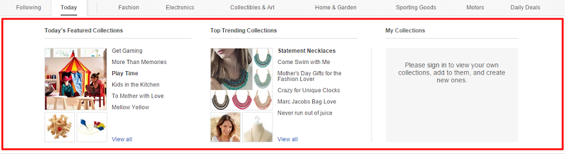
Mega menus are a design trend often used on large sites such as e-commerce and educational sites. For example, eBay’s mega menu:
But what exactly is a mega menu? Well, let’s see how Jakob Nielsen describes it:
A mega menu (a big, 2-dimensional drop-down panel) groups navigation options to eliminate scrolling and use typography, icons, and tooltips to explain users’ choices.
So, with that in mind, this article aims to help you understand how to build a simple responsive mega menu with Foundation. We’ll go step by step and construct a fully functional version of it. And take note that Foundation doesn’t support mega menus, but we’ll do our best to implement an easy-to-use solution based on its predefined styles. For more advanced and effective customizations, be sure to check/modify the corresponding Sass files.
If you’d like to jump ahead, the final demo is located here.
Building the Main Menu
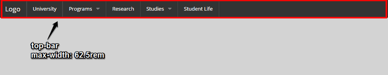
Before jumping into the process of creating our custom mega menu, let’s first build the main menu itself (i.e. the “topbar”). The following screenshot gives you an idea of how it will look:
As you can see, nothing fancy happening here. We just construct the menu by taking advantage of the basic code for the topbar component that Foundation provides us. In the upcoming sections, we’ll create a mega menu for two different items in the main menu: the “Programs” menu item and the “Studies” item. In fact, we’ll build two variations of this menu.
The code below shows the markup for the top bar:
<div class="contain-to-grid">

  <nav class="top-bar" data-topbar role="navigation">

    <ul class="title-area">

      <li class="name">

        <h1><a href="#">Logo</a></h1>

      </li>

      <li class="toggle-topbar menu-icon">

        <a href="#"><span>Menu</span></a>

      </li>

    </ul>

    <section class="top-bar-section">

      <ul class="left">

        <li class="divider"></li>

        <li>

          <a href="#">University</a>

        </li>

        <li class="divider"></li>

        <li class="has-dropdown">

          <a href="#">Programs</a>

          <ul class="dropdown m-menu">

            <li>

              <!-- mega menu here ... -->

            </li>

          </ul>

        </li>

        <li class="divider"></li>

        <!-- more list items here ... -->

      </ul>

    </section>

  </nav>

</div><!-- .contain-to-grid -->
Notice that we wrap the menu within a div element, with a class of contain-to-grid. In this way, our menu will have a maximum width equal to the grid width, which is 62.5rem (1000px) by default. If we don’t enclose the menu inside this container, its width will be set to the viewport width.
Customizing the Mega Menu
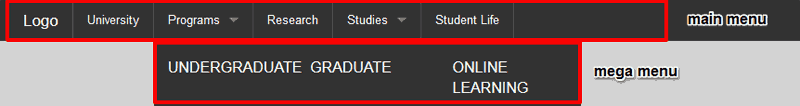
At this point we’re ready to start focusing on the mega menu (which we will give a class of m-menu). Here’s how it looks with the default styles:
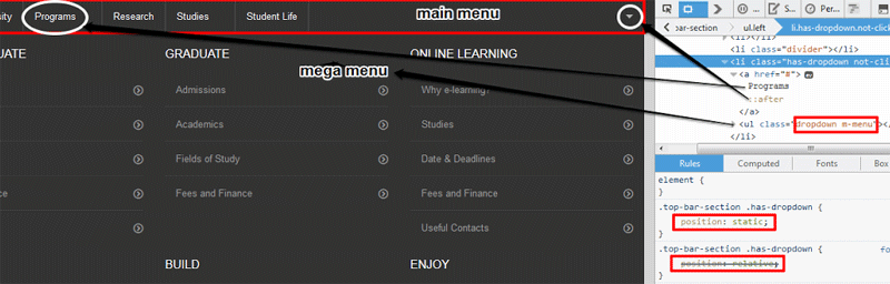
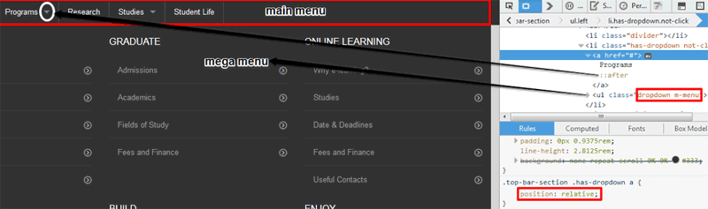
Well, this is not a mega menu, is it? Let’s create one! First, we have to position our menu relative to the main menu so that they will be vertically aligned (on medium and up screens) and have an equal width (i.e. ≤1000px). However, Foundation sets the position of the dropdowns relative to their (immediate) parent’s position. So, to avoid this, we modify the following declaration:
.top-bar-section .has-dropdown {

  position: relative;

}
…to read as follows:
.top-bar-section .has-dropdown {

  position: static;

}
At this point, however, our mega menu has a small problem:
Notice the small arrow icons (which indicate the dropdown menus) are likewise positioned relative to the main menu. We can solve this issue by adding a new CSS declaration:
.top-bar-section .has-dropdown > a {

  position: relative;

}
Below is the new state of the mega menu:
We’re almost done with our initial customizations. The last thing we have to do is fix inconsistencies that occur while we resize the browser window. For this reason, we will change the following CSS:
.top-bar-section .has-dropdown.moved {

  position: relative;

}
.top-bar-section .has-dropdown.moved > a:after {

  display: none;

}
To the following:
.top-bar-section .has-dropdown.moved {

  position: static;

}
.top-bar-section .has-dropdown.moved > a:after {

  display: block;

}
With that, we’ve successfully positioned our menu and we can move on to the next step!
Note: We could have used JavaScript to position and set the width of our menu. For this example though, we’re only interested in a pure CSS solution.
Adding Content to the Mega Menu
In this next step, we aim to prototype the layout of our menu and then we will add content to it. The screenshot below shows the mega menu that appears if we open the “Programs” menu item on medium screen sizes and larger (≥641px):
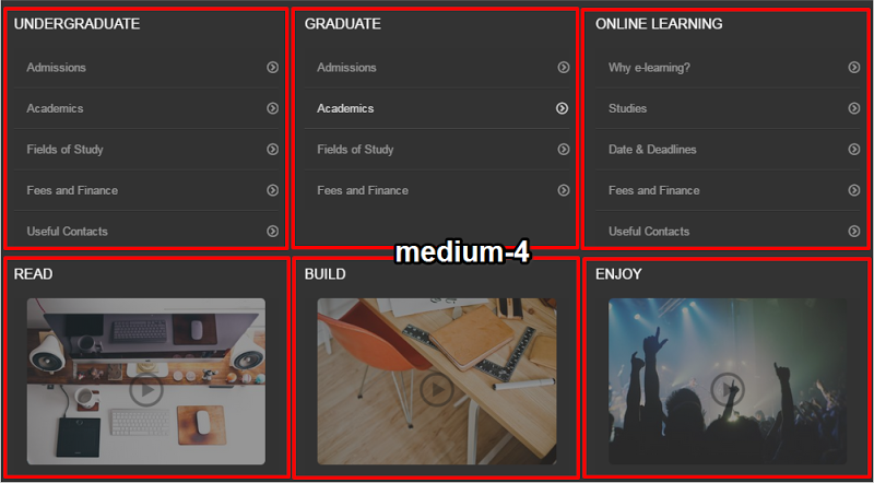
Notice that this menu consists of two rows, each containing three equal-sized columns (using the .medium-4 class).
Here’s the required markup:
<div class="row">

  <div class="medium-4 column">

    <h3>Undergraduate</h3>

    <ul>

      <li>

        <a href="#"><i class="icon-circle-right"></i>Admissions</a>

      </li>

      <li>

        <a href="#"><i class="icon-circle-right"></i>Academics</a>

      </li>

      <!-- more list items here ... -->

    </ul>

  </div><!-- .medium-4 .column-->

  <div class="medium-4 column">

    <h3>Graduate</h3>

    <ul>

      <!-- list items here ... -->

    </ul>

  </div><!-- .medium-4 .column-->

  <div class="medium-4 column">

    <!-- content here ... -->

  </div><!-- .medium-4 .column-->

</div><!-- .row -->

<div class="row">

  <!-- content here ... -->

</div><!-- .row -->
Let’s now have a look at the mega menu that appears if we open the “Studies” menu item:
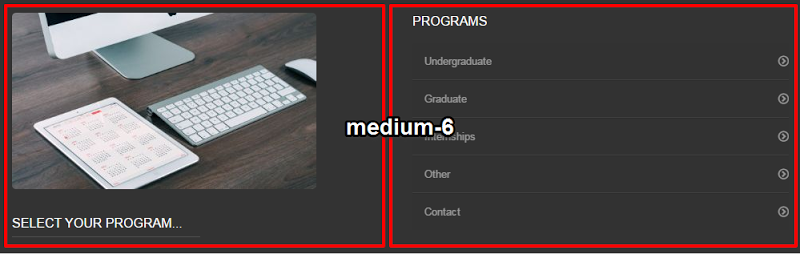
In this instance we have one row and two equal-width columns inside that row (using the .medium-6 class).
Below is the markup we’ll use:
<div class="row">

  <div class="medium-6 column show-for-medium-up">

    <img src="https://unsplash.it/380/220?image=668" alt="Example">

    <div class="info-wrap">

      <div class="info info-visible">

        <h3>Select your program...</h3>

        <p>More info...</p>

      </div>

      <div class="info">

        <h3>Undergraduate Studies</h3>

        <p>At vero eos et accusamus et iusto odio dignissimos ducimus qui

        blanditiis praesentium voluptatum deleniti atque corrupti quos dolores

        et quas molestias excepturi sint occaecati cupiditate non provident.</p>

      </div>

      <!-- more items here... -->

    </div><!-- .info-wrap -->
  </div><!--end of .column-->

  <div class="medium-6 column">

    <h3>Programs</h3>

    <ul class="is-hover">

      <li><a href="#"><i class="icon-circle-right"></i>Undergraduate</a></li>

      <li><a href="#"><i class="icon-circle-right"></i>Graduate</a></li>

      <li><a href="#"><i class="icon-circle-right"></i>Internships</a></li>

      <li><a href="#"><i class="icon-circle-right"></i>Other</a></li>

      <li><a href="#"><i class="icon-circle-right"></i>Contact</a></li>

    </ul>

  </div><!--end of .column-->

</div><!--end of .row-->
Note the structure of the elements with the .info-wrap and is-hover classes. We’ll refer to those elements in the next section.
Making Things Dynamic
In this example, we’re going to swap in and out some of the content inside the menu, when the user hovers their mouse over a particular section’s link. This might not be the most user-friendly way to do it, but it demonstrates what can be done within the mega menu, when it’s displayed.
In our HTML, as shown above, we have a series of info boxes that will correspond to different “Program” links:
<div class="info-wrap">

  <div class="info info-visible">

    <h3>Select your program...</h3>

    <p>More info...</p>

  </div>

  <div class="info">

    <h3>Undergraduate Studies</h3>

    <p>At vero eos et accusamus et iusto odio dignissimos ducimus qui

    blanditiis praesentium voluptatum deleniti atque corrupti quos dolores

    et quas molestias excepturi sint occaecati cupiditate non provident.</p>

  </div>

  <!-- 4 more "info" items here... -->

</div>
All the links are wrapped inside an element with a class of .info-wrap. In the CSS, we hide all the items by default except the first one, then we can swap in the correct corresponding item by adding and removing the .info-visible class on the different .info elements.
Here is our jQuery to accomplish this:
$('.is-hover a').on('mouseover', function () {

  var idx = $(this).parent().index() + 2;

  $('.info:nth-child(' + idx + ')').addClass('info-visible');

  $('.info:nth-child(' + idx + ')').siblings().removeClass('info-visible');

});
$('.dropdown').on('mouseout', function () {

  $('.info:nth-child(1)').addClass('info-visible')

                         .siblings().removeClass('info-visible');

});
The code above is triggered when the user opens the “Studies” mega menu, then hovers the mouse of one of the “Programs” links. The value of the idx variable is adjusted by “2” to account for the extra initially visible .info element and the fact that indexing in jQuery’s CSS selectors is not zero-based. We also make sure that the default info box is the only one displayed when the user moves the mouse off the mega menu.
Once that is in place, our mega menu is complete and fully functional. Here is the embedded demo on CodePen:
See the Pen Mega Menu Dropdowns with Foundation 5 by SitePoint (@SitePoint) on CodePen.
Mega Menus… Good or Bad?
Alright, we’ve built our simple mega menu, but you might be wondering whether it is a good approach to use a mega menu or not. Well, as is often the case, there’s no straightforward answer.
Mega menus can be a controversial topic in the web design and UX community. Some people find them useful and practical (e.g. saying they are easy to use), while others avoid implementing them (e.g. poor SEO). For sure, however, before you decide to structure your navigation based on this or a similar technique, you’ll have to take into consideration the pros and cons of this solution for your project.
Below you can find a few useful articles dealing with this issue:
- An SEO View of Mega Menus on r2i
- Mega-Menus Gone Wrong on Nielsen Norman Group
- Mega Menus Work Well for Site Navigation Nielsen Norman Group
Conclusion
In this article, I described a process for building a responsive mega menu with Foundation. Of course, this is my approach; you may have a different one. In any case, I hope that you found this solution interesting and you might give it a try in one of your upcoming projects. Also, feel free to share with us your own approach as well as your opinion about the use of mega menus.
Frequently Asked Questions on Building a Responsive Mega Menu with Foundation
What is a Mega Menu and why is it important for my website?
A Mega Menu is a large, panel-style dropdown menu that displays multiple options in a two-dimensional layout. It is important for your website because it improves navigation, making it easier for users to find what they’re looking for. It also allows you to showcase more of your content or products, and can improve SEO if properly structured.
How does a responsive Mega Menu work?
A responsive Mega Menu adjusts itself based on the device it’s being viewed on. On a desktop, it might appear as a full-width dropdown, while on a mobile device, it might appear as a collapsible list. This ensures that your website is user-friendly on all devices.
What is Foundation and how does it help in building a Mega Menu?
Foundation is a responsive front-end framework that makes it easier to design beautiful, functional websites. It provides a set of pre-designed components, including a Mega Menu, that you can easily customize to fit your needs.
How can I customize the design of my Mega Menu using Foundation?
Foundation provides a variety of customization options for its Mega Menu component. You can change the layout, colors, fonts, and more using CSS. You can also add images or icons to your menu items for a more visual navigation experience.
How can I improve the SEO of my Mega Menu?
To improve the SEO of your Mega Menu, make sure it’s properly structured with clear, descriptive labels for each menu item. Use keywords where appropriate, but avoid keyword stuffing. Also, ensure that all links in your menu are working and lead to relevant content.
Can I include images or icons in my Mega Menu?
Yes, you can include images or icons in your Mega Menu. This can make your menu more visually appealing and help users quickly identify what they’re looking for.
How can I make my Mega Menu accessible for all users?
To make your Mega Menu accessible, ensure that it’s keyboard navigable and that all text is readable by screen readers. Also, provide clear visual cues for menu items, such as hover effects or active states.
Can I use a Mega Menu on a small website or blog?
Yes, you can use a Mega Menu on any size website or blog. However, it’s most beneficial on larger sites with many pages or products, as it can help users navigate more easily.
How can I test the responsiveness of my Mega Menu?
You can test the responsiveness of your Mega Menu by viewing your website on different devices and screen sizes. You can also use online tools or browser features that simulate different devices.
What are some common mistakes to avoid when building a Mega Menu?
Some common mistakes to avoid when building a Mega Menu include making it too complex or cluttered, not making it responsive, not structuring it properly for SEO, and not making it accessible for all users.