

Key Takeaways
- HTML5’s canvas element, in conjunction with JavaScript, provides a modern and efficient way to create algebraic graphs for web pages, eliminating the need for offline drawing, Flash, or SVG.
- The canvas element allows for concepts such as layering, similar to techniques used in graphic design software, to build complex renderings. However, it also requires bespoke coding to work around current limitations, such as drawing end caps for axes and creating dashed lines.
- While the canvas element is still a relatively new tool, it holds significant potential for transforming data rendering in browsers, including real-time data from databases, and can be used to create various types of graphs, including line graphs, pie charts, and bar graphs.
How can we include a graph in a web page? Perhaps the obvious choice is to draw it offline, saving it as an image file to be included in the web page using the <img> element. Or maybe draw it using Flash to be included using <object>. Another option is SVG, but that has never been widely supported. Images and Flash have been in widespread use for many years, but today HTML5 gives us a better option – the canvas element.
In this article I will show how use of the canvas element makes it is easy to create graphs using a few lines of JavaScript. This article will avoid the need for a data feed of some description by using simple algebraic equations to generate the data points for the graphs, though, of course, the drawing techniques covered could just as easily be used for graphs based on data read directly from a database.
Graph Paper
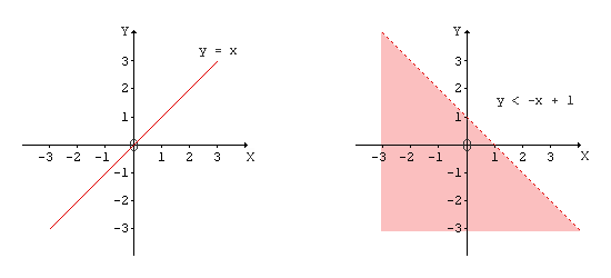
Firstly, let’s look at what we’ll be building in this article. The image below shows two fairly simple graphs. Both are straight-line plots, both easy to grasp in concept, and neither with complicated curves.
Even a cursory visual inspection reveals there is a common component – the axes and their units. So let’s start with some simple HTML and JavaScript to plot these on the canvas.
X and Y Axes
What HTML do we need? For any drawing using HTML5’s canvas element, all we need to code in HTML is the canvas element itself. For example,
<canvas id="axes"></canvas>Just as an artist starts with a blank canvas then paints on it with brushes and paint, we are going to code a blank canvas and draw on it using JavaScript. It is best to set the dimensions of the canvas in JavaScript using the canvas.width and canvas.height properties, as this will avoid any problems of scaling by the browser.
When drawing anything in the canvas element we need to bear in mind that by default the origin is at the top left. For the graphs used in this article we, however, want the origin to be in the center of the plot. This requires a little bit of offset thinking. The files axes.html and axes.js show the basic area we’ll be using.
A Simple Equation
For our first graph, let’s start with the simple, straight-line equation y = x. File equation1.html has the same HTML as axes.html but with the addition of a separate canvas for plotting the equation. Separating the various components of canvas drawing is not essential, but it does help when building a complex rendering. Nor is it a new or unusual technique as layering is an integral part of building complex renderings in Photoshop, GIMP, and other similar graphics software. The CSS z-index attribute can be used to position the layers in the order required.
A limitation of line drawing is the types of end cap currently available: only butt, round and square are part of the HTML5 specification. But we want an arrow for end cap of the x and y axes. That’s our first piece of bespoke coding to work around current limitations of the canvas.
The files for this example are equation1.html and equation1.js.
Shading a Graph
Equation 2 is a bit more complicated than the first equation, but not so different that we can’t build on what we’ve learned from Equation 1. In this second example, we need a broken line to show the lack of equality in the equation, and we need shading to show that part of the graph to which the equation applies.
It would be so much easier to draw a broken line if HTML5’s setLineDash() was supported by the browsers. It isn’t, so we need bespoke coding to draw a dashed line. This can be achieved very simply by considering a contiguous line to be composed of a series of small line segments joined end to end.
A canvas feature that we do have at our disposal is the ability to fill an area, which we’ll use for shading the graph. In order to ensure that any shading does not obscure other components of the graph we can adjust the opacity using either CSS or the canvas’s globalAlpha attribute. Note that globalAlpha, as its name suggests, applies to the entire canvas – it’s not possible to change the opacity of individual strokes that are drawn on the canvas. Another good reason for layering.
The files for this example are equation2.html and equation2.js.
Trigonometric Teaser
This article has been focused on algebraic graphs, but there’s no reason why the techniques covered here can not be applied to other forms of graphs. Equation 3 is the simple trigonometric equation y = 2 sin π x. Although this is obviously a curved plot, the technique mentioned for drawing a broken line can also be used to produce a pretty good rendering of a curve, as this example shows.
The files for this example are equation3.html and equation3.js.
All code examples for this article are available for download as a single zipped file.
Real-time Data
I mentioned in the introduction that the simple techniques presented in this article can be used for data read from a database. The use of the canvas for displaying any data in any form, whether it be line graphs, pie charts, bar graphs, etc., is still a comparatively unexplored topic given the youth of this HTML enhancement.
Some real-time examples for which the canvas could prove to be ideal include displaying data from weather stations, patient blood count data on a medical tablet, share price variation during trading, etc.
The days of generating graphical GIFs on the fly are surely numbered.
Summary
In this article we have covered a few essential aspects of using HTML5’s canvas element for the purpose of drawing graphs in a browser. We saw that we can transfer concepts such as layering from graphical work already used in other software. And although implementation of the HTML5 specification is still patchy, we can code workarounds to achieve the results we require.
The canvas is still young, but it has huge potential for transforming the way data can be rendered in a browser.
Frequently Asked Questions (FAQs) about Algebraic Graphs on Canvas
How can I create an algebraic graph on Canvas?
Creating an algebraic graph on Canvas involves a few steps. First, you need to understand the algebraic function you want to graph. This could be a simple linear function or a more complex quadratic or polynomial function. Once you have your function, you can plot it on Canvas using the ‘plot’ function. You can specify the range of x-values for your graph, and Canvas will automatically calculate the corresponding y-values. You can also customize the appearance of your graph, such as the color and thickness of the line.
What are some common types of algebraic graphs?
There are several types of algebraic graphs that you might encounter. These include linear graphs, quadratic graphs, cubic graphs, and polynomial graphs. Each of these types of graphs represents a different kind of algebraic function. For example, a linear graph represents a linear function, which has a constant rate of change. A quadratic graph represents a quadratic function, which has a rate of change that varies linearly.
How can I customize the appearance of my graph on Canvas?
Canvas offers a variety of options for customizing the appearance of your graph. You can change the color and thickness of the line that represents your function. You can also add labels to the x and y axes, and you can add a title to your graph. Additionally, you can adjust the scale of the graph to zoom in or out on certain areas.
Can I plot multiple functions on the same graph in Canvas?
Yes, you can plot multiple functions on the same graph in Canvas. This can be useful for comparing different functions or for visualizing the solution to a system of equations. To plot multiple functions, you simply call the ‘plot’ function multiple times, once for each function you want to graph.
How can I save my graph as an image in Canvas?
Once you have created your graph in Canvas, you can save it as an image file. This can be useful if you want to include the graph in a report or presentation. To save your graph as an image, you can use the ‘save’ function in Canvas. This will create an image file that you can then download and use as needed.
Can I use Canvas to graph non-algebraic functions?
Yes, you can use Canvas to graph non-algebraic functions as well. This includes functions like trigonometric functions, exponential functions, and logarithmic functions. To graph these types of functions, you would use the same ‘plot’ function as for algebraic functions.
How can I add a grid to my graph in Canvas?
Adding a grid to your graph in Canvas can make it easier to read and interpret. To add a grid, you can use the ‘grid’ function in Canvas. This will add horizontal and vertical lines to your graph at regular intervals, creating a grid.
Can I use Canvas to graph inequalities?
Yes, you can use Canvas to graph inequalities. This can be useful for visualizing the solution to an inequality or a system of inequalities. To graph an inequality, you would use the ‘plot’ function, just as for an equation. However, you would also need to specify the region of the graph that represents the solution to the inequality.
How can I plot a piecewise function in Canvas?
Plotting a piecewise function in Canvas involves a few extra steps. First, you need to define each piece of the function separately. Then, you can use the ‘plot’ function to graph each piece on the same set of axes. You will need to specify the range of x-values for each piece of the function.
Can I use Canvas to create 3D graphs?
Yes, you can use Canvas to create 3D graphs. This can be useful for visualizing functions of two variables or for exploring geometric shapes. To create a 3D graph, you would use the ‘plot3D’ function in Canvas. This function works similarly to the ‘plot’ function, but it allows you to specify a range of both x and y values.