

Key Takeaways
- Hotjar, used in conjunction with Google Analytics, can significantly improve a website’s user experience (UX) by identifying areas of the site that are not user-friendly or causing confusion, as well as revealing what users are most interested in.
- Using Hotjar’s user recordings feature, one can observe users’ interactions with a website in real-time, providing valuable insights into their behavior and preferences, and identifying potential stumbling blocks in the user journey.
- Hotjar’s heatmaps feature helps to understand what users want by showing where they click, scroll, and move their mouse on the site. This data can be used to make design changes that enhance UX and increase user engagement.
- Direct feedback can be obtained from users via Hotjar’s survey and Incoming tools, providing insights into user sentiment and suggestions for improvement, which can be used to continually iterate and improve the website’s UX.
Once upon a time, collecting website feedback from users was about bringing them into an office and asking them to perform specific tasks, so that we could assess the UX with real users. It was the best thing we had at the time, but there was a deficiency in the methodology.
By setting users up for UX testing, we were introducing an involuntary cognitive bias: users were taken out of their natural context, and consciously or not, there would be a subtle change in their behavior.
People will try to be nice. They won’t reveal the true extent of their thoughts, especially if they’re disappointed with your offering.
Also, this ancient type of usability testing is slower and not very cost effective. So when the concept of heatmaps were introduced, it was revolutionary. We could now (literally) see which aspects of our websites users were interested in via their clicking and scrolling behavior, and best of all, they didn’t even need to know about it.
Hotjar is one of the tools that does exactly this.
Building an MVP with Hotjar
Hotjar can be used in conjunction with Google Analytics, where Google Analytics is useful for identifying where your UX may be falling short, and usability testing with Hotjar can be used to identify why. That being said, we can also use Hotjar to create MVPs (minimum viable products).
The first time I saw Hotjar in action, being one of the early-stage beta testers, it felt like an epiphany. We were testing the MVP of our SaaS software BeeWits back then. We had just conceived the idea and we wanted to gauge interest in the concept. We setup a website, designed a pricing table and email capture form, and we decided that if a certain % of users were interested, then we were onto something.
But rather than just “hoping” for emails and asking for user feedback, we also set up Hotjar user recording on the MVP landing page.
Hotjar recording is a feature that literally records the actions of a user when they visit your website or web application. You can see the cursor trailing, the clicks, and follow their user journey as it happens.
In essence, you’re watching your customer in their most natural state.
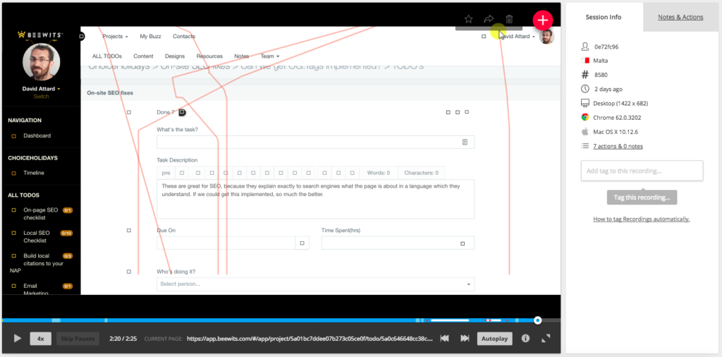
We were thus able to see our users’ interactions with the website, and get a clear sense of the whole user experience. By watching these recordings, we could see the stumbling blocks almost as if we were the user. In our case, we defined our UX (and validated our business idea) with Hotjar.
We could even “see” their reaction to the different price plans, since we could observe the users’ clicks and hovers. We were able to validate our concept from a business angle, as well as improve our UX over time.
Improving the UX with User Recordings
After we MVP’d our idea for a couple of months, we felt there was enough interest in the concept that we decided to develop on the service.
As we launched an early-access version of BeeWits, we wanted to focus on a customer journey where the user finds that “aha!” moment — the moment when they realize how the product will make their life better.
Our “aha!” moment typically happens when a user creates a project using one of our task templates: it’s the realization that they don’t need to create a project from scratch every single time.
Optimizing the customer journey
Your users are busy. (You should know, because you’re a user too, right?) They’ll abandon your app if they don’t get it right away, never to return.
When we first launched, the user had a blank slate. After watching user recordings, we realized that our users were getting lost because they had nothing to interact with. When a user starts a free trial and finds emptiness, it’s like they’ve walked into a deserted landscape. Users were stumbling around and then vanishing, but at least we sort of knew why.
We used Google Analytics to identify where users were dropping off. Otherwise, we’d have spent countless hours looking through user recordings to figure that out first, which is no fun.
So, on our next iteration, we let the user start off with an “Example Project”. Suddenly, our users had something to work with, and our Google Analytics data told us that we were experiencing more engagement.
Boosting engagement with more user recordings
The beauty of Hotjar recordings is that you can keep discovering stumbling blocks. It’s not a “wham bam, we’re done, let’s move on from usability testing” type of situation. We encountered another issue.
According to the session time of the Hotjar recordings, users that weren’t creating a project to completion were spending much less time than the ones who actually created a project.
Session times of users who didn’t create a project were typically less than two minutes, whilst those who did create a project were spending five minutes or more. However, the users who created a project were coming back to the trial and getting in touch with their feedback when prompted. So, our next goal was to ensure that the user finished creating their project, as they were more likely to return if they did.
After some brainstorming, we decided to turn the example project into a series of smaller tasks instead. We renamed it “Get to know BeeWits”. This project now contained a number of tasks which the user had to complete in order to learn how to use BeeWits, including the creation of a project. After a hundred (or so) more user recordings, we saw that both the session time and return rate had increased significantly!
Return rate is an important metric for free trials, because it’s really important for the user to see that they’re getting a lot of use out of the product if they’re to convert to a paying customer later.
Gauging User Interest with Heatmaps
As we watched more user recordings, we noticed more undesirable user behaviors. Our trialling users kept stumbling in the same spots, and each time we fixed something, the user experience improved and our analytics reflected that. But … our design process wasn’t over.
So far we’ve discussed user recordings as a way to discover usability flaws, and this works for both finished websites and MVPs. But we still had to assign a true value to our service. What would users pay for this?
Enter heatmaps.
Heatmaps is a Hotjar feature used to better understand what the user wants, and it was especially useful when we were trying to define our pricing. Have a look at the heatmap screenshot below.
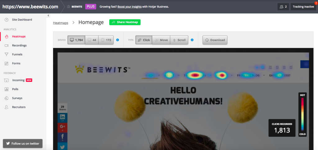
As we can see, our users were most interested in two things — the tools we offer, and the pricing — so we made changes to our website to better explain what tools we offer, and made the pricing more accessible.
The clicks on the pricing table were also particularly interesting.
We could see that our mid-tier pricing was being clicked more than any other. Some of our tiers were hardly clicked at all. So, again, we tweaked our website to give more prominence to the most popular pricing tier and even eliminated tiers that didn’t seem desirable to users at all.
Bonus Section: Surveys and Happiness Factor
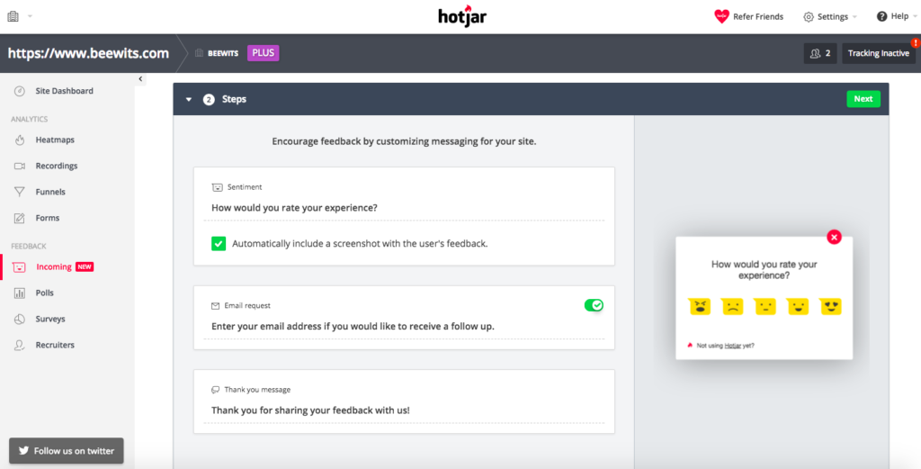
We’ve been talking about extracting insights from a user’s actions behind the scenes, but we can also speak to users directly using Hotjar’s feedback tools. While you should always keep surveys short, so that users don’t abandon them, they can nonetheless be very insightful.
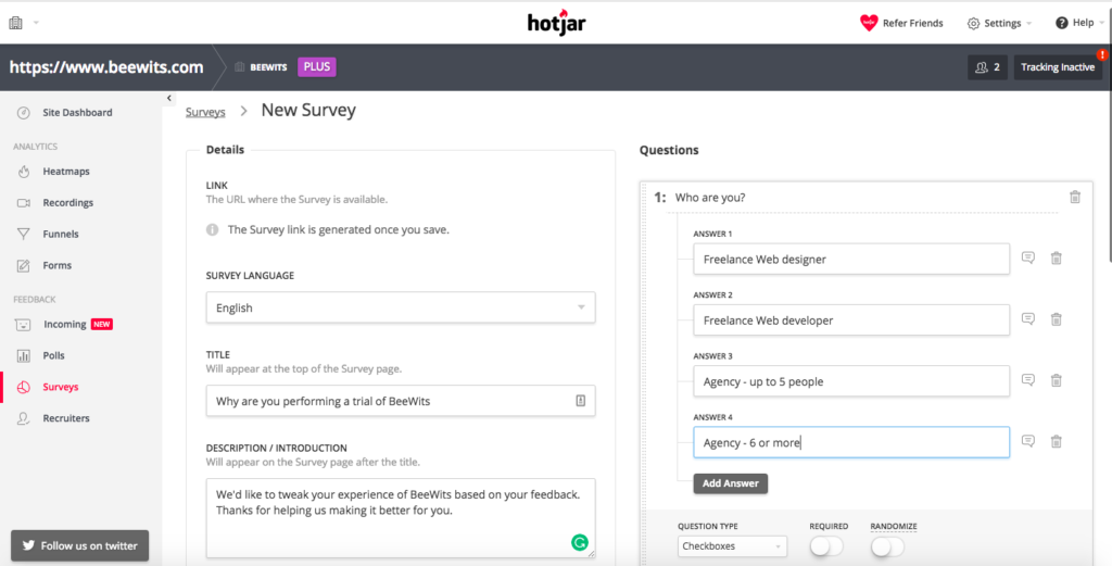
Besides the surveys, you can also use the Incoming tool to specifically find out what the user is feeling — be it happiness or frustration. Both the Incoming and customer survey tools require you to define a few quick settings (the questions you want to ask, etc.), and you’re good to go.
Conclusion
Only by watching the behaviors of users will you then be able to make data-driven decisions on what needs fixing, and by sourcing feedback of exactly what users think of your product, can you keep iterating and improving where your users want you to improve. Otherwise, you’re just making educated guesses at best, and that’s a risky way to approach UX.
Frequently Asked Questions (FAQs) about Improving Your Website’s UX with Analytics and Hotjar
How does Hotjar improve the user experience (UX) on my website?
Hotjar is a powerful tool that provides insights into how users interact with your website. It uses heatmaps, session recordings, and surveys to collect data about user behavior. This data can reveal areas of your website that are not user-friendly or are causing confusion. By identifying and addressing these issues, you can significantly improve the UX on your website.
What are the key features of Hotjar?
Hotjar offers a range of features designed to help you understand your users better. These include heatmaps that show where users click, scroll, and move their mouse on your site, session recordings that capture real user interactions, and surveys and feedback widgets that allow you to gather direct user feedback.
How does Hotjar’s pricing work?
Hotjar offers different pricing plans to suit various needs and budgets. They have a free basic plan, plus premium plans that offer more features and data. The cost of the premium plans depends on the number of pageviews per day your site receives.
Can I use Hotjar on multiple websites?
Yes, you can use Hotjar on multiple websites. However, each site requires its own Hotjar account. The number of accounts you can have depends on your pricing plan.
How does Hotjar protect user privacy?
Hotjar takes user privacy very seriously. It anonymizes all data and does not track users across sites. It also complies with GDPR and other privacy regulations.
How can I interpret the data from Hotjar’s heatmaps?
Hotjar’s heatmaps use color coding to show where users interact with your site. Areas where users click or move their mouse frequently are shown in red, while less active areas are shown in blue. This can help you identify popular areas of your site, as well as areas that may be causing confusion or frustration.
What kind of questions should I ask in Hotjar surveys?
The questions you ask in Hotjar surveys should be tailored to your specific needs and goals. However, some common questions include asking users about their overall experience, any difficulties they encountered, and any suggestions they have for improvement.
How can I use Hotjar to improve my website’s conversion rate?
By identifying and addressing issues that are causing users to leave your site or not complete desired actions, you can improve your website’s conversion rate. Hotjar’s tools can help you understand what’s working and what’s not, so you can make informed decisions about changes to your site.
Can I use Hotjar with other analytics tools?
Yes, Hotjar can be used alongside other analytics tools. In fact, using Hotjar in combination with other tools can provide a more comprehensive understanding of your users and their behavior.
How do I get started with Hotjar?
To get started with Hotjar, you simply need to sign up for an account, add your website, and install the Hotjar tracking code on your site. Once this is done, you can start setting up heatmaps, session recordings, and surveys.