

Key Takeaways
- Analytics can drive UX design by providing insights into user demographics and behavior, which can be used to guide users towards specific actions that meet business objectives, such as signing up to a website or subscribing to a service.
- KPIs are metrics that can measure the success of a particular activity, in this case, user experience. However, some KPIs can be misleading if analyzed incorrectly, leading to vanity metrics that seem useful but don’t provide any real insights about users or UX.
- Before deciding on KPIs to track, it’s important to first determine business goals. Once these goals are mapped out, KPIs can be identified to monitor these goals. Some key KPIs to track include Session Duration/Average Time on Page, Bounce Rate, Event Action, and Exit Rates.
- No singular metric is an indicator of UX quality. It’s crucial to cross-reference metrics and consider user intent when analyzing data. Understanding the difference between descriptive analytics (what happened and where) and diagnostic analytics (why it happened and how to fix it) can lead to more informed design decisions.
Recently we’ve been discussing how analytics can be used to drive UX design. By learning about our users’ demographics and gaining valuable insights into our users’ behavior, we can use data to inform our design decisions.
Make sure to check out all the articles in our UX Analytics series.
Analytics helps us to guide our users towards specific actions that meet our business objectives — such as signing up to our websites or subscribing to our services. As you probably know, we call these conversions.
In this article, I’m going to talk about the KPIs (key performance indicators) that designers should track to gain insights for improving UX.
Also, if you’ve dipped into analytics before and have been amazed by the amount of visitors you’re getting but dismayed at how many are converting, then you might be interested to know that, regarding to UX, there are a number vanity metrics that should be taken with a pinch of salt. In this article, I’ll explain what those metrics are, and why you should be skeptical about them.
Let’s dive in.
Firstly, What Are KPIs?
Wikipedia explains KPIs like this:
KPIs evaluate the success of a particular activity (such as projects, programs, products and other initiatives) in which it engages.
A KPI is a metric you can measure to determine the improvement or degradation of something (which, in our case, is user experience).
KPIs can tell you whether the website you’ve designed is achieving its business objectives or not. Some KPIs are outright useless for making these determinations, and others are dangerous if you analyze them in the wrong way.
Which brings me to vanity metrics.
What are vanity metrics?
Vanity metrics are metrics that seem useful in theory, but don’t actually describe our users or UX in any way. If a metric isn’t offering us any insights about our users, and is a metric that we can’t directly influence through design, then it’s not worth our time to track that metric and try to improve it.
Consider “Number of Visitors”, for example. As designers, we can’t influence this metric. Also, the number of visitors is useless if none of them are converting, hence there are other metrics that can be a better indicator.
So, what KPIs should I track?
Before deciding what KPIs to track, you should first determine what your business goals are. This is the number one mistake that businesses make when using analytics to inform design decisions. Is it more signups? More subscribers? Are you looking to guide users towards a contact form or checkout?
Once your goals are mapped out, you can then determine which KPIs will help you to monitor those goals. If your website is for a local service, I’d say that the ultimate goal is a call or enquiry. If your website is an ecommerce shop, the primary goal would number of sales. If you run a SaaS company, the goal which matters to you should be number of active subscriptions.
Let’s take a look at the main KPIs to keep an eye on.
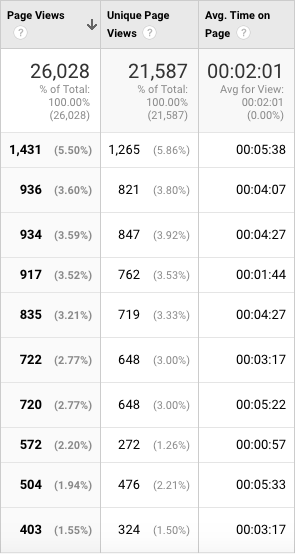
1. Session Duration/Average Time on Page
Session Duration/Session Time/Time on Site/Avg. Time on Page (different analytics tools will use different terms) can be a relative measure of interest in your website. Consider this: a user lands on your website, spends only 5 seconds on it, then bounces off. You could assume that they were much less interested than the user who spent a few minutes on the website.
However, you should also consider that the user might have been looking for something very specific, and your web page delivered it instantly and flawlessly, causing the visitor to leave perfectly satisfied. This is common with web pages that are informational in nature: a user has a search intent, they find it on your website, and have no other need or desire to stick around.
At this stage we don’t really know much about the user intent, but we could use other KPIs and metrics to reveal the other half of the story:
- Where did the user come from? Google? Another website?
- What device are they using? Maybe there’s a mobile-only issue?
- More importantly, did the visitor actually convert?
One metric doesn’t hold all the answers. Keep asking questions.
Session Duration as a vanity metric
As you can see, Session Duration can be dangerous if you make assumptions and don’t cross-reference it with any other metrics. Visitors that spend a lot of time on a website might be desperately trying to figure out how to do something, and visitors that spent only a few seconds might have received exactly the answer they were looking for. Context matters, so do a little investigating before you start bragging about your Avg. Time on Site metrics.
You also need to be aware of a particular “flaw” with the tracking of time with certain analytics tools, especially Google Analytics. Google Analytics determines how long a user spends on a specific web page by the moment they navigate to a different page. Therefore, if a visitor only visits one web page before bouncing off, no time will be recorded (even if there was time).
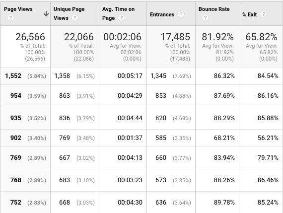
2. Bounce Rate
A bounce is when a visitor only visits one web page, or visits one web page and doesn’t take any action. So, in turn, Bounce Rate is then the percentage of visitors that bounce. Similarly to Avg. Time on Page, Bounce Rate needs to be observed with a critical eye, as it can differ depending on the user intent.
For example, the Bounce Rate of an article is likely to be high because the user intent is to gain information, not to buy or subscribe. Now, a product page may be different, because the user intent is to buy something, and this would naturally involve more interaction (delivery, credit card, confirmation, etc), resulting in a higher Bounce Rate. Once again, consider the user intent.
Are you asking for too much?
If the user intent is to gain information rather than buy something, then maybe your call to action should be to collect the user as a subscriber instead (your secondary goal). You can then try to convert the user into a customer later on (your primary goal). Sometimes conversion requires patience.
Is there too much friction?
If your forms have too many fields to fill out, or the user is required to complete another action (such as signing up) before completing their desired action (checking out), then this may result in the user leaving your website.
Are you asking for sensitive information?
If you haven’t established trust with your users, they may hesitate to hand over their sensitive information. What are you doing to build trust?
As you can see, there’s lots to consider here. While data is objective, the conclusions you draw from it are subjective. You should make use of usability testing and heatmap tools like Hotjar to find better answers, but use KPI tracking/analytics tools like Google Analytics to identify the holes in UX.
Bounce rate as a vanity metric
You’ve probably heard a lot of things about Bounce Rate. The most common misconception about Bounce Rates is that a high Bounce Rate is a bad thing, which isn’t necessarily true, but factoring in the user intent and even the Avg. Time on Page could tell you where you’re going wrong in terms of UX.
A high Bounce Rate combined with a lengthy Avg. Time on Page could indicate that the user is getting lost somewhere, in which case you should consider the questions above to help locate the issue. Once again, context matters, which is why Bounce Rate, although useful, can be a vanity metric if analyzed poorly.
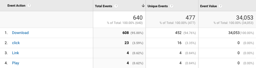
3. Event Action
While Session Duration, Avg. Time on Site and Bounce Rate are useful metrics to analyze, they matter not if the visitor doesn’t convert. Whether this is subscribing to your service or buying something from your store, a clear gauge of interest is when somebody has clicked the CTA on your website.
Event Action as a vanity metric
Many designers assume that the only Event Action to be measured is the click of the initial CTA, but in fact conversions are often made up of several interactions, and tracking each one can indicate what areas of the user flow we need to improve in terms of usability — that is, how many “interested” users are actually converting, and why are some not converting?
For example, if we were driving users to buy something, we’d need to compare how many users are clicking the “Add to Cart” button vs how many users are actually checking out, where the metric used to measure this comparison in this scenario actually has a very special name: Cart Abandonment Rate.
We need to use a combination of metrics (including those mentioned above) to determine whether or not there are stumbling blocks which we need to eliminate — which could be anything from friction to broken functionality.
As mentioned before, once you’ve identified key areas of investigation, you can then take a more diagnostic approach and use heatmaps to identify exactly where your UX is falling short. I’ll show you how to do this in a follow-up article, using Hotjar as an example as we learn about UX testing.
By the way, Event Actions need to be implemented by a front-end JavaScript developer. Here’s a guide that shows you how to do that.
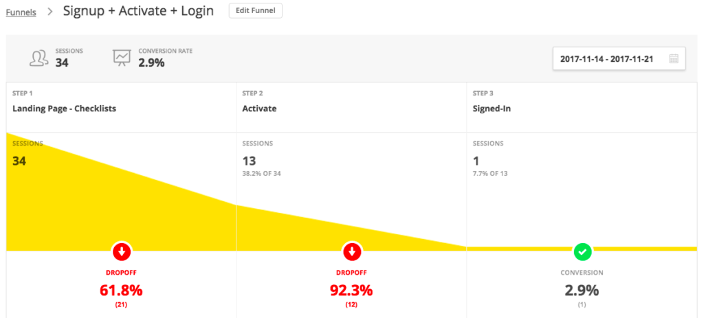
4. Exit Rates (and Exit Points)
Exit Rates — this is a big one.
You need to keep track of your Exit Rates, but most importantly, of your exit points. Like with most of the metrics mentioned above, Exit Rates will correlate with the user intent. However, if you have a web page that should be converting but has a high Exit Rate, that’s some indication that this web page or the overall customer journey could do with some improvement.
Pricing pages, checkouts and other important steps in the customer journey with a high Exit Rate need to be monitored carefully and analyzed deeply.
Exit Rates as a vanity metric
Decide which Exit Rates are undesirable (no conversion when there should be), and which are fine (an exit occurred after a conversion happened). You can analyze specific Exit Points to determine where it’s okay for users to exit.
Conclusion
In this article, we’ve discussed the main KPIs every designer needs to know about, and how you can measure them to gain insights about your website and the behavior of the users that visit it. If you don’t monitor these metrics carefully, you’ll wind up observing them in vain. This will have a hugely negative effect on your most important metric of all, your bottom line.
Long story short, no singular metric is an indicator of UX quality, and analyzing KPIs in this way will lead you down a path of wrong conclusions.
Stay tuned for the next article as we discuss the difference between descriptive analytics (those are the analytics we’ve discussed today) and diagnostic analytics. In essence, descriptive analytics uses the KPIs mentioned above to tell us what happened (and where), and diagnostic analytics tell us why it happened and what we can do to fix it.
Frequently Asked Questions on KPIs and Vanity Metrics for Designers
What are the key performance indicators (KPIs) for a designer?
Key Performance Indicators (KPIs) for designers are measurable values that demonstrate how effectively a designer is achieving key business objectives. These can vary depending on the specific role of the designer and the industry they are in. However, some common KPIs for designers include project completion rate, client satisfaction score, design error rate, and the number of design revisions.
What are vanity metrics in design?
Vanity metrics are data points that might look good on paper, but don’t actually contribute to the primary objectives of a business. In design, these could include the number of likes or shares a design gets on social media, or the number of awards a designer has won. While these metrics can boost a designer’s ego, they don’t necessarily translate into business success.
How can I differentiate between KPIs and vanity metrics?
The key difference between KPIs and vanity metrics is their impact on your business objectives. KPIs directly contribute to your business goals, while vanity metrics do not. For example, a high number of social media followers (a vanity metric) does not necessarily lead to increased sales or customer satisfaction (KPIs).
How can I set effective KPIs for my design projects?
Setting effective KPIs involves understanding your business objectives and how your design work contributes to these. Once you’ve identified these, you can set measurable goals that reflect your contribution. For example, if your objective is to increase customer satisfaction, a KPI could be the improvement in customer satisfaction scores after a design update.
How can I avoid focusing on vanity metrics?
To avoid focusing on vanity metrics, it’s important to always tie your metrics back to your business objectives. If a metric doesn’t contribute to your primary goals, it’s likely a vanity metric. Regularly reviewing and adjusting your metrics can also help keep your focus on what truly matters.
How can KPIs improve my design work?
KPIs can provide valuable feedback on your design work, helping you understand what’s working and what’s not. By focusing on KPIs, you can identify areas for improvement and track your progress over time. This can lead to better designs and more satisfied clients.
Can vanity metrics ever be useful?
While vanity metrics don’t directly contribute to business objectives, they can still provide some useful insights. For example, a high number of social media likes could indicate that your design is popular and engaging, even if it doesn’t directly lead to sales. However, these metrics should not be the primary focus of your measurement efforts.
How often should I review my KPIs?
The frequency of KPI review can depend on the nature of your projects and your business objectives. However, a general rule of thumb is to review your KPIs on a monthly basis. This allows you to track your progress and make adjustments as needed.
What tools can I use to track my KPIs?
There are many tools available to help track KPIs. These range from simple spreadsheets to more complex project management and analytics software. The best tool for you will depend on your specific needs and the complexity of your projects.
How can I communicate my KPIs to stakeholders?
Communicating your KPIs effectively involves clearly explaining what each KPI measures, why it’s important, and how it contributes to the overall business objectives. Visual aids like charts and graphs can also be helpful in presenting your KPIs in an easy-to-understand way.