
Key Takeaways
- Designers can learn valuable lessons from films, including the importance of balance in a composition, the strategic use of color to evoke emotions and provide information, and the power of contrast to distinguish elements and captivate attention.
- Other lessons from films for designers include the use of focal points to direct viewers’ attention and the strategic repetition of elements to emphasize importance, promote balance, and create a consistent flow.
- Beyond being sources of entertainment, films are a rich source of inspiration for designers, offering insights into effective visual storytelling, composition, and the evocation of emotions through design choices. Designers are encouraged to actively analyze films to draw inspiration for their design work.
Inspiration comes in many different shapes and sizes, and from this inspiration comes a wide variety of lessons, both simple and complicated. It’s important not only to learn from mistakes and from the design work of others, but also to take cues from inspiration sources that we probably wouldn’t consider if left to our own devices.
I’m a filmmaker and animator, in fact, I just graduated this past May with a degree in film. Over the years, I would watch various films and find something new that could be applied to my art and photography. One professor told us that after his course, we wouldn’t be able to watch films the same way again. In all honesty, I can’t watch a single film nowadays without breaking down the scenes and trying to take something from them to apply to my design work.
Film making is a form of designing, and I’m not just referring to the costume and set designers either. From the constant reworking of the screenplay to the actor considerations all the way up to post-production, filmmakers and those who aid in the process are constantly designing. The design process in film that entails alterations and iterations can used as design cues for graphic designers and web developers as well.
In this article, I won’t be getting into any film terminology or anything technical, but I do want to share five things that you as a designer can learn by sitting down and actively analyzing certain scenes in films.
Balance
The general consensus, regardless of your design field, is that balance is essential. In film, balance is achieved by many different means, including character numbers (how many antagonists versus protagonists), the setup of the landscape (the arrangement of elements), the amount of light utilized in a scene, and so on and so forth. Consider the still image below from Hellboy II: The Golden Army (2008) directed by Guillermo del Toro.
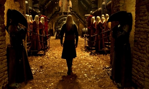
This isn’t just a gorgeous scene to admire. This particular image from the film accentuates several balancing elements that make for a perfect shot. This scene is the epitome of what balance is, from the positions of the guards and onlookers all the way down to the architecture (which you’ll notice is symmetrical).
If you have seen this film you will understand the very irony of the prince’s position (center stage) and the way this scene has been shot. His actions in the following scenes will cause a shift effectively destroying the balance his father (sitting on the throne) worked so hard to obtain. Despite his clothing being vastly different from everyone else’s in this image balance is still achieved with the help of color. The main colors of red, black, and the gold-like earthy hue is dominant throughout.
How can this particular scene be translated to your design work? If you are working on a portrait (let’s say a poster), consider balancing your elements via a hierarchy and if you are working on a landscape (such as a website), consider balancing your elements on both sides of your main focal point, similar to how the loyalists and guards are on either side of both the prince and the king.
Color
We all should know by now that color can make or break your design. The very purpose of color is to generate and provoke a shift in emotion in order to get a desired response. The psychology of color has been effectively used since the film industry started using it.
Most of the time you, will see color used in film to draw attention or to even provide real plot information. Think of how often we are able to distinguish the difference between the protagonist and the antagonist and how much color has to do with this distinction. Special attention should be paid to color because color are always deliberately chosen for a reason. Let’s consider this still image from David Fincher’s Fight Club (1999).

The first rule of Fight Club is: you don’t talk about Fight Club. Sure we’re not supposed to talk about Fight Club but it doesn’t mean we can’t talk about Tyler Durden or specifically Tyler Durden and the color red. I’ll admit that I didn’t realize this right away, but there is only one scene, if you don’t count the many times Tyler is shirtless, that Tyler Durden isn’t wearing something that is red or has red in it. Even when he’s shirtless he happens to have red blood on him. And, he’s often prancing around in that bathrobe wearing rose-tinted glasses.
Why is any of this important? Well, let’s think about what Mr. Durden represents and what the color red means in the movie Fight Club. There are several things Tyler could represent, but this isn’t a film analysis, so we’ll settle on saying he represents the “every man,” the guy who “Jack” wants to be. Now the color red means several things, including violence, danger, war, and revolution. Tyler is literally a walking red flag with his red leather jacket; he is a provoker, a revolutionist and let’s not to forget violent. When you actually go back and notice seemingly unimportant things like color, you realize that careful thought was put into things like Tyler’s penchant for red.
Take a cue from Fight Club and consider what each chosen color means. Don’t just look at color as a good contrast or compliment to your design; look at where you are putting the color and what it could mean.. Color translates differently among different cultures, so you need to study these differences, especially if you’re going to be doing print media for an unfamiliar culture.
Contrast
Contrast in film is an effective way to separate and distinguish film elements. I know it’s not a film, but HBO’s Game of Thrones might as well be. “Blackwater,” the ninth episode of the second season, had a ton of contrast. Let’s take a closer look.
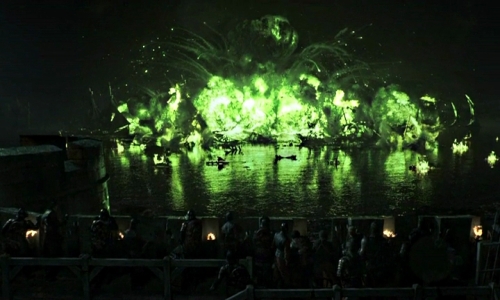
In the picture above, an entire fleet is nearly wiped out by to a rigged unmanned ship carrying explosive “wildfire.” There isn’t much I can say about the image that you can’t already see for yourself. You have a group of onlookers in the foreground, who are almost indiscernible compared to the chaos before them, watching as several ships are swallowed up in a mass of green smoke and flames.
The end result is absolutely beautiful with the green illuminating the massive black backdrop of sky and water. Not only does the contrasting color give us something pretty to look at, it also captivates our attention. This is the beauty of working with contrasts; You should take notice of the size of the contrasting element in this shot. The “wildfire” is quite large, exhibiting it’s powerful and catastrophic nature, but it is also large to grab your attention. Also, notice that it does not take up the entire screen, it leaves enough of night sky and water so that you can see the contrast.
Contrasting colors and elements should be used to either lead or draw attention to where you want your viewer’s focus. Think about your logo design and how effective it is. If it doesn’t seem to be as effective as you want, you may want to consider redesigning it and using contrasting colors to make it stand out a bit more. In print and digital media, it is best to use a contrasting background, especially if your project contains a lot of text. The more the contrast or differentiation between your foreground and background, the easier it is for the elements to be discerned.
Focal Point
In film, we are taught that it is our job as filmmakers to direct or lead the eye of the audience and we do that by preventing the audience from seeing what we don’t want them to see by using specific camera movements and angles. Unfortunately, unless your website has some amazing high tech ability to act like a camera, you won’t be able to keep your viewers from looking at whatever they want to look at. Luckily, there is the ability to use focal points to direct the eye to where it needs to go. Focal points are used a lot in films, including Pan’s Labyrinth (2006) another film by director Guillermo del Toro.
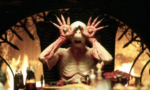
Above is a grotesque and horrific character that sees through the eyeballs that were placed in the slits of his palms. This image showcases several techniques, but the main technique is the focal point. There are several ways to establish focal points, and several of them are used in this particular shot. The grotesque creature is placed directly in the middle of the screen. His placement is centered and, thanks to the shot choice, he fills up most of the screen.
Remember contrasting colors? They play a part in establishing focal points. A Gothic style setting makes him the brightest element in the shot; this automatically pulls our eye to him. The last technique used to draw attention involves the fireplace, where you see ornate designs pointing to the creature. This strategic placement is being used in lieu of eyes. Generally when someone wants you take notice of something in a film, the camera will follow the person’s line of sight. In this case, the pointing iron metalwork acts as the eyes, and we follow their line of sight directly to the creature.
So, how can this be applied to design? When it comes to designing, creating a focal point will help you focus the viewer’s attention. You’ll want to use a combination of contrasting colors. You will also need to pay attention to placement and proportions, and even consider using eye leaders such as arrows or some other influential graphic.
Repetition
We repeat many elements in film: themes, aesthetics, clothing, architecture, and even musical compositions. Repetition is far from a bad thing, in fact, the use of repetition helps connote balances — that everything is alright in the world. When repetition is disrupted in a film, chances are something has gone wrong.
Consider how in horror movies you know something isn’t right when it’s been established that the protagonist’s sister always comes home at 3:15pm, but it’s now 11:25pm. You can’t really show this kind of repetition in web and graphic design , but you can show repetition by the design elements you use, much like repetition is used in Chronicles of Riddick (2004) directed by David Twohy.
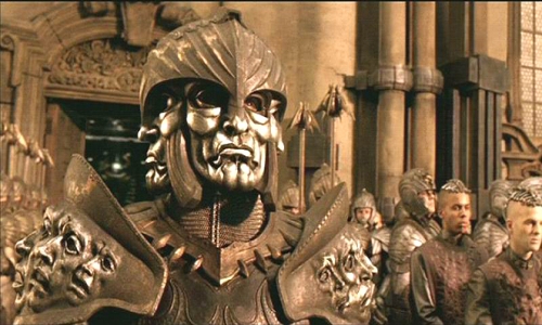
Sci-fi and fantasy films use a lot of repition, and Chronicles of Riddick is no exception. Here, the villian wears a helmet that has three faces, one on each side of his head, one to serve as a face mask. Not to be outdone, his pauldrons are covered in the engravings of open-mouthed faces that increase in size.
If you have seen the film, you will notice that this is not the only place where you will find these faces, in fact these same faces are on obelisks and spaceships. The repetition is heavy here in this still, which clearly depicts the faces/heads as important symbolism. You should take notice that heads on the villian’s pauldrons are not the same, the gaping mouths differ in severity from a look of open despair to a silent scream.
In your design, if you want people to emphasize the importance of certain elements, you should consider using repetition. Repetition shows consistency and helps promote balance and flow. If you are going to use repetition, consider taking a cue from this armor and use variation of color, pattern, and size, but remember to utilize the same shape throughout so that your design flows.
Conclusion
Films have been inspiring aesthetic choices for years, so why not let them inspire the way you design? Films aren’t just about entertaining; if that was the only case, you wouldn’t have so many talented people putting so much thought and effort into every design choice. I strongly encourage you to not only enjoy the next film you see, but to take inspiration from it. Look at the colors and the lighting and see if you can draw something from it to use in your next design project.
Have certain films inspired your design choices? Do you consider film an influential design medium?
Frequently Asked Questions about Film Design and Composition
What is the importance of white balance in film design?
White balance is a critical aspect of film design as it affects the color tones in your footage. It’s a camera setting that adjusts for color temperature in your scene, ensuring that what appears white in person appears white in your footage. Incorrect white balance can cause your footage to have a blue or orange tint, which can be distracting and unappealing. Therefore, understanding and correctly setting your white balance can significantly improve the quality of your footage.
How does balance contribute to film composition?
Balance in film composition refers to the distribution of visual elements in a scene. It creates a sense of stability and can be used to guide the viewer’s eye to the focal point of the scene. Balance can be symmetrical, where elements are mirrored on either side of the frame, or asymmetrical, where different elements balance each other out. Using balance effectively can enhance the storytelling and visual appeal of your film.
What are the rules of shot composition in film?
Shot composition in film involves arranging visual elements to convey a specific message or emotion. Some common rules include the rule of thirds, where the frame is divided into a 3×3 grid and elements are placed along these lines; leading lines, where lines in the scene guide the viewer’s eye to the subject; and depth, where different layers are used to create a sense of three-dimensionality. These rules can be used to create visually engaging and meaningful shots.
How does film design differ from photography?
While both film design and photography involve composing shots and telling stories visually, there are some key differences. Film design involves movement, both of the camera and the subjects within the frame, and also includes elements like sound and editing. Photography, on the other hand, captures a single moment in time and often focuses more on aesthetics and composition. Both require a strong understanding of visual storytelling, but the techniques and considerations can vary.
What can designers learn from films?
Films can teach designers a lot about visual storytelling, composition, and emotion. They can learn how to use different shots and angles to convey a particular mood or message, how to use color and lighting to enhance a scene, and how to guide the viewer’s eye through a composition. Films can also inspire designers with their creativity and innovation, encouraging them to think outside the box in their own work.
How does cinematic composition contribute to video productions?
Cinematic composition is a key aspect of video production. It involves arranging elements within the frame to tell a story visually. This can include the placement of characters, the use of light and shadow, and the choice of camera angles. Good composition can draw the viewer in, guide their eye through the scene, and enhance the storytelling.
What is the role of color in film design?
Color plays a significant role in film design. It can be used to set the mood, convey emotion, and highlight important elements in a scene. Different color schemes can evoke different feelings – for example, warm colors can create a sense of comfort and happiness, while cool colors can create a sense of calm or sadness. Understanding and using color effectively can greatly enhance the visual appeal and storytelling of your film.
How can balance be achieved in film composition?
Balance in film composition can be achieved by carefully arranging elements within the frame. This can involve placing objects or characters in a way that their visual weight is evenly distributed, using color and contrast to balance out different parts of the scene, or using camera angles and movement to create a sense of equilibrium. Achieving balance can make your shots more visually appealing and easier for the viewer to understand.
What are some common mistakes in film design?
Some common mistakes in film design include ignoring the rule of thirds, not using white balance correctly, and not considering the visual weight of different elements in a scene. These can result in shots that are visually unappealing or confusing for the viewer. By understanding and applying basic principles of composition, lighting, and color, you can avoid these mistakes and create more effective and engaging films.
How can I improve my film design skills?
Improving your film design skills involves practice, study, and experimentation. Watch a variety of films and analyze their composition, lighting, and color. Try recreating shots that you find particularly effective or appealing. Experiment with different techniques and styles to find what works best for you. And most importantly, keep making films – the more you practice, the better you’ll get.