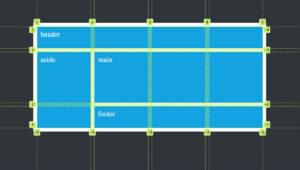
Follow these simple examples to learn how CSS Grid allows us to easily lay out elements on a page to create a range of flexible layouts.

Follow these simple examples to learn how CSS Grid allows us to easily lay out elements on a page to create a range of flexible layouts.

Learn five simple ways to horizontally and vertically center a div (or any other element) using CSS Grid, with fully interactive demos.

Learn about the CSS overflow property, its purpose, and how to use it to ensure your layouts work well on all devices and screen sizes.

Master modern CSS with these project suggestions, starting with the easiest and designed to build a breadth of skill in modern techniques.

Tiffany Brown introduces the basics of CSS Grid, covering the grid formatting context, defining a grid layout, explicit versus implicit grids, specifying track size for an implicit grid, creating flexible grids with flex units, using the grid-template shorthand property, and repeating rows and columns.

Diogo Souza walks through how to convert a traditional, float-based layout into one that harnesses the benefits of CSS Flexbox & Grid — while discussing graceful degradation and progressive enhancement along the way.

Paul answers anything and everything about CSS positioning — from floats and relative, absolute and fixed positioning to table display and even flexbox.
Baljeet Rathi introduces the different properties that make up the CSS Multi-column layout module, and how they can be used in responsive designs.
If Flexbox is your hot superpower, CSS table properties are the secret weapon you keep hidden for emergencies. Massimo adds a new string to your bow.