

Last week, we saw how interface text can impact your brand, and your business, on the most basic level.
This week, let’s get a bit deeper into that topic by looking at one of the main text-related problems that online businesses—particularly startups—face.
Key Takeaways
- A brand vocabulary is critical for clear communication and understanding of your service or product, especially for startups and online businesses. It involves consistently using easily understood terminology that aligns with your brand’s identity.
- Developing a strong brand vocabulary requires a deep understanding of your brand’s core values, target audience, and market positioning. It’s not enough to just use synonyms interchangeably; the specific words you choose to represent key elements of your service offering should be used consistently across all communication channels.
- A well-defined brand vocabulary not only strengthens your unique selling proposition but also aids in SEO, brand recognition, and audience engagement. Regularly reviewing and updating your brand vocabulary ensures it remains relevant and effective.
What should we call this?
Developers play a big role in online product and service development. But often, they’re not the best people to think about what elements of the product or service should be called.
Why not? Well, the names you give to aspects of your service should be tied to your brand. Since brand probably isn’t your developers’ main concern, someone else might need to take the initiative on this.
Let’s look at an example: Mailchimp’s features page. Mailchimp’s tagline is “Easy email newsletters”. They’re not targeting advanced users—the service is pitched at the mass market. And the features page provides a pretty clear description of what’s included in the service.
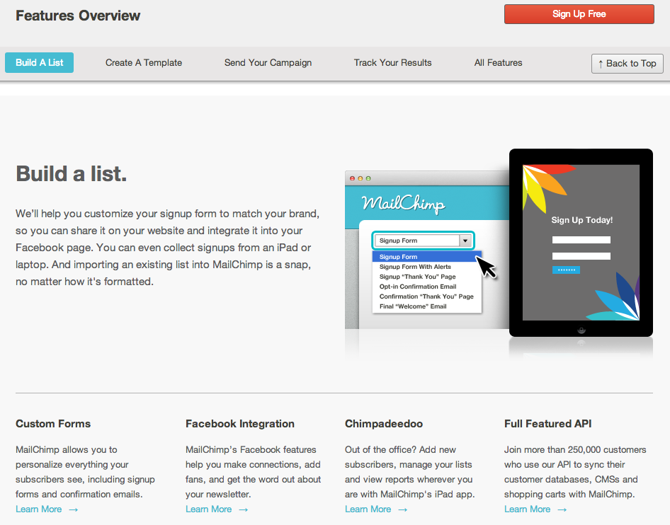
One of the reasons it’s so clear is the vocabulary Mailchimp have used. Subscribers are subscribers—they’re not customers, readers, or visitors. A signup form is a signup form, not a registration form, a subscription form, or anything else. A list is a list, rather than a mailing list, a subscriber database, or an email list.
This isn’t a happy accident. In creating this service description, Mailchimp have chosen to use easily understood terminology, and use it consistently.
Do you do that on your site?
Well, let’s look at a not-so-stellar example: 99designs’ How it Works page.

You might recall that 99designs was a disruptive startup that coined the term “crowdsourcing” back in the day. While the business has competition now, once upon a time design contests were an entirely new concept that no one (outside of the SitePoint Forums) had ever heard of before.
Accordingly, this page aims to explain the concept of “design contests”. But as you’ll see, it introduces a range of language that’s not clarified in the text:
- design package
- prize
- concept
- art work
Some of these terms have overlapping meanings: “design package” and “prize” are similar, for example. Also, for the layman, it’s hard to tell the difference between “concepts”, “your favorite design”, “the final design”, and “original artwork”.
99designs is in the process of improving this information, so we can expect it to become clearer in future. But the point is obvious: the names you give to aspects of your service, and the consistency with which you use them, is critical to customers’ and prospects’ understanding of what you do.
Getting it right
How can you make sure your site or app doesn’t fall prey to the same mistake?
The first thing to do is look at your brand. 99designs is about design contests. Cool.
The next thing to do is look at the main elements of the service your brand offers or entails. For 99designs, that includes things like contests, designs, designers, prizes, and so on.
Once you have a list of these key terms, jot down all the words that you won’t use in their place. You’re probably already using these synonyms in your interfaces or text on marketing and help pages. For the quick list we just made, the expanded list might look like this:
- design contests, not competitions, design projects, challenges
- designs, not concepts, pitches, mockups
- designers, not creatives, team members
- prizes, not packages, winnings, cash
This isn’t to say the words that come later on each line here can never be used—when you’re talking about a design mockup, by all means use that word. The point here is that this list—which becomes your brand vocabulary, and central to your company style guide—tells you which words to use where.
Consistency counts
Remember the Mailchimp and 99designs examples, and you’ll remember that consistent terminology really does matter when it comes to getting your message across—especially if your idea is first to market, or a new concept for your target audience to grasp.
Use terms consistently, and through repetition, they’ll be more likely to stick with your audience. Those people will more easily be able to pick up the meanings of those terms, and remember them. A strong brand vocabulary makes for clearer communication, which reduces friction and the learning curve, and encourages swifter uptake of your service by your target users.
Of course these aren’t just a bunch of words—they’re key elements of your service offering. Elements that, as in the case of 99designs, truly are part of your unique selling proposition. So don’t leave brand vocabulary to your developers to create as they go. This is worth your spending a little time on up front so you can ensure that your marketing pages, autoresponders, press releases, social updates, and blog posts all use the same terminology.
Next time, we’ll see how you can build on the communication muscle you’ve built into your brand vocabulary by applying it across your site, then use everything you have to communicate with users on their terms. In the meantime, let me know if you have anything to add—or any questions—in the comments.
Frequently Asked Questions (FAQs) about Brand Vocabulary
What is the importance of a brand vocabulary in marketing?
A brand vocabulary is a crucial aspect of marketing as it helps in creating a unique identity for a brand. It consists of specific words, phrases, and terms that are used consistently across all communication channels to convey the brand’s values, mission, and personality. This consistency in language helps in building a strong brand image and fosters a deeper connection with the audience. It also aids in differentiating the brand from its competitors, thereby giving it a competitive edge in the market.
How can I develop a strong brand vocabulary?
Developing a strong brand vocabulary involves a deep understanding of your brand’s core values, target audience, and market positioning. Start by defining your brand’s personality and tone of voice. Then, identify words and phrases that align with this personality and resonate with your target audience. Consistently use this vocabulary across all your communication channels. Regularly review and update your brand vocabulary to keep it relevant and effective.
What is the difference between brand vocabulary and brand voice?
While both brand vocabulary and brand voice are integral parts of a brand’s identity, they serve different purposes. Brand voice refers to the unique personality and emotion infused into a brand’s communication. It’s about how the brand speaks to its audience. On the other hand, brand vocabulary refers to the specific set of words and phrases that a brand uses in its communication. It’s about what the brand says.
Can a brand vocabulary evolve over time?
Yes, a brand vocabulary can and should evolve over time. As a brand grows and its target audience changes, its vocabulary should also adapt to reflect these changes. However, it’s important to maintain consistency in the core elements of the brand vocabulary to ensure that the brand’s identity remains strong and recognizable.
How does a brand vocabulary contribute to brand recognition?
A brand vocabulary contributes to brand recognition by creating a unique linguistic identity for the brand. When a brand consistently uses specific words and phrases in its communication, these become associated with the brand in the minds of the audience. Over time, this association strengthens, leading to increased brand recognition.
What role does a brand vocabulary play in content marketing?
In content marketing, a brand vocabulary plays a crucial role in creating engaging and impactful content. It helps in maintaining consistency in the brand’s messaging across different content formats and platforms. This consistency aids in building a strong brand image and fosters a deeper connection with the audience.
How can I ensure consistency in my brand vocabulary?
Ensuring consistency in your brand vocabulary involves creating a brand style guide that outlines the specific words, phrases, and terms to be used in all brand communication. This guide should be shared with all team members involved in content creation and marketing. Regularly reviewing and updating the guide can also help in maintaining consistency.
Can a brand vocabulary help in SEO?
Yes, a well-defined brand vocabulary can aid in SEO. By consistently using specific keywords related to your brand and industry in your content, you can improve your search engine rankings. This can lead to increased visibility and traffic to your website.
What are some common mistakes to avoid when developing a brand vocabulary?
Some common mistakes to avoid when developing a brand vocabulary include not aligning the vocabulary with the brand’s personality, not considering the target audience while choosing words and phrases, and not maintaining consistency in the use of the vocabulary across different communication channels.
How can I measure the effectiveness of my brand vocabulary?
The effectiveness of a brand vocabulary can be measured through various metrics such as brand recognition, audience engagement, and conversion rates. Surveys and feedback from the audience can also provide valuable insights into how well the vocabulary resonates with them.

