Saving Bandwidth by Using Images the Smart Way

Images are the native language of our brains. While it takes us years to learn to talk, read and write, we’re processing images from the day we’re born.
This allows images to convey complex ideas much faster than words–even a thousand words. They can liven up a webpage and even draw people into reading about-about a topic they make not have otherwise bothered with.
Key Takeaways
- Selecting the appropriate image format can significantly save bandwidth; for instance, GIF is ideal for logos and flat-color graphics, PNG is suitable for small images or those needing to be saved without data loss, and JPG is best for photographic images with color variations.
- Using Photoshop’s ‘Save for Web’ option can optimize image sizes without compromising quality, thus saving bandwidth. However, it’s crucial to keep original images backed up as individual pixels can’t be modified after using this option.
- Serving resized images based on screen size, using CSS properties to replace simple patterns, and avoiding images altogether when possible can also help in bandwidth conservation. Third-party services like imgix can be used for image resizing if budget allows.
The Costs
However, on the internet, imagery doesn’t come without cost. Images soak up a large percentage of the world’s bandwidth and this impacts on user experience. We know that every surplus second a page takes to loads increases the bounce rate while also negatively impacting your PageRank.
In this article, we’re going to discuss a lot of important tips designed to save you both time and bandwidth
Choosing the Appropriate Image Format
Let’s begin by getting right back to basics, and look at the fundamental pros and cons of each web image format (even if you think you know it all).
GIF
GIF is a lossless file format with support for transparency and animation. It is limited to a maximum palette of 256 colors. It’s not recommended for saving highly-graduated photographic images as they are made up of much more than 256 colors. It is, however, great for logos, flat-color graphics and illustrations with few gradients.
GIF’s animation abilities mean it can also be used in place of short explanatory videos.
PNG
Like GIF, PNG is also lossless and supports transparency. However, there is no native support for animation.
This format is also suitable for small sized images or images which need to be saved without losing any data. PNG images can be saved in PNG8 or PNG24 format. PNG8 is palette-based and can be used as a GIF substitute if no animation is needed. PNG8 can support up to 256 colors.
One point worth keeping in mind is that it is still common for graphics application to export PNG-8 with 2-bit transparency (i.e. pixels are either 100% opaque or 100% transparent) and this can result in jagged edges. Better editors use a graduated 8-bit transparency in their PNG export.
PNG24, on the other hand, can support up to 16 million colors. You can use the latter to save photographic images, but more complex images will mean bigger file size.
JPG
Finally, JPEG or JPG format is suited for photographic images where color may change from pixel to pixel. This format can reduce file size by a huge margin, but there are a few caveats.
Firstly, JPEG is a lossy format. This means it compresses images by selectively discarding data. This is the reason it can reduce the file size significantly, you need to make a compromise between quality of image and file size. JPG also does not support transparency.
JPEG images can be in either baseline or progressive format. Progressive format renders a lower resolution image first before progressively enhancing its quality as more data becomes available. This format also reserves layout space on page for the image which reduces page elements from reflowing during page load.
When working with JPG you should always maintain your original uncompressed images separately. Re-compressing JPEG images results in a cumulative loss of quality, as more data is discarded each time the images are saved. It is much better to start with the uncompressed original image.
Let’s Compare
Here are a few images that show the difference in file size in various images: Simple, flat-color image in .gif format. File size : 4.4 KB

Simple, flat-color image in .png format. File size : 8.5 KB

Simple, flat-color image in .jpg format. File size : 26.2 KB

Photographic image in .png format. File size : 350 KB

Photographic image in .jpg format. File size : 85 KB
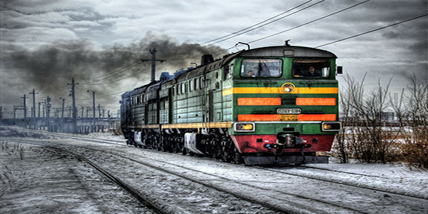
As you can see, there is no glaring difference between first three images quality wise but image size increases considerably in JPEG format for images with little to no color variations. In this case, GIF provides the most savings in bandwidth.
However, the last two images are different. Here the PNG format has much larger file size. This is because there is a huge color variation and PNG does not discard data selectively. Unless you examine the images very closely you won’t see much difference in quality.
The example above clearly illustrates how you can save a lot of bandwidth by simply choosing the appropriate image format.
Does ‘Save for Web’ Make Any Real Difference?
Photoshop’s ‘Save as..‘ option has always allowed us to create PNG, GIF and JPG images, but we’ve had the option of ‘Save for Web…‘ over recent years (and Extract Assets even more recently). Is there any real difference?
In short, yes there is a very worthwhile option.
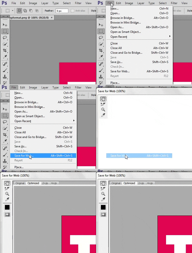
Accessed via ‘File > Save for Web…’, this interface provides lots of options such as optimizing the number of colors in PNG-8 and GIF format and setting the quality in JPEG format. You can also set a blur value which can save a few more kilobytes.
Keep in mind that once you save images this way you won’t be able to modify individual pixels anymore. For this reason, it is always a good idea to have an original image backed up. Here are the above two images optimized with ‘Save for Web…’ option.
Simple image in optimized .png format. File size : 3 KB

Photographic image in optimized .jpg format. File size : 40 KB

Relative saving on both these images is 32% and 53% respectively. This is beneficial for both the users as well as the website owners.
Serving Resized Images
Serving images with the same resolution to users with varying screen sizes is not optimal. Sure, it saves some time but it can cost a lot of extra bandwidth. The users have to wait longer for the webpage to load and images resized with CSS don’t always scale well.
To serve different images based on screen size you can use a variety of solutions like Adaptive Images or a jQuery plugin like HiSRC.
There are three options available to resize images.
First one is to resize each and every image on your website manually. This can be a tiring process. You can then use browser re-sizing to make the initially resized image scale to fit perfectly on devices with more similar resolutions. For instance, it is much better to use CSS to resize an image from 400x300 to 350x262 than resizing it from 800x600 to 350x262.
If you have no problem working with some libraries, there are a few pretty good solutions available. This would cost you nothing in terms of money, but you will have to invest time in learning about the library.
Two such PHP based libraries are phpThumb and WideImage. Once an image has been resized, you can later serve its cached version to speed up the process.
Third and probably the easiest solution would be to use third party services. You will have to shell out a few bucks but if money is not a big concern this may be the ideal solution for you. One such service is imgix. You can try their service for one month free of cost.
Avoiding Images Altogether
Sometimes you can avoid images entirely. Browser support for a raft of CSS properties has increased considerably in the last five years. You no longer need to use images for rounded corners and basic drop shadow effects anymore. You can take it a step further by replacing simple patterns in your websites with carefully crafted CSS gradients.
Here is a CodePen demo with a simple pattern created purely in CSS. The size of the code is 189B without prefixes.
See the Pen JYGrWR by SitePoint (@SitePoint) on CodePen.
Here is a more complex pattern created using just CSS. Without any prefixes, it is about 625B in size.
See the Pen QjyqpY by SitePoint (@SitePoint) on CodePen.
Many more examples can be found on Lea Verou’s CSS Pattern Gallery. This approach is much more flexible and definitely saves bandwidth.
Conclusion
In this article, I have tried to cover a few important points which can improve user experience and save bandwidth at the same time.
-Do you have some other tips on saving bandwidth by optimizing images? -Please share your own favorite tools and opinions in the comments.
Frequently Asked Questions (FAQs) about Saving Bandwidth by Using Images Smartly
What are the benefits of saving bandwidth when using images?
Saving bandwidth when using images has several benefits. Firstly, it improves the loading speed of your website, providing a better user experience. Slow-loading websites can deter visitors, leading to higher bounce rates. Secondly, it can reduce the cost of website hosting, especially if you’re on a plan that charges based on the amount of data transferred. Lastly, it’s more environmentally friendly as it reduces the amount of data that needs to be transferred across the internet, thereby reducing energy consumption.
How can I optimize images for my website to save bandwidth?
There are several ways to optimize images for your website. One of the most effective methods is to compress your images before uploading them to your website. There are many free online tools available that can do this without noticeably reducing the quality of the images. Another method is to use CSS sprites, which combine multiple images into one, reducing the number of HTTP requests needed to load your website. Lastly, consider using vector graphics for simple images and logos, as they are resolution-independent and usually smaller in file size than raster images.
What is the difference between lossy and lossless compression?
Lossy and lossless are two different types of data compression. Lossy compression reduces file size by eliminating redundant or unnecessary information, which can result in some loss of quality. This is typically used for images and videos where a slight loss of quality is acceptable. On the other hand, lossless compression reduces file size without losing any information, maintaining the original quality. This is typically used for text and data files where it’s important to preserve every bit of information.
How does image format affect bandwidth usage?
The format of an image can significantly affect the amount of bandwidth it uses. Some image formats, like JPEG and PNG, are more efficient at compressing data and therefore use less bandwidth. Other formats, like BMP and TIFF, are less efficient and use more bandwidth. Additionally, some formats are better suited for certain types of images. For example, JPEG is great for photographs, while PNG is better for images with transparent backgrounds.
What are CSS sprites and how do they save bandwidth?
CSS sprites are a technique used in web development where multiple images are combined into one single image. This reduces the number of HTTP requests needed to load a webpage, thereby saving bandwidth. The individual images within the sprite are accessed using CSS to specify their position within the sprite. This technique is particularly useful for small images like icons and buttons that are used throughout a website.
How does responsive image technique help in saving bandwidth?
Responsive image technique is a method where the server sends an image that is appropriate for the user’s device and screen resolution. This means smaller images for mobile devices and larger images for desktop computers. By sending only the necessary data, this technique can significantly reduce bandwidth usage and improve loading times, especially for users on slower or metered internet connections.
What is the role of a Content Delivery Network (CDN) in saving bandwidth?
A Content Delivery Network (CDN) is a network of servers distributed around the world that deliver content to users based on their geographic location. By serving content from a server close to the user, a CDN can reduce the amount of data that needs to be transferred over long distances, thereby saving bandwidth. Additionally, CDNs can cache content, further reducing the amount of data that needs to be transferred.
How can I measure the bandwidth usage of my website?
There are several tools available that can help you measure the bandwidth usage of your website. These tools can provide detailed reports on the amount of data transferred, the number of HTTP requests, and the loading times of your webpages. Some popular tools include Google’s PageSpeed Insights, GTmetrix, and Pingdom.
Can I save bandwidth by using video instead of images?
While video can provide a more engaging user experience, it typically uses more bandwidth than images. However, there are ways to optimize video to reduce bandwidth usage. For example, you can compress your videos, use a lower resolution or frame rate, or use a streaming service that adjusts the quality of the video based on the user’s internet connection.
What is lazy loading and how does it save bandwidth?
Lazy loading is a technique where images or other content are only loaded when they are needed, such as when they come into view in the user’s browser. This can significantly reduce the amount of data that needs to be loaded when a user first visits your website, thereby saving bandwidth. There are several JavaScript libraries available that can help you implement lazy loading on your website.
Monty is a front-end developer who loves to learn about new JavaScript libraries and frameworks. He has been doing front-end development for three years now and likes to write about interesting libraries and tools that he comes across in his research.


