
The foundation for many sites continues to be a layout grid, whether that’s composed of Grid or Flexbox. In this excerpt from Unleashing the Power of CSS: Advanced Techniques for Responsive User Interfaces, we’ll see how both of these tools provide ways to create fluidly responsive layout grids without media queries.
Key Takeaways
- CSS Grid and Flexbox are powerful tools for creating fluidly responsive layout grids without the need for media queries. They allow for the creation of a responsive set of columns that adjust themselves as needed, with a single constraint dictating the minimum width columns can be.
- The Grid and Flexbox solutions have key differences: in Grid, the parent defines the child behavior, while in Flexbox, the child layout behavior is set on the children. Flexbox also allows flex items to grow to fill all remaining extra space, preventing an “orphan” that can appear with the Grid solution.
- Flexbox’s flex-basis property can be further adjusted to assign unique “breakpoints” for different items. By changing the –min custom property, the behavior of the wider column can be effectively altered. This demonstrates the versatility and control Flexbox offers in creating responsive layouts.
Responsive Layouts with Grid
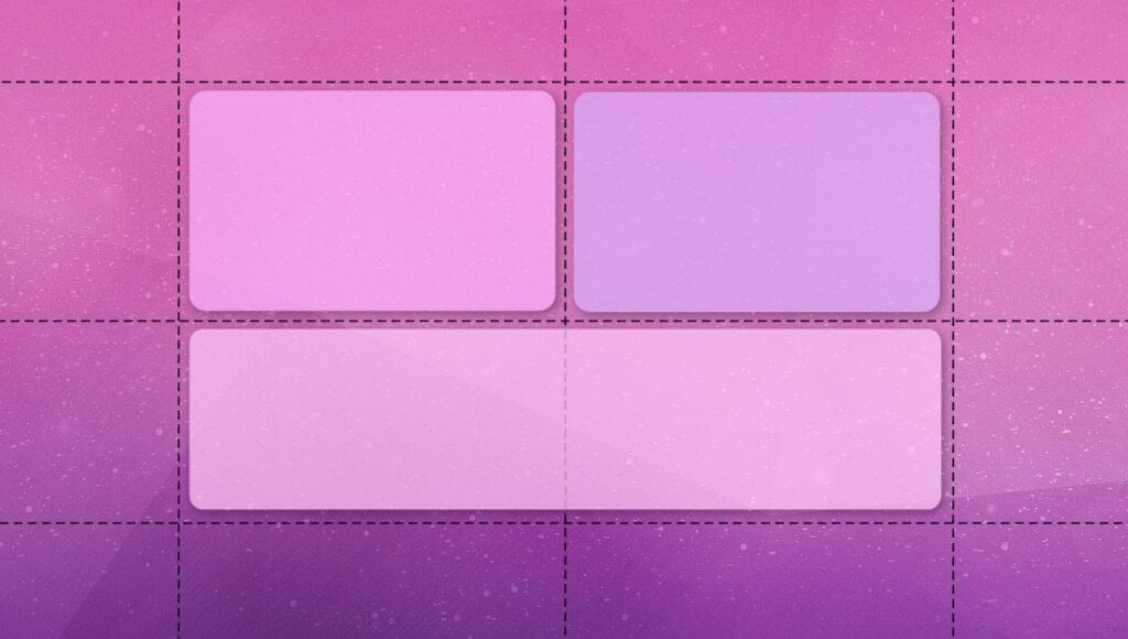
First up is perhaps my favorite of all the solutions, because of its versatility and ease of use. Using Grid, we can create a responsive set of columns that create themselves as needed. We’ll provide a single constraint — a minimum width that columns can be — which does double-duty as a sort of “breakpoint” before column items break onto new rows.
The following video demonstrates the behavior we’re after.
Here’s all it takes to accomplish this responsive grid layout, where our minimum column size is set to 30ch via a helper custom property. This rule directs the browser to create as many columns as will fit that are at least 30ch wide:
.grid {
  --min: 30ch;

  display: grid;
  grid-template-columns: repeat(auto-fit, minmax(min(100%, var(--min)), 1fr));
}
Since 1fr is the “max” value of minmax(), the columns are also allowed to stretch to fill any leftover space equitably within a row. So, if the available space is 80ch and there are two grid children, they’ll each take up 40ch. If there are three children, the third will be on a second row, since 80 doesn’t divide equally into the minimum size allowed of 30.
The following CodePen demo provides a live example of a responsive Grid layout.
See the Pen
Responsive CSS Grid layout by SitePoint (@SitePoint)
on CodePen.
To learn more about grid layout, check out our beginner’s guide to CSS Grid.
Responsive Layouts with Flexbox
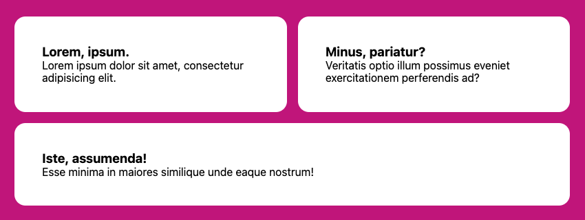
We can accomplish a similar experience with Flexbox. The difference between the Flexbox and Grid solution is that grid items that flow to a new row can’t expand across multiple grid columns. With Flexbox, we can direct the flex items to grow to fill all remaining extra space, preventing an “orphan” that appears with the Grid solution.
In this code, as in the Grid code, the browser will create as many columns as will fit the inline space with at least the --min size of 30ch. If we have three items and the third needs to move to a new row, it will take up the remaining space due to the flex shorthand, which importantly sets flex-grow to 1. It therefore has a similar behavior to 1fr in most cases:
.flexbox-grid {
  --min: 30ch;

  display: flex;
  flex-wrap: wrap;
}

.flexbox-grid > * {
  flex: 1 1 var(--min);
}
The image below shows the final, odd-numbered list item spanning two columns, thanks to the flex-grow property.
Note: in both the Grid and Flexbox solutions, if we add a gap, that space will be subtracted from the calculation of how many columns may be created before new rows are added.
Keen readers may have noticed another key difference between these solutions: when using Grid, the parent defines the child behavior. For Flexbox, we set the child layout behavior on the children. The flex shorthand sets, in order, flex-grow, flex-shrink, and flex-basis.
As an experiment, we can change the flex-grow value to 0 and see how the items will only expand up to the flex-basis value. (Experiment with the CodePen demo below.) It’s important to keep flex-shrink to 1, so that, eventually — when the available inline space is narrower than the flex-basis — the items are still allowed to “shrink”, as this helps to prevent overflow.
The following CodePen demo shows our Flexbox layout in action.
See the Pen
Responsive Flexbox Grid layout by SitePoint (@SitePoint)
on CodePen.
The flex-basis property can be further adjusted for this solution to assign unique “breakpoints” for different items. Since we’re setting that value via the --min custom property, and Flexbox children control their own size, we can adjust it with an inline style:
<li style="--min: 40ch">...</li>
The other list children in this example will still flow around it and use the 30ch from the base rule, but the wider column effectively changes the behavior.
Here’s a CodePen demo of this code in action.
See the Pen
Responsive Flexbox Grid layout – adjusted –min by SitePoint (@SitePoint)
on CodePen.
Here are two other Flexbox techniques that use flex-grow and flex-basis in interesting ways:
- Heydon Pickering’s Flexbox Holy Albatross, which breaks down from columns into a single row based on the parent container’s total width.
- Heydon Pickering’s and Andy Bell’s sidebar layout, which shows how to force varying Flexbox-based breakpoints for better control of when items wrap.
This article is excerpted from Unleashing the Power of CSS: Advanced Techniques for Responsive User Interfaces, available on SitePoint Premium.
Frequently Asked Questions (FAQs) about Responsive CSS Layout Grids
What is the difference between CSS Grid and Flexbox?
CSS Grid and Flexbox are both powerful layout systems in CSS. While they can be used together, they each have their own strengths. CSS Grid is a two-dimensional system, meaning it can handle both columns and rows, making it ideal for web page layout. Flexbox, on the other hand, is a one-dimensional layout model, and is used for designing a small scale layout, while CSS grid is intended for larger scale layouts.
How can I create a responsive layout without using media queries?
You can create a responsive layout without using media queries by using CSS Grid or Flexbox. These layout systems allow you to create flexible layouts that adapt to different screen sizes. For instance, with CSS Grid, you can use the ‘fr’ unit to create flexible grid tracks that resize based on the available space.
How does the ‘fr’ unit work in CSS Grid?
The ‘fr’ unit in CSS Grid stands for ‘fraction’. It represents a fraction of the available space in the grid container. For example, if you have a grid with two columns, and you set the width of one column to 1fr and the other to 2fr, the first column will take up one third of the available space, and the second column will take up two thirds.
Can I use CSS Grid and Flexbox together?
Yes, CSS Grid and Flexbox can be used together. You can use CSS Grid to layout the overall page structure, and then use Flexbox inside grid items to layout their content. This allows you to take advantage of the strengths of both layout systems.
How can I align items in a Flexbox container?
You can align items in a Flexbox container using the ‘align-items’ property. This property accepts several values, including ‘flex-start’, ‘flex-end’, ‘center’, ‘baseline’, and ‘stretch’. For example, ‘align-items: center’ will vertically align the items in the center of the container.
What is the difference between ‘justify-content’ and ‘align-items’ in Flexbox?
In Flexbox, ‘justify-content’ is used to align items along the main axis (horizontally if ‘flex-direction’ is ‘row’, vertically if ‘flex-direction’ is ‘column’), while ‘align-items’ is used to align items along the cross axis (perpendicular to the main axis).
How can I create a grid with equal-width columns in CSS Grid?
You can create a grid with equal-width columns in CSS Grid by setting the ‘grid-template-columns’ property to a series of ‘1fr’ values. For example, ‘grid-template-columns: 1fr 1fr 1fr’ will create a grid with three equal-width columns.
How can I make a Flexbox container scrollable?
You can make a Flexbox container scrollable by setting the ‘overflow’ property to ‘auto’ or ‘scroll’. This will add a scrollbar to the container if the content overflows the container’s bounds.
Can I use CSS Grid and Flexbox in all browsers?
CSS Grid and Flexbox are supported in all modern browsers, including Chrome, Firefox, Safari, and Edge. However, they are not supported in Internet Explorer 10 and earlier. You can use tools like Autoprefixer to add the necessary vendor prefixes for better browser compatibility.
How can I learn more about CSS Grid and Flexbox?
There are many resources available online to learn about CSS Grid and Flexbox. The Mozilla Developer Network (MDN) has comprehensive guides on both CSS Grid and Flexbox. You can also find tutorials on websites like CSS-Tricks, and courses on platforms like Codecademy and Udemy.