

Key Takeaways
- The CSS gap property allows developers to add space horizontally and vertically between elements, solving a number of layout issues and making it easier to manage margins. This property can be used with three different layout modes: Grid, Flexbox, and multi-columns.
- The gap property can take two values: a row value (the space between rows of elements), and a column value (the space between columns of elements). If only one value is specified, it applies to both rows and columns. The values for the gap can be any length units, percentage units, or even values calculated with the calc() function.
- The gap property can be used with CSS Grid, Flexbox, and Multi-column layouts. It works seamlessly across responsive layouts, adjusting the gap direction to the arrangement of the boxes. It can also be used to space text elements by setting the text container to display: grid and adding a gap value.
- While the gap property for Grid layouts was initially called grid-gap, it’s best to stick to using gap, as that now works with Grid, Flexbox, and multi-columns. However, alignment properties like justify-content and align-content can space items further apart than your gap value in certain circumstances. It’s also important to note that gap cannot accept negative values.
In this article, we’ll explore the uses of the CSS gap property, which makes it super easy to add space between elements, and solves a number of layout issues that have plagued developers over the years.
What Is gap For?
The gap property allows us to add space between elements horizontally and vertically. We’ve always been able to do this with margin, of course. But using margin to space items apart can be a pain — especially when items wrap across lines — because there’s always that last item that will have unwanted margin.
The following Pen shows four divs spaced apart with right and bottom margin:
article > div {
  margin: 0 10px 10px 0;
}
See the Pen
The CSS gap Property: using margin instead of gap by SitePoint (@SitePoint)
on CodePen.
Notice the background of the container sticking out along the right and across the bottom?
The gap property only puts space between items, which makes it so much easier for layout. Here’s the same layout as above, but this time using gap instead of margin:
article {
  display: grid;
  gap: 10px;
}
See the Pen
The CSS gap Property: spacing items with gap shorthand by SitePoint (@SitePoint)
on CodePen.
Now we don’t get the ugly, unwanted gap on the right and along the bottom. The gap is now just between items, and the items fit snugly within the their container.
We can use gap with three different layout modes: Grid, Flexbox, and multi-columns. We’ll look at each in turn below.
Guidelines for Using the gap Property
Using gap is as simple as writing gap: 10px. (We saw the result of doing that in the demo above.) But let’s look at what this means.
The gap property can take two values: a row value (that is, the space between rows of elements), and a column value (the space between columns of elements): gap: <row-gap> <column-gap>.
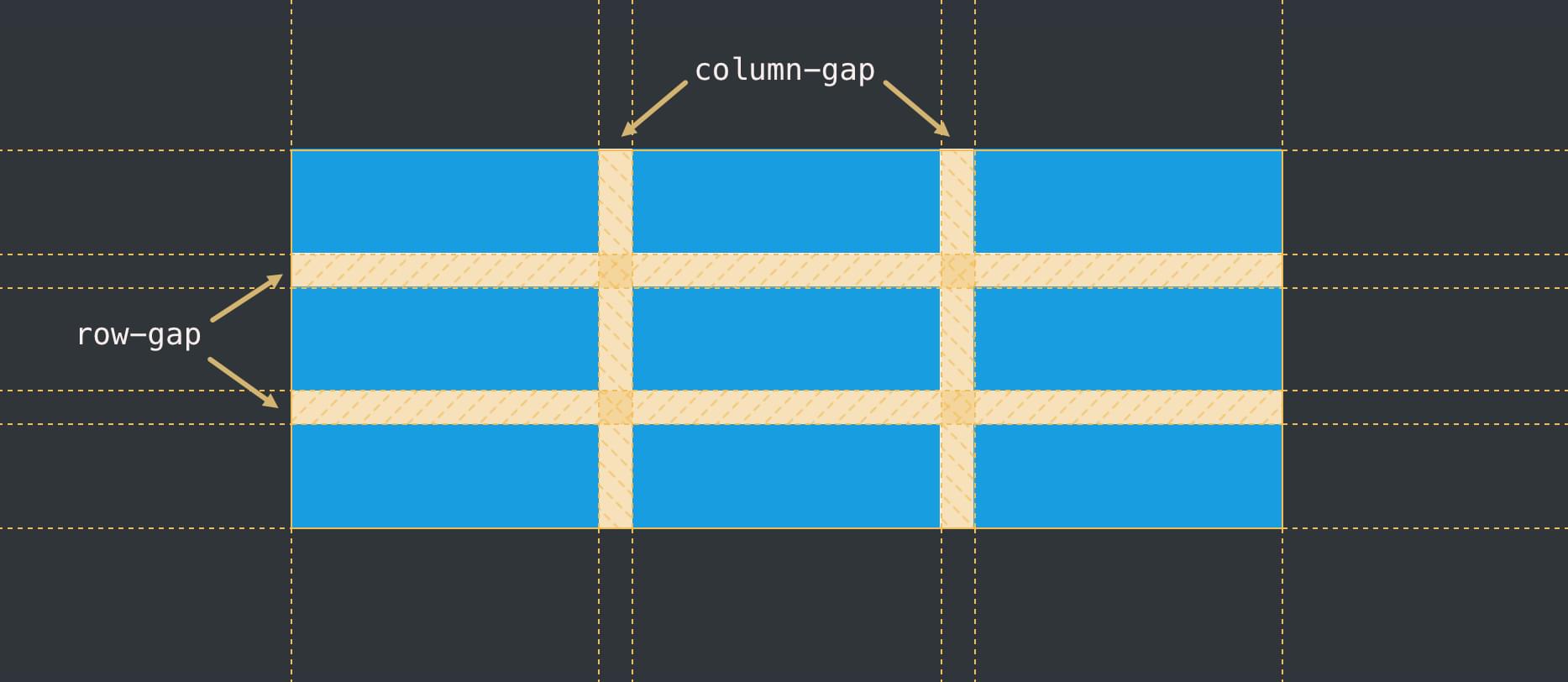
If we specify only one value, it will apply to any rows and columns.
We can just specify a column or row gap separately with the row-gap and column-gap properties.
Values for gap can be any length units (such as px, em, vw), percentage units, or even values calculated with the calc() function.
How to Use the gap Property with CSS Grid
We saw an example above of gap used with Grid layout. Let’s try another example with some different units:
article {
  display: grid;
  gap: 30px 1em;
}
See the Pen
The CSS gap Property: using gap with Grid longhand by SitePoint (@SitePoint)
on CodePen.
This time, we have different units for row and column.
An extra bonus of gap is that it works seamlessly across responsive layouts. If we set a gap between two items, that gap will apply whether the items sit side-by-side or one above the other, as shown in the Pen below.
See the Pen
Untitled by SitePoint (@SitePoint)
on CodePen.
Press the 0.5x button at the bottom of the Pen above, or open the Pen in your browser and widen and narrow the viewport to see how the gap direction adjusts to the arrangement of the boxes. We’re benefitting here from the single value on the gap property, which can apply to rows and columns. If we don’t want the gap between rows on smaller screens, we could instead set column-gap: 10px. Try this in the Pen above.
For more on how to work with Grid layouts, check out our beginner’s guide to CSS Grid layout.
How to Use the gap Property with Flexbox
When Flexbox first hit the streets, it had no gap property, so we had to resort to the age-old, pain-inducing use of margins. Thankfully, using gap with Flexbox is now mainstream and well-supported in modern browsers.
We can use it in the same way we use it for Grid:
article {
  display: flex;
  gap: 2vw 1vw;
  flex-wrap: wrap;
}
See the Pen
The CSS gap Property: using gap with Flexbox by SitePoint (@SitePoint)
on CodePen.
In situations where our flex items responsively wrap, the gap settings will reflow as needed, and often won’t line up both vertically and horizontally, as shown in the Pen below.
See the Pen
The CSS gap Property: using gap with a responsive Flexbox layout by SitePoint (@SitePoint)
on CodePen.
If we want gaps to line up horizontally and vertically, it’s better to use Grid.
As with Grid, if we only want gaps between columns or rows, we can use column-gap and row-gap separately.
How to Use the gap Property with Multi-column Layout
Multi-column layout organizes content into columns, but by default those columns will have a gap of 1em set by the browser. We can use the gap property to set our preferred gap width:
article {
  column-count: 2;
  gap: 3em;
}
See the Pen
The CSS gap Property: using gap in a multi-column layout by SitePoint (@SitePoint)
on CodePen.
(Try removing the gap property in the Pen above and see what happens.)
Because we’re only working with columns here, just a column gap value is applied, as there’s no row for this value to be applied to.
Just for fun, let’s also add a vertical line between those columns:
article {
  column-count: 2;
  gap: 3em;
  column-rule: 1px solid #e7e7e7;
}
See the Pen
The CSS gap Property: using gap and column-rule in multi-column layout by SitePoint (@SitePoint)
on CodePen.
Note that column-rule is shorthand for column-rule-width, column-rule-style, and column-rule-color.
Useful Things to Know about the gap Property
The gap property for Grid layouts was initially called grid-gap, with the longhand forms of grid-row-gap and grid-column-gap. While those properties still work, it’s best to stick to using gap, as that now works with Grid, Flexbox and multi-columns.
Multi-column layouts have an older column-gap property, which also still works. But once again, it’s easier just to remember gap in all scenarios.
A gap can be set as a % value, but a percentage of what? It actually depends on a number of factors, and it can be somewhat hard to predict. You can explore this further in the specification. As a general rule, unless you really know what you’re doing it’s safer to avoid percentages with gap.
Alignment properties like justify-content and align-content also serve to space elements apart in Grid and Flexbox layouts, and in certain circumstances they’ll space items further apart than your gap value. The gap value is still useful, though, as it at least provides a minimum space between elements on smaller screens.
Why not space all elements with gap?
As noted above, gap solves some annoying issues associated with margin spacing. Those margin issues can also affect things like text. For example, if we space text elements — such as paragraphs and headings — with a bottom margin, we’ll get an unwanted margin after the final element, or if we use top margin, we might end up with an unwanted top margin on the first element. There are easy ways to deal with this in CSS, but it’s still a pain, and some developers have decided to use gap instead.
To use gap to space text elements, we simply set the text container to display: grid and add a gap value:
article {
  display: grid;
  gap: 1em;
}
The <h1>, <h2>, <p> and <ul> elements are all now grid items.
See the Pen
The CSS gap Property: spacing text content with gap by SitePoint (@SitePoint)
on CodePen.
But should we do this? One downside is that the spacing is the same for all elements, and it can be more visually appealing to vary spacing between elements, especially around headings. Using gap for this is still an interesting idea, though. To explore this further, check out Kevin Powell’s really interesting video on using gap for spacing text.
Wrapping Up
The gap property is a handy tool for spacing items apart when using Grid, Flexbox and multi-column layouts. It saves us from having to use the messy margin hacks of old. It can be used in creative ways throughout a design, but don’t go overboard with it!
Further reading
- Read more about how CSS Grid layout works
- Read more about how Flexbox layout works
- Read more about how CSS multi-column layout works
- Read about the
gapproperty in the CSS Box Alignment Module Level 3 specification or on MDN
Frequently Asked Questions (FAQs) about CSS Gap Property
What is the CSS Gap Property?
The CSS Gap Property is a shorthand property for ‘row-gap’ and ‘column-gap’. It specifies the size of the gap between the rows and columns in a grid, flex, or multi-column layout. This property is particularly useful in creating visually appealing and well-structured layouts in CSS. It helps in maintaining consistent spacing and alignment in your design elements.
How does the CSS Gap Property work?
The CSS Gap Property works by setting the size of the gap (the empty space) between the rows and columns. The first value you provide will set the row gap, and the second value will set the column gap. If you only provide one value, it will set both the row and column gaps to that value. For example, ‘gap: 10px 20px’ will set the row gap to 10px and the column gap to 20px.
Can I use the CSS Gap Property with Flexbox?
Yes, you can use the CSS Gap Property with Flexbox. It allows you to create a gap between flex items. However, please note that this feature may not be supported in all browsers, especially older ones. Always check the browser compatibility before using it.
What is the difference between ‘gap’ and ‘grid-gap’ in CSS?
The ‘grid-gap’ property is a shorthand property for ‘grid-row-gap’ and ‘grid-column-gap’, used exclusively with grid layouts. However, the CSS Grid Layout Module Level 2 has replaced ‘grid-gap’ with ‘gap’. Now, ‘gap’ can be used with grid, flex, and multi-column layouts.
How can I use the CSS Gap Property for responsive design?
The CSS Gap Property can be used in responsive design by setting it with relative units like percentages or viewport units. This way, the gap size will adjust based on the size of the viewport or the parent element, making your layout responsive.
Can I use negative values with the CSS Gap Property?
No, you cannot use negative values with the CSS Gap Property. The gap property only accepts non-negative values. If you try to use a negative value, it will be ignored, and the default value will be used instead.
What is the default value of the CSS Gap Property?
The default value of the CSS Gap Property is ‘normal’, which means the browser will determine the size of the gap. However, you can override this default value by specifying your desired gap size.
Can I use the CSS Gap Property with multi-column layouts?
Yes, you can use the CSS Gap Property with multi-column layouts. It allows you to set the gap between the columns in a multi-column layout.
Is the CSS Gap Property inherited?
No, the CSS Gap Property is not inherited. This means that the gap size specified for a parent element will not be applied to its child elements.
What units can I use with the CSS Gap Property?
You can use several units with the CSS Gap Property, including pixels (px), ems (em), rems (rem), percentages (%), and viewport units (vw, vh). Each unit has its own use case and can be used based on your specific needs.