This screencast is a part of our AtoZ CSS Series. You can find other entries to the series here.
Transcript
Pseudo elements are elements on the page that aren’t found in the HTML code.
They can be manipulated with any CSS that would be applied to any other element.
Two special pseudo elements – :before and :after can be used to generate content on the page from CSS and have many potential use cases.
In this episode we’ll learn about:
- The five different pseudo elements
- Generating content like text, images attribute values and counters from CSS
- And how to make complex shapes with minimal markup
Pseudo Elements
There are five pseudo elements in CSS:
:first-line:first-letter:selection:before:after
These are differentiated from pseudo classes with the double colon but are often written in CSS with a single colon for brevity.
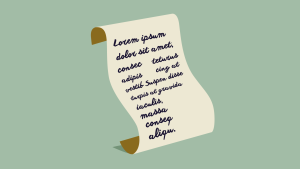
I’ve got a long blockquote of placeholder text here. I can change the color of the first line of text with :first-line which even holds true when the text reflows. I can create a drop cap by styling the :first-letter with float and a larger font-size. And I can change the color of selected text with :selection.
I can add large quotation marks before and after the blockquote with the :before and :after pseudo elements. The text gets generated from the content property and can then be styled with CSS to get the desired effect.
blockquote {
  position: relative;
  border-left: 5px solid #66d9ef;
  padding: 1em 1em 1em 2em;
}
blockquote p: first-line {
  color: #cc3f85;
}
blockquote p: first-letter {
  float: left;
  font-size: 4em;
  margin-right: 0.5em;
}
::selection {
  background: #cc3f85;
  color: #fff;
}
blockquote:before {
  content: "“";
  position: absolute;
  top: 0;
  left: -0.6em;
  font- size: 8em;
  font-family: Georgia;
}
blockquote:after {
  content: "”";
  bottom: -0.25em;
  right: -0.5em;
  line-height: 1rem;

}
blockquote:before,
blockquote: after {
  position: absolute;
  color: #66d9ef;
  font-size: 8em;
  font-family: Georgia;
}
Generated Content
Using :before and :after pseudo elements allows us to add all sorts of different content to the page.
We’ve already seen how text content can be added to the page but we can also add images, attribute values, counters or an empty string to just provide access to the two extra elements.
Adding an image is similar to adding a background-image with url(). Here, use url() as the value of the content property. I actually prefer to use background images and just provide access to the pseudo elements by creating an empty string for content. This gives more control over the image as all the usual properties like background-position, background-repeat and background-size become available.
li:before {
  content: url(star.png);
  display: inline-block;
  vertical-align: middle;
  margin-right: 0.5em;
}
It’s possible to inject the value of a HTML attribute into the page using the content property too. When creating a print stylesheet, I like to add the following snippet to output the URL of links so they can be read from the page:
a[href]: not([href*="#"]): after {
  content: attr(href);
}
This will add the link after the link text for any links that aren’t internal or hash links.
The final special case for generated content is to insert the value of a counter variable. I’ve found this useful in the past for numbering complex lists of legal terms and conditions.
I’ve got a series of headings here with a series of nested lists beneath them. I want each section heading to have a number and each list item to be numbered as a sub-item of each section.
For every h2 I’ll increment a “section” counter and for each list item, I’ll increment a “item” counter. Before each section heading, I’ll output the value of the section counter and before each list item, I’ll output the value of the item counter. Additional strings can be added between the counters to create a complex numbering system. A simplified form of this method could be used to control the styling of the numbers or bullets in lists.
h2 {counter-increment: section;}
ul {counter-reset: item;}
li {counter-increment: item;}

h2:before {
  content: counter(section) " - ";
}
li:before {
  content: counter(section) "." counter(item);
}
Shapes
As each element on the page can have two “extra” elements and these can be styled however we like, it’s possible to make all sorts of complex shapes.
When thinking for an example to demonstrate, I came across a reference of shapes on CSS-Tricks; one of them really stood out and I’m going to walk through the process of how it works. Let’s make the Yin-Yang symbol with a single element.
.yin-yang {
  position: relative;
  width: 200px;
  height: 200px;
  border-style: solid;
  border-color: black;
  border-width: 4px 4px 100px 4px;
  background: #fff;
  border-radius: 100%;
}
.yin-yang: before,
.yin-yang: after {
  content: "";
  position: absolute;
  top: 50%;
  border-radius: 100%;
  width: 24px;
  height: 24px;
}
.yin-yang: before {
  background: white;
  left: 0;
  border: 36px solid black;
}
.yin-yang:after {
  background: black;
  left: 50%;
  border: 36px solid white;
}
Starting with box, this can be turned into a circle with border-radius. Two colored semi-circles can be created by using a border-bottom that equals the height of the circle. The two dots are created by making two more circles with pseudo elements and placing them with position:absolute. Using borders that match the color of the semi-circles, the two rounded ends of the symbol can be created. Pretty sweet if you ask me.
I’m a big fan of using pseudo elements; you can do a lot with them and add all sorts of visual flair to the page without cluttering up the markup.
Frequently Asked Questions about CSS Pseudo-elements
What are the different types of CSS Pseudo-elements?
CSS Pseudo-elements are used to style specific parts of an element. There are several types of pseudo-elements, including ::before, ::after, ::first-letter, ::first-line, ::selection, ::backdrop, and ::placeholder. Each of these pseudo-elements targets a different part of an element. For example, ::before and ::after are used to insert content before or after the content of an element, while ::first-letter and ::first-line are used to style the first letter or line of a block-level element.
How do I use the ::before and ::after pseudo-elements?
The ::before and ::after pseudo-elements are used to insert content before or after the content of an element. They are often used for decorative purposes, such as adding icons or quotes. To use these pseudo-elements, you need to specify the content property. For example, to add a heart icon before a paragraph, you could use the following code:p::before {
content: "❤";}
Can I use pseudo-elements to style form inputs?
Yes, you can use pseudo-elements to style form inputs. However, not all form inputs can be styled using pseudo-elements. For example, the ::placeholder pseudo-element can be used to style the placeholder text of an input field. Here’s an example:input::placeholder {
color: red;}
How do I style the first letter of a paragraph using pseudo-elements?
You can use the ::first-letter pseudo-element to style the first letter of a block-level element. This is often used to create a drop cap effect. Here’s an example:p::first-letter {
font-size: 2em;
color: red;}
Can I use multiple pseudo-elements on the same element?
Yes, you can use multiple pseudo-elements on the same element. For example, you could use both ::before and ::after on the same element to insert content before and after its content. However, keep in mind that the order of the pseudo-elements matters. The ::before pseudo-element will always be inserted before the ::after pseudo-element.
Are pseudo-elements supported in all browsers?
Most modern browsers support pseudo-elements. However, older versions of some browsers may not support all pseudo-elements. It’s always a good idea to check the browser compatibility before using a pseudo-element.
What is the difference between pseudo-elements and pseudo-classes?
Pseudo-elements and pseudo-classes are both used to apply styles to elements based on certain conditions. However, they are used for different purposes. Pseudo-classes are used to style an element when it’s in a certain state, such as when it’s hovered over or focused. On the other hand, pseudo-elements are used to style a specific part of an element.
Can I use pseudo-elements with JavaScript?
Pseudo-elements are not part of the DOM, so they cannot be directly accessed or manipulated using JavaScript. However, you can change the styles applied to a pseudo-element by changing the styles of the parent element using JavaScript.
How do I use the ::selection pseudo-element?
The ::selection pseudo-element is used to change the appearance of the text that a user has selected. For example, you could change the background color and text color of the selected text. Here’s an example:::selection {
background: yellow;
color: black;}
Can I animate pseudo-elements?
Yes, you can animate pseudo-elements using CSS animations or transitions. However, keep in mind that not all properties can be animated. For example, you can animate the opacity or transform of a pseudo-element, but you cannot animate the content property.
 Guy Routledge
Front-end dev and teacher at The General Assembly London. A to Z CSS Screencaster, Founder of sapling.digital and Co-founder of The Food Rush.