

Key Takeaways
- Designing a landing page mockup in Photoshop allows you to set up elements in a desirable manner and see what works best before you begin actual website building.
- The process involves creating a new canvas, filling the background, setting guidelines, creating headers and footers, adding main content wallpaper, adding an iPhone vector, creating a ribbon banner, adding a header title, logo, and buttons, and finishing with text content.
- Layers in Photoshop are a powerful feature that allows you to manage different elements of your design separately, such as the header, body, and footer. This way, you can easily modify each section without affecting the others.
- To optimize your landing page design for mobile devices, consider factors like screen size, touch controls, and load times. Start by designing a responsive layout that adapts to different screen sizes and ensure all buttons and links are large enough to be easily tapped on a touchscreen.
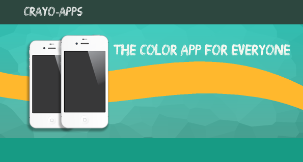
The landing page is a crucial element in regards to web design. Its effectiveness can translate to increased conversions, increased profits and sales or a failing business. Most times your website visitors will see your landing page first so it is important to make a good impression. While you may know that the landing page’s main goal is to get the visitor to take action, whether it is downloading an app or buying a product, it doesn’t mean you know how to design one. You can learn more about the Anatomy of an Effective Landing Page.
In today’s tutorial you will learn how to design your own mockup landing page in Photoshop. This will allow you to set up elements in a desirable manner and see what works best before you begin the actual website building, so let’s get started.
Resources That You Need
iPhone 4s Vector
Candy Blur Wallpaper
Web Icons
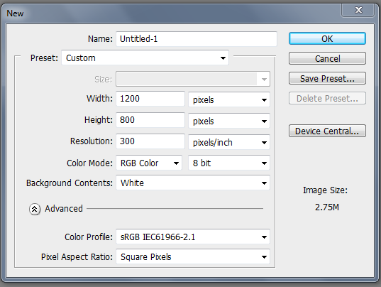
Step 1 New Canvas
Before we begin working on our design we need to first create a new document. Go to File > New or either press Ctrl + N and give your canvas the dimensions of 1200px x 800px and press OK.
Step 2 Fill Background
Create a new layer to add your background color. Change your foreground color to #179b84 and fill in your empty layer.

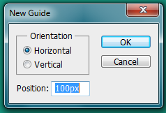
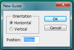
Step 3 Guidelines
We need to create some guidelines in order to mark here our content will go. To create your guidelines you need to go to View > New Guide. Follow the images below to get your guidelines set up.
For the header:
For the content:
For the footer:

Here is what your final image should look like

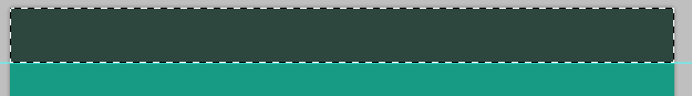
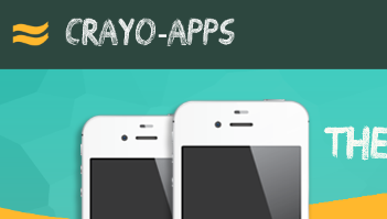
Step 4 Header
Since we now have an idea where our elements are going to go thanks to our guidelines we can now block out our header. Create a new layer and change your foreground color to #2d473f. Use the marquee tool to fill in the top portion of your canvas where your header should go.
Step 5 Footer
Next create another layer, this will be for your footer. Now using the same color in step 4 use the Rectangular Marquee Tool to select the footer section and fill it in.
![]()
Step 6 Main Content Wallpaper
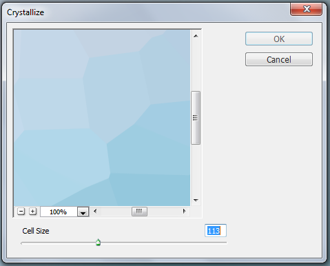
We will be using an image in the largest section of our design. You will need to open the wallpaper image first.

Once it is open go to Filter> Pixelate > Crystallize and make the cell size 113 then press OK.
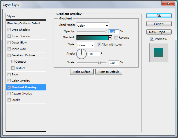
Making sure your foreground color is #2d473f and your background color is #179b84 go to the Blending Options menu. Check the Gradient Overlay box and change the settings to match the ones in the image below.
When you have your filters rendered out, copy and paste the image into the main content section of your landing page and lower the opacity to 50%.

Step 7 iPhone
Open up the iPhone 4s vector and paste it to your canvas. You will notice that it is large so you will need to scale it down by using the Transform Tool or Ctrl + T. Move the iPhone towards the left side of the screen in the main content box.

Duplicate the iPhone and resize it slightly smaller and move it behind the original iPhone layer.

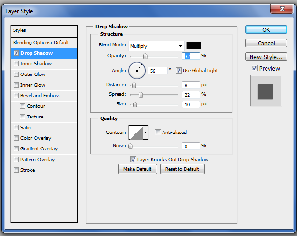
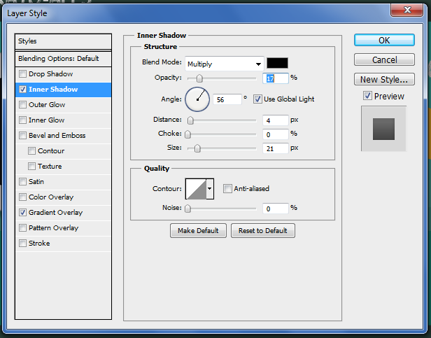
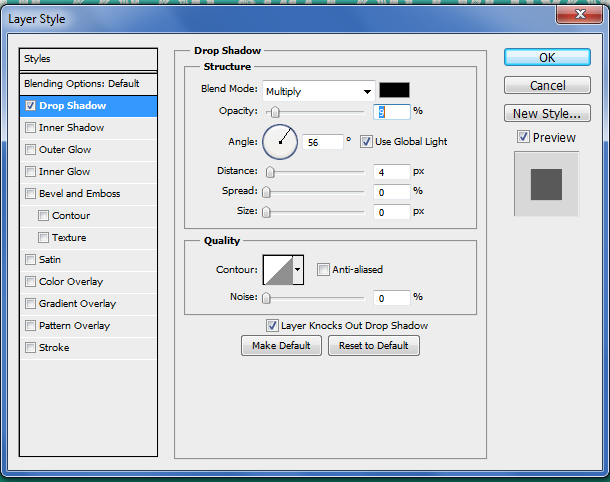
Add a drop shadow to both iPhones by double clicking on both layers to access the Blending Options menu and entering the correct settings as shown below once you check the Drop Shadow box.
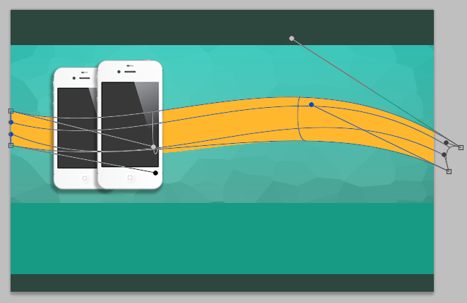
Step 8 Ribbon Banner
To begin on our banner we need to first create a new layer underneath our two iPhones. Next use the Rectangular Marquee Tool to create a long skinny banner in the middle of the main content box. Fill it in with #ffb72d.

Step 9 Warp Ribbon
We want to add some bend to our ribbon so we need to warp it by going to Edit > Transform > Warp. Manipulate the points so you have something that looks like this. Press Enter for effects to take place.
Step 10 Header Title
Our header needs to be filled in so we are going to do that now. With your desired font and color enter in the title and slogan line in the header and main content area. In this case I will be using the typeface Drawing Guides and the color #ffffff.
Step 11 Logo
You can add a logo to your landing page if you want to. For this design I simply duplicated my yellow banner and scaled it down to create the Crayo-Apps logo.
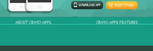
Step 12 Buttons
Successful landing pages have call to action buttons or CTAs so we are going to make some. With the Rounded Rectangle Tool we are going to create two buttons under the ribbon in our content box. Make sure the radius is at 20px and one button is #ffb82d and the other one is #2d473f.

Step 13 Blending Options
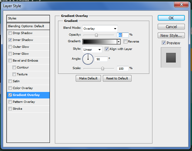
To make the buttons stand out we are going to add effects to them. Open up the Blending Options menu for one of the buttons by either double clicking on it or by right clicking on it. Check the boxes for Gradient Overlay and Inner Shadow. Change the settings so that they match the images below.
When you are finished, copy the layer style and paste it on to the other button.

Step 14 Web Icons
Other than text we want to add icons to our buttons. To do this you need to first download the web icons PSD file and then open it up. We will be using the ‘trolley’ icon and the ‘phone’ icon. Place these icons on the left side of your button.

Remove the layer style so that you icons appear flat instead of 3D.

Step 15 Button Text
Using the same typeface you used for your header use it to fill in your buttons. In this case I typed “Download App” and “Visit Store”.

To give the buttons some pop I added in a drop shadow.
Step 16 Text Content
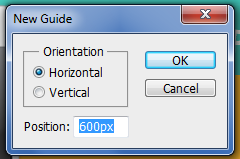
We need to now put some text in our smaller content box but first we need a guideline to make sure that everything is even. Go to View > New Guide and then check the Horizontal option and make the position 600px.
Once more using the same text add in your desired titles and space them evenly apart. Make sure that they are sitting on the guideline.
Step 17 Finish
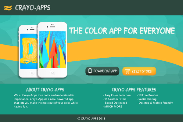
To finish up your landing page you will need to fill in the rest of the important information such as app features and a little about the company or app. You will also need to add images to your iPhone vectors so they aren’t blank. You can use whatever images you want. In this case I used images from previous tutorials and other graphic design work that I have done. Once all the details are added you are done with your design.
Download PSD File
Frequently Asked Questions (FAQs) about Designing a Landing Page Mockup in Photoshop
What is the ideal canvas size for designing a landing page in Photoshop?
The ideal canvas size for designing a landing page in Photoshop depends on the design requirements and the target audience’s screen resolution. However, a common practice is to start with a canvas width of 1366 pixels, which is a standard width for many desktop screens. The height can be flexible, but it’s good to start with 768 pixels. Remember, it’s essential to design responsively, so your landing page looks good on all devices.
How can I make my landing page design more engaging?
To make your landing page design more engaging, focus on creating a clean and intuitive layout. Use high-quality images and compelling headlines. Incorporate colors that align with your brand identity. Also, consider using interactive elements like buttons, forms, or sliders to encourage user interaction.
How can I use layers effectively in Photoshop while designing a landing page?
Layers are a powerful feature in Photoshop that allows you to manage different elements of your design separately. You can use layers to separate different sections of your landing page, like the header, body, and footer. This way, you can easily modify each section without affecting the others. Also, remember to name your layers logically to keep your work organized.
How can I optimize my landing page design for mobile devices?
To optimize your landing page design for mobile devices, you need to consider factors like screen size, touch controls, and load times. Start by designing a responsive layout that adapts to different screen sizes. Make sure all buttons and links are large enough to be easily tapped on a touchscreen. Also, optimize your images to ensure they load quickly on mobile networks.
How can I use typography effectively in my landing page design?
Typography plays a crucial role in conveying your message and establishing your brand identity. Choose a font that aligns with your brand personality and is easy to read. Limit the number of different fonts you use to maintain a consistent look. Also, pay attention to factors like font size, line spacing, and text alignment to ensure your text is legible and aesthetically pleasing.
How can I use color effectively in my landing page design?
Color can greatly influence the mood and perception of your landing page. Use colors that align with your brand identity and complement each other well. Consider using a color scheme tool to help you choose a harmonious color palette. Also, use color strategically to highlight important elements like call-to-action buttons.
How can I add interactivity to my landing page design in Photoshop?
While Photoshop is primarily a static design tool, you can still plan for interactivity in your design. For example, you can design different states for buttons (normal, hover, clicked), or create mockups of dropdown menus or sliders. However, the actual interactivity will need to be implemented in the coding phase.
How can I ensure my landing page design is user-friendly?
To ensure your landing page design is user-friendly, focus on creating a clear and intuitive layout. Make sure all important information and call-to-action buttons are prominently placed and easy to find. Also, consider the user’s journey through your page and aim to make it as smooth and straightforward as possible.
How can I use Photoshop to create a responsive landing page design?
While Photoshop doesn’t directly support responsive design, you can still use it to plan your responsive layouts. Start by designing your page for a standard desktop screen size. Then, create additional mockups for other key screen sizes (like tablet and mobile), adjusting your layout as needed to ensure it looks good on all devices.
How can I use Photoshop to optimize my landing page images?
Photoshop offers various tools to optimize your images for the web. You can use the “Save for Web” feature to adjust the quality and file size of your images. Also, consider using Photoshop’s image compression features to reduce file size without significantly impacting image quality.

