Fifteen Web Sites Using Horizontal Scrolling
 Having a horizontal scroll bar on a web site is generally considered to be a major no-no. Usability expert Jacob Nielson had the following guidelines regarding scrollbars:
- Offer a scrollbar if an area has scrolling content. Don’t rely on auto-scrolling or on dragging, which people might not notice.
- Hide scrollbars if all content is visible. If people see a scrollbar, they assume there’s additional content and will be frustrated if they can’t scroll.
- Comply with GUI standards and use scrollbars that look like scrollbars.
- Avoid horizontal scrolling on Web pages and minimize it elsewhere.
- Display all important information above the fold. Users often decide whether to stay or leave based on what they can see without scrolling.
“Avoid horizontal scrolling.” Yes, certainly it’s important that there is no accidental horizontal scrolling. That seems like an obvious one, but for some designers, the decision to use horizontal scrolling is as much a part of the design as choosing the colors. Looking at a web site with horizontal scrolling is a little like opening up a multi-fold brochure, in that it can provide little surprises are you drag that page along.
As you’ll see from the examples I’ve picked out below, many of these sites are for creative professions. Web and graphic designers, photographers and graffiti artists, and perhaps that’s where this style is most suitable? Here are fifteen web sites successfully using horizontal scrolling.
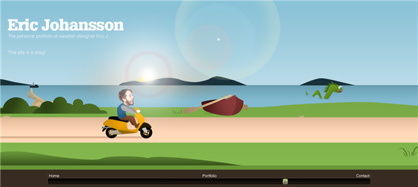
Eric Johannson has the appropriate tagline “This site is a drag.”
Stéphane Bucco’s portfolio

Banksy

Ricardo Arce

Beca Voices

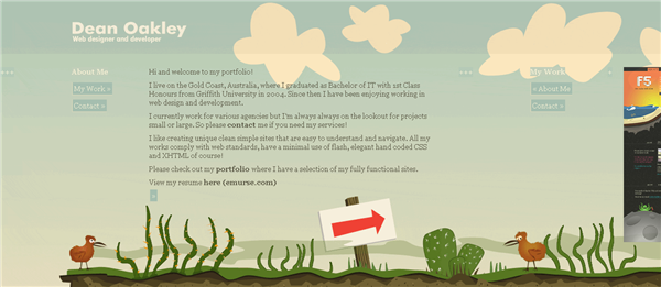
Dean Oakley
Frank Giacobbe

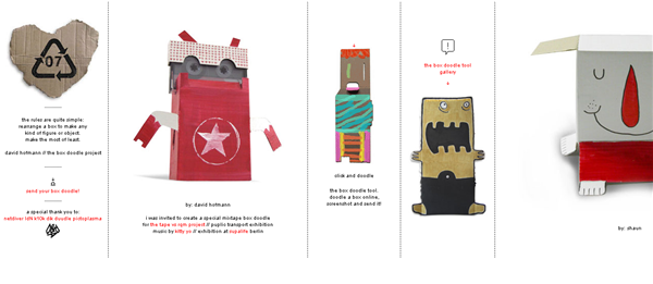
Box Doodle
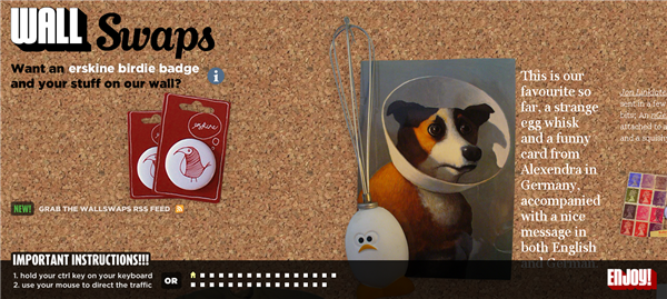
Wallswaps
Pixel Lounge
![]()
Paolo Boccardi

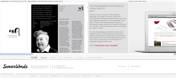
Swear Words
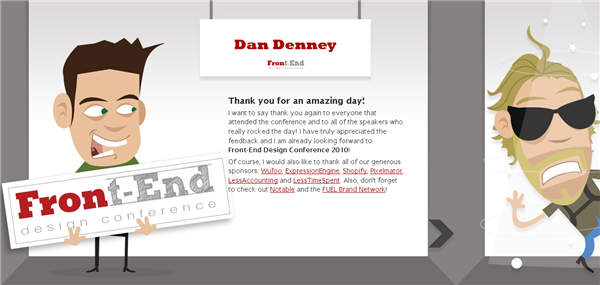
Front End Design Conference – The conference is over now, but the site has information and downloads on what took place and still uses horizontal scrolling.
Over on CSS Tricks, Chris Coyier has a nice tutorial explaining how to create a horizontal scrolling web site with CSS.
What do you think of horizontal scrolling? Is it best saved for creative sites, or will we be seeing more of this in mainstream sites?
Frequently Asked Questions about Horizontal Scrolling Websites
What are the benefits of using horizontal scrolling on a website?
Horizontal scrolling offers a unique and dynamic user experience that can set a website apart from the traditional vertical scrolling sites. It allows for a more immersive storytelling experience, as users navigate through content in a linear, left-to-right progression. This can be particularly effective for portfolio websites, where each piece of work can be presented individually, or for timeline-based content. Additionally, horizontal scrolling can be a great way to showcase panoramic or wide-screen images, and it can also be used to create interesting parallax effects.
How can I implement horizontal scrolling on my website?
There are several ways to implement horizontal scrolling on a website. One common method is to use CSS and JavaScript. CSS can be used to create a container for the horizontally scrolling content, and JavaScript can be used to control the scrolling behavior. There are also many libraries and plugins available that can simplify the process, such as ScrollMagic or fullPage.js.
Are there any drawbacks to using horizontal scrolling?
While horizontal scrolling can offer a unique user experience, it also has some potential drawbacks. For one, it can be disorienting for users who are accustomed to vertical scrolling. It can also be more difficult to navigate on mobile devices, where vertical scrolling is more intuitive. Additionally, horizontal scrolling can make it more difficult for search engines to crawl and index your site, which could potentially impact your site’s SEO.
How can I make my horizontal scrolling website more user-friendly?
There are several strategies you can use to make your horizontal scrolling website more user-friendly. One is to provide clear navigation cues, such as arrows or scroll bars, to indicate that your site scrolls horizontally. You can also use animation or parallax effects to guide users through your content. Additionally, it’s important to ensure that your site is responsive and works well on both desktop and mobile devices.
Can I combine horizontal and vertical scrolling on my website?
Yes, it’s possible to combine horizontal and vertical scrolling on a website. This can be done using CSS and JavaScript, or with the help of a library or plugin. However, it’s important to be mindful of the user experience when combining scrolling directions. Too much movement can be disorienting for users, so it’s important to use this technique sparingly and thoughtfully.
How can I optimize my horizontal scrolling website for SEO?
Optimizing a horizontal scrolling website for SEO can be a bit more challenging than with a traditional vertical scrolling site, but it’s certainly possible. One strategy is to ensure that all of your content is accessible to search engines. This means avoiding the use of images for text, and making sure that all of your content is included in the HTML of your page. You can also use meta tags and structured data to help search engines understand your content.
What are some examples of websites that use horizontal scrolling effectively?
There are many websites that use horizontal scrolling effectively. Some examples include the portfolio website of designer Timo Becker, the interactive storytelling site for the film “Life of Pi”, and the product showcase site for the Sony Playstation 4. These sites use horizontal scrolling to create a unique and engaging user experience, while also showcasing their content in a visually appealing way.
Can horizontal scrolling be used on e-commerce websites?
Yes, horizontal scrolling can be used effectively on e-commerce websites. It can be a great way to showcase products in a carousel or slider format, allowing users to easily browse through a selection of products without having to navigate to a new page. However, it’s important to ensure that the scrolling functionality is intuitive and easy to use, and that product information is still easily accessible.
How can I test the usability of my horizontal scrolling website?
There are several ways to test the usability of your horizontal scrolling website. One method is to conduct user testing, where you observe users interacting with your site and note any difficulties or frustrations they encounter. You can also use analytics tools to track how users navigate through your site, and use this data to identify any areas that may need improvement.
Are there any accessibility considerations for horizontal scrolling websites?
Yes, there are several accessibility considerations for horizontal scrolling websites. For one, it’s important to ensure that your site can be navigated using a keyboard, as some users may not be able to use a mouse or touch screen. You should also provide alternative navigation options for users who may have difficulty with horizontal scrolling, such as a traditional vertical scroll bar or pagination. Additionally, it’s important to ensure that all of your content is accessible to screen readers and other assistive technologies.
Jennifer Farley is a designer, illustrator and design instructor based in Ireland. She writes about design and illustration on her blog at Laughing Lion Design.
