Having Anything that is Flashing or Blinking
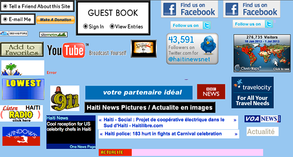
Sites with these effects are going away, but believe it or not, I still come across sites with these antiquated effects every now and then. Don’t place banners on your sites that flash or blink, as they are distracting from the content and a part of a disadvantageous strategy. If someone wants to buy something on your site, they will. Strategic placement is much better than utter annoyance any day. Also, don’t set your headers or anything else to blink or pulsate. They used to use this a lot in the 90’s and now it just looks dated… not that it ever looks spectacular.
Generic Colors
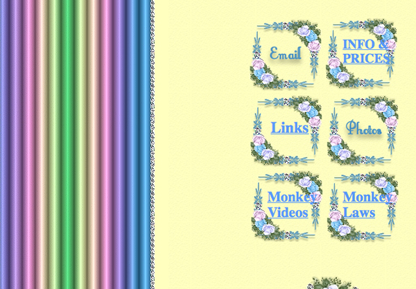
Using the default colors for your site is a quick way to make your site look dated. Having your links in the generic blue, and having them underlined is the sign of a less-than-dilligent designer who’s happy with the browser defaults. Most sites now use colors for their links that match the rest of the site. They are usually styled with a hover state using CSS, so visitors know that a section of text is actually a link. Also, when you use a lot of fluorescent colors that don’t go well together, that can make your site look like the dated work of an inattentive designer. Colors that are too bright hurt the eyes, so be sure to use colors like that sparingly, if at all.
Generic Typefaces
In recent years, @fontface and Google Web Fonts has made it easy to integrate custom typefaces in your websites. No longer are you stuck with Arial, Helvetica, Verdana and the other “web safe” typefaces. You can integrate beautiful, bold typography within your site to give it a custom look and personality of its own. It’s easy to do, and your sites will look much more up-to-date and professional.Using Tables for Your Design
The days of using tables and slicing images into a grid are long gone. Now, you can and should construct all of your layout ideas via CSS. Having a couple of PNG files mixed into a CSS layout is okay, but you no longer have to slice up images to make a beautiful website. You can add dimension to your websites with the text shadow and box shadow CSS properties. Also, there are tons of grid CSS layouts and frameworks that you can use to structure your site properly.Using Images Where You Could Use CSS
Since CSS has become the predominate method for designing sites, this have almost disappeared from web design altogether. One of the most common uses for using images where you could use CSS was for adding custom typography to a site that just wasn’t available at the time. Now, with Google Web Fonts and @fontface integration, you can find almost any style of typeface that will match what you are looking for. Combine this with transitions, CSS gradients and other effects, and the need for a lot of imagery has gone away.
Not Taking Advantage of CSS at All
Using CSS will make your site much faster than using images. You can achieve so much in the way of style and structure that you never could before. You no longer have to struggle with tables or slicing layouts. When a site doesn’t take advantage of CSS, it’s apparent even to a visitor who doesn’t know their padding from their margin. You just can’t get the same speed, structure, and user-friendliness from a sliced design as you can with CSS. You end up seeing each slice load, and when one gets hung up, then it leaves an ugly hole in your design. Using CSS will cut your load time in a fraction of what it would be with a sliced PNG layout, and it can offer numerous other benefits in the realms of responsiveness, search engine placement, cross-browser compatibility, and more.Not Using Transparency in Logos & Images That Require It
This is one of the quickest ways to look dated and unprofessional. How many times have you been to a site where the background is a certain color, and the logo looks like it has just been haphazardly pasted on there? Don’t leave a white background behind your logos. Use Photoshop to create a GIF or PNG file with a transparent background. The background of the site will show through and will look much more natural than if you just use a flat JPEG.Conclusion
Web design is always in a state of progression, and it’s important to stay up-to-date on the latest practices so your website doesn’t look dated. If your website has any of the qualities shown above, you might want to consider redesigning it or at least upgrading it. What do you think is something that makes a website look dated? Share your thoughts in the comments section below.Frequently Asked Questions about Website Design
What are the key elements that make a website look modern and professional?
A modern and professional website is characterized by several key elements. First, it should have a clean and intuitive design that makes it easy for users to navigate. This includes a clear menu structure, logical page layout, and consistent use of colors and fonts. Second, it should be mobile-friendly, as a significant portion of web traffic now comes from mobile devices. Third, it should load quickly, as slow loading times can frustrate users and lead to higher bounce rates. Lastly, it should have high-quality, relevant content that provides value to users and helps to improve search engine rankings.
How can I ensure my website doesn’t look dated?
To ensure your website doesn’t look dated, it’s important to keep up with current design trends. This doesn’t mean you have to redesign your website every year, but it does mean you should regularly review and update your design to ensure it remains fresh and relevant. This could involve updating your color scheme, changing your fonts, or introducing new design elements. Additionally, make sure your website is responsive and optimized for mobile devices, as this is now a standard expectation for modern websites.
What are some common mistakes that can make a website look unprofessional?
Some common mistakes that can make a website look unprofessional include poor use of color, inconsistent fonts, cluttered layout, slow loading times, and outdated or irrelevant content. Additionally, a lack of mobile optimization can make a website look out of touch, as more and more people are now browsing the web on their mobile devices. Lastly, broken links or errors on your website can also create a poor impression and make your site look unprofessional.
How important is the use of images and visuals in website design?
The use of images and visuals in website design is extremely important. They not only make your website more attractive and engaging, but they can also help to convey your message more effectively. High-quality, relevant images can help to enhance your content and make it more digestible for users. However, it’s important to ensure that your images are optimized for the web, as large, unoptimized images can slow down your website and negatively impact your user experience.
How can I make my website more user-friendly?
Making your website more user-friendly involves focusing on the user experience. This means ensuring your website is easy to navigate, with a clear menu structure and logical page layout. It also means making sure your website loads quickly, as slow loading times can frustrate users and lead to higher bounce rates. Additionally, your website should be mobile-friendly, as a significant portion of web traffic now comes from mobile devices. Lastly, your content should be high-quality, relevant, and easy to read, providing value to users and helping to improve your search engine rankings.
What role does color play in website design?
Color plays a crucial role in website design. It can help to create a certain mood or atmosphere, convey your brand identity, and guide users’ attention to certain elements on the page. However, it’s important to use color wisely. Too many different colors can make your website look cluttered and confusing, while too little color can make it look bland and uninteresting. It’s also important to consider color contrast, as this can affect the readability of your text.
How can I improve the loading speed of my website?
Improving the loading speed of your website can involve several strategies. First, you should optimize your images for the web, as large, unoptimized images can slow down your website. Second, you should minimize the use of heavy scripts and plugins, as these can also impact your loading speed. Third, you should use a reliable hosting provider that can handle the amount of traffic your website receives. Lastly, you can use tools like Google’s PageSpeed Insights to identify any specific issues that may be slowing down your website.
How important is mobile optimization in website design?
Mobile optimization is extremely important in website design. With more and more people browsing the web on their mobile devices, it’s crucial that your website is designed to look and function well on smaller screens. This means ensuring your layout is responsive, your text is readable, and your buttons and links are easy to click on. Additionally, mobile optimization can also help to improve your search engine rankings, as Google now uses mobile-friendliness as a ranking factor.
How can I make my website more engaging for users?
Making your website more engaging for users can involve several strategies. First, you should ensure your content is high-quality, relevant, and provides value to users. This could involve incorporating engaging visuals, interactive elements, or multimedia content. Second, you should make your website easy to navigate, with a clear menu structure and logical page layout. Lastly, you should regularly update your website with fresh content, as this can help to keep users coming back for more.
How can I improve the search engine ranking of my website?
Improving the search engine ranking of your website involves a combination of on-page and off-page SEO strategies. On-page strategies include optimizing your content for relevant keywords, using meta tags, and ensuring your website is mobile-friendly. Off-page strategies include building high-quality backlinks, promoting your content on social media, and getting your website listed in relevant directories. Additionally, it’s important to regularly update your website with fresh, relevant content, as this can help to improve your search engine rankings.
James George is a professional web developer and graphic designer. James is an expert in design, and a professional web developer, with a special interest in WordPress. Founder of Design Crawl, James has been a professional designer since 2005.
