The Art & Science of Great Website Color Selection

Key Takeaways
- The color selection process for a website is not arbitrary and goes beyond personal preference. It involves understanding the psychological and cultural associations of colors, taking into account the target audience and the brand’s personality.
- Rather than choosing absolute colors, it is advisable to select color palettes based on relative associations between colors. Online tools can help find interesting analogous and complementary variations once the baseline color is chosen.
- Colors can be used strategically in website design to guide user attention and highlight important elements. However, it’s crucial to consider accessibility, ensuring sufficient contrast for readability and not solely relying on color to convey information.

Hard-Wired Colors

 It’s worth mentioning that some food logos, like Oreos, are branded with blue. This may seem at odds with our attraction to food.
After all, there is very little blue food out there, and it has even been shown that blue is a hunger-suppressor. (Perhaps blue is associated with food that has turned bad.)
But consistent branding is powerful, and in the case of Oreos, it can survive the natural aversion to blue food.
So humans are pre-wired to associate color with food, and insofar as our survival instinct is concerned, color plays no other major role. For developers struggling with the color selection for non food-related websites, this is unfortunate.
But we are not completely without hope, because color still plays a role in our modern lives, thanks to predispositions that are downloaded into our brains by societal influences.
It’s worth mentioning that some food logos, like Oreos, are branded with blue. This may seem at odds with our attraction to food.
After all, there is very little blue food out there, and it has even been shown that blue is a hunger-suppressor. (Perhaps blue is associated with food that has turned bad.)
But consistent branding is powerful, and in the case of Oreos, it can survive the natural aversion to blue food.
So humans are pre-wired to associate color with food, and insofar as our survival instinct is concerned, color plays no other major role. For developers struggling with the color selection for non food-related websites, this is unfortunate.
But we are not completely without hope, because color still plays a role in our modern lives, thanks to predispositions that are downloaded into our brains by societal influences.
Cultural Predispositions
It turns out that certain “rules” regarding colors and the associated emotions are based on personal preferences that are usually (forgive the pun) colored by cultural influences. Color selection for large web-based audiences therefore becomes a study of common human agreements on the roles certain colors play. And while these roles may seem obvious, from a historical perspective they are in constant flux.
To that end, the diagram below, courtesy the Logo Company, conveys some of the more popular color associations of today, along with company logos built around them:
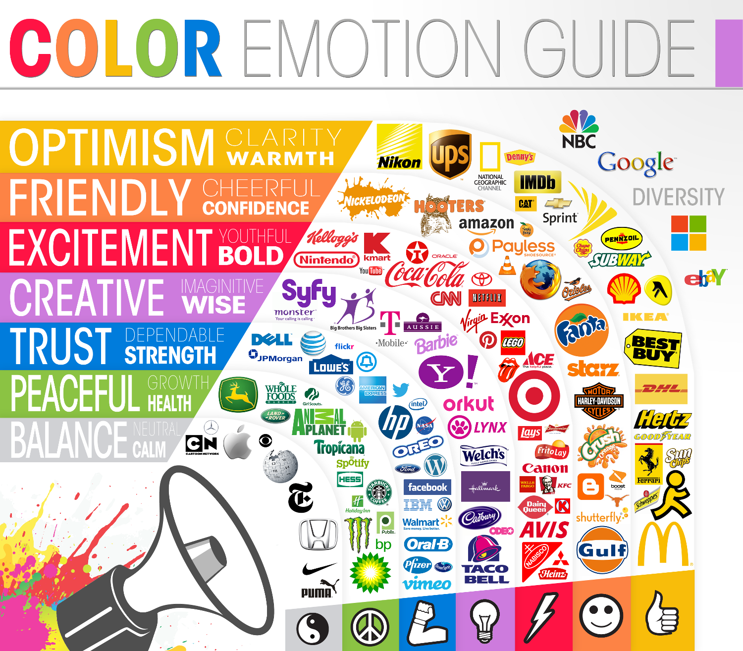
More specifically, contemporary western culture makes the current associations:
- Red – Love, Excitement, Lust, Hunger, Bold, Youthful, Urgency, Danger, Romance, Warmth, Quickness, Negative Issues
- Black – Stability, Credibility, Strength, Power, Precision, Professional, Accuracy, Sophistication, Grief, Fear, Submissiveness
- Brown – Nurturing, Historical, Safety, Conservative, Reliable, Ruggedness
- Violet/Purple – Authority, Royalty, Spirituality, Mystery, Magical, Religious, Sensuality, Love, Wisdom, Creativeness, Imaginative, Springtime
- Yellow – Energy, Clarity, Warmth, Innovation, Drive, Dynamic, Competence, Happiness, Optimism
- Green – Organic, Natural, Youth, Education, Adventure, Ecological, Calmness, Healthy, Peaceful, Summer, Envy
- Orange – Creativity, Dynamic, Energetic, Expressive, Innocence, Enthusiasm, Autumn, Introspection
- Blue – Credibility, Calmness, Trust, Dependable, Cleanliness, Medicine, Power, Judicial, Professional, Masculine, Competency, Quality, Big Company, Winter
- White – Happiness, Purity, Sincerity, Cleanliness, Clinical, Medicinal, Balanced, Spacious, Simple, Easy, Fresh, Winter
Keep in mind that the above associations represent a cultural snapshot in time as well as geography. As websites become increasingly global, the cultural differences on color may converge; however, they’ll continue to change over time, so website designers should be aware of the latest societal influences and be prepared to refactor their website colors accordingly.
Also keep in mind that absolute colors attract absolute mindsets, and this gives rise to some differences in the genders. Studies have shown that men are tuned into absolute colors and are fairly blind – or simply don’t care about – slight variations in hue. (An interesting infographic on this topic can be found on the KISSmetrics blog.) For example, men are likely to refer to “magenta” and “salmon” as “pink.” Contrarily, women are more tuned into softer tones; that is, colors with subtle variations in hues. One could therefore argue that while absolute colors have cultural and temporal significance, it’s not wise to choose an absolute color for your website; rather, use the absolute color as a basis for choosing colors that are related but not exact.
Color Relations
With the goal of avoiding absolute colors for our websites, we therefore need to find palettes based on the relative associations between colors. This turns out to be a fairly simple exercise, because colors do exhibit specific relationships with each other.
For example, we may decide to use green to help emphasize educational products on our website. To avoid absolutes and yet pick a palette of colors that complement green, we may choose to use what’s known as adjacent, or similar, colors. The calculation of adjacent colors is simplified by dozens of online color tools, such as this one from the Colors on the Web website by Donald Johansson.
The colors below were chosen by first selecting the absolute green color (#00FF00), then clicking on the analogous color #65FF65. (In this case, the analogous color was actually a different shade; that is, it did not change the hue, it just lightened the baseline color a bit.)
The result was two “analogous” generations away from green, which produced two interesting hue variations, #64FF98 and #98FF64. See the diagram below.
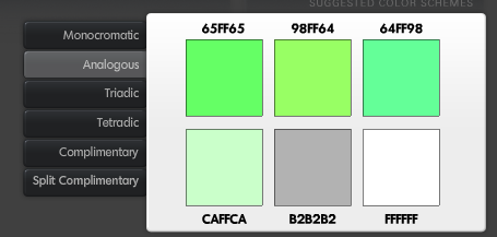
In our green example, we could continue to experiment with further generations of analogous colors to get just the right hues and shades of green for our website.
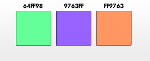
Note that you can – and should – embrace complements in your color relations. These complements are used to offset areas where you want to grab the viewer’s attention. For example, the proverbial “website conversion” involves coaxing the user to take some desired action, such as downloading a white paper or clicking on a “Buy Now” button. The problem is that the human brain is known for its ability to quickly adapt to baseline colors (a phenomenon known as “color constancy”) and requires something out of the ordinary to get its attention. You would therefore implement a conversion button or link that uses a complementary color. There are several ways to get to these complementary colors; perhaps the most widely used is known as the “triadic” relationship. You find the triadic relationship by creating an equilateral triangle on a color wheel, where you set one of the vertices of the triangle at your baseline color, and the other two vertices will point to the complementary colors.
For example, if we were to select the #64FF98 color from the above diagram as the baseline color for our site, the triadic colors could be calculated from the Colors on the Web website as #9763FF and #FF9763. (Personally, I don’t like these triadic colors, so I would probably go back and select a slightly different baseline color.)
You can also select a singular complementary color, which is on the opposite side of the color wheel, as well as other variations of complementary colors. The great thing about these online color calculators is that there are so many variations, many of which will surprise and delight you.
The bottom line is that once you select a baseline color, it’s fairly easy to find good analogous and complementary variations.
Summary
Your website color selection process may seem arbitrary. Indeed, humans are not pre-wired to associate color with anything but sources of food. Individual color preferences are mainly due to cultural influences, and these influences change over time. It is therefore necessary to understand your target culture when selecting the baseline color for your website. After having made that selection, you can use some free online tools to help find some interesting variations. You can also use these tools to find complementary colors that will help attract attention to important areas on your site.
Frequently Asked Questions on Website Color Selection
What is the significance of color in website design?
Color plays a crucial role in website design as it can significantly influence the perception and behavior of the site’s visitors. It can evoke emotions, convey messages, and even affect the readability of the content. Therefore, choosing the right color scheme is essential to create a visually appealing and effective website.
How can I choose the right color scheme for my website?
Choosing the right color scheme for your website involves understanding your brand, your target audience, and the message you want to convey. You should consider the psychological effects of colors and how they align with your brand’s personality. Also, ensure that the colors you choose enhance readability and usability of your site.
What are the common color schemes used in website design?
There are several common color schemes used in website design, including monochromatic, analogous, complementary, and triadic. Monochromatic schemes use different shades of a single color, while analogous schemes use colors that are next to each other on the color wheel. Complementary schemes use colors that are opposite each other on the color wheel, and triadic schemes use three colors that are evenly spaced around the color wheel.
How does color psychology affect website design?
Color psychology is the study of how colors affect human behavior and decision-making. In website design, understanding color psychology can help you choose colors that evoke the desired emotions and reactions from your site’s visitors. For example, red is often associated with urgency and excitement, while blue is seen as trustworthy and calming.
What is the role of contrast in website design?
Contrast in website design is used to differentiate elements on a page and improve readability. It can be achieved through the use of different colors, sizes, shapes, and textures. High contrast can draw attention to important elements, while low contrast can create a more harmonious and balanced design.
How can I test the effectiveness of my website’s color scheme?
You can test the effectiveness of your website’s color scheme through user testing and analytics. User testing involves getting feedback from actual users about their experience and perception of your site. Analytics, on the other hand, can provide data on user behavior, such as bounce rate and time spent on the site, which can indicate whether your color scheme is effective or not.
Can I use more than three colors in my website design?
While it’s possible to use more than three colors in your website design, it’s generally recommended to keep your color scheme simple to avoid overwhelming your visitors. If you choose to use more colors, make sure they are well-balanced and harmonious.
What is the impact of color on website accessibility?
Color can significantly impact website accessibility. For example, using colors with sufficient contrast can improve readability for people with visual impairments. Also, relying solely on color to convey information can be problematic for color-blind users. Therefore, it’s important to consider accessibility when choosing your website’s color scheme.
How can I use color to guide user attention on my website?
You can use color to guide user attention on your website by using contrasting colors for important elements, such as call-to-action buttons or key information. You can also use color to create visual hierarchy, with the most important elements in the most prominent colors.
What are some common mistakes to avoid when choosing colors for my website?
Some common mistakes to avoid when choosing colors for your website include using too many colors, using colors that clash, not considering color psychology, and neglecting accessibility. It’s also important to avoid relying solely on personal preference and instead make informed decisions based on your brand, audience, and objectives.
Dan Schaefer is a web designer living in Ventura County, California. He’s been a part of several startups, doing everything from engineering to sales to marketing.