

Trends change and design fads come and go, but visual design and its underlying principles haven’t really changed much in the last 50 years. Whether you look at the latest trends in print design, the ratio for margins, web design, grid structures, or any other aspects of design, they are all based on age-old principles like the rule of thirds and the golden ratio. Let’s consider a few examples of rapidly-evolving design technology that still somehow sticks to its roots.
Key Takeaways
- Despite changes in trends and technology, the fundamental principles of visual design have remained consistent over the last 50 years. These principles include the rule of thirds, the golden ratio, and the methods for determining proper book margins.
- Hick’s Law, which says the time taken to make a selection from a menu is determined by how the information is organized, is still relevant in web design. A well-structured menu can improve user experience by making choices easier and less overwhelming.
- Fitt’s Law, stating that navigation choices are influenced by the size of the menu, is another principle still used in modern web design. A larger menu is typically more visually attractive and likely to be navigated to, up to a certain limit.
- The Golden Ratio, a principle found in nature and art that determines the most aesthetically pleasing ratio between areas in a composition, is still employed in modern web design. It can be used to determine the width of a website’s content and sidebar for an aesthetically pleasing design.
Book Margins
Books and reading technology have undergone tremendous changes in the past few years, but the way that we determine proper book margins hasn’t changed at all. It doesn’t matter if the media is meant for print purposes or if the book will end up being an ebook; setting up proper margin space is essential for any book design. You have to leave enough space for an aside, captions, page numbers, etc.
Books look their best when each page item is separated by an adequate amount of negative space. Below is an example of how page margins are determined. You have two pages side by side, and from a combination of different angles, you can use the following method to determine proper margins for your book layout.
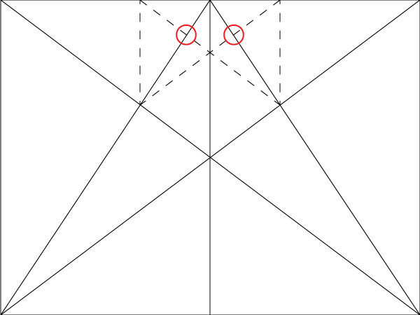
Start at the upper inside corner of each page, and create lines from that point to the outside bottom corners. Then, create two lines that span the entire layout — connecting the bottom outside corners to the upper corners on the opposite page. Look below for clarity.

Where the two lines intersect, create vertical lines from the the points in which the lines intersect.

Next, create diagonal lines from the top and bottom of each newly-drawn line. Where they intersect the original diagonal lines (the red circles), that is the beginning point of your content box where your paragraphs should go.
From there, draw out the box from these beginning points to where the right corners intersect the outside diagonal lines, as in the diagram below illustrates.
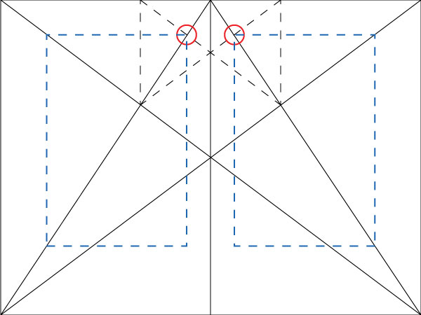
This is the same method that has been used for ages. It is meant to create the most visually pleasing arrangement of type on a page.
The Rule of Thirds
The rule of thirds has been around for nearly two centuries, possibly even longer. It was first recorded in the late 1790s and has been a useful rule for composition that we still use heavily today. The rules of thirds is simple, and it’s an easy way to determine the focal point of an image. You can apply the rule of thirds to any shape or orientation of an image or design.

To implement the rule of thirds, select your image and divide it equally into thirds vertically and horizontally. You should have nine equal sections of your image. Where the vertical and horizontal lines intersect are called the “focal points” of your image.
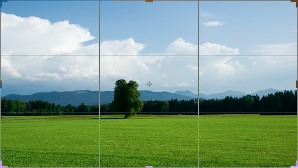
Then, simply crop the image so that the main subject falls one one of the four focal points.

Hick’s Law and Web Design
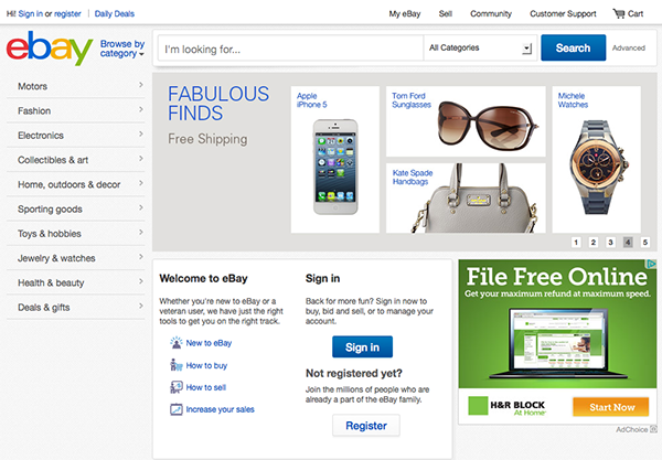
To sum up Hick’s Law in layman’s terms, the time it takes for you to make a selection from a menu of items is determined by how that information is organized or offered. If there is no rhyme or reason to the way that a menu is structured, it can make it more difficult to make a choice. In the example below, there is a huge amount of information to take in and process. Think about the first time that you came to this site to look for something. Were you overwhelmed by the amount of options?

Consider the eBay site below and the information offered. You can find just about anything on eBay, and they make it very easy to do so with less information and more organization. There is a lot of careful reasoning behind the layout of their site. Notice the large search bar in the middle of the page; you can simply type in what you are looking for. If you prefer browsing through a menu, their items are broken down via category on the left side. This menu is more prominent than the links across the top right portion of the site.
Imagine if eBay tried to offer every kind of available item on their homepage. Hicks law is at work here, because it is easier to process a more simplified refined layout than it is to try to process a lot of little menus clustered together. This principle is especially important when designing landing pages, where more information can often lead to lower effectiveness.
Fitt’s Law and Web Design
Fitt’s law basically states that the choice of where you navigate is based upon the size of the menu. The larger a menu is, the more visually attractive it is… to an extent. You will most likely instinctively navigate to the largest menu on a page, as long as it isn’t too large. After a certain point, a menu can become too large and become less effective.
The law also covers the fact that you can’t determine exactly where the user will start their movements from, but their initial move is determined by the size of the menu on the screen. For example, on the eBay site, if you were going to buy a jacket, you would initially move your mouse towards the left menu before you even read or processed the content, because that is the main menu and the likely source of the information you’re looking for.
The Golden Ratio
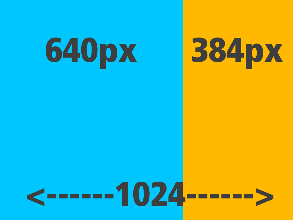
The Golden Ratio has been around for a very long time. You can find several examples in nature, such as in the structure of a seashell. You can find it in renown artworks like the Mona Lisa. The Golden Ratio determines the most aesthetically pleasing ratio between areas in a composition, and we employ it in modern web design today. Mathematically speaking, the Golden Ratio works out to be roughly 1.6.
Suppose you have a website that is going to have an overall width of 1024px. You take the total width of the website and divide it by 1.6 and you will get 640px. That will be your content area. If you subtract 640px from 1024px, you get 384px, which is the ideal width of the sidebar, according to the Golden Ratio.
Below is an example of a site whose basic structure is based on the Golden Ratio. As you can see, the golden ratio isn’t just used to determine the width of a sidebar; it can also be used to determine the width of a website’s content. The blue area below is the main content area, where the main navigation is shown, as well as the small ads at the bottom. The orange area is where the secondary parts of the website are located, such as social media icons and the store locator.

U.S. Cellular’s website is also loosely based on the Golden Ratio. Notice the placement of the phone, and how the navigation aligns with it. Notice also how you can break the ratio alignment with some elements (such as the four modules in the footer) and still have a cohesive, aesthetically pleasing design.

Conclusion
The designs of the last 50 years may have changed in style, but the underlying principles that they are based upon still remain the same. The Golden Ratio, Fitt’s and Hick’s Law, and the Rule of Thirds are all still used extensively today. They are based on mathematical proportions and are still the best guidelines to get the best visual results. New styles or designs are often based upon principles from hundreds of years ago.
Do you consult the Golden Ratio, Fitt’s Law, Hick’s Law, or the Rule of Thirds during your designing, or do you rely on modern accommodations like grid systems or templates?
Frequently Asked Questions about Design Evolution
Why hasn’t design changed significantly in the past 50 years?
Design, in essence, is about solving problems and enhancing functionality. While the tools, mediums, and aesthetics may have evolved over the past 50 years, the core principles of design remain the same. These principles, such as balance, contrast, and hierarchy, are timeless and universal. They are the foundation of good design, regardless of the era or medium.
How does Hick’s Law apply to web design?
Hick’s Law, which states that the time it takes to make a decision increases with the number and complexity of choices, is highly relevant in web design. A website with too many options can overwhelm users, leading to decision paralysis and a poor user experience. Therefore, web designers often strive to simplify interfaces and reduce the number of choices to improve usability.
What are some inventions that haven’t needed updating?
Some inventions have stood the test of time due to their simplicity and effectiveness. Examples include the wheel, the light bulb, and the paperclip. These inventions fulfill their intended function so well that any changes would not significantly improve their performance.
What is information overload in the context of web design?
Information overload refers to the difficulty a person can have understanding an issue and making decisions when they are presented with too much information. In web design, this can occur when a site is cluttered with excessive text, images, or options, making it difficult for users to find the information they need or make decisions.
What are some things that haven’t changed in the past 100 years?
Many fundamental aspects of life and society have remained relatively unchanged over the past 100 years. These include basic human needs and emotions, the importance of family and community, and the desire for knowledge and understanding. In terms of physical objects, many simple but effective inventions, such as the bicycle and the pencil, have also remained largely unchanged.
How is Hick’s Law being redefined in the digital age?
While the basic premise of Hick’s Law remains valid, its application in the digital age is being redefined. With the advent of digital technology, users are now faced with an unprecedented number of choices. However, advances in interface design and personalization algorithms are helping to manage this complexity and improve decision-making.
How has the role of the designer evolved over the past 50 years?
While the fundamental principles of design have remained constant, the role of the designer has evolved significantly. Designers today need to be versed in a wide range of skills, from traditional graphic design to user experience design, coding, and even psychology. They also need to be able to work with a variety of digital tools and platforms.
What are the key principles of good design?
The key principles of good design include balance, contrast, emphasis, movement, pattern, rhythm, and unity. These principles guide the arrangement and application of elements in a design to create a pleasing and effective composition.
How can design help to manage information overload?
Good design can help to manage information overload by organizing and presenting information in a clear and concise manner. This can involve using visual hierarchy to guide the viewer’s attention, grouping related information together, and using whitespace to reduce clutter.
What is the future of design?
The future of design is likely to be shaped by advances in technology, such as artificial intelligence, virtual reality, and 3D printing. However, the core principles of design will remain relevant. Designers will need to continue to focus on solving problems and enhancing functionality, while also adapting to new tools and mediums.

