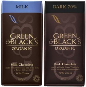
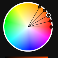
 Last week we took a look at purple, a vibrant rich color. Today, we’re talking about brown. In some ways brown is almost an opposite to purple in terms of connotations. Brown is considered to be earthy, natural, simple. It conveys feelings of dependability, wholesomeness and conservatism. On the downside it could also be considered a little dull, but that can be alleviate by combining it with brighter colors.
Brown is closely associated with wood and to a smaller extent with stone. A few years ago there was a plethora of websites with wooden backgrounds. This trend seems to be over now, but when done well, “wooden” sites were eye-catching and gave a nice textured feeling. Brown is, of course, also associated with old and aged photographs and materials and can be used to create a warm and nostalgic feeling.
Using Brown
There are many shades and tints of brown and many of their names come from nature. Light browns include sand, cream and beige, mid browns include chocolate, cocoa and dark browns include coffee and mahogany.
Using light colors with dark browns can produce a rich combination and if you think about autumn colors you’ll see nature giving a superb display of browns with reds, oranges and yellows – a ready made palette for conveying warmth.
Brown with green is earthy and brown with mint green is stylish. Yellows and oranges brighten dark brown while still looking “natural.” If you want to avoid using black, dark brown can be a good substitute without appearing as hard.
Brown Logos
I found it really difficult to think of or find many internationally famous logos using brown. If you can think of any, please add them.
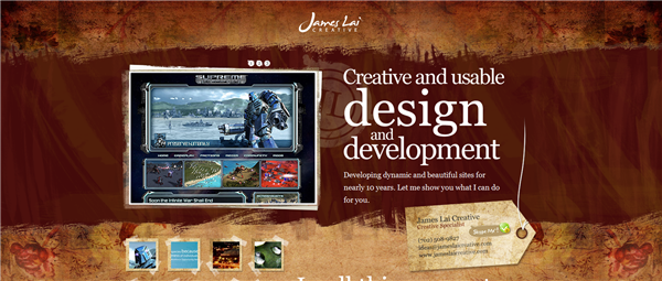
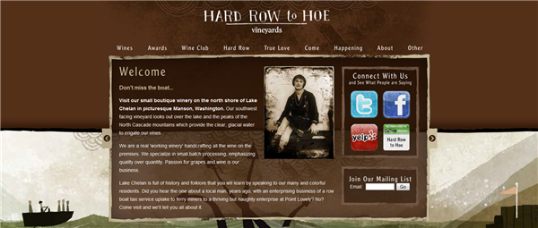
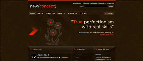
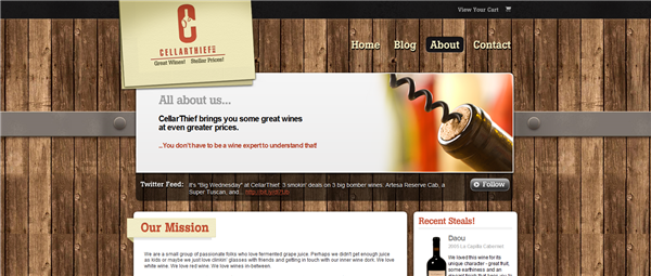
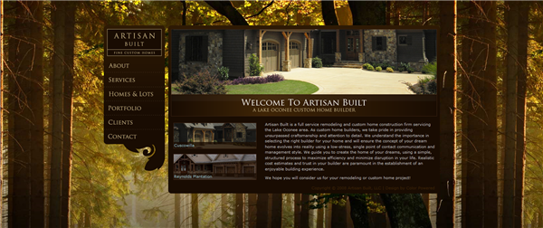
However, I did find plenty of websites doing a really nice job with brown, here’s ten that I liked.
James Lai Creative
Moustache Me

Hard Row To Hoe
New Concept
E-webbed

Cellar Thief
Artisan Built
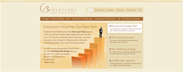
e3fs
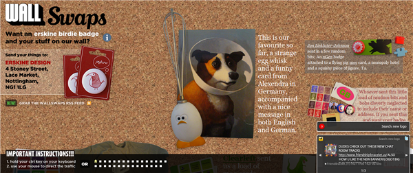
Wall Swaps
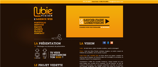
Lubie Vision
So what do you think of brown? Is it a color you like to use or avoid like the plague? Have you seen other nice examples of websites using brown?
Frequently Asked Questions about Brown Color in Design
What is the significance of brown color in design?
Brown is a natural color that evokes a sense of strength and reliability. It’s often associated with resilience, dependability, security, and safety. Brown can also create feelings of warmth, comfort, and security. It’s often used in designs related to construction, legal services, and other industries where strength and reliability are key factors.
What colors complement brown?
Brown is a versatile color that pairs well with a variety of hues. It can be complemented by warm colors like red, orange, and yellow, as well as cooler tones like blue, green, and purple. The specific shade of brown can also influence which colors work best with it. For example, a lighter, warmer brown might pair well with a soft blue, while a darker, cooler brown could be complemented by a deep burgundy or emerald green.
What is the opposite color of brown on the color wheel?
Brown is a complex color that doesn’t have a direct opposite on the traditional color wheel. However, in the context of color theory, the opposite of brown can be considered to be a light, cool color such as light blue or teal. These colors contrast with brown and can create a balanced, harmonious color scheme when used together.
How does brown affect the mood of a design?
Brown can have a grounding effect on a design, creating a sense of stability and reliability. It can also evoke feelings of warmth and comfort, especially when used in combination with other warm colors. However, too much brown can create a dull, drab mood, so it’s important to balance it with other colors.
How can I use brown effectively in my designs?
Brown can be used in a variety of ways in your designs. It can serve as a neutral background color, allowing other colors to pop. It can also be used as an accent color, adding a touch of warmth and naturalness to a design. When using brown, consider the mood you want to create and choose shades that support that mood.
What does brown represent in different cultures?
Brown has different meanings in different cultures. In Western cultures, it’s often associated with earthiness, nature, and simplicity. In some Eastern cultures, brown represents humility and being grounded. Understanding these cultural associations can help you use brown effectively in your designs.
What emotions does brown evoke?
Brown can evoke a range of emotions, depending on its context. It can create feelings of comfort, warmth, and security. It can also evoke feelings of strength, reliability, and stability. However, in some contexts, brown can also evoke feelings of dullness or drabness.
What industries commonly use brown in their branding and design?
Industries that commonly use brown in their branding and design include construction, furniture, agriculture, and legal services. These industries often want to convey a sense of strength, reliability, and stability, which brown can help achieve.
How does lighting affect the appearance of brown in a design?
Lighting can significantly affect how brown appears in a design. In natural light, brown can appear warmer and more vibrant. In artificial light, it can appear cooler and more muted. It’s important to consider the lighting conditions in which your design will be viewed.
How can I combine brown with other colors in a design?
Brown can be combined with a variety of colors in a design. It pairs well with warm colors like red, orange, and yellow, as well as cool colors like blue, green, and purple. The key is to balance the warmth of brown with the coolness of other colors to create a harmonious color scheme.
Jennifer Farley is a designer, illustrator and design instructor based in Ireland. She writes about design and illustration on her blog at Laughing Lion Design.
Published in
·APIs·Business·Cloud·Entrepreneur·Libraries·Programming·Software·Software Development·Web·October 13, 2014
