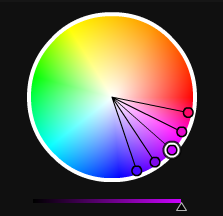
 Last week I looked at the cheery color yellow, this week it’s the turn of yellow’s complementary color, purple. In the wrong hands it can look over the top, but used well purple is vibrant and stylish. Looking at the color wheel we know that purple is the meeting point between warm red and cool blue and consists of many shades in between. Because of this purple is considered warm at the magenta and maroon end and cool at the violet end.
Purple is a deep rich color associated with prosperity and wealth, royalty and nobility. It also has religious connotations with Easter and purple robes. Funnily enough if you take a look at some of the Christian and Church web sites, there’s not many using shades of purple. The color is also strongly associated with nature through flowers and plants such as lilac, lavender, pansies and orchids with many shades of purple taking their name from nature. In 2008 Pantone chose Blur Iris (PANTONE 18-3943) as its color of the year. Leatrice Eiseman, executive director of the Pantone Color Institute® described Blue Iris as bringing
together the dependable aspect of blue, underscored by a strong, soul-searching purple cast. Emotionally, it is anchoring and meditative with a touch of magic. Look for it artfully combined with deeper plums, red-browns, yellow-greens, grapes and grays.
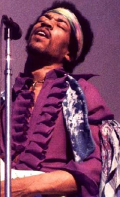
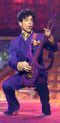
Purple was apparently the favorite color of Jimi Hendrix and we know that Prince likes it too.
Using Purple
As mentioned, purple spans both warm and cool and can create a different mood depending on the colors it’s combined with. Deep purples with a hint of red produce a warm color scheme. Lighter purples are delicate and often considered romantic. Feminine color schemes are created when combined with pink. A more manly feeling can be conveyed using dark purple with black and dark greys. Earthy and natural color schemes combine deep purples with beige or lighter purples with green. Yellow and purple are complimentary colors and create strong eye-catching contrast.
Purple In Logo Design
I want to say thanks to the Twitter pals who helped me track down this little selection of almost globally famous logos using purple as a major color, I was having major logo-block trying to think of internationally recognized brands. It seems purple is not as unpopular as I originally thought when it comes to branding.
Purple In Web Design
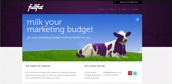
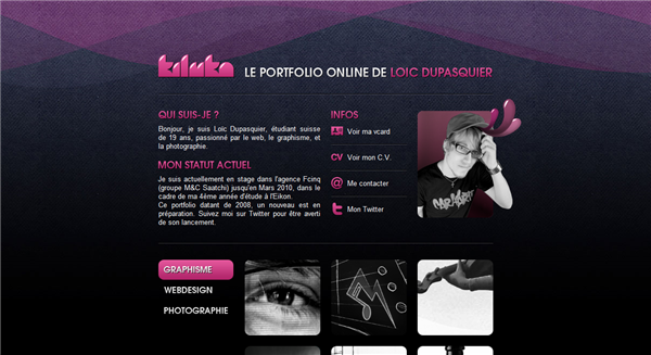
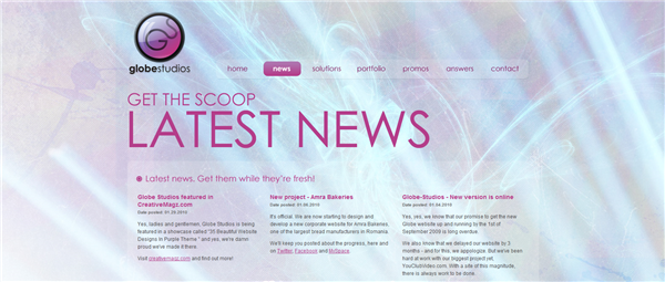
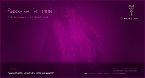
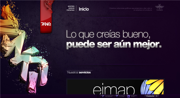
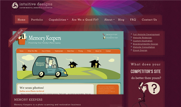
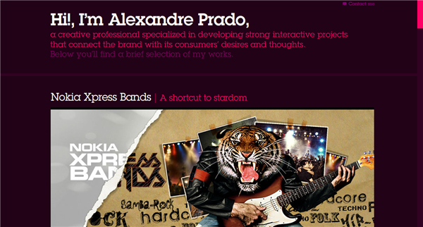
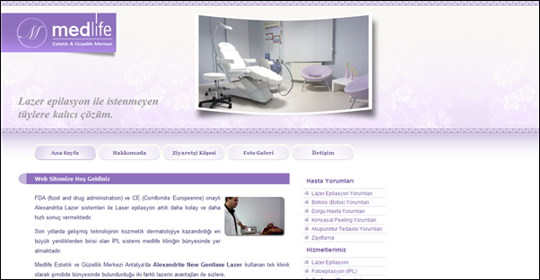
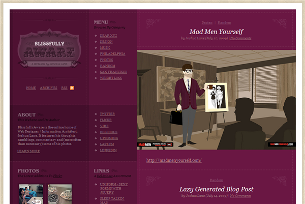
Here’s ten sites doing a good job with purple either as a major background color or as a hint in more minimalist designs.
Full Fat
So what do you think? Is purple your cup of tea when it comes to design? Have you seen other websites displaying purple themes that you like?
Frequently Asked Questions about Purple in Design
What is the significance of purple in design?
Purple is a color that holds a lot of significance in design due to its rich history and cultural associations. It is often associated with royalty, luxury, and power due to its rarity in nature and the expense involved in producing it in the past. In design, purple can be used to convey these feelings of luxury and power. It can also be used to evoke feelings of mystery, creativity, and magic due to its association with the supernatural and the unknown.
How does the use of purple affect the mood of a design?
The use of purple in a design can greatly affect the mood and tone of the piece. Lighter shades of purple, such as lavender, can evoke feelings of calm and serenity, making them ideal for designs intended to be soothing or relaxing. Darker shades, on the other hand, can create a sense of drama and sophistication, making them perfect for designs that aim to convey a sense of luxury or power.
Is purple considered a warm or cool color?
Purple is generally considered a cool color in design. This is because it is closer to blue on the color wheel, which is typically associated with coolness. However, depending on the specific shade of purple, it can sometimes lean towards being a warm color. For example, a purple with more red in it will be warmer than a purple with more blue.
How can I effectively use purple in my designs?
Using purple effectively in your designs depends on the mood and message you want to convey. For a calming, soothing effect, consider using lighter shades of purple. For a more dramatic, luxurious feel, opt for darker shades. Remember to consider color harmony and balance as well – purple can be beautifully complemented by its opposite on the color wheel, yellow, for a vibrant, high-contrast look.
What are some common associations with the color purple?
Purple is often associated with royalty, luxury, and power due to its historical significance. It’s also associated with creativity, mystery, and magic due to its rarity in nature and its use in various cultural and spiritual contexts. In some cultures, purple is also associated with mourning and death.
How does the perception of purple vary across different cultures?
The perception of purple can vary greatly across different cultures. In Western cultures, it is often associated with royalty and luxury, while in some Eastern cultures, it is associated with mourning and death. In Thailand, purple is worn by widows, and in Brazil, it is the color of mourning. Understanding these cultural associations is important when designing for a global audience.
What emotions does the color purple evoke?
The color purple can evoke a wide range of emotions, depending on its shade and context. Lighter shades of purple can evoke feelings of calm and serenity, while darker shades can create a sense of drama and sophistication. Purple can also evoke feelings of mystery, creativity, and magic due to its associations with the supernatural and the unknown.
What are some popular color combinations with purple?
Purple can be combined with a variety of colors for different effects. For a vibrant, high-contrast look, combine purple with its opposite on the color wheel, yellow. For a calming, harmonious look, pair purple with other cool colors like blue and green. For a sophisticated, elegant look, combine purple with neutral colors like black, white, or gray.
How does lighting affect the appearance of purple?
Lighting can greatly affect the appearance of purple. In natural light, purple can appear more blue, while in artificial light, it can appear more red. The intensity of the light can also affect the appearance of purple – under bright light, it can appear lighter and more vibrant, while under dim light, it can appear darker and more subdued.
How can I use purple in my branding?
Purple can be a powerful color to use in branding. It can convey a sense of luxury and sophistication, making it ideal for high-end brands. It can also convey creativity and innovation, making it a great choice for brands in the creative or tech industries. Consider the mood and message you want your brand to convey when deciding how to use purple in your branding.
Jennifer Farley is a designer, illustrator and design instructor based in Ireland. She writes about design and illustration on her blog at Laughing Lion Design.
