We’re coming close to the end of this series. Last week I posted about gray, with some examples of its use in web design. This week, we’re going darker and the focus is on black. Like gray, black provides a near-neutral background which allows other elements of the design to stand out. A lot of photography sites use a black background to allow the photographs take center stage.
Black is a powerful color. It can be serious and sophisticated, and it makes other (lighter) colors pop. There is a feeling of weight when using black that doesn’t exist with any of the other colors. Occasionally, you see reversed out text in print, i.e. black background with white text, often on business cards but on the web we see it frequently and it can look very striking.
Good Black/Bad Black
Some associations that are made with black are of course mourning, death and evil, but on the upside black can exude elegance, intensity, confidence, mystery, power and strength.
We can also think about some of the positive and negative perceptions of black in every day language: Something fancy can be described as black tie, or an expert (not just in martial arts) can be referred to as a black belt. On the downside, a person could be a blackguard, black-hearted, a black sheep or be blacklisted.


All images from The Dieline
Black in Design
Black is a great partner to almost any color. It makes other colors appear brighter. Even very dark colors can work well with black when texture differentiates them. Used with white it provides great contrast. Black and red are also very eye-catching and dramatic, while combined with orange it still attractive but has connotations of Halloween. Yellow really pops out of a black background, while light blue gives an air of conservatism.
Black In Web Design
As always I’ll conclude with a small selection of web sites proudly sporting today’s color. Here are ten sites wearing black with just a hint of extra color thrown in. A few of these sites use textures or gradients to lift the background from being a very plain black.
Versions

Artifice Studios

Gate 679

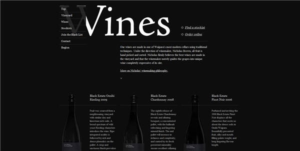
Black Estates

Rehybrid

Kardo Ayoub

Addictionary

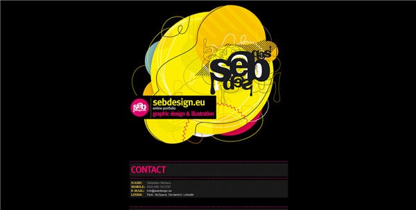
Seb Design

Level 9 Design

Artworking

What do you think of black? Do you like it on web sites, or do you find the contrast of black background and light text too hard on the eye?
Frequently Asked Questions about Black Color in Design
What is the psychological impact of using black color in design?
Black is a powerful color that often signifies strength, authority, and sophistication. It can evoke strong emotions and is often associated with elegance and formality. However, it can also be associated with mystery, fear, and the unknown. In design, using black can create a sense of depth and perspective. It’s also great for highlighting other colors, making them pop against the dark background.
How can I effectively use black in my design projects?
Black can be a very effective color when used correctly. It can add depth, highlight important elements, and create contrast. To use black effectively, consider its impact on the overall design. Too much black can be overwhelming and can make a design feel heavy or oppressive. Use it sparingly to highlight specific elements or to create contrast.
What colors pair well with black in design?
Black is a versatile color that pairs well with almost any color. It can create a striking contrast when paired with bright, bold colors like red or yellow. It also works well with pastel shades, creating a sophisticated and elegant look. For a more subtle and harmonious look, pair black with shades of gray or white.
What are some common mistakes to avoid when using black in design?
One common mistake is using too much black, which can make a design feel heavy and overwhelming. Another mistake is not considering the psychological impact of black. For example, using black in a design meant to evoke feelings of joy and positivity may not have the desired effect. It’s also important to consider the contrast between black and other colors in your design.
How does black affect the readability and legibility of text?
Black text on a white background is the most readable and legible color combination. However, black text on a dark background can be difficult to read. If you’re using black for your text, make sure there’s enough contrast with the background color to ensure legibility.
Can black be used in minimalist design?
Absolutely! In fact, black is often used in minimalist design due to its simplicity and versatility. It can help create a clean, modern look and can be used to highlight specific elements in a design.
What is the cultural significance of black in design?
The cultural significance of black varies greatly from culture to culture. In some cultures, black is associated with mourning and death, while in others it symbolizes power, sophistication, and elegance. It’s important to consider the cultural context when using black in your designs.
How can I use black to create a mood or atmosphere in my designs?
Black can be used to create a variety of moods and atmospheres, depending on how it’s used. For example, using black as a dominant color can create a dramatic, sophisticated, or mysterious mood. On the other hand, using black as an accent color can add depth and highlight other colors in the design.
What are some examples of successful use of black in design?
There are countless examples of successful use of black in design. For example, many luxury brands use black in their logos and branding to convey a sense of sophistication and elegance. In web design, black can be used to create a sleek, modern look.
How does black color affect the perception of a brand?
The color black can have a significant impact on how a brand is perceived. Black is often associated with power, sophistication, and luxury. Therefore, brands that use black in their logo or branding are often perceived as being high-end or luxurious. However, it’s important to remember that the perception of color can vary depending on cultural and personal associations.
Jennifer Farley is a designer, illustrator and design instructor based in Ireland. She writes about design and illustration on her blog at Laughing Lion Design.
Published in
·APIs·Business·Cloud·Entrepreneur·Libraries·Programming·Software·Software Development·Web·October 13, 2014


