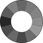
 In this series we’ve looked at pretty much every color in the rainbow and it’s use in design. In this post, we’re looking almost at an absence of color because today, I’m writing about the color gray. Gray is a balanced, neutral color and it is very popular in web design. It doesn’t evoke particularly strong emotions (except maybe a bad mood) in the same way Red, Orange or Purple might. It’s not as definite as black, but a very dark gray can do the business in almost the same way. Likewise a very light gray is not as stark as white, but it can sometimes fill the space occupied by white.
Gray has positive and negative connotations. “Gray matter” is associated with intellect and brain power, while the word “gray” itself is used to describe something that’s dull and boring. Gray suits are the uniform of the corporate world. Gray color names include charcoal, gunmetal, powder, ashen, lead and slate.
Gray In Design
It’s hard to go too far wrong with gray. It seems to work with just about every color. Because of it’s neutrality, it is frequently used as a background color. It makes other colors pop. As mentioned earlier, you can use light gray to replace white and dark gray to replace black. To get a warmer more earthy gray, use Taupe, which is a grayish brown.
Using gray with pastels and soft pink produces a feminine feel, while darker colors combined with gray create a more masculine quality. Dark gray with red or orange
is a particularly eye catching combination. Take a look at the movie posters below.

 Gray is frequently used as as a background color for portfolios (both on and offline). It allows photographs, illustrations or other color elements come to the forefront while providing a solid backbone to the portfolio. Having most of the layout in gray almost makes the background disappear, yet makes the other elements and colors really standout.
Web Sites Using Gray
This week it really wasn’t hard to find a large number of nicely designed sites. Gray is extremely popular both as a background color and also for both headlines and body copy text. Here’s ten sites doing good things in gray.
Ok Cog Aoke
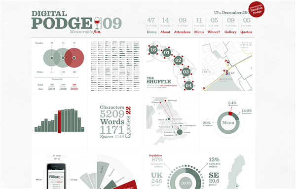
 Digital Podge 2009
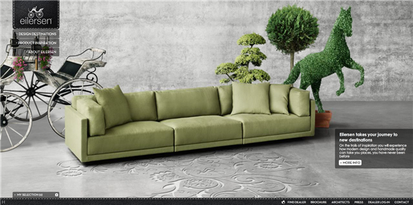
 Eilersen
 Christopher Meeks
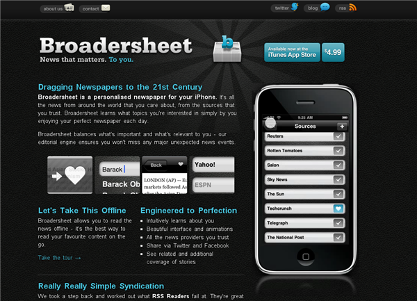
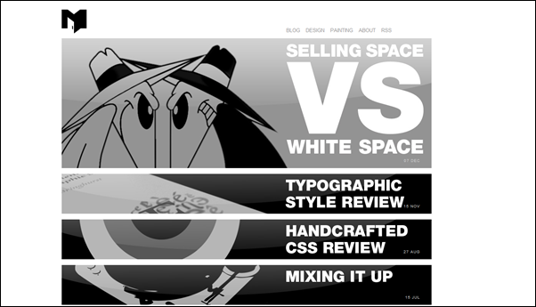 Broader Sheet
 Ricardo Gimenes
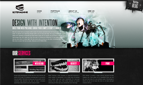
 Ectomachine
 Jeff Finley
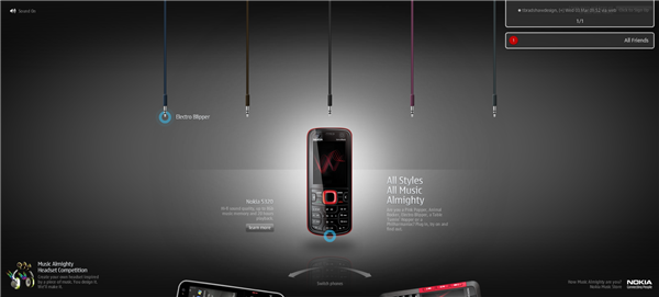
 Nokia Music Almighty
 And there you have it. Are you a fan of gray? Any other nice web sites you’ve liked sporting this neutral color?
Frequently Asked Questions about Grey in Design
What is the significance of grey in design?
Grey is a neutral color that is often used in design for its versatility and balance. It can be used to create a calming, sophisticated, or even dramatic effect depending on the shade and how it’s used. Grey can also be used to highlight other colors, making them stand out more. It’s a popular choice in interior design, graphic design, and fashion due to its ability to blend well with almost any color and create a sense of elegance and sophistication.
How does the use of grey affect the mood or tone of a design?
The use of grey in design can greatly influence the mood or tone of a project. Lighter shades of grey can create a soothing and calming atmosphere, while darker shades can evoke a sense of mystery and drama. Grey can also be used to create a professional and sophisticated look, making it a popular choice for corporate and business designs.
What are some effective ways to use grey in design?
Grey can be used in a variety of ways in design. It can be used as a background color to help other colors pop, or as a main color to create a minimalist and modern look. Grey can also be used in gradients to add depth and dimension to a design. Additionally, using different shades of grey together can create a monochromatic color scheme that is visually interesting and cohesive.
How does grey compare to other neutral colors in design?
Compared to other neutral colors, grey is often seen as more sophisticated and versatile. While beige and brown can sometimes be seen as dull or outdated, grey is often associated with modern and contemporary design. It also pairs well with a wider range of colors, making it a more flexible choice for designers.
What are some common misconceptions about using grey in design?
One common misconception about using grey in design is that it’s boring or lacks personality. However, when used correctly, grey can create a sophisticated and visually interesting design. Another misconception is that grey is only suitable for modern or minimalist designs. In reality, grey can be used in a variety of design styles, from traditional to contemporary.
How can I choose the right shade of grey for my design?
Choosing the right shade of grey depends on the overall look and feel you want to achieve. Lighter shades of grey can create a light and airy feel, while darker shades can add drama and intensity. Consider the other colors in your design and how they will interact with the grey. You may also want to consider the psychological effects of different shades of grey and how they will impact the mood of your design.
Can grey be used as a primary color in design?
Yes, grey can certainly be used as a primary color in design. In fact, using grey as a primary color can create a sophisticated and modern look. It’s also a great choice for creating a monochromatic color scheme, which can be visually interesting and cohesive.
What are some common mistakes to avoid when using grey in design?
One common mistake when using grey in design is not considering the undertones of the grey. Some greys have warm undertones, while others have cool undertones, and this can greatly affect how the grey interacts with other colors in your design. Another mistake is using too much grey, which can make a design feel dull or monotonous.
How can I incorporate grey into my existing design?
There are many ways to incorporate grey into your existing design. You could use it as a background color to help other colors stand out, or use it in text or graphics for a subtle and sophisticated look. You could also use grey in a gradient or pattern to add depth and interest to your design.
What are some popular trends involving grey in design?
Some popular trends involving grey in design include using grey in monochromatic color schemes, using grey as a background color to make other colors pop, and using grey in gradients. Grey is also a popular choice for minimalist and modern designs, and is often used in combination with other neutral colors for a sophisticated and balanced look.
Jennifer Farley is a designer, illustrator and design instructor based in Ireland. She writes about design and illustration on her blog at Laughing Lion Design.

