
In the physical world, some things click when we flick or press them — such as light switches. Some things light up or beep — such as the buttons on an ATM. These responses are all “micro-interactions” that let us know when we’ve successfully done something. In this article, we’ll learn ten simple ways to add micro-interactions to buttons on a web page.
Key Takeaways
- Enhance User Experience: Micro-interactions provide immediate feedback and keep users engaged, improving the overall user experience on websites.
- Variety of Effects: The tutorial covers a range of effects from sound additions, border animations, and 3D transformations to more complex interactions like shape and text changes.
- Accessibility and Interaction: Sound-based micro-interactions can be particularly useful for improving accessibility, especially on mobile devices.
- CSS and JavaScript Utilization: All effects are achieved using a combination of CSS for styling and animations, and JavaScript for dynamic interactions.
- Interactive Feedback: Examples include visual feedback like button shakes or changes in icon and text, which confirm user actions effectively.
- Combination of Effects: The tutorial encourages combining different micro-interactions to create unique user interface elements, enhancing both functionality and aesthetic appeal.
What are Micro-interactions?
Micro-interactions are small interactions or animations on the user interface. They provide instant feedback to users when they perform actions. Micro-interactions keep users engaged and can improve their overall experience.
Some examples of micro-interactions include the typing indicator when we’re chatting with someone online, the progress bar on a download, and the loading indicator when we refresh a page.
Buttons are one of the most common interactive elements on websites, and they can perform a range of tasks — such as toggling, submitting, deleting, closing, selecting (via radio buttons, option buttons, or select menus), and so on.
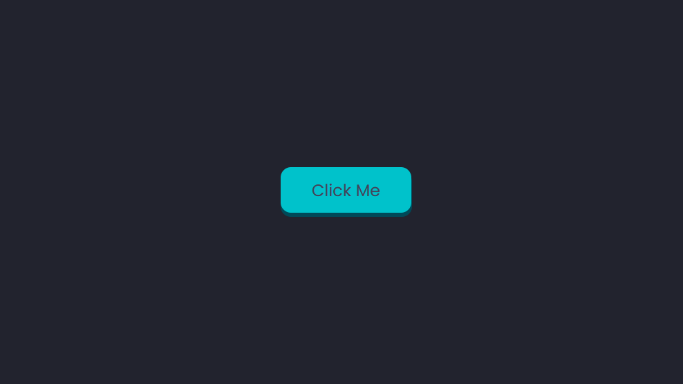
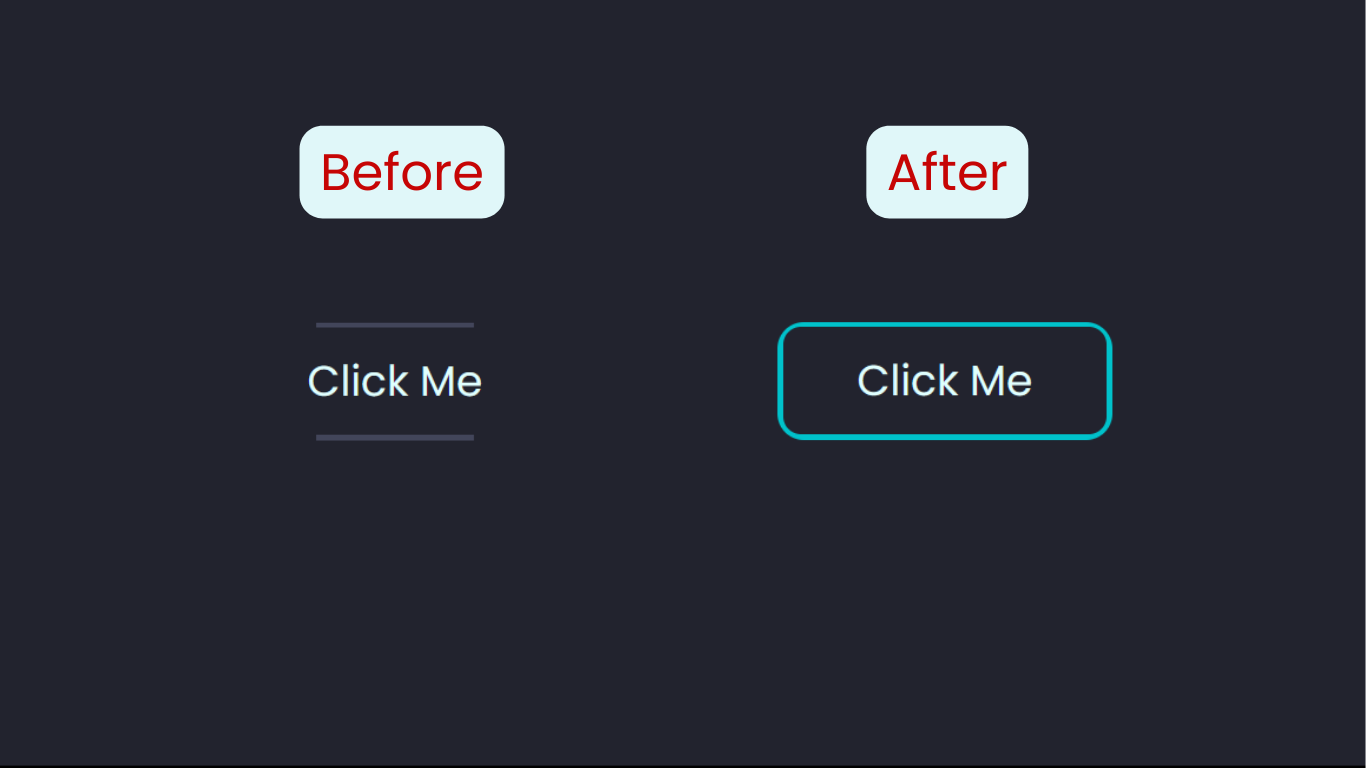
Bouncy 3D Micro-interaction
We can use the CSS transform property to create a 3D button that bounces when we click on it. Before we get started, the image below shows what we’re aiming for.
Here’s the HTML for this button:
<body>
  <button class="btn"><span class="text">Click Me</span></button>
</body>
For this example, we’re nesting a <span> element within the <button>. Normally, this wouldn’t be necessary when creating a button, but we need it to create the final 3D look of the button.
The <button> has a class name of btn, and the <span> that holds the “Click Me” text has a class name of text. These elements will form the two distinct parts of the button — the top, and the sides.
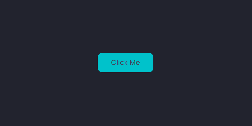
Here’s the CSS for the button:
.btn {
  position: relative;
  background: #004958;
  border-radius: 15px;
  border: none;
  cursor: pointer;
}

.text {
  display: block;
  padding: 15px 45px;
  border-radius: 15px;
  background: #00c2cb;
  font-size: 1.5rem;
  font-weight: 500;
  color: #42455a;
}
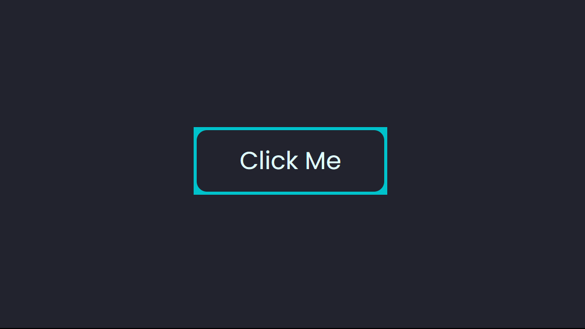
The following screenshot shows what it looks like at this point.
To create the sides of the button, we’ll use the transform property to move the text upwards. This will create a 3D look.
We’ll then animate this property by changing its translate value vertically, along the y-axis, to create the bouncy effect when the button is clicked (that is, when it’s :active):
.text {
  display: block;
  padding: 15px 45px;
  border-radius: 15px;
  background: #00c2cb;
  font-size: 1.5rem;
  font-weight: 500;
  color: #42455a;
  transform: translateY(-6px);
  transition: transform ease 0.1s;
}

.btn:active .text {
  transform: translateY(-2px);
}
The following Pen shows the effect in action. The user now gets visual feedback as the button moves up and down when being clicked.
See the Pen
Bouncy 3D button by SitePoint (@SitePoint)
on CodePen.
Adding a Clicking Sound to a Button
Sound can be a form of micro-interaction — such as when clicking the buttons of a mouse. Having sound associated with actions on a web page can be especially useful for users with tablets and mobile devices.
First, here’s the HTML for the button:
<button>Click Me</button>
For this example, the styling isn’t important. To replicate the sound of a physical button clicking, we’ll need some JavaScript. We’ll create an Audio object, and specify the source of the clicking sound:
var mouseclick = new Audio();
mouseclick.src = "/click.wav";
This sound is going to play when the user clicks on the button. For this to happen, we’ll add an onmousedown event to the button:
<button onmousedown="mouseclick.play()">Click Me</button>
Note: we can’t name the audio object click, because it’s a reserved word and can’t be used as a variable name.
The following CodePen demo shows our clicking button in action.
See the Pen
Button with clicking sound by SitePoint (@SitePoint)
on CodePen.
Buttons with Border Animations
There are several ways to animate the border of a button, so we’re going to look at a few examples.
Simple border micro-interaction
Let’s start with something simple. Normally, if we wanted to add a border to any element, we’d use the border property. But in CSS, we also have the outline property, which is very similar. It adds an outline around the element. Outlines go over the element they’re applied to, meaning they’re drawn around the border.
They’re even declared the same way. Here’s an example of a button with an outline and a border:
button {
  border: 3px solid cyan;
  outline: 3px solid red;
}
The screenshot below shows what this looks like.
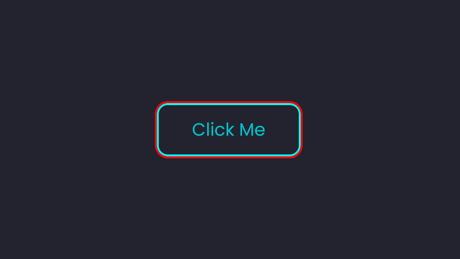
Outlines don’t affect the dimensions of the main element (the button, in this case), and they can overlap other content or elements. We can also change their position using the outline-offset property.
A positive offset value will push the outline outwards, away from the border. A negative value will do the opposite. So if we wanted to hide the outline, for instance, we’d need to give it the negative value of the border’s width. This is what we’re animating to create a micro-interaction for our button:
button {
  border: 2px solid #00c2cb;
  outline: 2px solid #00c2cb;
  outline-offset: -2px;
  transition: outline-offset 200ms ease;
}

button:hover {
  outline-offset: 3px;
}
The button is essentially sprouting a second border. It makes for a simple micro-interaction.
The following Pen shows this in action.
See the Pen
Border animation with outline by SitePoint (@SitePoint)
on CodePen.
Button hover effects with pseudo-elements
Now let’s move on to something more complex. We’ll be using the ::before and ::after pseudo-elements, as well as the inset property, to create some nice border animations.
The image below shows what we’re aiming for with this button micro-interaction.
We’ll set up our styles step by step, starting with the main <button>:
button {
  position: relative;
  background: transparent;
  padding: 15px 45px;
  border-radius: 15px;
  border: none;
  font-size: 1.5rem;
  color: #e0ffff;
  font-weight: 500;
  cursor: pointer;
  overflow: hidden;
  z-index: 1;
}
The inset property pushes an element away from its parent element horizontally and vertically:
button::before {
  content: '';
  position: absolute;
  inset: 0px 50px;
  background: #42455a;
  transition: inset 350ms ease;
  z-index: -1;
}
The inset was first added to the ::before pseudo-element for this button. It has a value of 0px 50px, so it will only apply to the y-axis.
Here’s how the button will look at this point with just the ::before element:
Next, we add the ::after pseudo-element:
button::after {
  content: '';
  position: absolute;
  inset: 3px;
  border-radius: 10px;
  background: #22232e;
  z-index: -1;
}
This ::after pseudo-element will cover the ::before pseudo-element, leaving a gap the size of the inset and thus creating a border.
The image below shows what the button will look like at this point when we hover over it.
To get the final look, we’ll add overflow: hidden to the main <button> element. This will remove the square corners and complete this button’s micro-interaction.
The following Pen provides a live example.
See the Pen
Button border animation with pseudo elements and inset property by SitePoint (@SitePoint)
on CodePen.
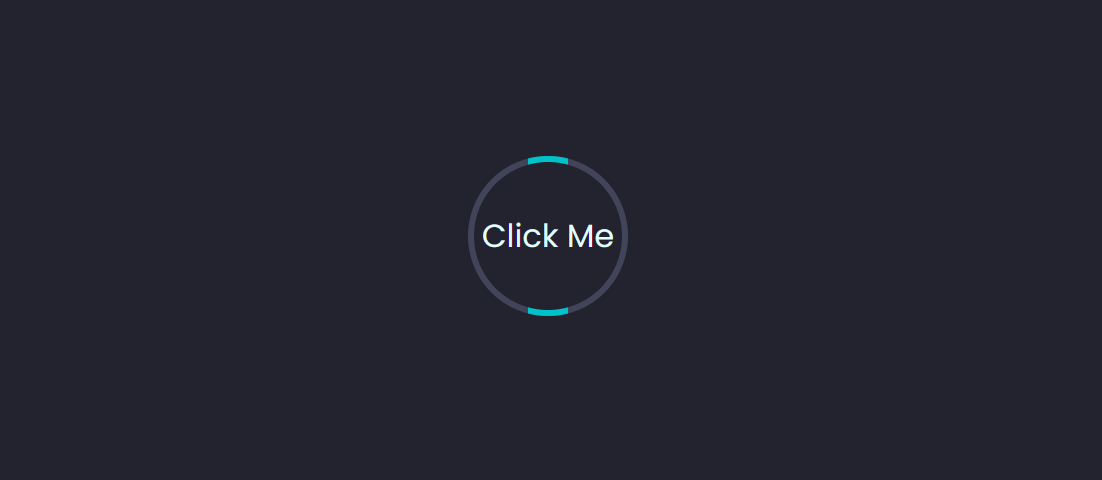
Border animation on a round button
Sticking with the method we used above, we can create a border animation on a round button. We can create a round button by setting the border-radius to 50% and giving it equal height and width. For this example, we’ll be using most of the styling from the previous button.
Here’s the CSS:
button {
  background: #42455a;
  width: 80px;
  height: 80px;
  border-radius: 50%;
}

button::before {
  content: '';
  position: absolute;
  inset: -1px 30px;
  background: #00c2cb;
  transition: 500ms;
  animation: rotate 4s linear infinite;
  z-index: -1;
}

button:hover::before {
  inset: -1px;
}

button::after {
  content: '';
  position: absolute;
  inset: 3px;
  border-radius: 50%;
  background: #22232e;
  z-index: -1;
}
The following screenshot shows how things look so far.
We’re using the same effect as the previous example, so the border will become blue once we hover over the button.
At this point, we can make a slight variation by rotating the ::before pseudo-element using CSS animation:
@keyframes rotate {
  0% {
    transform: rotate(0deg);
  }
  100% {
    transform: rotate(360deg);
  }
}
The Pen below shows the final result for this button micro-interaction.
See the Pen
Rotating border animation by SitePoint (@SitePoint)
on CodePen.
Ripple Micro-interaction
We’re going to add a ripple effect to the button when it’s clicked. This can be within or around the button.
We’ll use some JavaScript to create this micro-interaction. Here’s the JavaScript code, after styling the button:
let btn = document.querySelectorAll("button");
btn.forEach((btn) => {
  btn.onclick = function (e) {
    let x = e.pageX - e.target.offsetLeft;
    let y = e.pageY - e.target.offsetTop;
    let ripples = document.createElement("span");

    ripples.style.left = x + "px";
    ripples.style.top = y + "px";
    this.appendChild(ripples);

    setTimeout(() => {
      ripples.remove();
    }, 2000); /*1000 = 1s*/
  };
});
The click function tracks the x and y positions of the mouse click and creates a new <span> element. Each <span> represents a ripple, and we’re using a setTimeout() method to remove it after two seconds. (Check out setTimeout JavaScript Function: Guide with Examples for more on setTimeout().)
After this is the CSS. We’re styling the ripples, and using CSS animation to change their size and opacity. This will create the ripple effect.
Here’s the CSS for the <span> element:
button span {
  position: absolute;
  background: #004958;
  transform: translate(-50%,-50%);
  pointer-events: none;
  border-radius: 50%;
  animation: ripple 2s linear infinite;
  transition: 0.5s;
}

@keyframes ripple {
  0% {
    width: 0;
    height: 0;
    opacity: 0.5;
  }
  100% {
    width: 500px;
    height: 500px;
    opacity: 0;
  }
}
The following CodePen demo shows the result.
See the Pen
Ripples effect on buttons by SitePoint (@SitePoint)
on CodePen.
Note: in the CodePen demo above, overflow: hidden is added to the main <button> element to ensure that the ripples don’t expand beyond the boundaries of the button.
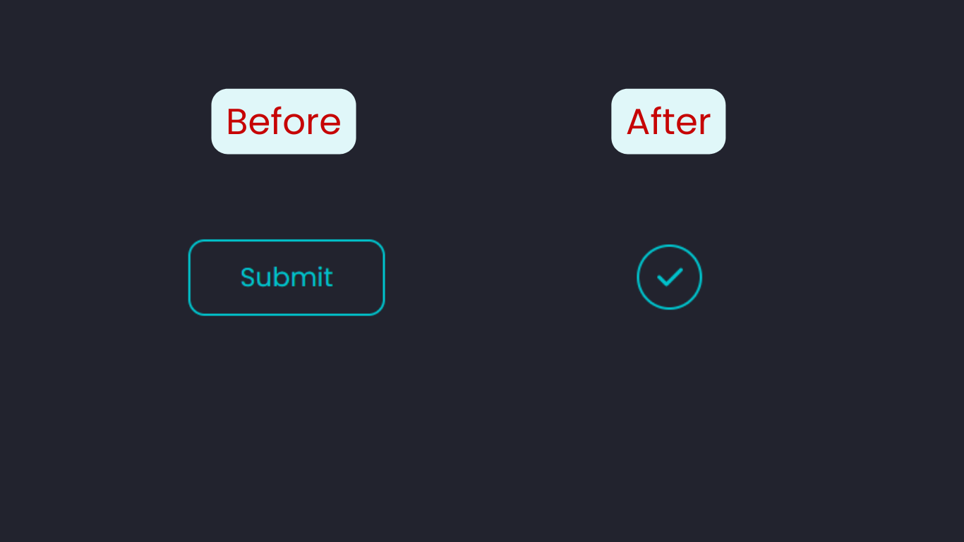
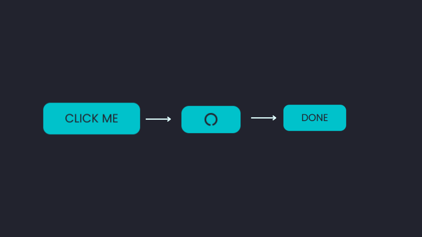
Shape-changing Micro-interaction
A button morphing into another shape will make an interesting micro-interaction. This can be used to acknowledge a submission.
The following screenshot shows what we’re aiming for.
As always, we’ll start by styling the main <button> element. For this example, we’re adding a check icon from Font Awesome:
<button>
  Submit
  <i class="fa-solid fa-check"></i>
</button>
Here’s the CSS:
button {
  position: relative;
  padding: 15px 45px;
  width: auto;
  display: flex;
  justify-content: center;
  align-items: center;
  font-size: 1.5rem;
  border-radius: 15px;
  border: 2px solid #00c2cb;
  background: none;
  color: #00c2cb;
  cursor: pointer;
  outline: none;
  transition: 200ms;
}

i {
  position: absolute;
  color: transparent; /* To hide the check icon */
  transition: 200ms;
}
Next, we’ll reduce the button to a circle, changing the text to the check icon, and adding a spinning loading animation. All these will be triggered by clicking the button.
Here’s the CSS for changing the shape of the button:
button:focus {
  color: transparent;
  outline: none;
  border: 2px solid transparent;
  border-radius: 50%;
  width: 50px;
  height: 50px;
  padding: 25px 25px;
  border-left: 2px solid #00c2cb;
  animation: spin 2s 500ms forwards;
}
Giving the button equal height and weight and border-radius: 50% will change its shape to a circle. The border-left property is for the loading animation.
Here are the @keyframes to create the spinning loading animation. We’ll be using the transform property:
@keyframes spin {
  80% {
    border: 2px solid transparent;
    border-left: 2px solid #00c2cb;
  }
  100% {
    transform: rotate(720deg);
    border: 2px solid #00c2cb;
  }
}
Finally, the check icon will be revealed, but only after the spin animation. This means there will be a delay. We can specify the delay with the CSS animation-delay property, or by adding a second time value to the animation shorthand property. The first time will always be the animation duration:
button:focus i {
  animation: check 300ms 2300ms forwards;
}

@keyframes check {
  to {
    color: #00c2cb;
  }
}
And that’s a wrap on this button micro-interaction. We can tweak the delay and durations to get everything synchronized to taste.
The CodePen demo below shows the final result.
See the Pen
Submit Button Micro-interaction by SitePoint (@SitePoint)
on CodePen.
Text Change Micro-interaction
This is another micro-interaction that works for a submit button. The screenshot below shows what we’re aiming for.
We’re starting with a regular button that has some text in it. When we click on the button, we’ll switch to a loading animation, and then finally end with new text.
Here’s the HTML:
<button>
  <i class="fa-solid"></i>
  <span class="btn-text">Click Me</span>
</button>
The two items nested in the <button> element are the loading icon and the text. This particular icon is from Font Awesome: <i class="fa-solid fa-circle-notch"></i>. As you can see, one of the class names is missing from the button: it will be added later on with JavaScript.
Here’s the CSS for the spinning loading animation:
.fa-circle-notch {
  animation: animate 1s ease infinite;
}

@keyframes animate {
  0% {
    transform: rotate(0turn);
  }
  100% {
    transform: rotate(1turn);
  }
}
All that’s left is the JavaScript function:
btn = document.querySelector("button"),
icon = document.querySelector("i"),
btnText = document.querySelector(".btn-text");

btn.onclick = function () {
  btn.style.cursor = "wait";
  btnText.textContent = "";
  icon.classList.add("fa-circle-notch");

  setTimeout(() => {
    btn.style.pointerEvents = "none";
    btnText.textContent = "done";
    icon.style.display = "none";
  }, 3000);/*1000 = 1s*/
}
We start by targeting the main elements — the <button>, icon, and text. Then for the click function, we change the cursor style, removing the button text, and add the missing class name for the load icon. Finally, we use setTimeout() to add the new button text and hide the load icon.
The CodePen demo below shows the final result.
See the Pen
Subimit button Micro-interaction with changing text by SitePoint (@SitePoint)
on CodePen.
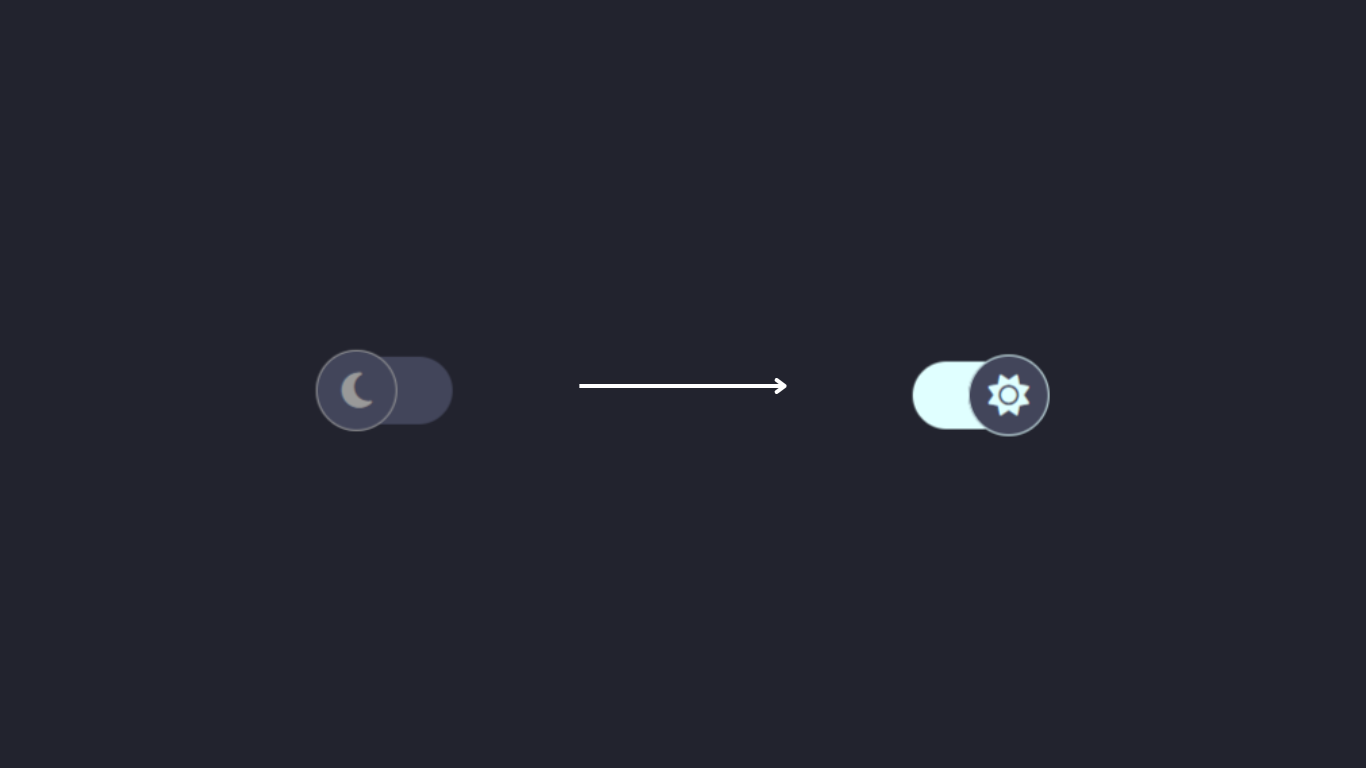
Icon Change Micro-interaction
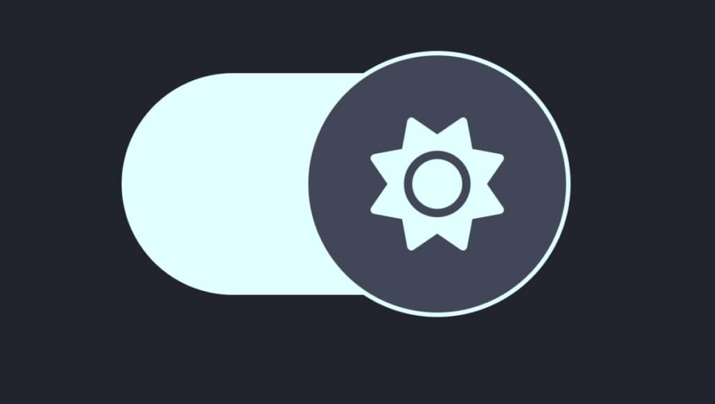
This micro-interaction is great for toggle buttons. We’ll start with a simple light/dark toggle, pictured below.
Here’s the HTML for this button:
<div class="toggle-btn">
  <div class="icon">
    <i class="fa-solid fa-moon"></i>
  </div>
</div>
Here’s the CSS:
.toggle-btn {
  position: relative;
  height: 50px;
  width: 100px;
  background-color: #42455a;
  border-radius: 100px;
  cursor: pointer;
  transition: all 0.4s ease;
}

.toggle-btn .icon {
  position: absolute;
  top: 50%;
  left: -1px;
  transform: translateY(-50%);
  height: 60px;
  width: 60px;
  font-size: 30px;
  color: #999;
  display: flex;
  align-items: center;
  justify-content: center;
  background: #42455a;
  border: 1px solid #999;
  border-radius: 50%;
  transition: all 0.4s ease;
}
This will create the initial state of the toggle button. The next step is to add styling for its active state:
.toggle-btn.active {
  background: #e0ffff;
}

.toggle-btn.active .icon {
  left: calc(100% - 59px);
  color: #e0ffff;
  border: 1px solid #e0ffff;
}

.toggle-btn.active .icon i {
  animation: spin 0.5s;
}

@keyframes spin {
  to {
    transform: rotate(0.5turn);
  }
}
We’ll control the CSS above with JavaScript. We’ll use JavaScript to toggle the button, changing the icon in the process:
const toggleBtn = document.querySelector(".toggle-btn"),
  lockIcon = document.querySelector(".icon i");

toggleBtn.addEventListener("click", () => {
  toggleBtn.classList.toggle("active");

  if(toggleBtn.classList.contains("active")) {
  lockIcon.classList.replace("fa-moon", "fa-sun");
  } else
 lockIcon.classList.replace("fa-sun", "fa-moon");
})
The CodePen demo below shows the final result.
See the Pen
Light/Dark Toggle by SitePoint (@SitePoint)
on CodePen.
Shaky Icons Micro-interaction
Using transform: rotate(), we can make our button icons shake when we click or hover over the button. This is great for subscription or notification buttons.
Here’s the CSS we can use to do this:
button:hover i {
  animation: shake .2s ease-in-out .2s infinite alternate;
}

@keyframes shake {
  0% {
    transform: rotate(0deg);
  }
  90% {
    transform: rotate(-10deg) scale(1.2);
  }
  100% {
    transform: rotate(10deg) scale(1.2);
  }
}
It’s very straightforward: we’re adding the animation to the :hover or :focus state of the button. The transform property can then be applied with @keyframes.
The following CodePen demo shows this effect in practice.
See the Pen
Shaking CSS button Micro-interaction by SitePoint (@SitePoint)
on CodePen.
Jittery Button Micro-interaction
We can animate a button every few seconds, so that it reminds the user to click on it. For this example, we’ll stop/remove the animation when the button is hovered over or clicked.
The animation-play-state property can pause an animation. An alternative is to simply set animation to none:
button i {
  animation: shake 1s ease-in-out infinite alternate;
}

button:hover i {
  animation-play-state: paused;
}

@keyframes shake {
  0% {
    transform: rotate(0deg);
  }
  90% {
    transform: rotate(-10deg) scale(1.2);
  }
  100% {
    transform: rotate(10deg) scale(1.2);
  }
}
The following CodePen demo shows the result.
See the Pen
Pause button animation on hover by SitePoint (@SitePoint)
on CodePen.
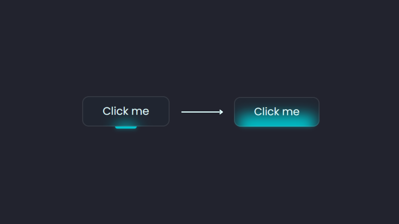
Glow Up Micro-interaction
For our final button micro-interaction, we’re going to have our button glow when it’s hovered over. We’ll need a combination of pseudo-elements and the box-shadow property.
The image below shows what our button will look like.
Here’s the HTML for this button:
<button><span class="btn-text">Click me</span></button>
And here’s the CSS:
button {
  display: flex;
  justify-content: center;
  align-items: center;
  background: transparent;
  position: relative;
}

button .btn-text {
  padding: 14px 45px;
  font-size: 25px;
  color: #e0ffff;
  border: 2px solid rgba(255,255,255,0.1);
  border-radius: 15px;
  background: rgba(0,73,88,0.05);
  backdrop-filter: blur(15px);
  cursor: pointer;
  z-index: 1;
  transition: 0.2s;
}
At this point, we should have a regular-looking button. To add the bar at the bottom, we’ll use the ::before pseudo-element:
button::before {
  content: '';
  position: absolute;
  left: 50%;
  transform: translateX(-50%);
  bottom: -5px;
  width: 25%;
  height: 10px;
  background: #00c2cb;
  border-radius: 10px;
  transition: .5s;
  box-shadow: 0 0 10px rgba(0,194,203,0.5);
}
The box-shadow adds the glow, which is complemented nicely by the backdrop-filter on the button text.
To complete this micro-interaction, we’ll increase the size of the pseudo-element on hover:
button:hover::before {
  bottom: 0;
  height: 40%;
  width: 90%;
  border-radius: 30px;
  transition-delay: 0.5s;
}
The following CodePen demo shows this effect in action.
See the Pen
Button glow on hover by SitePoint (@SitePoint)
on CodePen.
Combining Button Micro-interactions
Each example is great as it is, but we can combine some of them to a achieve even more micro-interactions. For example, the bouncy button will work with the clicking sound. The sound can match the purpose of the button, like the notification bell. The shake animation can be added to the submit button to indicate that the action is denied, or invalid.
What other combinations can you think of?
The Benefits of Micro-interactions
Micro-interactions are not just fancy little effects. They play a role in improving user experience. There are a few reasons why micro-interactions are good for your websites.
As we saw at the start of this article, micro-interactions provide instant feedback. Imagine clicking a submit button and nothing happens: there’s no way of knowing if that action was successful or not. Having micro-interactions will make your website more engaging.
Beyond buttons, if you’re transitioning to a new page or starting a download, and there are several other scenarios, without micro-interactions your site would feel dull. Check out An Introduction to the View Transitions API to learn about exiting new ways to offer micro-interactions to site visitors.
Conclusion
We’ve looked at how to create ten micro-interactions for buttons. We started with a 3D bouncy button, then progressed to adding sound and animating borders. We also covered how to add a ripple click effect to a button, and how to change the shape, text, and icon in a button. We ended by adding a glow up effect on hover.
It’s important to keep things simple: every micro-interaction must have a purpose. As we’ve seen, some of these interactions require a fair bit of code, so it’s best to use them sparingly. Simple is best.
You can try combining some of these to create more micro-interactions.
Frequently Asked Questions (FAQs) about Button Micro-Interactions
What are Button Micro-Interactions?
Button Micro-Interactions are subtle animations or design elements that occur when a user interacts with a button on a website or application. They are designed to provide visual feedback to the user, enhancing the overall user experience. For example, a button might change color, shape, or size when clicked, indicating that the user’s action has been acknowledged and is being processed.
Why are Button Micro-Interactions important in web design?
Button Micro-Interactions play a crucial role in enhancing user experience. They provide immediate feedback to the user, making the interface feel more responsive and intuitive. They can also guide the user through the interface, making it easier to navigate and use. Moreover, they can add a touch of creativity and personality to a website or application, making it more engaging and enjoyable to use.
How can I implement Button Micro-Interactions in my website or application?
Implementing Button Micro-Interactions involves a combination of design and coding. You’ll need to design the interaction in a way that is visually appealing and intuitive, and then code it using HTML, CSS, and JavaScript. There are also various libraries and tools available that can simplify the process, such as Animate.css, Hover.css, and GreenSock.
Can Button Micro-Interactions improve website conversion rates?
Yes, Button Micro-Interactions can potentially improve website conversion rates. By making the interface more engaging and intuitive, they can encourage users to interact with the website more, increasing the chances of them completing desired actions, such as making a purchase or signing up for a newsletter.
Are there any best practices for using Button Micro-Interactions?
Yes, there are several best practices for using Button Micro-Interactions. They should be subtle and not distract from the main content. They should provide meaningful feedback and enhance the user experience. They should also be consistent with the overall design and branding of the website or application.
Can Button Micro-Interactions affect website performance?
If not implemented properly, Button Micro-Interactions can potentially affect website performance. They can increase the load time and use up more resources, especially if they are complex or numerous. Therefore, it’s important to optimize them for performance, ensuring they are lightweight and efficient.
How can I test the effectiveness of my Button Micro-Interactions?
You can test the effectiveness of your Button Micro-Interactions through user testing. This involves observing users as they interact with your website or application, and gathering feedback on their experience. You can also use analytics tools to track user behavior and measure the impact of the interactions on user engagement and conversion rates.
Can Button Micro-Interactions be used on mobile devices?
Yes, Button Micro-Interactions can be used on mobile devices. However, they may need to be adapted to the smaller screen size and touch interface. For example, hover effects that work well on desktop may not be suitable for mobile, as there is no cursor to trigger the effect.
What are some common examples of Button Micro-Interactions?
Some common examples of Button Micro-Interactions include buttons that change color or shape when clicked, buttons that animate to show loading progress, and buttons that morph into other elements, such as a form or a dialog box.
Where can I find inspiration for Button Micro-Interactions?
There are many online resources where you can find inspiration for Button Micro-Interactions, such as Dribbble, Behance, and CodePen. You can also look at popular websites and applications to see how they use micro-interactions.