UX: What Can We Prototype? What Can’t We Prototype?

The following is a short extract from our book, Designing UX: Prototyping, written by Dan Goodwin and Ben Coleman. It’s the ultimate guide to prototyping. SitePoint Premium members get access with their membership, or you can buy a copy in stores worldwide.
Key Takeaways
- Prototypes are particularly useful in the design of a website’s information architecture and structural elements, layout and visual hierarchy, and interactive elements. They allow for testing and presentation of structures, navigation, labels, and content in a tangible way that stakeholders can visualize and explore.
- Prototypes cannot be used to make decisions based on quantitative research, measure the success of a task completion/conversion funnel, test the accessibility of a design, or test the impact of visual design. They also should not be the sole source of documentation for a project.
- Prototypes are not fully functional products, so they may not accurately represent the final product’s performance or user experience. They also require time and resources to create, which may not be feasible for all projects.
- To create a successful prototype, start by clearly defining your goals and objectives. Then, create a simple, low-fidelity prototype to test your ideas. Test your prototype with real users, and be open to their feedback. Iterate based on this feedback, and continue to refine your prototype until it meets your goals and objectives.
What can we prototype?
In simple terms, what we might consider creating a prototype for are the kinds of things that we might we otherwise use sketches and wireframes to explore and design.
We’ll now review some of the items for which prototypes are particularly helpful in the design of a website.
Information Architecture and Structural Elements
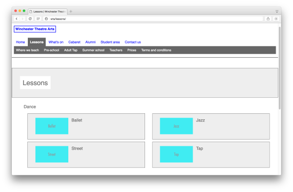
Presenting a site’s structure as a sitemap diagram to the project team and stakeholders is often ineffective. It’s even harder to user-test structural elements with such a diagram. At a more granular level, we have the same problem testing and presenting other aspects of information architecture including structure, behavior and labelling in navigation, or taxonomies (such as the categories users can employ to segment and query products in an online shop).
It’s possible to build an interactive prototype and populate it with real structural elements (for example, primary and secondary page navigation, product categories). Then we can test these structures: the page hierarchy, the behavior of the navigation, and the labels that we’re proposing with real users given real tasks to perform. We can present our information architecture to stakeholders in an exciting, tangible way that they can visualize and explore.

This lends itself particularly well to the loading of real content for prototyping then being used for production. We can start at a low level of fidelity by loading the structure of a website into a content management system (CMS) database for a prototype. Then we can increase fidelity by adding placeholder content, then further still by adding in real content. This content can then potentially be used in a production implementation. We’ll talk about this in detail in Chapter 7.
Layout and Visual Hierarchy
We can use a prototype to design, test, and communicate the overall layout and hierarchy of elements that make up a page. This is the kind of design where we’d traditionally use wireframes.
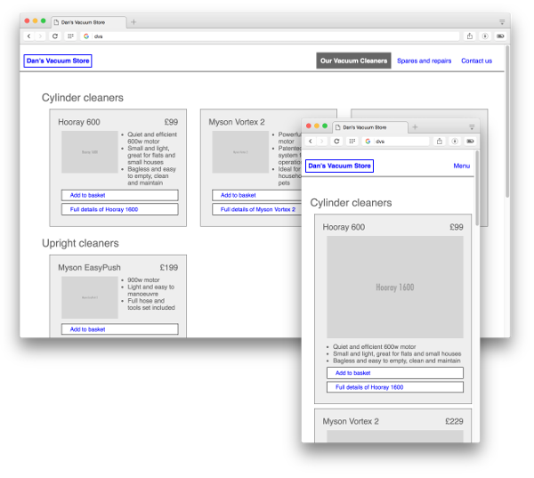
Take the example of a site presenting a range of vacuum cleaners. We might have a list of all cleaners grouped or categorized in a certain way; for example, a page for each individual cleaner showing specifications, options, and user reviews. We have to decide what content to present in the listing and what to display on a single cleaner page, as well as how to lay them out.
We can use insights from user research to help us, such as the tasks different types of users are trying to achieve, what information is needed to solve those tasks, and what’s considered important / less important. From there we can come up with a proposed layout for the listing and for the single page. Then we can implement that proposal in a prototype, ideally using some real content.

A prototype enables us to present the proposal to stakeholders and to test it with real users. Over the lifetime of our prototype, we can add, remove, and change content, as well as alter the layouts we’re proposing. We can test small changes or radical alternatives to the layout. If our prototype’s implementation has a good separation of content and presentation, the process of changing the layout while maintaining the same base content is easy. That means we can test more layouts, more quickly and more easily.
Interactive Elements
All websites have at least some interactive elements (such as a link), but many have interactive elements that are more involved and complex. This requires significant amounts of user interface design.
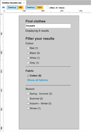
Consider the example of an ecommerce site selling clothes and accessories. Users tend to have varying requirements in narrowing their clothing searches, whether it’s by size, color, season, garment type, fabric, brand, and so on. This often leads designers of an ecommerce store to consider a faceted navigation pattern, where users can narrow their search across several sets of criteria––for example, medium size, yellow color, and cotton fabric––and see the results promptly.

While it sounds straightforward enough, this is a remarkably complicated feature to design. The ability of a prototype to help us try out ideas for laying out categories, their method of interaction, and which categories to narrow results by will significantly improve our chances of doing it justice. We can use a decent set of representative content to quickly implement a range of ideas for presenting and interacting with that content. We can communicate our ideas with stakeholders and test them out with real users––iterating, changing, and experimenting as we go.
Without a prototype, this kind of rapid iteration could only happen once the online store had been (at least) partially implemented. Prototyping allows us to do it earlier, quicker, and cheaper.
What can’t we do with a prototype?
By now, I’m hoping you have plenty of ideas for a prototype and what can be achieved by creating one. That said, it’s worth addressing what we’re unlikely to achieve with a prototype.
Use Quantitative Research to Make Decisions
If you’re looking to try out some design ideas with a view to employing metrics to assess which is “better” (for example, more sign-ups, more conversions, highest task completion rate), a prototype is unlikely to help. For these kinds of tests, you need a large sample size––typically in the thousands or tens of thousands; however, utilizing quantitative research to make decisions such as these is beyond the scope of this book.
It’s worth pointing out, though, that prototypes generally will help you test your designs with a large number of users more successfully than alternatives such as sketches or wireframes. This is because of the ease of implementing, sharing, publishing and running tests with prototypes, and iterating these tests over and above the other methods.
Testing for Completion/Conversion Funnel Progress
It’s generally a bad idea to try to measure the success of a task completion/conversion funnel (for example, how far users of an ecommerce site progress along a sales funnel) with user tests, whether it be a prototype or with a production siteQuantitative measurement of progress in goal funnels is covered in the SitePoint book Researching UX: Analytics: https://www.sitepoint.com/premium/books/researching-ux-analytics.
This is because in an observed user-testing scenario, users are motivated to complete the tasks they’re presented with purely by the nature of being a participant in a user test. We might expect to hear comments along the lines of “I’d have given up by now,” which to a degree are useful. But since what users say they do and what they actually do can be two completely different things, such comments only help up to a point. When using a site in a natural context, user behavior in reality may be very different and tolerance for poor design much lower.
Testing Accessibility
Most prototyping techniques fail to match the final production implementation and, as a result, can’t be used to test the accessibility of a design; for example, measuring the ability for users of assistive technologies to access content and features.
Typically, HTML prototyping is done in a very rough-and-ready way, so coding standards and accessibility barely get a look-in.
An accessible implementation is essential, and best audited and tested on a production site prior to launch and on an ongoing basis. That said, if you wanted to test the accessibility of certain features in a prototype (such as a complicated interactive element), there’s no reason why you couldn’t build those features to the relevant standards and test them.
Testing the Impact of Visual Design
Generally, prototypes are created at a level of fidelity that is too low to test the impact of visual design features such as font sizes, background colors, or borders on the visual hierarchy of a design.
Some prototyping tools and techniques (such as InVision, discussed in Chapter 6) do allow the creation of a prototype from high-fidelity design mockups. Hence, if you can come up with a sensible user-testing strategy, you could use these to test the impact of your visual design changes.
Being the Sole Source of Documentation
Agile (whether it’s little a or big A agile) prefers working software over comprehensive documentation, so it can be natural for some teams to rely solely on their evolving prototype to document what they’re doing.
Prototypes on their own don’t document the history of creating a design (although a good source-control workflow could help here). Therefore, it’s important that you take care to document changes between versions when evolving your prototype. Similarly, a prototype alone won’t always show enough to provide sufficient documentation for full design and development. Furthermore, it’s too easy for stakeholders or project team members to miss an important feature because they failed to click on that part of the prototype.
To mitigate these problems, consider how you can produce just enough supporting documentation and decision-making history so that the team can understand what’s been implemented and why.
Frequently Asked Questions (FAQs) about Prototyping
What are the common mistakes to avoid in rapid prototyping?
Rapid prototyping is a crucial part of the design process, but it’s not without its pitfalls. Some common mistakes include rushing the process, not testing the prototype with real users, and not iterating based on feedback. It’s important to take the time to thoroughly plan your prototype, test it with a diverse group of users, and be open to making changes based on their feedback.
How does prototyping fit into the UX design process?
Prototyping is a key part of the UX design process. It allows designers to create a working model of a product or feature before it’s fully developed. This helps to identify any potential issues or improvements early on, saving time and resources in the long run. It also provides a tangible way to communicate ideas and concepts to stakeholders and users.
What are the limitations of prototyping?
While prototyping is a valuable tool, it’s not without its limitations. Prototypes are not fully functional products, so they may not accurately represent the final product’s performance or user experience. They also require time and resources to create, which may not be feasible for all projects. Additionally, feedback from prototypes may not always be applicable to the final product.
How can I avoid common pitfalls in prototyping?
To avoid common pitfalls in prototyping, it’s important to plan your prototype carefully, test it with real users, and be open to feedback. Don’t rush the process, and make sure to iterate based on user feedback. It’s also important to manage expectations, as prototypes are not fully functional products.
What is the role of prototyping in design thinking?
In design thinking, prototyping is used to test ideas and concepts before they’re fully developed. This allows designers to identify potential issues or improvements early on, saving time and resources. Prototyping also provides a tangible way to communicate ideas to stakeholders and users, helping to ensure that the final product meets their needs and expectations.
What is a functional UX prototype?
A functional UX prototype is a working model of a product or feature that allows users to interact with it as they would with the final product. This helps designers to understand how users will interact with the product and to identify any potential issues or improvements.
How can I create a successful prototype?
To create a successful prototype, start by clearly defining your goals and objectives. Then, create a simple, low-fidelity prototype to test your ideas. Test your prototype with real users, and be open to their feedback. Iterate based on this feedback, and continue to refine your prototype until it meets your goals and objectives.
What are the benefits of prototyping?
Prototyping offers several benefits. It allows designers to test ideas and concepts before they’re fully developed, saving time and resources. It also provides a tangible way to communicate ideas to stakeholders and users, helping to ensure that the final product meets their needs and expectations.
What tools can I use for prototyping?
There are many tools available for prototyping, ranging from pen and paper to sophisticated software. Some popular prototyping tools include Sketch, InVision, and Adobe XD. The best tool for you will depend on your needs, skills, and budget.
How can I improve my prototyping skills?
To improve your prototyping skills, practice is key. Start by creating simple, low-fidelity prototypes, and gradually work your way up to more complex ones. Seek feedback from users and other designers, and be open to learning and improving. There are also many online resources and courses available to help you improve your prototyping skills.
Dan is the user experience director at fffunction. With a background of twenty years experience in agency and in-house software and web development, he is an all-rounder with strong technical and people skills in addition to user experience. He loves user research and bringing users and empathy for them into every step of a project.
Published in
·CMS & Frameworks·Development Environment·Miscellaneous·Patterns & Practices·PHP·September 29, 2014


