How the CSS :is, :where and :has Pseudo-class Selectors Work


Key Takeaways
- The CSS pseudo-class selectors :is(), :where(), and :has() provide new ways to target HTML elements. The :is() selector allows for more efficient styling of multiple elements, reducing the need for verbose selector strings. The :where() selector operates similarly to :is(), but with zero specificity, making it useful for applying baseline styles without increasing specificity. The :has() selector targets an element containing a set of others, providing a long-awaited way to target parent elements.
- The :is() and :where() pseudo-class selectors are supported in all modern browsers, but not in Internet Explorer. The :has() selector is newer with limited support currently, but is expected to be widely available by 2023. Using these selectors can simplify CSS syntax and reduce the need for CSS preprocessors.
- The specificity of :is() and :where() selectors differ. The :is() selector has the same specificity as the most specific selector within its arguments, while the :where() selector has zero specificity. This can be practical for CSS resets, which apply a baseline of styles when no specific styling is available, allowing for override of any CSS reset style regardless of the specificity.
CSS selectors allow you to choose elements by type, attributes, or location within the HTML document. This tutorial explains three new options — :is(), :where(), and :has().
Selectors are commonly used in stylesheets. The following example locates all <p> paragraph elements and changes the font weight to bold:
p {
  font-weight: bold;
}
You can also use selectors in JavaScript to locate DOM nodes:
- document.querySelector() returns the first matching HTML element
- document.querySelectorAll() returns all matching HTML elements in an array-like NodeList
Pseudo-class selectors target HTML elements based on their current state. Perhaps the most well known is :hover, which applies styles when the cursor moves over an element, so it’s used to highlight clickable links and buttons. Other popular options include:
:visited: matches visited links:target: matches an element targeted by a document URL:first-child: targets the first child element:nth-child: selects specific child elements:empty: matches an element with no content or child elements:checked: matches a toggled-on checkbox or radio button:blank: styles an empty input field:enabled: matches an enabled input field:disabled: matches a disabled input field:required: targets a required input field:valid: matches a valid input field:invalid: matches an invalid input field:playing: targets a playing audio or video element
Browsers have recently received three more pseudo-class selectors…
The CSS :is Pseudo-class Selector
Note: this was originally specified as :matches() and :any(), but :is() has become the CSS standard.
You often need to apply the same styling to more than one element. For example, <p> paragraph text is black by default, but gray when it appears within an <article>, <section>, or <aside>:
/* default black */
p {
  color: #000;
}

/* gray in <article>, <section>, or <aside> */
article p,
section p,
aside p {
  color: #444;
}
This is a simple example, but more sophisticated pages will lead to more complicated and verbose selector strings. A syntax error in any selector could break styling for all elements.
CSS preprocessors such as Sass permit nesting (which is also coming to native CSS):
article, section, aside {

  p {
    color: #444;
  }

}
This creates identical CSS code, reduces typing effort, and can prevent errors. But:
- Until native nesting arrives, you’ll need a CSS build tool. You may want to use an option like Sass, but that can introduce complications for some development teams.
- Nesting can cause other problems. It’s easy to construct deeply nested selectors that become increasingly difficult to read and output verbose CSS.
:is() provides a native CSS solution which has full support in all modern browsers (not IE):
:is(article, section, aside) p {
  color: #444;
}
A single selector can contain any number of :is() pseudo-classes. For example, the following complex selector applies a green text color to all <h1>, <h2>, and <p> elements that are children of a <section> which has a class of .primary or .secondary and which isn’t the first child of an <article>:
article section:not(:first-child):is(.primary, .secondary) :is(h1, h2, p) {
  color: green;
}
The equivalent code without :is() required six CSS selectors:
article section.primary:not(:first-child) h1,
article section.primary:not(:first-child) h2,
article section.primary:not(:first-child) p,
article section.secondary:not(:first-child) h1,
article section.secondary:not(:first-child) h2,
article section.secondary:not(:first-child) p {
  color: green;
}
Note that :is() can’t match ::before and ::after pseudo-elements, so this example code will fail:
/* NOT VALID - selector will not work */
div:is(::before, ::after) {
  display: block;
  content: '';
  width: 1em;
  height: 1em;
  color: blue;
}
The CSS :where Pseudo-class Selector
:where() selector syntax is identical to :is() and is also supported in all modern browsers (not IE). It will often result in identical styling. For example:
:where(article, section, aside) p {
  color: #444;
}
The difference is specificity. Specificity is the algorithm used to determine which CSS selector should override all others. In the following example, article p is more specific than p alone, so all paragraph elements within an <article> will be gray:
article p { color: #444; }
p { color: #000; }
In the case of :is(), the specificity is the most specific selector found within its arguments. In the case of :where(), the specificity is zero.
Consider the following CSS:
article p {
  color: black;
}

:is(article, section, aside) p {
  color: red;
}

:where(article, section, aside) p {
  color: blue;
}
Let’s apply this CSS to the following HTML:
<article>
  <p>paragraph text</p>
</article>
The paragraph text will be colored red, as shown in the following CodePen demo.
See the Pen
Using the :is selector by SitePoint (@SitePoint)
on CodePen.
The :is() selector has the same specificity as article p, but it comes later in the stylesheet, so the text becomes red. It’s necessary to remove both the article p and :is() selectors to apply a blue color, because the :where() selector is less specific than either.
More codebases will use :is() than :where(). However, the zero specificity of :where() could be practical for CSS resets, which apply a baseline of standard styles when no specific styling is available. Typically, resets apply a default font, color, paddings and margins.
This CSS reset code applies a top margin of 1em to <h2> headings unless they’re the first child of an <article> element:
/* CSS reset */
h2 {
  margin-block-start: 1em;
}

article :first-child {
  margin-block-start: 0;
}
Attempting to set a custom <h2> top margin later in the stylesheet has no effect, because article :first-child has a higher specificity:
/* never applied - CSS reset has higher specificity */
h2 {
  margin-block-start: 2em;
}
You can fix this using a higher-specificity selector, but it’s more code and not necessarily obvious to other developers. You’ll eventually forget why you required it:
/* styles now applied */
article h2:first-child {
  margin-block-start: 2em;
}
You can also fix the problem by applying !important to each style, but please avoid doing that! It makes further styling and development considerably more challenging:
/* works but avoid this option! */
h2 {
  margin-block-start: 2em !important;
}
A better choice is to adopt the zero specificity of :where() in your CSS reset:
/* reset */
:where(h2) {
  margin-block-start: 1em;
}

:where(article :first-child) {
  margin-block-start: 0;
}
You can now override any CSS reset style regardless of the specificity; there’s no need for further selectors or !important:
/* now works! */
h2 {
  margin-block-start: 2em;
}
The CSS :has Pseudo-class Selector
The :has() selector uses a similar syntax to :is() and :where(), but it targets an element which contains a set of others. For example, here’s the CSS for adding a blue, two-pixel border to any <a> link that contains one or more <img> or <section> tags:
/* style the <a> element */
a:has(img, section) {
  border: 2px solid blue;
}
This is the most exciting CSS development in decades! Developers finally have a way to target parent elements!
The elusive “parent selector” has been one of the most requested CSS features, but it raises performance complications for browser vendors, and therefor has been a long time coming. In simplistic terms:
- Browsers apply CSS styles to an element when it’s drawn on the page. The whole parent element must therefore be re-drawn when adding further child elements.
- Adding, removing, or modifying elements in JavaScript could affect the styling of the whole page right up to the enclosing
<body>.
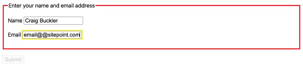
Assuming the vendors have resolved performance issues, the introduction of :has() permits possibilities that would have been impossible without JavaScript in the past. For example, you can set the styles of an outer form <fieldset> and the following submit button when any required inner field is not valid:
/* red border when any required inner field is invalid */
fieldset:has(:required:invalid) {
  border: 3px solid red;
}

/* change submit button style when invalid */
fieldset:has(:required:invalid) + button[type='submit'] {
  opacity: 0.2;
  cursor: not-allowed;
}
This example adds a navigation link submenu indicator that contains a list of child menu items:
/* display sub-menu indicator */
nav li:has(ol, ul) a::after {
  display: inlne-block;
  content: ">";
}
Or perhaps you could add debugging styles, such as highlighting all <figure> elements without an inner img:
/* where's my image?! */
figure:not(:has(img)) {
  border: 3px solid red;
}

Before you jump into your editor and refactor your CSS codebase, please be aware that :has() is new and support is more limited than for :is() and :where(). It’s available in Safari 15.4+ and Chrome 101+ behind an experimental flag, but it should be widely available by 2023.
Selector Summary
The :is() and :where() pseudo-class selectors simplify CSS syntax. You’ll have less need for nesting and CSS preprocessors (although those tools provide other benefits such as partials, loops, and minification).
:has() is considerably more revolutionary and exciting. Parent selection will rapidly become popular, and we’ll forget about the dark times! We’ll publish a full :has() tutorial when it’s available in all modern browsers.
If you’d like to dig in deeper to CSS pseudo-class selectors — along with all other things CSS, such as Grid and Flexbox — check out the awesome book CSS Master, by Tiffany Brown.
Frequently Asked Questions (FAQs) about CSS :is() and :where() Pseudo-Class Selectors
What is the main difference between :is() and :where() pseudo-class selectors in CSS?
The primary difference between :is() and :where() pseudo-class selectors in CSS lies in their specificity. The :is() pseudo-class selector has the same specificity as the selector placed inside it. On the other hand, the :where() pseudo-class selector has zero specificity, meaning it doesn’t contribute to the overall specificity of a selector. This can be particularly useful when you want to apply styles to a group of elements without increasing the specificity.
Can I use :is() and :where() pseudo-class selectors with all CSS properties?
Yes, you can use :is() and :where() pseudo-class selectors with all CSS properties. These pseudo-class selectors are not tied to specific CSS properties. They are used to select elements based on certain conditions, and you can apply any CSS property to the selected elements.
Are :is() and :where() pseudo-class selectors supported in all browsers?
The :is() and :where() pseudo-class selectors are relatively new additions to CSS and are supported in most modern browsers. However, they may not be supported in older browsers or some versions of Internet Explorer. It’s always a good idea to check the current browser support on a site like Can I Use before using these selectors in your code.
How can I use the :is() pseudo-class selector in CSS?
The :is() pseudo-class selector in CSS allows you to group multiple selectors into one. For example, instead of writing three separate selectors for h1, h2, and h3, you can group them together using the :is() pseudo-class selector like this: :is(h1, h2, h3) { color: blue; }.
How can I use the :where() pseudo-class selector in CSS?
The :where() pseudo-class selector in CSS is used in the same way as the :is() pseudo-class selector, but it has zero specificity. For example, you can use it to select all elements with a certain class without increasing the specificity: :where(.class1, .class2, .class3) { color: blue; }.
Can I nest :is() and :where() pseudo-class selectors?
Yes, you can nest :is() and :where() pseudo-class selectors. This can be useful when you want to select elements that meet multiple conditions. For example, you can select all h1 and h2 elements inside a div element like this: div :is(h1, h2) { color: blue; }.
Can I use :is() and :where() pseudo-class selectors with pseudo-elements?
Yes, you can use :is() and :where() pseudo-class selectors with pseudo-elements. For example, you can select all first letters of h1 and h2 elements like this: :is(h1, h2)::first-letter { color: blue; }.
Can I use :is() and :where() pseudo-class selectors with attribute selectors?
Yes, you can use :is() and :where() pseudo-class selectors with attribute selectors. For example, you can select all elements with a data-attribute like this: :is([data-attribute]) { color: blue; }.
Can I use :is() and :where() pseudo-class selectors with class selectors?
Yes, you can use :is() and :where() pseudo-class selectors with class selectors. For example, you can select all elements with a certain class like this: :is(.class1, .class2, .class3) { color: blue; }.
Can I use :is() and :where() pseudo-class selectors with id selectors?
Yes, you can use :is() and :where() pseudo-class selectors with id selectors. For example, you can select all elements with a certain id like this: :is(#id1, #id2, #id3) { color: blue; }.
Craig is a freelance UK web consultant who built his first page for IE2.0 in 1995. Since that time he's been advocating standards, accessibility, and best-practice HTML5 techniques. He's created enterprise specifications, websites and online applications for companies and organisations including the UK Parliament, the European Parliament, the Department of Energy & Climate Change, Microsoft, and more. He's written more than 1,000 articles for SitePoint and you can find him @craigbuckler.


