


Developers and designers of mobile applications must always focus on ensuring accessibility for vision and hearing impaired users. This article will offer some checklists you should complete to ensure your application is more accessible.
Key Takeaways
- Developers should ensure that touchable control sizes are appropriately sized and easily visible, with a recommended minimum of 48dp in length and width.
- To improve accessibility, developers should add a virtual view hierarchy for custom controls that are completely visible, provide android:contentDescription for grouped small controls, and change android:contentDescription for buttons that change function.
- Other key accessibility considerations include avoiding description for decorative images, ensuring proper spacing between controls, and ensuring adequate color contrast between the foreground and background. The app title should also be adequately set to be accessible to low vision or visually impaired users.
Touchable control sizes
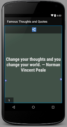
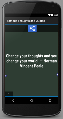
While working on any app, users rely on touchable controls. The controls should have appropriate size and be easily visible. Your app should have controls with a minimum of 48dp in length as well as width. It is approximately equal to 9mm and recommended for controls for which a user can select or take an action.
In the below figures, you can see the less accessible and more accessible ways of sizing buttons.
Less Accessible
More Accessible
Text field hints
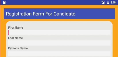
EditText is a control which configures itself to be editable. For ensuring accessibility, add an android:hint attribute for EditText fields. Adding the attribute will help users in understanding what content is written when the text field is empty. The content of the android:hint attribute can be spoken.
android:hint="Enter First Name"Less Accessible
More Accessible

Custom controls
If your application has a custom control which is completely visible, then it is a good practice to provide a virtual view hierarchy. This is important, since the default accessibility services processing may not give sufficient descriptions for users.
A virtual view hierarchy provides a complementary view hierarchy to accessibility services and runs in the background. It can be considered a method for application developers to closely match the actual information on-screen. The accessibility services receive callbacks by the system when Accessibility Events are fired and provides more useful context information to users.
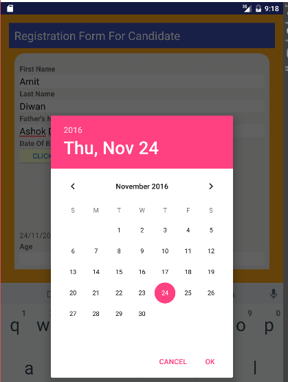
Below, you can see Calendar Control, where the calendar is implemented in single view.
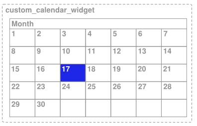
As you can see above, a day is selected, but the default accessibility service will only announce the year as well as month. So, users with no vision will face difficulty in selecting the correct day. This happens since the accessibility services only receive the description information for the complete calendar control, not for the specific day.
To avoid such issues, add a virtual view hierarchy.
This also works for prompts of related controls, such as DatePicker. Below you can see an example of aDatePicker` control for adding “Date of Birth”.
Description for a set of small controls
For ensuring accessibility, group a set of small controls using ViewGroup. Add them if they are smaller than the minimum recommended touch size in your application screens. After grouping, provide android:contentDescription for the group.
The ViewGroup class is a subclass of the View class and works as containers to group View instances together.
These are some of the commonly used ViewGroup subclasses:
- LinearLayout
- RelativeLayout
- GridView
In the following, you will see how to add content description to Relative Layout `ViewGroup.
For example, let’s add the android:contentDescription attribute to the RelativeLayout given below.
<RelativeLayout
    xmlns:android="http://schemas.android.com/apk/res/android"
    xmlns:tools="http://schemas.android.com/tools"
    android:layout_width="match_parent"
    android:layout_height="900dp"
    android:background="#2E4058"
    android:contentDescription=”Send email section”
    tools:context="amit.net.demoapplication.MainActivity">
Avoid Description for decorative images and graphics
Let’s say you have some elements in your app, like an image for border or decoration, which is not enabling a user action. For these types of images and graphics, avoid adding accessibility content description i.e. android:contentDescription.
For example, avoid adding description for the decorative image in the app screen shown below.
Controls like speech button that change function
For buttons or controls that change function, the android:contentDescription for these buttons should be changed appropriately.
For example, you have two buttons: Speak and Pause, that change function when a user accesses them. Speak is pressed when the user is about to give input and Pause when the user stops speaking.
In this example, the speech button changes from Speak to Pause, so you can add the following content description with the attribute android:contentDescription.

android:contentDescription="Speak" 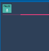
android:contentDescription="Pause" Appropriate App Title
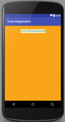
An app’s title is vital for every user, including low vision or visually impaired users. The content of the title is spoken to users with screen-readers, TalkBack or VoiceOver.
For example, let’s add app title in AndroidManifest.xml.
android:label="@string/app_name"
Here, the string value is set in strings.xml, i.e.
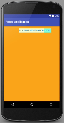
<string name="app_name">Voter Registration</string>
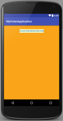
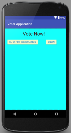
So, app title is Voter Registration as shown below.
If you will not change the app title, Android will automatically show you the application name.
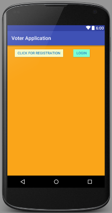
Proper Spacing
Proper spacing between controls is key to help users read text properly. In the next two examples, you can see the wrong as well as the right way to add controls.
Less accessible
As you can see above, it is quite difficult to read. But with correct spacing, you can easily read whatever is written on the button and it is quite easy to differentiate between both buttons.
Accessible
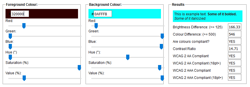
Color Contrast
The color contrast for foreground and background color should be WCAG compliant to ensure the text is readable.
You can use this online tool to check the contrast ratio of any set of colors.
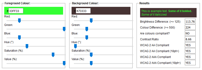
As shown above, check the contrast ratio and if you can see Yes in the Result, it means you have set adequate foreground and background colors.
For example, in the text below, you can see the foreground and background colors are WCAG compliant.
In the below figure, we added the same foreground and background color as shown above.
The Checklist
- Touchable control sizes
- Text field hints
- Visible controls should be within a virtual view hierarchy
- Add
android:contentDescriptionattributes - Ensure
android:contentDescriptionchanges when if control changes function - Your app should have an adequate
app_name - Place proper spacing between controls
- Ensure background and foreground colors have an adequate contrast ratio
Frequently Asked Questions (FAQs) on Mobile App Accessibility
What are the key elements to consider for mobile app accessibility?
Mobile app accessibility is about making your app usable by as many people as possible, including those with disabilities. Key elements to consider include color contrast, font size, touch target size, and the ability to navigate the app using assistive technologies. It’s also important to ensure that all functionality is available in both portrait and landscape orientations, and that the app can be used without sound.
How can I test the accessibility of my mobile app?
There are several tools and techniques available for testing mobile app accessibility. Automated tools can help identify issues with color contrast, font size, and other visual elements. Manual testing, on the other hand, can help identify issues with navigation, touch target size, and the use of assistive technologies. It’s also a good idea to involve users with disabilities in your testing process, as they can provide valuable feedback on the usability of your app.
What is the role of color contrast in mobile app accessibility?
Color contrast is a key element of mobile app accessibility. It ensures that the text and other elements on your app are easily distinguishable and readable by all users, including those with visual impairments. The Web Content Accessibility Guidelines (WCAG) recommend a minimum contrast ratio of 4.5:1 for normal text and 3:1 for large text.
How can I make my mobile app accessible for users with hearing impairments?
There are several ways to make your mobile app accessible for users with hearing impairments. One is to provide captions or transcripts for any audio content. Another is to ensure that your app can be used without sound, by providing visual cues or haptic feedback for important events.
What is the importance of touch target size in mobile app accessibility?
Touch target size is an important aspect of mobile app accessibility. It refers to the size of the area that a user can tap or swipe to interact with an element on the screen. If the touch target size is too small, users with motor impairments may struggle to interact with your app. The WCAG recommend a minimum touch target size of 44×44 pixels.
How can I make my mobile app accessible for users with cognitive impairments?
Making your mobile app accessible for users with cognitive impairments can involve a range of strategies. These might include using simple and clear language, providing step-by-step instructions, and avoiding time limits for tasks. It’s also important to ensure that your app is predictable and consistent in its design and functionality.
What is the role of assistive technologies in mobile app accessibility?
Assistive technologies, such as screen readers and voice recognition software, play a crucial role in mobile app accessibility. They enable users with disabilities to interact with your app in ways that suit their needs. To ensure your app is compatible with these technologies, it’s important to follow best practices for accessible coding and design.
How can I ensure my mobile app is accessible in both portrait and landscape orientations?
To ensure your mobile app is accessible in both portrait and landscape orientations, it’s important to test your app in both modes. Make sure that all functionality is available and that the layout and design remain clear and usable. This is particularly important for users with motor impairments, who may prefer to use their device in a particular orientation.
What are some common mistakes to avoid when designing for mobile app accessibility?
Common mistakes to avoid when designing for mobile app accessibility include using color alone to convey information, using small touch target sizes, and not providing alternative text for images. It’s also a mistake to assume that all users will interact with your app in the same way, and not to consider the needs of users with disabilities in your design and testing processes.
How can I keep up to date with best practices for mobile app accessibility?
Keeping up to date with best practices for mobile app accessibility can involve a range of strategies. These might include following relevant blogs and news sites, attending conferences and webinars, and participating in online communities. It’s also a good idea to regularly review the WCAG and other accessibility guidelines, as these are frequently updated.