

Key Takeaways
- Improving the user experience on long-scroll mobile websites can be achieved by adhering to standard sizes of popular mobile devices, positioning CTAs optimally within the first scroll, and avoiding fancy scrolling techniques that may slow down the page load time.
- Unnecessary desktop elements should be hidden on mobile to simplify and declutter the design. Products and images can be moved into a gallery to reduce the overall page height, and duplicate elements should be eliminated to shorten the length of the page and reduce the user’s need to scroll.
- The mobile-first approach to website design is essential for enhancing user experience and increasing conversions, especially as mobile devices dominate the market. This includes ensuring that core information and call-to-action are accessible within the first scroll, and that the design is optimized for the majority share of users’ devices.

In this fast-evolving digital world, a designer’s aim is to help the user save their valuable time by simplifying user experiences. The more simplified your design is, the more conversions you can expect, and since we currently exist in an era where mobile devices own the majority share of the market, this can sometimes be quite tricky.
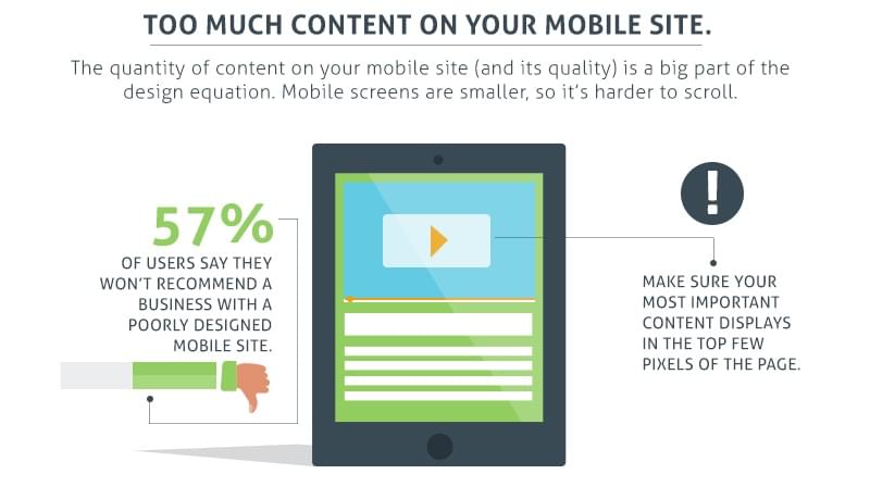
Among other things, handheld devices are used to shop online, more increasingly than ever before, so it’s completely essential that your website’s usability on mobile meets the user’s expectations. One such factor that tends to let the user down is long-scroll websites.
Why Are Long-Scroll Pages Problematic?
Long-scroll websites on mobile devices are not often appreciated; the overall height of your website naturally increases on mobile, because in most cases, the horizontal elements become stacked, as depicted in the figure below. This is bad because long-scroll websites break the user’s interest, resulting in them bouncing to another website.

Let’s highlight the drawbacks of long-scroll websites.
Scrolling Quickly Becomes Sluggish and Boring
When you adapt your desktop layout for mobile devices, the content usually becomes vertically stacked, and the overall webpage height increases ⏤ this divides the attention of your users. Repetitive scrolling can annoy the user very quickly, but you can avoid this by taking a mobile-first approach to website design.
Navigation Can be Unfriendly
The navigational structure of your website matters a lot, both on desktop and mobile. When you include lots information on a single webpage, it becomes cluttered (especially on a mobile device), and as a result, users find it difficult to reach their desired destination.
Hindrance for the Footer Elements
Footer navigations are considered important because users often scroll down to the footer to find their next webpage. If your mobile design is too long, users will likely find it difficult to navigate to other webpages, which will increase the bounce rate (bounce rate: the % of visitors who only visited one webpage in the session).
Why Should Long-Scroll Pages be Optimized?
According to Smart Insights, 48% of consumers do mobile research using search engines ⏤ organic traffic is considered to be a major source of traffic and conversions. Ignoring the ramifications of long-scroll pages can be a big loss to your business.
Source: Formstack.
According to a 2016 Marketing Report by Salesforce, 68% of marketing agencies have integrated a mobile marketing strategy into their overall marketing strategy. Just these facts alone emphasize the importance of adopting a proper mobile strategy.
But now for the million-dollar question: how do you optimize the overwhelming scrolling structure of mobile websites when you have so much content to display?
Let’s take a look.
1. Follow the Standard Sizes of Popular Mobile Devices
For mobile websites, there is no standard height that needs to be followed. It ultimately depends on the analysis of how your visitors browse the mobile website in question, however it is recommended that a mobile website should be readable in approximately three to five scrolls.
We also need to factor in the viewport height of the various mobile devices that exist today. All recent iPhones (the iPhone 6 and iPhone 7 series) should be included by default, however, when it comes to Android it’s difficult to identify which brands and which models should be considered. Take a look at this Brand Fragmentation Analysis by OpenSIgnal ⏤ this will surely give an idea about which Android devices are the most popular.

According to the brand fragmentation analysis above, Samsung is clearly ruling the Android device market. By testing your mobile designs on the most commonly used devices, you can ensure that your layout and content is optimized for the majority share of your users.
Another Android device that should be considered is Google Nexus, because of its material design element. It’s quite common among designers to test their designs on this device.
Source: AppBrain.
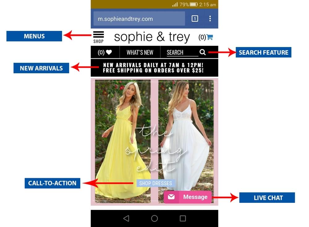
2. Position CTA’s to Get the Most of the First Scroll
A famous saying applies here, “your first impression can be the last one”. The first scroll actually decides whether or not your users should hit the back button or not. The core information and call-to-action should be accessible within the first scroll, so that visitors can easily find what they’re looking for.
So the idea is that you insert the CTAs in a timely spot, and the important information (including links) should be placed conveniently within the first scroll, however, you shouldn’t take this too far. You shouldn’t stuff your above-the-fold-content with a bunch of calls to action.
I really like the user-experience of Sophie and Trey, both on desktop and mobile. It’s a female clothing brand which has successfully implemented a very well-balanced mobile website design. As you can see in the screenshot below, all of the significant elements have been perfectly laid out.
3. Avoid Fancy Scrolling
Parallax scrolling websites are a common trend in the creative web design industry; it’s been considered as one of the best storytelling techniques. Despite this, there are some drawbacks which simply can’t be ignored.
- Parallax scrolling usually increases the time it takes for the webpage to load (especially on mobile), which is bad for the user experience, and for SEO rankings as well
- Parallax layouts are hard to translate to mobile designs as it makes responsive design difficult to achieve.
4. Hiding Unnecessary Desktop Elements on Mobile
“The ability to simplify means to eliminate the unnecessary so that the necessary may speak.” ~ Hans Hofmann.
When it comes to mobile design, you have to make the best of a limited space. Be very specific, very direct and display only the elements which are the most crucial.
Amazon is doing splendidly in this regard. Compare their desktop and mobile layouts to see how they’ve excluded the unnecessary stuff on mobile!

5. Move Products and Images Into a Gallery
Business-to-customer websites sometimes need to showcase multiple products, and display multiple images of each of those products. Unfortunately, this naturally increases the overall page height of the mobile layout. Galleries (also known as sliders) can solve that.
Galleries can be implemented on mobile in a variety of ways (depending on how tech-savvy your audience is). One way is to introduce horizontal scrolling elements, so that should the user want to scroll through a section that many other uses may not, they’re not forced to.
We recently implemented this feature to our newly designed website, in which we transformed the list of clientele into a gallery that the user can scroll optionally.

6. Eliminate Duplicate Elements
On desktop websites, the navigational elements are usually repeated in the footer (to save the user from having to scroll back up). On mobile, so that the navigation is always accessible, you can fix it to the top of the webpage (or the bottom, which is more accessible to thumbs) and eliminate any other instance of the navigation ⏤ this is one example of how we can minimize unnecessary objects in our mobile layouts, shortening the length of them and ultimately reducing the user’s need to scroll.

In a Nutshell
Enhancing the user experience has always been one of the biggest concerns for brands worldwide. Users are always interested in brands that provide them value, not only from their product but also from the user experience they offer. The current generation is progressing toward the mobile-first design, and in order to compete against the cutting-edge competition in the market, it’s important to harness your creative powers and build an amazing user experience that stands out and becomes part of your brand.
Frequently Asked Questions (FAQs) on Improving Long Scroll Mobile Websites
What are the key elements to consider when designing a long scroll mobile website?
When designing a long scroll mobile website, it’s crucial to consider the user experience. This includes the ease of navigation, the loading speed, and the overall aesthetic appeal. The content should be organized in a logical and intuitive manner, with clear headings and subheadings. The website should also be responsive, meaning it should adapt to different screen sizes and orientations. Additionally, consider incorporating interactive elements to engage users and keep them scrolling.
How can I improve the loading speed of my long scroll mobile website?
Improving the loading speed of your long scroll mobile website can be achieved through several methods. One is optimizing your images and other media files to reduce their size. Another is using lazy loading, which only loads content as it’s needed. You can also minimize the use of heavy scripts and plugins, and leverage browser caching to store parts of your website locally on the user’s device.
How can I make my long scroll mobile website more engaging?
To make your long scroll mobile website more engaging, consider incorporating interactive elements such as animations, videos, and quizzes. You can also use storytelling techniques to guide users through your content. Additionally, make sure your content is relevant and valuable to your audience. Regularly updating your content can also keep users coming back.
What is the role of typography in long scroll mobile websites?
Typography plays a crucial role in long scroll mobile websites. It not only contributes to the aesthetic appeal of the site but also affects readability. Choose fonts that are easy to read on small screens and use different font sizes and styles to differentiate between headings, subheadings, and body text. Also, ensure there is sufficient contrast between the text and the background.
How can I optimize the navigation of my long scroll mobile website?
Optimizing the navigation of your long scroll mobile website can be achieved by using a sticky navigation bar, which stays visible even as the user scrolls down. You can also use anchor links to allow users to jump to specific sections of the page. Additionally, consider providing a “back to top” button for easy navigation.
What are some common mistakes to avoid when designing a long scroll mobile website?
Some common mistakes to avoid when designing a long scroll mobile website include overloading the page with too much content, using too many heavy media files that slow down the loading speed, and not optimizing the website for different screen sizes and orientations. Also, avoid making the navigation too complex or confusing.
How can I use analytics to improve my long scroll mobile website?
Analytics can provide valuable insights into how users interact with your long scroll mobile website. You can see which sections of the page are most viewed, how long users stay on the page, and what devices they are using. This information can help you identify areas of your website that need improvement.
How can I make my long scroll mobile website more accessible?
To make your long scroll mobile website more accessible, ensure that all elements of the site are easily accessible and usable for people with disabilities. This includes using alt text for images, providing transcripts for videos, and ensuring that all interactive elements can be accessed using a keyboard.
How can I test the performance of my long scroll mobile website?
You can test the performance of your long scroll mobile website using various tools such as Google’s PageSpeed Insights, which analyzes the content of a web page and generates suggestions to make it faster. You can also use mobile usability testing tools to see how your website performs on different devices.
How can I keep users engaged on my long scroll mobile website?
Keeping users engaged on your long scroll mobile website can be achieved by providing valuable and relevant content, using interactive elements, and ensuring a smooth and enjoyable user experience. Regularly updating your content and providing opportunities for user interaction can also help keep users engaged.