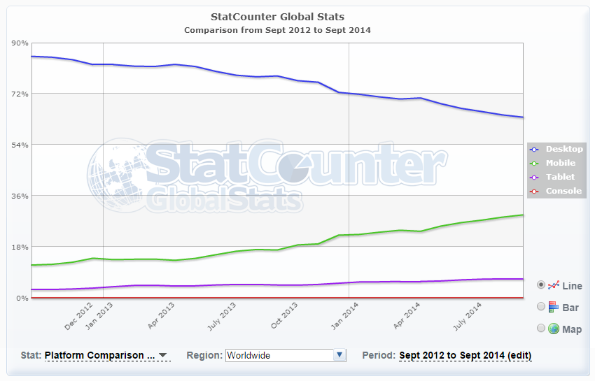
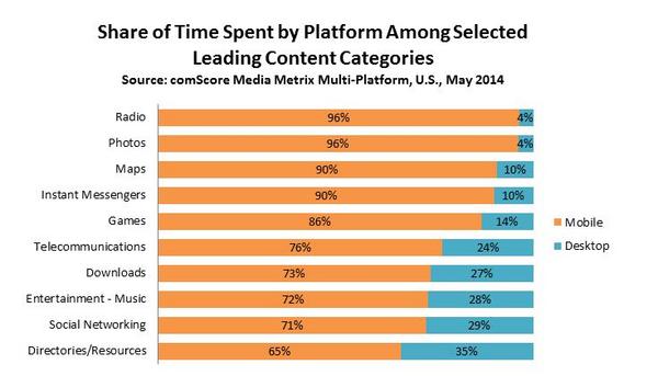
Did you know that mobile traffic (i.e. smartphones, etc.) accounts for about 30% of website page views today? That’s up 3x from a measly 10% just 2 years ago. In the same period, desktop access is now down to 60% (here’s how this data is measured).
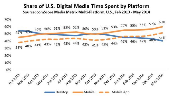
Looking at the time spent instead of just the page views, this report by comScore shows that mobile platforms account for 60% of digital media time spent.
I could share more numbers to drive home the point, but those of you wh are data-inclined can look up more here and here. These numbers are just an indication of how rapidly web usage patterns are changing.
Luke Wroblewski talked about the need for Mobile First designs back in 2011 and shared some early data in 2012, much before we saw such a major shift in web usage patterns. Two years on, with smartphones and tablets replacing PCs dramatically, even at the workplace, it’s alarming to see most designers and developers still stuck designing the traditional way – for large screen desktops – and still talking about progressive enhancement versus graceful degradation.
The Traditional Desktop First Approach is Outdated
If you’re still approaching your web design strategy primarily with large screens in mind, it’s time to think it over. Here’s why:
- Users are moving to mobile. A growing number of users now care more about the mobile experience rather than how your website works on the desktop. Whether your site is about ecommerce, or providing information and content, users want to be able to access it, and use it, wherever they are, whenever they need it. And that’s most likely to be from a mobile device, as shown by the data in the first paragraph of this article.
- Desktop for creation. Mobile for consumption. Mobile devices are the primary way most viewers consume content today. Desktops continue to be used, mostly for content creation or “work” – things that are too intricate to be done on mobile devices. Even that is changing with many firms turning to mobile devices for work as well. You can readm more more about mobile usage behaviour in this excellent report (PDF).
- Mobile devices and browsers have evolved. In terms of web development, the primary difference between desktop and mobile experience used to be that mobile browsers were very basic and didn’t support many key development features, leading us to adopt a graceful degradation approach. That no longer holds true. Mobile browsers have evolved. Graceful degradation and progressive enhancement should not be the primary strategy on mobile any more. These principles evolved as a way to handle the huge differences in what various browsers supported. Mobile devices these days have CPUs and GPUs almost at par with desktops. And modern WebKit-based mobile browsers are way better than IE8! So you don’t have to dumb it down for mobiles any more. The real limitations are screen space and download bandwidths.
- The essence of the web is the User Experience. Not design. As designers and developers we often get caught in the intricacies of what fancy things our tools let us do – whether it be playing around with graphics, animation, or media queries. The web is not about us. It’s not even about HTML, CSS, JavaScript or the other tools we use. It’s about connecting people.. Your website really does not need fancy graphics, fading forms, or the latest CSS3 features to create an exquisite user experience.
The Future of the Web is Mobile
The way we experience the internet has changed so dramatically over the last few years that starting your design for desktops, in this day and age, is like keeping one foot firmly planted in the past. It prevents you from moving ahead. It means your website will be outdated pretty soon. While this may be good news for some (hey, you get to re-do the website and charge extra for it), most of us like to put good, lasting work out there – the kind that’ll be appreciated. Here’s how a mobile first approach helps you:
- It’s your best bet on being future proof. Again, go back and look at the data at the top of this article.
- It forces you to focus on people, on the user experience, on the content. Depending on the device, a mobile user has less than 20% screen space available as compared to the desktop. In order to make sure your website still conveys the message it needs to, you are forced to focus on the core. You have to know exactly who your target audience is, and exactly what you want them to experience.
- It lets you leverage extended capabilities. Think touch, think GPS. These, and other such extended capabilities, are already part of the mobile experience today. And we’ll see them entering the desktop space soon. Explicitly designing for mobile devices, it opens you up to the possibility of leveraging these ‘extended’ capabilities to create rich context-aware websites. It gives you the space to think outside the box, as opposed to sticking to dated concepts and capabilities of the desktop world.
- Cleaner Design. Cleaner code. A mobile first approach is minimalistic. Instead of starting out with a large design that has everything and the kitchen sink, and then adding in media queries and what not to selectively display or hide certain elements on smaller screens, you start with the bare minimum, and add on only what’s absolutely required – an almost Zen approach. For some more insight on this, check out Jeremy Girard’s tale over at Smashing Magazine of how his company ended up with mobile first design and how it helped them.
What’s Holding You Back?
As you can see, I’m clearly biased in favor of mobile first designs. So I had to rack my brains considerably to try and figure why everyone else wasn’t so enthusiastic. There’s only two things I could come up with.
-
Habit. We’re just so used to the old way of designing. Start with a large screen that ‘has it all’; then leave out some parts for smaller screens. We don’t want to make the effort to change. We don’t want to believe that it’s required, or even that it’s possible. Designing for mobile first forces you to re-think your entire design and development strategy. You start with less. Less space, less content. It’s really hard to do that. Plus we’d have to think about things like gestures and touch and GPS, instead of mouse controls and clicks like we’re used to.
-
Clients. Yes, clients. They have the final say on the design. And some of them still asked for Flash-based websites rather than HTML. Some want jazzy images and graphics. And some will not like the minimalist mobile first designs you present to them. But as a designer/developer, it’s your job to figure out what’s best for the website and the client, and to explain it to them. Of course, if their site traffic is all from desktops and not from mobile, then by all means do a desktop-based design. But if they’re in a space that’s seeing growing mobile access, then brush up on your persuasion skills and show them why it makes sense to go mobile first.
In Summary
Designing for mobile first not only prepares your website for the explosive growth that is already happening in the mobile space, but as a designer and developer, it forces you to focus on the user.
A mobile first design doesn’t only apply to new websites. This is a good approach to follow even if you already have a desktop version. In the process of designing for mobile, you’ll have to identify what are the core areas, what are your priorities, what you really want to show on the screen, and how you want users to interact with your site. These insights will also provide pointers for ways to optimise the desktop site.
While I’ve been saying “mobile” first, do note that the principles are not really limited to “mobile” devices. It’s all about better usability, better use of screen real estate and better use of page elements and code – things we should always keep at the forefront, but which often get buried under the bling.
Less is more. Simple is better. The minimalist in me kind of likes that. But more so, because it brings the focus back on people, not on technicalities.
 Richa Jain
Once upon a time, Richa was a savvy techie & manager, in the semiconductor software industry. After her miraculous escape and recovery, she now works from her garden, creating websites, writing about technology, business & entrepreneurship; and helping others escape the cubicle lifestyle.


