
Web Design trends can change faster than the time it takes your coffee to cool down. Just kidding.
Somewhere, someone is always putting effort into making new design trends. The use of large scale photography is mclellanjacobs.com one of those trends that arrived in 2013. Large photographs not only provide a good contrast but also their message is clear and appealing.
Key Takeaways
- Large photographs in web design provide a strong visual impact, conveying complex ideas quickly and effectively, and setting a mood that aligns with the brand’s identity.
- Using large photographs requires careful optimization, including image compression and responsive design, to prevent slow load times and ensure a positive user experience.
- The use of text within large photographs should be carefully considered to ensure legibility and alignment with the overall design aesthetic. Fonts should be extraordinary but not fancy.
- Common mistakes to avoid when using large photographs include using low-quality or irrelevant images, not optimizing images for the web, and not considering the user experience, such as slow load times or difficult navigation.
Why Large Photographs?
It provides a pleasant visual experience to the eyes and eye catching photography has an impact that is hard to match. We should not forget the scientific fact that our brain processes images 60,000 times faster than reading text.
Images with impact can be important to make a vivid and memorable website. When you use a large photograph effectively, the photograph turns the website into a simple but yet beautiful web design. One thing you should remember is that the use of large photographs will make your website visually congested so make sure that other elements complement the images.
3 Common Mistakes to Avoid When Dealing With Large Photograph Websites
- Battle with different sizes: Resolution is a term associated with every type of design but it becomes entirely necessary to understand when using larger photographs. You have to test with different resolutions and take into account the width of different browsers.
- Loading Time: Using large photographs with high resolution and good quality will increase file sizes. This will increase your load time significantly. Use Firebug or similar plugins to get hints on how to optimize your website.
- Wrong Format: You may face loading issues because of poor format selection. Choose the web standard formats such as JPEG, PNG and GIF to avoid long loading times.
The Websites
Note that clicking each image below will open the target website in a new tab or window.
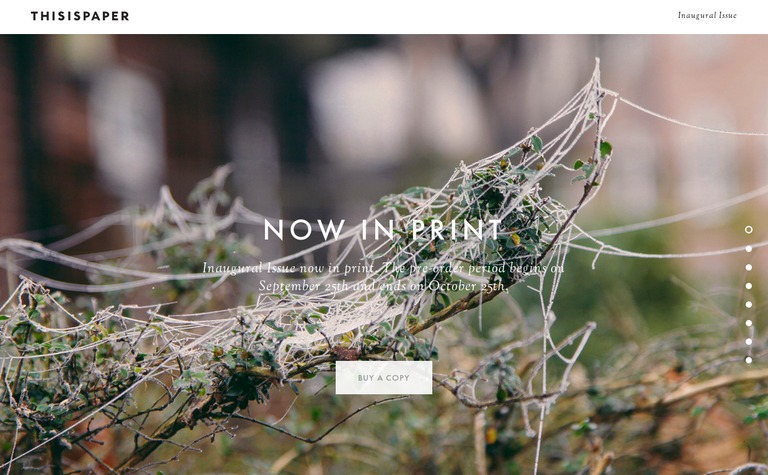
Thisispaper has a strong background slide shows that represents the service they offer and their background is catchy and innovative.The slideshows provide more flexibility to the website.
At first glance, you will see only one photo background but when you use the slider provided, you are actually producing a combination of two photo backgrounds. The website is full of CSS and jQuery.
Code24 not only uses multiple photographs that slide after a fixed time interval, but also provides space for a menu. They have written their tagline on the semitransparent rectangle with perfect use of color that makes the text completely visible.

Falve is a multipage website that has nothing on the landing page except a slider of images and a clean menu on top. This is probably to provide more space for the photographs.

Uber has smartly played with large photographs and each element complements the design. Here also you will get multiple photographs that are fashionable and at the same time represent their product.
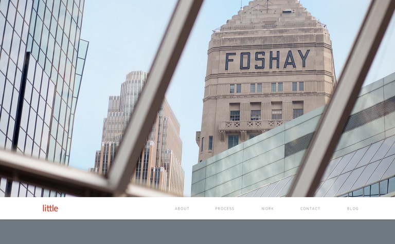
The Little is a brand design firm based in Minneapolis that used a building photograph with a brand name top of it. Such types of large photographs take the agency and client relation to the next level and reflect the promising attitude of the agency.
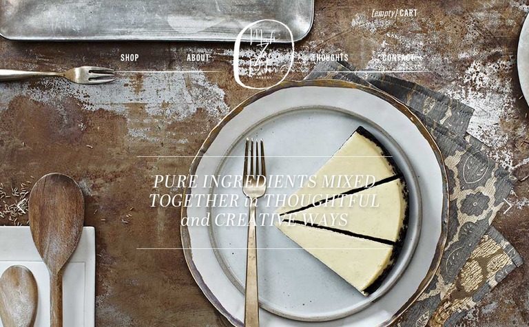
The Mah Ze Dahr Bakery is another single page wbsite as creative as their tag line. On the home page you will get some nice lines with every slide. At each scroll the background photograph changes. One thing you will notice is that there is no home link – the logo plays the role of the home link.

Creativity at its best. So far, you have seen websites with large backgrounds, here is the custom tee designing web application that provides you the freedom to design a tee, choose size and place order right from the landing page.
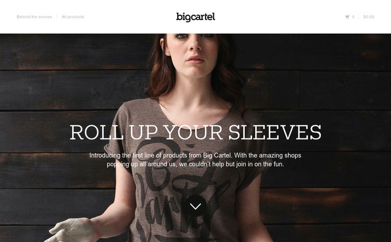
To avoid the visibility issue Big Cartel has used their navigation on whitespace unlike other websites that place the navigation on the photograph. One thing is sure that all large photograph websites are using some text on their photographs. Make sure the fonts are extraordinary but not fancy.
The purpose of including this is to show you how a great website will become worse when you use odd fashion fonts. Though the website has made proper use of the photograph, the fonts seem uneven or at least not what we are used to seeing on regular websites.
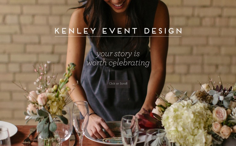
Here Kenley Event design has used the focus of the photograph. As they are a planning company they have focused on serving. The moment you click on scroll, the CSS plays its magic and makes the website more attractive.
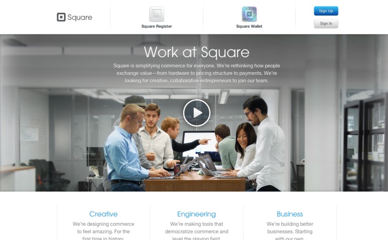
Square website is creatively designed: a worthy inclusion on this list. At each scroll you will get something new to the photograph that offers a nice mood to the website.

Niedlov’s Breadworks is a single website with no navigation menu. The navigation menu is replaced by an arrow. With the help of the arrow you can scroll down and up.
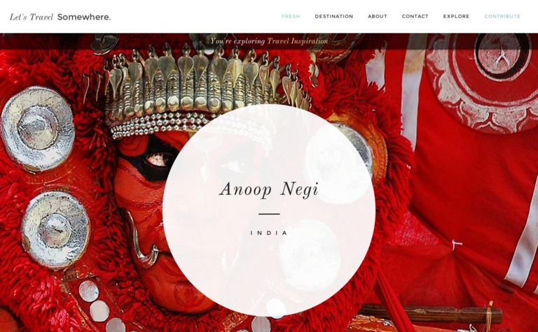
Let’s Travel Somewhere is a responsive travel inspiration blog which attracts visitors with their high quality large photography background. Each photograph fits perfectly in your browser window. So remember to make your website responsive too.
Daniel Hopwood is a single page website that has a navigation bar at the bottom of the photograph. Though it is unusual, it perfectly suits the website.
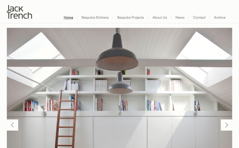
Jack Trench has an interesting setup of the website. Designers have perfectly focused on what to show to viewers. So one more advantage of large photographs is that you can be focused on what to show and what is worthy to display.
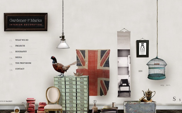
As they offer interior decoration their background implies this. At first glance, the logo looks like a board on the wall. The menu is well placed.
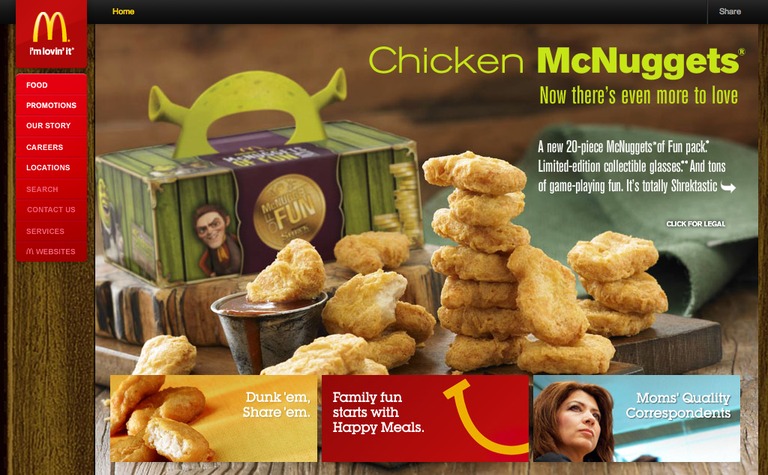
One of the uses of large photographs is to shout out about a new product or service. In this case, McD perfectly promotes its new food item. So it is a technique the designer can use in creative ways.
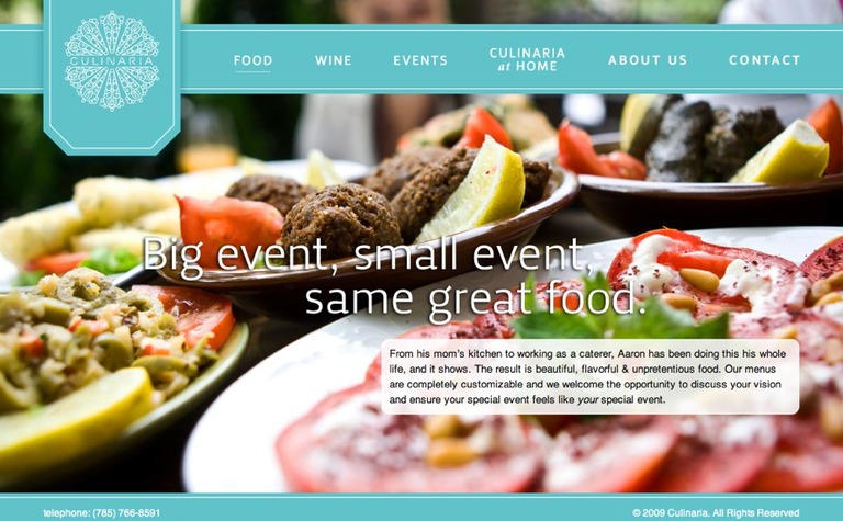
Use of photography is most common among food, travel, personal portfolios etc. Keeping a mouth-watering photograph really gains a bonus point for the food industry. This overall design will inspire the designer who wants to design a food website.
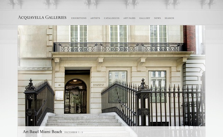
Not only does Acquavella Galleries feature an attractive and beautiful photograph but also its simple look and font styles complement it. It is a good inspiration for designers who are looking to design portfolio and gallery websites.
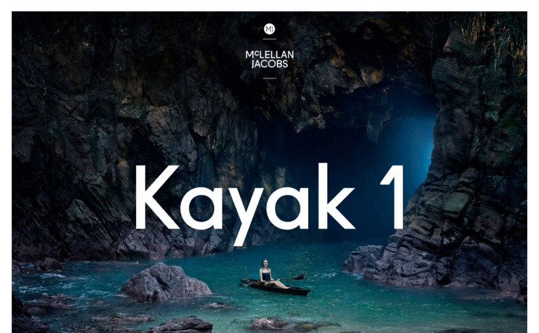
McLellan Jacobs sells kayaks (a small single person boat) and to gain attraction they have taken advantage of the large photograph to show their product with the most adorable natural background to show and give you the feel of the product.
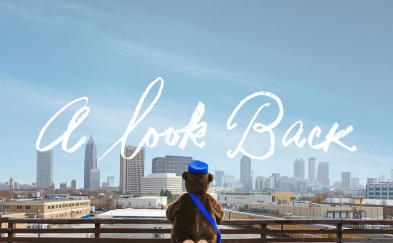
MailChimp is an email marketing service which used large background so creatively that it makes it worth staying and reading their annual report. The website tells a story of their last year activities in detail. The story begins with a large photograph with text, a look back and when you finish reading report the last photo will say Thanks. So here we learn that if we effectively and creatively use large photograph backgrounds then we can take it to another level.
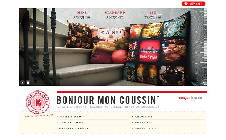
Bonjour’s multipage website has set the best example of creative work with photograph. The pillow is in order from big to mini with the size label on top. It also features a scale (at right side) to make the website more trustworthy.
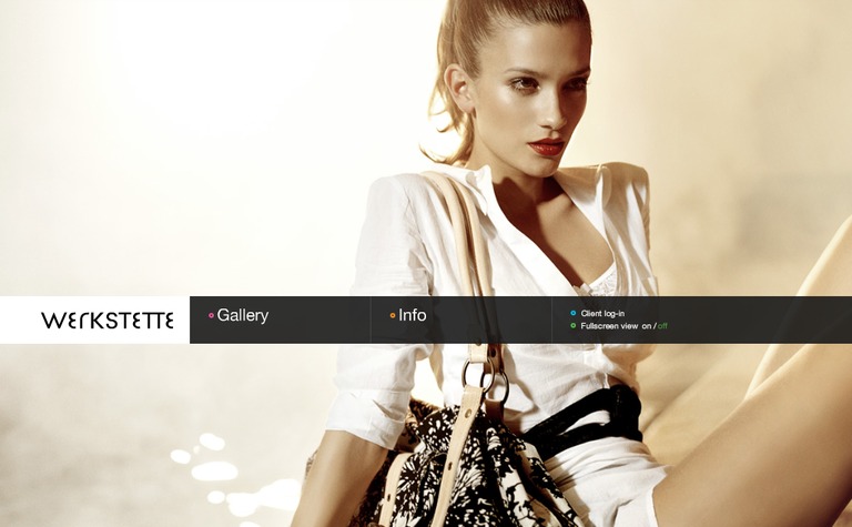
I fall in love with Werkstette. They have perfectly mixed every effect with a navigation bar. Let’s talk about semitransparent navigation bar which is perfectly positioned at the center. There is an option at the right side of the navigation bar to view the website in full screen mode (I have never encountered this before). Not only this, when you click on Gallery the navigation bar will move down and after a fraction of a second, it will hide automatically.
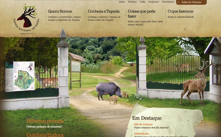
Tapada de mafra is shows a Portugal Park entrance photograph that is truly inviting and welcoming. Nothing can be better than to show entrance of a park or some prime location of the park on the landing page to attract visitors.
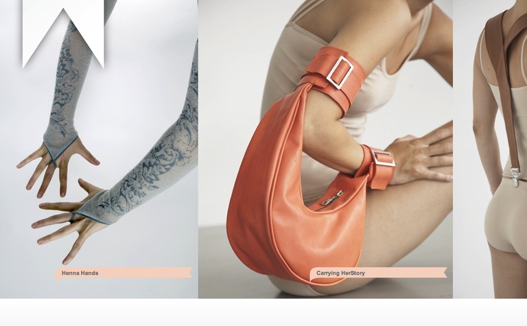
It is not necessary to feature only one large photograph on the landing page. In this style you not only get space to show different products but also you can show products from different views. Marlous de Roode proves this by showing fashion accessories from different angles to give you complete visual range of products from different sides.
Adding full page slide shows to serve collections of your jewelry, designs, interiors and photography portfolio is becoming trendier. Lula design is a perfect example for those looking for showing collections.
The use of large photographs is one thing but when you mix some more ideas into in, it becomes more useful and informational for the user. When you place the mouse over any of the images you will get some additional information.
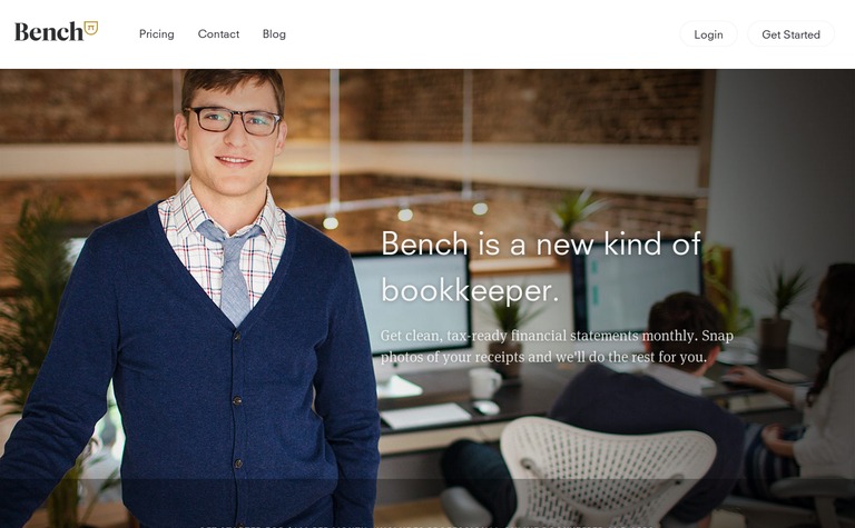
Here, Bench.co used their office workstation behind a professional. As you land on their website you will get a transparent menu with perfect use of fonts. As you scroll down the menu will become opaque and stick to the page. Here the designer has effectively played with navigation.
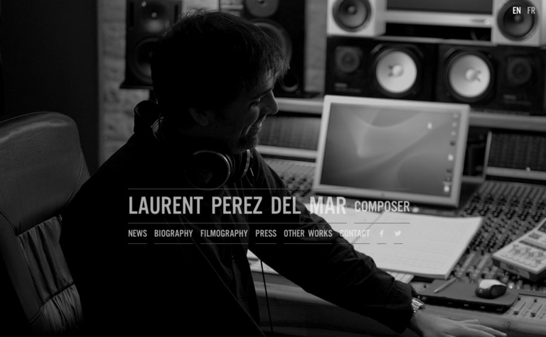
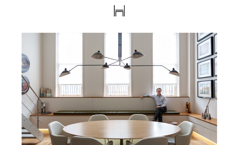
This is a single page website with transparent navigation menu. To give a personal and professional touch to the website, Laurent has used his office photograph as background. He has perfectly placed the navigation menu at the center of the page as the navigation bar, commonly seen either at the top or center in large photograph.
What About SEO?
The arguments about whether content is king are never ending and everyone has their own views on it. We cannot conclude anything from these arguments. But we cannot rule out that text content is more important for a website than photographs. Text content is the oxygen of your website.
Colin Alsheimer, Senior Digital Manager at Weber Shandwick in Dallas, suggests that you use a minimum of 300 search friendly words for your website. I would also suggest you never use Flash for slideshows on your website because it is outdated technology and it is very difficult for search engine spiders to crawl and index. Go for jQuery and CSS, they have many advantages over Flash.
Conclusion
The reason behind this popular trend is that designers can play with depth, focus, contrast of photographs. It not only sets a good mood for the website but also provides relevancy with the niche of the website. This trend is getting wider and wider, day by day as designers experiment with animation and video, too. I would suggest you to use ONLY high quality photographs otherwise it will down your website in no time.
I hope you have discovered something new in this article. Let me know what you think about the use of large photographs as website background.
Frequently Asked Questions on Large Photograph-Based Website Designs
What are the benefits of using large photographs in website design?
Large photographs can significantly enhance the visual appeal of a website. They can create a strong first impression, draw attention, and engage users. Large images can also convey complex ideas quickly and effectively, making it easier for users to understand the message or the purpose of the site. They can also help to establish a particular mood or atmosphere, and reinforce branding.
How can I optimize large images for my website?
Optimizing large images is crucial to ensure that they do not slow down your website. You can use image compression tools to reduce the file size without compromising on quality. Also, consider using responsive images that adapt to the screen size of the user’s device. This can help to improve load times and enhance user experience.
What are some best practices for using large photographs in website design?
When using large photographs, ensure that they are high-quality and relevant to your content. They should enhance your message, not distract from it. Also, consider the layout and composition of your images. They should be well-composed and aesthetically pleasing. Lastly, always consider the user experience. Ensure that your images do not slow down your site or make it difficult to navigate.
Can I use stock photos for my website design?
Yes, you can use stock photos, but it’s important to choose them carefully. They should be high-quality and relevant to your content. Also, consider the licensing terms. Some stock photos require attribution or have restrictions on their use.
How can I incorporate text into my large photograph-based website design?
There are several ways to incorporate text into your design. You can overlay text on your images, but ensure that it is legible and does not detract from the image. You can also use text boxes or banners, or place text next to your images. The key is to ensure that your text and images work together to convey your message effectively.
What are some common mistakes to avoid when using large photographs in website design?
Some common mistakes include using low-quality images, not optimizing images for web, using irrelevant images, and not considering the user experience. Also, avoid using too many large images as this can slow down your site and overwhelm your users.
How can I use large photographs to enhance my branding?
Large photographs can be a powerful tool for branding. They can help to establish a particular mood or atmosphere, and convey your brand’s personality. Choose images that reflect your brand’s values and aesthetics. Also, consider using consistent colors, styles, and themes in your images to reinforce your branding.
How can I ensure that my large photograph-based website design is accessible?
To ensure accessibility, provide alternative text for your images. This can help users with visual impairments understand the content of your images. Also, ensure that your text is legible and contrasts well with your images.
Can I use large photographs in e-commerce website design?
Yes, large photographs can be very effective in e-commerce website design. They can showcase products in detail and create a strong visual impact. However, ensure that your images are optimized for web to prevent slow load times.
How can I measure the effectiveness of my large photograph-based website design?
You can use various metrics to measure the effectiveness of your design, such as bounce rate, time on site, and conversion rate. User feedback can also provide valuable insights. Consider conducting user testing or surveys to understand how users interact with your site and how you can improve it.