There are universally accepted best practices in graphic design that apply to all mediums.
Likely you’ve heard the term ‘negative space’ before – it’s one of those practices used by designers all the time. If they did it right, you probably didn’t even notice it. It tends to be a technique used to draw your attention to the message, or the theme visual, adding to it’s impact.It’s a little counter-intuitive when you have a lot to communicate – it’s hard not to be tempted to use every pixel. The good news is, if you can grasp the idea of negative space, you’ll better understand how and when to use it.
The term “negative space”, in a graphic design context, is a little misleading. It sounds like you’re describing space on your page (real or virtual) with nothing in it.
That’s actually not true.
There’s plenty of “something” in that space, and when used with purpose, it’s resulting effect is anything but “negative”.
Negative space is a roadmap through your design and communications, showing the viewer the important stuff they need to know, or want to see.
It works a little like a photograph with some blurry areas, and one very sharply focused area. Your mind intuitively knows to ignore the blurry and go to the sharp.
Our brains are set to seek out familiar shapes and patterns, like recognizing someone’s face, a particular tree, or your pet cat from the neighbour’s cat.
Negative space in design sends your brain the same signals. When an empty space is interrupted by an element, your eye is drawn there.
The most basic, practical way to understand negative space is to imagine a logo, top of your page, centered, and about 15 to 20% of the width of your browser.

Importantly, there’s nothing on either side. So, where do you look?
Answer: Right at the logo.
You don’t have to start at the left and follow the nothing until you reach the something. Your eyes went straight there, because the something interrupted the nothing.
That’s how negative space works. It’s the ‘nothing’ that takes you right to the something.
So, all page elements should have space?
That said, there’s an important distinction to make between elements worthy of negative space, and those not.
A logo? Excellent candidate for a negative space treatment. It’s an important element.
Conceptual image? Yup. Adds to the drama.
Date of published article? Well, not so much. when an element on your page is given a region of space on it’s own, it immediately reads as “more important” than the other elements on the page that conform more conventionally to the flow of the layout.
So, logos, headings, section titles, important visuals – all elements with the proper level of importance for a negative space treatment.
Telling Stories with Negative Space



Going beyond the simple logo example I mentioned above, the more advanced applications of negative space are a little harder to grasp, but very powerful when used properly.
Negative space can create a trick for the eye – one that might take a moment for your viewer to catch, but when they do grab it, they’ll appreciate your cleverness.
I’ve included some examples of what I mean.
Creating Visual Drama with Negative Space
Another application of negative space is to dramatize a theme visual, like an important portrait or key visual. This is often used together with either a theme headline or brand tagline.
This is a little harder to pull off when working on an average, everyday project, but on a gig where your client wants a little something more “upscale”, this can work nicely.
Here an example of it in action (image used with permission from the photographer, Anthony Taylor).

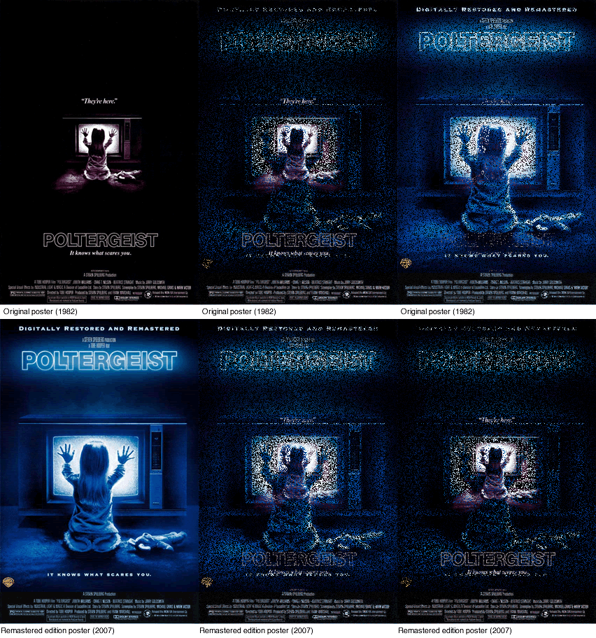 Likewise, horror movie posters artists have been some of the most masterful exponents of this trick.
The poster for Steven Spielberg’s Poltergeist (1982) is a classic example.
None of its individual components are very scary.
There’s a little girl, a teddy bear, a big TV screen. There is no blood or gore, no ghosts, not even a spooky typeface.
But, somehow the layout drenches it in fear and loathing. Clearly something inside that TV has enthralled that poor, innocent girl, and she’s helpless, lost in the darkness, beyond our or anyone else’s reach.
Interestingly, for the 25th anniversary edition (2007), they reworked that original poster, removing most of the negative space and scaling up the imagery, with questionable results.
Now, as the viewer, we are sharing the room with the girl. Sure, it’s no holiday destination, but a lot of the desperation has ebbed away.
So, what’s the trick to using Negative Space?
Getting deeper into pure design, negative space used with other design concepts like divisions of thirds and fifths, grid-based design and typography (not just choosing fonts, but the craft of creating interesting and engaging type) becomes a very diverse set of tools in an effective toolbox.
The pro designers go into that toolbox on every project, but don’t use every tool, every time, of course.
Good design is usually simple. One visual trick. One cute gimmick. One type treatment.
It becomes chaos when you try to overdose on techniques – much like writing web code. The best approach is usually the simplest one, using the least code. Design is no different.
The bottom line is, it’s not easy to create good design the first time out of the gate, and frankly, there’s a lot of really bad design out there, in and on all mediums.
I find, in any situation, the best design approach is the one a Creative Director I used to work for used.
His philosophy:
“Get the message right. Make it clear and easy to follow, and keep it on strategy. Do that, and the design will take care of itself.”
Put the negative space technique in your design toolbox, and whip it out now and again. Your clients will challenge you to fill every pixel, yes. It happens to the best of us.
But, a good design is always the best defense.
Frequently Asked Questions about Negative Space
What is the concept of negative space in design?
Negative space, also known as white space, is the area around and between the subject of an image. It’s not just the background, but the space that defines the boundaries of positive space, the main focus area. In design, negative space is used to create balance, harmony, and help guide the viewer’s eye to the focal point. It’s a powerful tool that can add depth and complexity to a design, making it more engaging and visually appealing.
How does negative space contribute to the overall design?
Negative space plays a crucial role in defining the layout and visual hierarchy of a design. It helps to separate different elements, making the design easier to understand and navigate. It can also be used to create interesting visual effects, such as hidden images or optical illusions. By manipulating negative space, designers can guide the viewer’s attention and influence how they perceive the design.
Can negative space be any color or does it have to be white?
Despite its name, negative space doesn’t have to be white. It can be any color, texture, or pattern. The key is that it contrasts with the positive space, helping to distinguish different elements and make the design more readable. In some cases, the negative space can even become the main focus of the design, creating a unique and memorable visual effect.
What is the difference between positive and negative space?
Positive space refers to the main subject or elements of a design, while negative space is the area around and between these elements. Both are equally important and need to be balanced to create a successful design. Too much positive space can make a design feel crowded and chaotic, while too much negative space can make it feel empty and unfinished.
How can I effectively use negative space in my designs?
Using negative space effectively requires a good understanding of design principles and a keen eye for detail. Start by defining the main elements of your design and then use negative space to highlight and frame these elements. Experiment with different layouts and compositions, and don’t be afraid to leave some areas empty. Remember, negative space is not just empty space, but a powerful design tool that can add depth and sophistication to your designs.
Can negative space be used in all types of design?
Yes, negative space can be used in all types of design, from graphic design and web design to interior design and architecture. It’s a universal design principle that can enhance the visual appeal and functionality of any design.
What are some famous examples of negative space in design?
There are many famous examples of negative space in design. One of the most iconic is the FedEx logo, which uses negative space to create an arrow between the letters ‘E’ and ‘X’. Another example is the World Wildlife Fund logo, which uses negative space to create the image of a panda.
What are the benefits of using negative space in design?
Using negative space in design can have several benefits. It can improve readability, guide the viewer’s eye, create balance and harmony, and add depth and complexity to a design. It can also help to convey a certain mood or atmosphere, and make a design more memorable and distinctive.
Can negative space be used in photography?
Yes, negative space can be used in photography to create powerful and compelling images. By leaving empty space around the subject, photographers can draw attention to the subject and create a sense of scale and context. Negative space can also be used to create interesting compositions and visual effects.
How can I improve my skills in using negative space?
Improving your skills in using negative space requires practice and experimentation. Study the work of other designers and artists, and try to incorporate their techniques into your own work. Experiment with different layouts and compositions, and get feedback from others. Remember, design is a process of trial and error, and every mistake is an opportunity to learn and improve.
 Shawn Barry
Shawn Barry is a creative professional and Owner/Creative Director at Booster Rocket Media. Shawn has over 22 years experience in the creative industry as a graphic designer and art director. He also teaches graphic design through his own youtube channel.
