
This article was sponsored by New Relic. Thank you for supporting the sponsors who make SitePoint possible!
We’ve had a lot of performance talk over the years here at SitePoint, and we believe it’s time to revisit the topic with some more advanced aspects. The approaches mentioned in this article won’t be strictly PHP related, but you can be sure they’ll bring your application to a whole new level if used properly. Note that we won’t be covering the usual stuff – fewer requests for CSS, JS and images meaning faster websites and similar hints are common knowledge. Instead, we’ll be focusing on some less known/used upgrades.
Key Takeaways
- Minimizing HTML elements and unnecessary tags can help improve web performance. Using prefetching techniques to load resources in advance can also enhance speed and user experience.
- Validate your CSS using tools like CSSLint and CSS Explain to detect errors and potential performance issues. Using CSS 2D translate to move objects instead of top/left can also boost performance.
- Google’s PageSpeed Module can automatically implement best practices for website optimization, improving the serving of static resources, minifying and optimizing CSS and JavaScript, and reducing image size.
- Using Google’s open-source compression algorithm, Zopfli, can increase compression by 3-8%, which can make a noticeable difference for websites serving static content to a large number of clients.
- Small performance fixes can have a significant impact on the overall performance of a website. Utilize tools such as HAR and Dev Tools profiling to monitor your site’s performance and implement necessary improvements.
HTML
-
Remove unnecessary tags
The fewer elements, the better. Remove unnecessary HTML.
<div>
    <div>
        <p>Some of my<span>text</span>.</p>
    </div>
</div>
vs.
<div>
    <p>Some of my<span>text</span>.</p>
</div>
Not applicable to all scenarios, of course, but structure your HTML in a way which lets you remove as many DOM elements as possible.
You can also reduce the filesize of HTML documents by omitting some tags that aren’t needed. This does tend to look rather hacky and seems to go against standards, so it should only be done when deploying to production if at all – that way you don’t confuse other developers who work on the same code.
-
Prefetch
Prefecthing is when you tell the browser a resource will be needed in advance. The resource can be the IP of a domain (DNS prefetch), a static resource like an image or a CSS file, or even an entire page.
When you expect the user to go to another domain after visiting your site, or, for example, you host your static resources on a subdomain like
images.example.com, DNS prefetching can help remove the few miliseconds it takes for the DNS servers to resolveimages.example.comto an IP address. The gain isn’t much, but accumulated, it can shave off some decent loading time off the requests you make your user’s browser do. DNS prefetching is done with a<link>in the<head>like so:<link href="//images.example.com" rel="dns-prefetch" />and is supported in all major browsers. If you have any subdomains you expect the current visitor to load after they’re done with the page they’re currently on, there’s no reason not to use DNS prefetch.When you know some resources are going to be needed on the next visit, you can prefetch them and have them stored in the browser cache. For example, if you have a blog and on that blog a two-part article, you can make sure the static resources (i.e. images) from the second part are pre-loaded. This is done like so:
<link href="//images.example.com/sept/mypic.jpg" rel="prefetch" />. Picasa Web Albums uses this extensively to pre-fetch 2 following images to the one you’re currently viewing. On older browsers, you can make this happen by loading a phantom Image element in JavaScript:var i = new Image(); i.src = 'http://images.example.com/sept/mypic.jpg';This loads the image into the cache, but doesn’t use it anywhere. This method won’t work for CSS and JS files, though, so you’ll have to be inventive with those resources if you want them prefetched on ancient browsers. XMLHttpRequest springs to mind – load them via ajax, and don’t use them anywhere. See here on how to pull that off.
One thing to be mindful of is prefetching only the resources we’re certain or almost certain the user will need. If the user is reading a paginated blog post, sure, prefetch. If the user is on a form submission screen, definitely prefetch the resources they can expect on the screen they get redirected to after submitting. Don’t prefetch your entire site, and don’t prefetch randomly – consider the bandwidth, and use prefetching sparingly, keeping mobile devices in mind. Mobile devices are typically on limited bandwidth, and pre-downloading a 2MB image probably wouldn’t be very user friendly. You can avoid these issues by selectively prefetching – detect when a user is on a mobile device or on a limited bandwidth connection and don’t use prefetching in those cases. Better yet, add settings to your website and ask people to agree to prefetching – save their preference into localStorage and hash it with the user agent string, allowing them to allow or disallow prefetching on every device separately.
You can also prefetch and prerender entire pages. Prefetching pages means fetching their DOM content – the HTML. This usually doesn’t provide much of a speed boost due to most of the content actually being in JavaScript, CSS and images – content not fetched by the page prefetch. This type of fetching is currently only fully supported by Firefox. Prerendering is another matter – prerendering is only in Chrome, and it not only fetches the DOM behind the scenes, but also all related content in the form of CSS, JS and images. In fact, it already renders the entire page in the background – the page is sitting in RAM, fully opened and rendered, waiting to be visited. This allows the change to be instant when a user clicks the prerendered link, but introduces the same problems as described in the previous paragraph – bandwidth can suffer. Additionally, your server registers this prerender as a visit, so you might get some skewed analytics if the user actually changes his mind and doesn’t end up opening the prerendered website. The prerender syntax is:
<link rel="prerender" href="http://example.com/sept/my-post-part-2">.At the moment, there is only one proper way to detect your page being prerendered or prefetched, and that’s with the Page Visibility API, which is currently supported in all major browsers except the Android browser and Opera Mini. You use this API to make sure the page is actually being watched, and then initiate any analytics tracking you might be doing.
CSS
-
CSS Lint
Use CSSLint to validate your CSS and point out errors and potential performance problems. Read and respect the rules as put forth in the CSSLint wiki to write the most efficient possible CSS.
-
CSS Explain
Much like SQL Explain in the database world, there is a nifty CSS Explain tool too – https://github.com/josh/css-explain. You can use it to analyze your CSS selectors. If you’d like to test it out immediately, paste the contents of this file into your browser’s console, and just issue a command like
cssExplain('.item.subclass.anotherclass').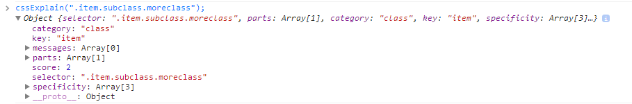
The goal is to get the lowest possible score on the scale of 1 to 10. You can also try it out in my jsFiddle. While the results aren’t to be taken too seriously (you’re better off following the CSSLint advice), they still do a good job at explaining the complexity of selectors and at least hint at possible problems.
-
Translate vs. top/left
Use CSS 2D translate to move objects instead of top/left. There’s no point in trying to explain this in detail when Paul Irish and Chris Coyer did such a fantastic job. Make sure you read/watch their material and bake this knowledge in – use translate over top/left whenever possible.
-
Scroll smoothly
You may have noticed that sites like Facebook and Google+ take ages to become scrollable when opening them. It’s almost like they need time to warm up. This is a problem on many of today’s websites, and a huge UX gutpunch. Getting your page to scroll smoothly isn’t as difficult as it may seem – especially when you know what to look out for. The key to reducing scroll lag is minimizing paints – paints are what happens when content on your screen changes from frame to frame, and the browser needs to repaint it on the screen – it needs to calculate a new look, and slap this new look onto one of the layers a rendered website consists of. For more information on these issues, and to find out how to diagnose paint problems, see Paul Lewis’ excellent post.
Server
-
Optimize your PHP with some easy wins
There are many things you can do to speed up your app from the PHP side. For some easy wins, see Fredric Mitchell’s last article or any of the other performance related articles here on SitePoint.
-
Use Google’s PageSpeed Module
The PageSpeed Module by Google is a module you can install into Nginx and Apache which automatically implements some best practices for website optimization. The module evaluates the performance of a website as perceived by the client, making sure all the rules are respected as much as possible and improving the serving of static resources in particular. It will minify, optimize and compress CSS and JavaScript for you, reduce image size by removing meta data that isn’t used, set Expires headers properly to better utilize browser cache, and much more. Best of all – it doesn’t require any architecture changes from you. Just plug it into your server and it works. To install the module, follow these instructions – you’ll need to build from source for Nginx, but that’s a mere couple commands of work. To get properly introduced to Pagespeed, see the following video – it’s a bit long and old by now, but still an incredibly valuable resource:
-
Use SPDY
In an effort similar to PageSpeed, Google also leads the development of SPDY. mod_spdy is another Apache module designed to serve your website much faster. Installing it is not as straightforward as one might like, and it needs browser support as well, but that’s looking better by the day. SPDY is actually a protocol (much like HTTP is a protocol) which intercepts and replaces HTTP requests where able, serving the site much faster. See this high level overview for more info, or even better, this newbie friendly breakdown. While using SPDY can be risky as we still wait for more widespread adoption, the gains seem to outweigh the risks by far.
-
Use WebP for images
WebP is an image format aiming to replace all others – JPG, PNG and GIF. It supports alpha layers (transparency), animation, lossless and lossy compression, and more. Browser adoption has been very slow, but it’s easy to support all image types these days with tools that automate the WebP conversion like the aforementioned PageSpeed module (it can automatically convert images to WebP on-the-fly). For an in-depth introduction and discussion about WebP, see this comprehensive guide.
-
Compress with Zopfli
Use Zopfli compression to pre-compress your static resources. It’s an open source compression algorithm, again spearheaded by Google, which increases the compression by 3-8% when compared to the usual compression methods used online. On smaller websites this hardly makes a difference, but if you’re scaling your app or serving your static content to a lot of clients, it will definitely make a noticeable difference, as reported by the Google Web Fonts team:
Conclusion
There are many ways to improve the performance of your app, and as is often in life – the whole is greater than the sum of the parts. Implement some of the measures we’ve mentioned in this article and those preceding it, and you’ll get a nice, tangible improvement. Implement them all, and you’ve got an app so fast and light it can travel through time. Monitor your app, utilize HAR, look at Dev Tools profiling or sign up for services that do all this for you – just don’t ignore the performance aspect of your site. While most project these days are “do and depart”, don’t leave your client with a website you’re not proud of.
Never underestimate the small fixes you can do – you never know which one will be the tipping point to excellence!
Frequently Asked Questions (FAQs) on Web Performance Tricks
What is the difference between div and span tags in HTML?
In HTML, div and span tags are used to group block-level and inline elements respectively. The div tag is a block-level element that is used for larger chunks of code, while the span tag is an inline element used for a small chunk of HTML inside a line. The main difference between them is how they affect the layout of the webpage. Div elements create a new line and take up the full width available, while span elements do not create a new line and only take up as much width as necessary.
How can I improve the performance of my website?
There are several ways to improve the performance of your website. One of the most effective methods is to optimize your images. Large, high-resolution images can slow down your site, so it’s important to resize, compress, and optimize them. Another method is to minify your CSS and JavaScript files, which can reduce the size of your files and speed up your site. You can also use a Content Delivery Network (CDN) to deliver your content more quickly to users around the world.
What is the impact of website performance on user experience?
Website performance has a significant impact on user experience. Slow-loading websites can frustrate users and lead to higher bounce rates. On the other hand, fast-loading websites can improve user satisfaction, increase engagement, and potentially lead to higher conversion rates. Therefore, it’s crucial to optimize your website’s performance to provide the best possible user experience.
How does HTML affect website performance?
HTML is the backbone of any website, and the way it’s written can greatly affect the website’s performance. For instance, unnecessary tags, excessive use of tables, and improper use of forms can slow down your website. On the other hand, clean, well-structured HTML can improve your website’s loading speed and overall performance.
What are some advanced web performance tricks?
Some advanced web performance tricks include using prefetching and preloading to load resources in the background, implementing server push to send multiple responses for a single client request, and using service workers to cache resources and serve them directly from the cache. These techniques can significantly improve your website’s performance, but they require a deep understanding of web technologies and careful implementation.
How can I measure my website’s performance?
There are several tools you can use to measure your website’s performance, including Google’s PageSpeed Insights, GTmetrix, and WebPageTest. These tools can provide detailed insights into your website’s loading speed, resource usage, and other performance metrics. They can also provide recommendations on how to improve your website’s performance.
What is the role of JavaScript in website performance?
JavaScript plays a crucial role in website performance. While it can enhance the functionality and interactivity of a website, poorly written or excessive JavaScript can slow down a website. Therefore, it’s important to write efficient JavaScript, minimize its use, and defer or asynchronously load JavaScript files to improve your website’s performance.
How does CSS affect website performance?
CSS affects website performance in several ways. Large, complex CSS files can slow down your website, so it’s important to keep your CSS clean and well-organized. You should also avoid using excessive CSS animations, as they can cause performance issues. Additionally, you should use CSS sprites to combine multiple images into one, reducing the number of HTTP requests and improving your website’s loading speed.
What is the impact of server response time on website performance?
Server response time is the amount of time it takes for a server to respond to a request from a browser. A slow server response time can significantly slow down your website, while a fast server response time can improve your website’s loading speed. Therefore, it’s important to choose a reliable hosting provider and optimize your server configuration to improve your server response time.
How can I optimize my website for mobile devices?
Optimizing your website for mobile devices is crucial, as more and more users are browsing the web on their smartphones and tablets. You can optimize your website for mobile devices by using responsive design, optimizing images for mobile, reducing the use of heavy JavaScript and CSS, and implementing mobile-friendly navigation. You should also test your website on various mobile devices to ensure it performs well on all of them.