

Key Takeaways
- D3.js is a versatile JavaScript library that enables developers to create dynamic, interactive data visualizations in web browsers using HTML, SVG, and CSS.
- The library provides a rich set of tools for data manipulation, allowing for the transformation of raw data into meaningful visual representations, which can be customized extensively to suit unique creative visions.
- D3.js utilizes scales to map data values to visual display properties, such as size or color, facilitating the creation of graphs, charts, and other visual elements that accurately reflect the data.
- The article provides practical examples, such as bar charts, line charts, and animated visualizations, demonstrating how D3.js can be used to render both simple and complex data graphics.
- D3.js supports advanced features like transitions and animations, enabling developers to create visually appealing and dynamically updating visualizations that enhance the user experience and engagement with data.
This article was peer reviewed by Michaela Lehr and Tim Severien. Thanks to all of SitePoint’s peer reviewers for making SitePoint content the best it can be!
D3.js is a JavaScript library for manipulating documents based on data. D3 helps you bring data to life using HTML, SVG, and CSS.
There are only three JavaScript libraries that I would suggest every web developer should learn: jQuery, Underscore and D3. These are libraries that allow you to think about code in new ways: jQuery allows you to write less and do more with the DOM, Underscore (or lodash) gives you functional tools for changing the way you write programs and D3 gives you a rich tool-set for data manipulation and graphics programming. If you’re unfamiliar with D3 please take a moment to look at the impressive gallery of examples to see what can be done with it.
This aint’ your daddy’s charting library.
William Playfair invented the bar, line and area charts in 1786 and the pie chart in 1801. Today, these are still the primary ways that most data sets are presented. Now, these charts are excellent but D3 gives you the tools and the flexibility to make unique data visualizations for the web, your creativity is the only limiting factor.
D3 is an extremely flexible low-level visualization library with a jQuery-like API for mapping data to HTML and SVG documents. It contains a wealth of helpful mathematical functions for data transformation and physics calculations, although most of it’s power comes from manipulating geometries and paths in SVG.
This article aims to give you a high level overview of D3’s capabilities, in each example you’ll be able to see the input data, transformation and the output document. Rather than explaining what every function does I’ll show you the code and you should be able to get a rough understanding of how things work. I’ll only dig into details for the most important concepts, Scales and Selections.
A Bar Chart
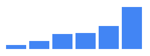
I promised you more than William Playfair’s charts but making the humble bar chart with HTML is one of the easiest ways to understand how D3 transforms data into a document. Here’s what that looks like:
d3.select('#chart')
  .selectAll("div")
  .data([4, 8, 15, 16, 23, 42])
  .enter()
  .append("div")
  .style("height", (d)=> d + "px")
The selectAll function returns a D3 “selection”: an array of elements that get created when we enter and append a div for each data point.
This code maps the input data [4, 8, 15, 16, 23, 42] to this output HTML.
<div id="chart">
  <div style="height: 4px;"></div>
  <div style="height: 8px;"></div>
  <div style="height: 15px;"></div>
  <div style="height: 16px;"></div>
  <div style="height: 23px;"></div>
  <div style="height: 42px;"></div>
</div>
All of the style properties that don’t change can go in the CSS.
#chart div {
  display: inline-block;
  background: #4285F4;
  width: 20px;
  margin-right: 3px;
}
GitHub’s Contribution Chart
With a few lines of extra code we can convert the bar chart above to a contribution chart similar to Github’s.
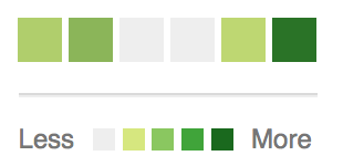
Rather than setting a height based on the data’s value we can set a background-color instead.
const colorMap = d3.interpolateRgb(
  d3.rgb('#d6e685'),
  d3.rgb('#1e6823')
)

d3.select('#chart')
  .selectAll("div")
  .data([.2, .4, 0, 0, .13, .92])
  .enter()
  .append("div")
  .style("background-color", (d)=> {
    return d == 0 ? '#eee' : colorMap(d)
  })
The colorMap function takes an input value between 0 and 1 and returns a color along the gradient of colors between the two we provide. Interpolation is a key tool in graphics programming and animation, we’ll see more examples of it later.
An SVG Primer
Much of D3’s power comes from the fact that it works with SVG, which contains tags for drawing 2D graphics like circles, polygons, paths and text.
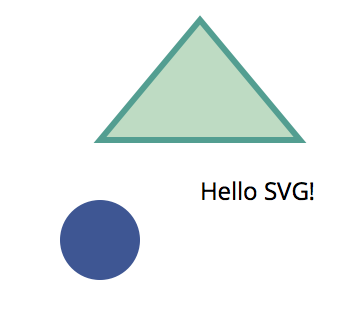
<svg width="200" height="200">
  <circle fill="#3E5693" cx="50" cy="120" r="20" />
  <text x="100" y="100">Hello SVG!</text>
  <path d="M100,10L150,70L50,70Z" fill="#BEDBC3" stroke="#539E91" stroke-width="3">
</svg>
The code above draws:
- A circle at 50,120 with a radius of 20
- The text “Hello SVG!” at 100,100
- A triangle with a 3px border, the
dattribute has the following instructions- Move to 100,10
- Line to 150,70
- Line to 50,70
- Close path(Z)
<path> is the most powerful element in SVG.
Circles

The data sets in the previous examples have been a simple array of numbers, D3 can work with more complex types too.
const data = [{
  label: "7am",
  sales: 20
},{
  label: "8am",
  sales: 12
}, {
  label: "9am",
  sales: 8
}, {
  label: "10am",
  sales: 27
}]
For each point of data we will append a <g>(group) element to the #chart and append <circle> and <text> elements to each with properties from our objects.
const g = d3.select('#chart')
  .selectAll("g")
  .data(data)
  .enter()
  .append('g')
g.append("circle")
  .attr('cy', 40)
  .attr('cx', (d, i)=> (i+1) * 50)
  .attr('r', (d)=> d.sales)
g.append("text")
  .attr('y', 90)
  .attr('x', (d, i)=> (i+1) * 50)
  .text((d)=> d.label)
The variable g holds a d3 “selection” containing an array of <g> nodes, operations like append() append a new element to each item in the selection.
This code maps the input data into this SVG document, can you see how it works?
<svg height="100" width="250" id="chart">
  <g>
    <circle cy="40" cx="50" r="20"/>
    <text y="90" x="50">7am</text>
  </g>
  <g>
    <circle cy="40" cx="100" r="12"/>
    <text y="90" x="100">8am</text>
  </g>
  <g>
    <circle cy="40" cx="150" r="8"/>
    <text y="90" x="150">9am</text>
  </g>
  <g>
    <circle cy="40" cx="200" r="27"/>
    <text y="90" x="200">10am</text>
  </g>
</svg>
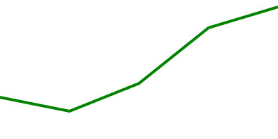
Line Chart
Drawing a line chart in SVG is quite simple, we want to transform data like this:
const data = [
  { x: 0, y: 30 },
  { x: 50, y: 20 },
  { x: 100, y: 40 },
  { x: 150, y: 80 },
  { x: 200, y: 95 }
]
Into this document:
<svg id="chart" height="100" width="200">
  <path stroke-width="2" d="M0,70L50,80L100,60L150,20L200,5">
</svg>
Note: The y values are subtracted from the height of the chart (100) because we want a y value of 100 to be at the top of the svg (0 from the top).
Given it’s only a single path element, we could do it ourselves with code like this:
const path = "M" + data.map((d)=> {
  return d.x + ',' + (100 - d.y);
}).join('L');
const line = `<path stroke-width="2" d="${ path }"/>`;
document.querySelector('#chart').innerHTML = line;
D3 has path generating functions to make this much simpler though, here’s what it looks like.
const line = d3.svg.line()
  .x((d)=> d.x)
  .y((d)=> 100 - d.y)
  .interpolate("linear")

d3.select('#chart')
  .append("path")
  .attr('stroke-width', 2)
  .attr('d', line(data))
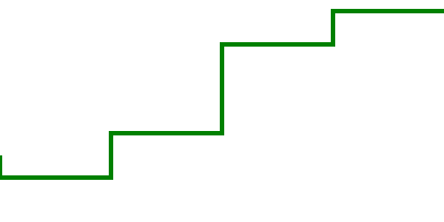
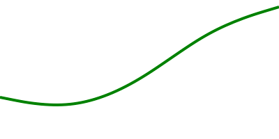
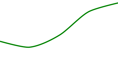
Much better! The interpolate function has a few different ways it can draw the line around the x, y coordinates too. See how it looks with “linear”, “step-before”, “basis” and “cardinal”.
Scales
Scales are functions that map an input domain to an output range.
In the examples we’ve looked at so far we’ve been able to get away with using “magic numbers” to position things within the charts bounds, when the data is dynamic you need to do some math to scale the data appropriately.
Imagine we want to render a line chart that is 500px wide and 200px high with the following data:
const data = [
  { x: 0, y: 30 },
  { x: 25, y: 15 },
  { x: 50, y: 20 }
]
Ideally we want the y axis values to go from 0 to 30 (max y value) and the x axis values to go from 0 to 50 (max x value) so that the data takes up the full dimensions of the chart.
We can use d3.max to find the max values in our data set and create scales for transforming our x, y input values into x, y output coordinates for our SVG paths.
const width = 500;
const height = 200;
const xMax = d3.max(data, (d)=> d.x)
const yMax = d3.max(data, (d)=> d.y)

const xScale = d3.scale.linear()
  .domain([0, xMax]) // input domain
  .range([0, width]) // output range

const yScale = d3.scale.linear()
  .domain([0, yMax]) // input domain
  .range([height, 0]) // output range
These scales are similar to the color interpolation function we created earlier, they are simply functions which map input values to a value somewhere on the output range.
xScale(0) -> 0
xScale(10) -> 100
xScale(50) -> 500
They also work with values outside of the input domain as well:
xScale(-10) -> -100
xScale(60) -> 600
We can use these scales in our line generating function like this:
const line = d3.svg.line()
  .x((d)=> xScale(d.x))
  .y((d)=> yScale(d.y))
  .interpolate("linear")
Another thing you can easily do with scales is to specify padding around the output range:
const padding = 20;
const xScale = d3.scale.linear()
  .domain([0, xMax])
  .range([padding, width - padding])

const yScale = d3.scale.linear()
  .domain([0, yMax])
  .range([height - padding, padding])
Now we can render a dynamic data set and our line chart will always fit inside our 500px / 200px bounds with 20px padding on all sides.
Linear scales are the most common type but there’s others like pow for exponential scales and ordinal scales for representing non-numeric data like names or categories. In addition to Quantitative Scales and Ordinal Scales there are also Time Scales for mapping date ranges.
For example, we can create a scale that maps my lifespan to a number between 0 and 500:
const life = d3.time.scale()
  .domain([new Date(1986, 1, 18), new Date()])
  .range([0, 500])

// At which point between 0 and 500 was my 18th birthday?
life(new Date(2004, 1, 18))
Animated Flight Visualization
This is all well and good but so far we’ve only looked at static lifeless graphics. Let’s make an animated visualization that shows the active flights over time between Melbourne and Sydney in Australia.
See the Pen D3 – flights by SitePoint (@SitePoint) on CodePen.
The SVG document for this type of graphic is made up of text, lines and circles.
<svg id="chart" width="600" height="500">
  <text class="time" x="300" y="50" text-anchor="middle">6:00</text>
  <text class="origin-text" x="90" y="75" text-anchor="end">MEL</text>
  <text class="dest-text" x="510" y="75" text-anchor="start">SYD</text>
  <circle class="origin-dot" r="5" cx="100" cy="75" />
  <circle class="dest-dot" r="5" cx="500" cy="75" />
  <line class="origin-dest-line" x1="110" y1="75" x2="490" y2="75" />

  <!-- for each flight in the current time -->
  <g class="flight">
    <text class="flight-id" x="160" y="100">JQ 500</text>
    <line class="flight-line" x1="100" y1="100" x2="150" y2="100" />
    <circle class="flight-dot" cx="150" cy="100" r="5" />
  </g>

</svg>
The dynamic parts are the time and the elements within the flight group and the data might look something like this:
let data = [
  { departs: '06:00 am', arrives: '07:25 am', id: 'Jetstar 500' },
  { departs: '06:00 am', arrives: '07:25 am', id: 'Qantas 400' },
  { departs: '06:00 am', arrives: '07:25 am', id: 'Virgin 803' }
]
To get an x position for a dynamic time we’ll need to create a time scale for each flight that maps its departure and arrival times to an x position on our chart. We can loop through our data at the start adding Date objects and scales so they’re easier to work with. Moment.js helps a lot here with date parsing and manipulation.
data.forEach((d)=> {
  d.departureDate = moment(d.departs, "hh-mm a").toDate();
  d.arrivalDate = moment(d.arrives, "hh-mm a").toDate();
  d.xScale = d3.time.scale()
    .domain([departureDate, arrivalDate])
    .range([100, 500])
});
We can now pass our changing Date to xScale() to get an x coordinate for each flight.
Render Loop
Departure and arrival times are rounded to 5 minutes so we can step through our data in 5m increments from the first departure to the last arrival.
let now = moment(data[0].departs, "hh:mm a");
const end = moment(data[data.length - 1].arrives, "hh:mm a");

const loop = function() {
  const time = now.toDate();

  // Filter data set to active flights in the current time
  const currentData = data.filter((d)=> {
    return d.departureDate <= time && time <= d.arrivalDate
  });

  render(currentData, time);

  if (now <= end) {
    // Increment 5m and call loop again in 500ms
    now = now.add(5, 'minutes');
    setTimeout(loop, 500);
  }
}
Enter, Update and Exit
D3 allows you to specify transformations and transitions of elements when:
- New data points come in (Enter)
- Existing data points change (Update)
- Existing data points are removed (Exit)
const render = function(data, time) {
  // render the time
  d3.select('.time')
    .text(moment(time).format("hh:mm a"))

  // Make a d3 selection and apply our data set
  const flight = d3.select('#chart')
    .selectAll('g.flight')
    .data(data, (d)=> d.id)

  // Enter new nodes for any data point with an id not in the DOM
  const newFlight = flight.enter()
    .append("g")
    .attr('class', 'flight')

  const xPoint = (d)=> d.xScale(time);
  const yPoint = (d, i)=> 100 + i * 25;

  newFlight.append("circle")
    .attr('class',"flight-dot")
    .attr('cx', xPoint)
    .attr('cy', yPoint)
    .attr('r', "5")

  // Update existing nodes in selection with id's that are in the data
  flight.select('.flight-dot')
    .attr('cx', xPoint)
    .attr('cy', yPoint)

  // Exit old nodes in selection with id's that are not in the data
  const oldFlight = flight.exit()
    .remove()
}
Transitions
The code above renders a frame every 500ms with a 5 minute time increment:
- It updates the time
- Creates a new flight group with a circle for every flight
- Updates the x/y coordinates of current flights
- Removes the flight groups when they’ve arrived
This works but what we really want is a smooth transition between each of these frames. We can achieve this by creating a transition on any D3 selection and providing a duration and easing function before setting attributes or style properties.
For example, let’s fade in the opacity of entering flight groups.
const newFlight = flight.enter()
  .append("g")
  .attr('class', 'flight')
  .attr('opacity', 0)

newFlight.transition()
  .duration(500)
  .attr('opacity', 1)
Let’s fade out exiting flight groups.
flight.exit()
  .transition()
  .duration(500)
  .attr('opacity', 0)
  .remove()
Add a smooth transition between the x and y points.
flight.select('.flight-dot')
  .transition()
  .duration(500)
  .ease('linear')
  .attr('cx', xPoint)
  .attr('cy', yPoint)
We can also transition the time between the 5 minute increments so that it displays every minute rather than every five minutes using the tween function.
const inFiveMinutes = moment(time).add(5, 'minutes').toDate();
const i = d3.interpolate(time, inFiveMinutes);
d3.select('.time')
  .transition()
  .duration(500)
  .ease('linear')
  .tween("text", ()=> {
    return function(t) {
      this.textContent = moment(i(t)).format("hh:mm a");
    };
  });
t is a progress value between 0 and 1 for the transition.
Be Creative
There’s a lot more to the library than I’ve been able to cover in this article, I would have loved to dig into some of these more meaty examples, but you need to put the horse before the cart as they say.
- Polar Clock
- Force Layouts
- Geography & Projections
- Voronoi Tessellation
- Prim’s Algorithm V
- OMG Particles II
There are plenty more examples in the D3 Gallery. If you’re keen to learn more I highly recommend Scott Murray’s D3 Tutorials and also the D3 documentation, which is excellent.
Hopefully this high level overview with a few practical examples has given you an idea of how to work with Selections, Scales and Transitions. Think about the best ways to represent your data and have fun creating your own unique data visualizations. Drop me a line in the comments and let me know what you’ve built with D3!