

Key Takeaways
- Web pages consist of several key components including a containing block, logo, navigation, content, footer, and whitespace. These elements work together to create a cohesive and user-friendly design.
- The design of these components can greatly impact user experience. For instance, easy-to-find navigation, a clear logo for brand recognition, and well-planned whitespace for readability are all crucial for a positive user experience.
- Other important factors in web design include typography, images and multimedia, color scheme, responsive design, and site speed. These elements not only contribute to the aesthetic appeal of a site but also its functionality and performance.
Even from a nondesigner’s standpoint, defining a design that satisfies all the requirements I outlined previously is a simple task. It’s similar to making a phrase on your refrigerator with magnetic poetry words. Although there are millions of ways to arrange the words, only a few arrangements make any sense. The magnetic words are like the components, or blocks, of the web page. Although the number of these necessary blocks depends on the size and subject of the site, most websites have the components seen in the figure below:
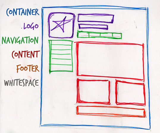
Let’s look at each of these components in turn:
Containing block
Every web page has a container. This could be in the form of the page’s body tag, an all-containing div tag. Without some sort of container, we’d have no place to put the contents of our page. The elements would drift beyond the bounds of our browser window and off into empty space. The width of this container can be fluid, meaning that it expands to fill the width of browser window; or fixed, so that the content is the same width no matter what size the window is.
Logo
When designers refer to an identity, they’re referring to the logo and colors that exist across a company’s various forms of marketing, such as business cards, letterhead, brochures, and so on. The identity block that appears on the website should contain the company’s logo or name, and sit at the top of each page of the website. The identity block increases brand recognition while informing users that the pages they’re viewing are part of a single site.
Note: Many people use the words “identity” and “branding” interchangeably. Branding is a broad term that describes the process of developing an awareness of a company, product, or service. The branding process involves advertising, market research, customer feedback, and much more. Identity is actually a subset of branding in that it deals only with the visual aspects of branding.
Navigation
It’s essential that the site’s navigation system is easy to find and use. Users expect to see navigation right at the top of the page. Whether you plan to use vertical menus down the side of the page, or a horizontal menu across the page, the navigation should be as close to the top of the layout as possible. At the very least, all main navigation items should appear “above the fold.”
Above “the Fold”
The fold, as many designers call it, is where the content of a page ends before users scroll down. This metaphor is derived from the fold in a newspaper. If you look at the cover of a folded newspaper, most of the headlines and biggest news appear in the top half, so that the most important news items can be seen at a glance when the newspaper is folded. The location of the fold on a web page depends on the browser dimensions and the user’s screen resolution. At a resolution of 1024×768 pixels, accounting for browser chrome—that is, the space taken up by the browser application itself in the form of tabs, buttons, the address bar, and a bottom status bar—the fold is usually just over 500 pixels from the top.
Content
Content is king. A typical website visitor will enter and leave a website in a matter of seconds. If visitors are unable to find what they’re looking for, they’ll undoubtedly close the browser or move on to another site. It’s important to keep the main content block as the focal point of a design, so that visitors can scan the page for the information they need.
Footer
Located at the bottom of the page, the footer usually contains copyright, contact, and legal information, as well as a few links to the main sections of the site. By separating the end content from the bottom of the browser window, the footer should indicate to users that they’re at the bottom of the page.
Whitespace
The graphic design term whitespace (or negative space) literally refers to any area of a page without type or illustrations. While many novice web designers (and most clients) feel a need to fill every inch of a web page with photos, text, tables, and data, empty space on a page is every bit as important as having content. Without carefully planned whitespace, a design will feel closed in, like a crowded room. Whitespace helps a design to breathe by guiding the user’s eye around a page, but also helps to create balance and unity—two important concepts that we’ll discuss in more detail later in this chapter.
At this point, we’ve had our initial meeting with Mr. Smith, our theoretical client, and it was helpful. He explained very thoroughly what his business does and what he wants the site to achieve. Even though we’ve yet to see actual content, we can use the standard blocks of web page anatomy to start developing a layout. Although other site-specific blocks are worked into the designs of many website layouts, the web page anatomy works to summarize the most common blocks.
Now that we have this information, how can we use it to create a foundational layout for Smith’s Services? It’s time for some grid theory, which we’ll cover next, so stay tuned.
The Principles of Beautiful Web Design
This article is from Jason Beaird’s The Principles of Beautiful Web Design book (the second edition of which is out now). This is the third part of the first chapter.
Frequently Asked Questions (FAQs) about Web Page Anatomy
What is the importance of a website’s header?
The header is one of the most critical parts of a website. It’s the first thing visitors see when they land on your site, and it sets the tone for their entire browsing experience. The header typically includes the site’s logo, navigation menu, and sometimes a search bar or call-to-action button. It’s essential to make the header visually appealing and easy to navigate to ensure a positive user experience.
How does the footer contribute to a website’s functionality?
The footer is located at the bottom of a web page and often contains information like contact details, links to privacy policies or terms of service, social media icons, and sometimes a secondary navigation menu. It serves as a final point of interaction for users, providing them with essential information and additional resources.
What is the role of whitespace in web design?
Whitespace, also known as negative space, is the unmarked space between different elements on a web page. It’s a crucial aspect of web design as it helps to separate different sections, improve readability, and highlight key elements. Whitespace can also make a website look clean, uncluttered, and professional.
How important is typography in web design?
Typography plays a significant role in web design. It’s not just about choosing a font; it’s about readability, accessibility, and the overall user experience. Good typography can guide users through a site, enhance the site’s aesthetic appeal, and reinforce the brand’s identity.
What is the significance of a call-to-action (CTA) on a web page?
A call-to-action (CTA) is a prompt that encourages users to take a specific action, such as signing up for a newsletter, downloading a resource, or making a purchase. CTAs are crucial for driving conversions and achieving the website’s primary goals.
How does the layout of a web page impact user experience?
The layout of a web page significantly impacts the user experience. A well-structured layout helps users navigate the site easily, find the information they’re looking for, and interact with the site effectively. It can also influence the site’s visual appeal and the user’s overall impression of the brand.
What is the role of images and multimedia in web design?
Images and multimedia elements like videos and animations can greatly enhance a website’s appeal. They can make a site more engaging, provide visual cues, and help convey complex information in an easily digestible format. However, it’s important to use them judiciously to avoid slowing down the site’s load time.
How does color scheme affect a website’s look and feel?
The color scheme of a website plays a significant role in its look and feel. Colors can evoke emotions, draw attention to specific elements, and reinforce the brand’s identity. A well-chosen color scheme can make a website more visually appealing and enhance the user experience.
What is responsive design and why is it important?
Responsive design is a web design approach that ensures a website looks and functions well on all devices, regardless of screen size. With the increasing use of mobile devices for internet browsing, responsive design has become essential for providing a consistent user experience across all platforms.
How does site speed impact user experience and SEO?
Site speed is a critical factor in both user experience and search engine optimization (SEO). Slow-loading websites can frustrate users, leading to higher bounce rates. Additionally, search engines like Google consider site speed as a ranking factor, meaning slow-loading sites may rank lower in search results.