

Writing future-proof CSS is hard. Conflicting classnames, specificity issues, and so on, come up when you have to write and maintain thousands of lines of CSS. To get rid of the aforementioned issues, Styled Components was created.
Styled Components makes it easy to write your CSS in JS and makes sure there are no conflicting classnames or specificity issues with multiple other benefits. This makes writing CSS a joy.
In this tutorial, we’ll explore what CSS in JS is, the pros and cons of styled-components, and finally, we’ll redesign Unsplash using Styled Components. After completing this tutorial, you should be able to quickly get up and running with Styled Components.
Note: Styled Components was specifically built with React in mind, so you have to be using React to use Styled Components.
Key Takeaways
- Understand the basics of CSS in JS and how Styled Components simplify the process by allowing CSS to be written directly within JavaScript, avoiding common issues like conflicting classnames and specificity problems.
- Learn the setup process for a React project using Styled Components, including necessary installations and initial configuration steps.
- Explore the advantages of Styled Components, such as automatic critical CSS injection, smaller CSS bundles, and easy theming for React applications.
- Discover practical implementations of Styled Components by creating dynamic themes and managing global styles within a React application.
- Gain insights into the maintenance benefits of Styled Components, which include easier code management and the ability to remove unused CSS efficiently.
- Follow a comprehensive guide on redesigning the Unsplash interface using Styled Components, complete with detailed code examples and explanations for each step.
Prerequisites
For this tutorial, you need a basic knowledge of React.
Throughout the course of this tutorial we’ll be using yarn. If you don’t have yarn already installed, then install it from here.
To make sure we’re on the same page, these are the versions used in this tutorial:
- Node 12.6.0
- npx 6.4.1
- yarn 1.17.3
Evolution of CSS
Before CSS-in-JS was created, the most common way to style web apps was to write CSS in a separate file and link it from the HTML.
But this caused trouble in big teams. Everyone has their own way of writing CSS. This caused specificity issues and led to everyone using !important.
Then came Sass. Sass is an extension of CSS that allows us to use things like variables, nested rules, inline imports and more. It also helps to keep things organized and allows us to create stylesheets faster.
Even though Sass might be thought of as an improvement over CSS, it arguably causes more harm than good without certain systems put in place.
Later, BEM came in. BEM is a methodology that lets us reduce specificity issues by making us write unique classnames. BEM does solve the specificity problem, but it makes the HTML more verbose. Classnames can become unnecessarily long, and it’s hard to come up with unique classnames when you have a huge web app.
After that, CSS Modules were born. CSS Modules solved what neither Sass nor BEM could — the problem of unique classnames — by tooling rather than relying on the name given by a developer, which in turn solved specificity issues. CSS Modules gained a huge popularity in the React ecosystem, paving the way for projects like glamor.
The only problem with all these new solutions was that developers were made to learn new syntaxes. What if we could write CSS exactly how we write it in a .css file but in JS? And thus styled-components came into existence.
Styled Components uses Template Literals, an ES6 feature. Template literals are string literals allowing embedded expressions. They allow for multi-line strings and string interpolation features with them.
The main selling point of Styled Components is that it allows us to write exact CSS in JS.
Styled Components has a lot of benefits. Some of the pros and cons of Styled Components are listed below.
Pros
There are lots of advantages to using Styled Components.
-
Injecting Critical CSS into the DOM
Styled Components only injects critical CSS on the page. This means users only download CSS needed for that particular page and nothing else. This loads the web page faster.
-
Smaller CSS bundle per page
As it only injects styles that are used in the components on the page, bundle size is considerably smaller. You only load the CSS you need, instead of excessive stylesheets, normalizers, responsiveness, etc.
-
Automatic Vendor Prefixing
Styled Components allows you to write your CSS and it automatically vendor prefixes according to the latest standard.
-
Remove unused CSS
With Styled Components, it’s easier to remove unused CSS or dead code, as the styles are colocated with the component. This also impacts on reducing bundle size.
-
Theming is easy
Styled Components makes it really easy to theme a React applications. You can even have multiple themes in your applications and yet easily maintain them.
-
Reduces the number of HTTP requests
Since there are no CSS files for resets, normalizers, and responsiveness, the number of HTTP requests are considerably reduced.
-
Unique Classnames
Styled Components generates unique classnames every time a build step takes place. This allows avoiding naming collisions or specificity issues. No more having global conflicts and being forced to resolve them with
!importanttags. -
Maintenance is easy
Styled Components allows you to colocate styles with the component. This allows for painless maintenance. You know exactly which style is affecting your component, unlike in a big CSS file.
Cons
Of course, nothing’s perfect. Let’s look at some downsides associated with Styled Components.
-
Unable to Cache Stylesheets
Generally, a web browser caches
.cssfiles when a user visits a website for the next visit, so it doesn’t have to download the same.cssfile again. But withstyled-components, the styles are loaded in the DOM using the<style>tag. Thus, they can’t be cached and every time user has to request styles when they visit your website. -
React specific
Styled Components was made with React in mind. Thus, it’s React specific. If you use any other framework, then you can’t use Styled Components.
However, there’s an alternative very similar to
styled-componentsknown as emotion which is framework agnostic.
Getting Practical
Now that we know the pros and cons of Styled Components, let’s start using it.
Go ahead and scaffold a new React project using create-react-app. To scaffold it, we’ll be using npx, which lets you download and run a package temporarily without polluting the global namespace.
Type the following in the terminal:
$ npx create-react-app unsplash-styled-components
Then go inside the unsplash-styled-components directory and install the following packages needed for the purpose of this tutorial, namely styled-components and react-medium-image-zoom:
$ cd unsplash-styled-components
$ yarn add styled-components react-medium-image-zoom
The styled-components package allows us to write actual CSS in JS while the react-medium-image-zoom package allows us to zoom in on an image Medium-style.
Now, once the installation is complete, delete unneeded files like App.css, App.test.js, index.css and logo.svg from the src/ directory.
Go ahead and remove import './index.css'; from index.js, as it’s no longer needed.
Replace the contents of App.js with the following:
import React from 'react'

const App = () => <h1>Hello React</h1>

export default App
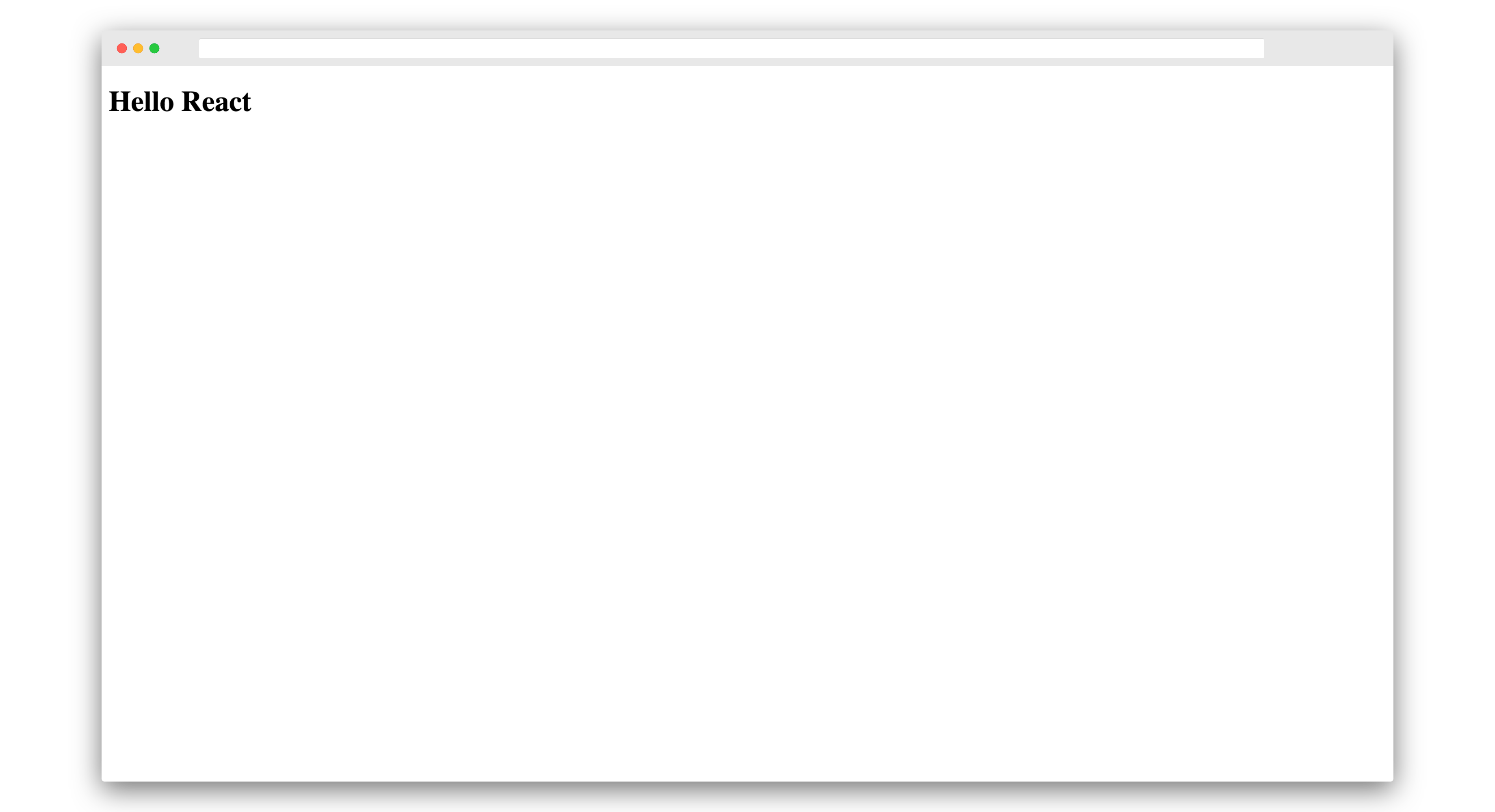
Try running the development server now by typing yarn start in the terminal.
You should see Hello React printed on the screen like this:
Styled Components uses tagged template literals to style your component.
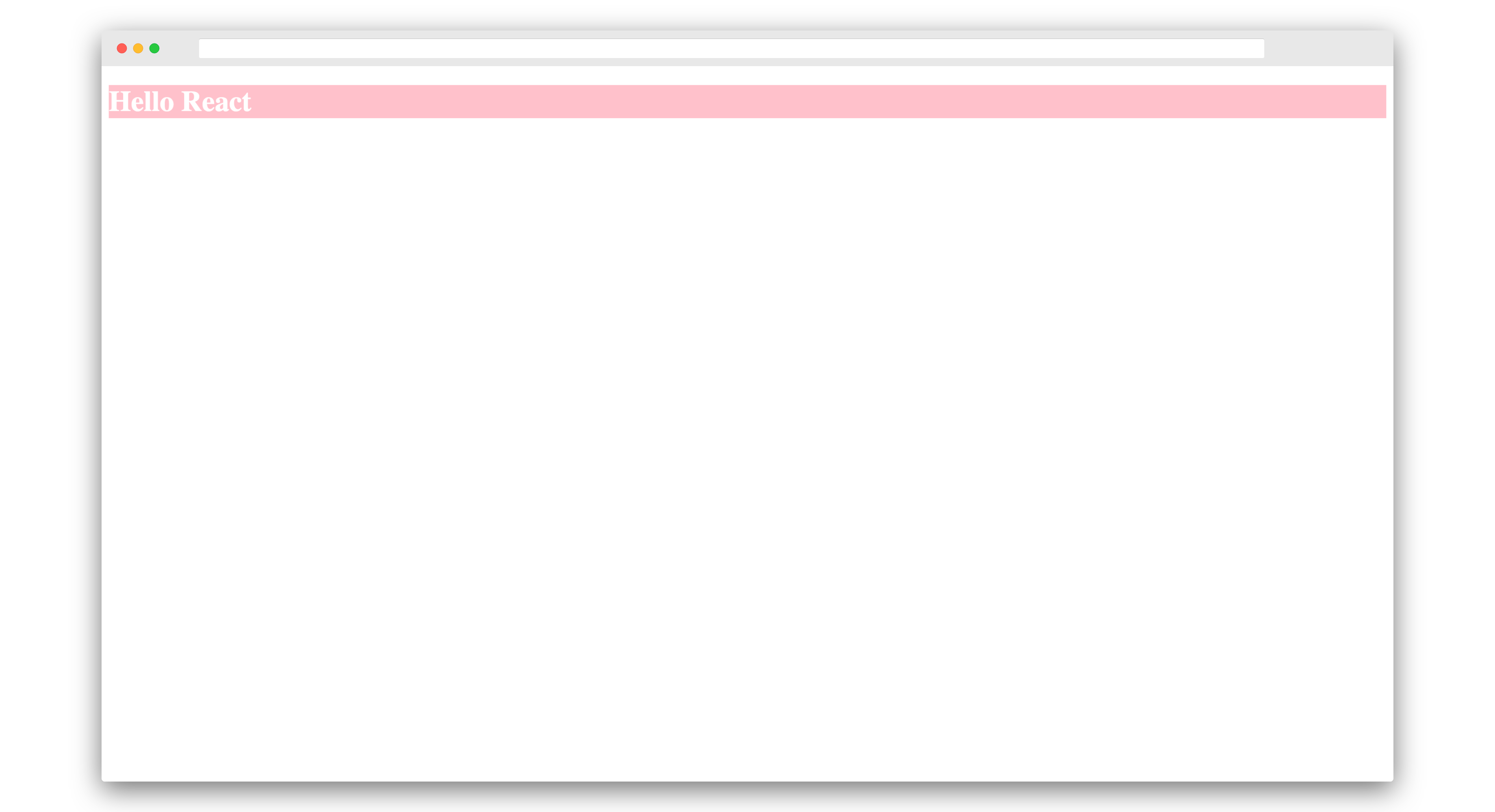
Let’s suppose you want to style the h1 as white text on a pink background by using Styled Components. Here’s how you would do it:
import React from 'react'
import styled from 'styled-components'

const Header = styled.h1`
    background-color: pink;
    color: white;
`

const App = () => <Header>Hello React</Header>

export default App
It should now look like this:
We just created our first Styled Component Header. The Header component is assigned to styled.h1. The default export styled coming from styled-components has basic HTML primitives like div, span, h1, h2, etc.
Inside of styled.h1 we write the actual CSS. Notice how we’re writing CSS rather than making style objects.
Furthermore, the Header component gets replaced in the browser with an h1 tag and a unique classname. A style tag gets inserted into the DOM with the same unique classname. This is the basics of how Styled Components actually work.
Our styles are in the same file as our component. This means our component is co-located with styles. Thus, it’s easier to remove styles associated with a particular component, thereby eliminating dead code.
Traditionally in CSS, it’s hard to reason about, as we have to find a particular element’s classname or id or specific selector, then remove them one by one. It’s easy in a small project, but it gets hard as the project complexity increases. With Styled Components, no matter the complexity of the project, it’s easier to add, edit and remove styles, as they’re colocated with the component.
Theming in Styled Components
Let’s add theming to our project.
Create a utils/ folder in the src/ directory. Then create a themes.js file in the utils/ folder. Paste the following in themes.js:
export const themes = {
  common: {
    fontFamily:
      "-apple-system, BlinkMacSystemFont, 'Segoe UI', Roboto, Oxygen, Ubuntu, Cantarell, 'Open Sans', 'Helvetica Neue', sans-serif",
  },
  light: {
    type: 'light',
    bgColor: 'white',
    color: '#3E4C59',
    searchBgColor: '#E4E7EB',
    boxShadow: '0.8rem 0.8rem 1.5rem gray',
    categoryColor: '#999',
    categoryHoverColor: '#333',
  },
  dark: {
    type: 'dark',
    bgColor: '#1F2933',
    color: '#E4E7EB',
    searchBgColor: '#E4E7EB',
    boxShadow: '0.4rem 0.4rem 1.5rem #111111',
    categoryColor: '#CBD2D9',
    categoryHoverColor: '#9AA5B1',
  },
}
The themes.js file contains an object named themes with three properties: common, light and dark.
The common property contains common styles across themes, the light property contains styles for the light theme, and the dark property contains styles for the dark theme.
Now change App.js as follows:
import React, { useState } from 'react'
import styled, { ThemeProvider } from 'styled-components'
import { themes } from './utils/themes'

const lightTheme = () => ({
  ...themes['common'],
  ...themes['light'],
})

const darkTheme = () => ({
  ...themes['common'],
  ...themes['dark'],
})

const Header = styled.h1`
    background-color: pink;
    color: white;
`

const App = () => {
  const [theme, setTheme] = useState(lightTheme())
  const setDarkTheme = () => setTheme(darkTheme())
  const setLightTheme = () => setTheme(lightTheme())
    return (
        <ThemeProvider theme={theme}>
            <>
                <Header>Hello React</Header>
                <button onClick={setLightTheme}>Make it light</button>
                <button onClick={setDarkTheme}>Make it dark</button>
            </>
        </ThemeProvider>
    )
}

export default App
Firstly, we’ve imported the useState hook from react, ThemeProvider from styled-components and themes from ./utils/themes.
Then we’ve created two arrow functions, lightTheme and darkTheme.
The lightTheme function returns an object combining the common and light properties from the imported themes variable.
So basically, the lightTheme function after evaluation is this:
const lightTheme = () => ({
    fontFamily:
        "-apple-system, BlinkMacSystemFont, 'Segoe UI', Roboto, Oxygen, Ubuntu, Cantarell, 'Open Sans', 'Helvetica Neue', sans-serif",
    type: 'light',
    bgColor: 'white',
    color: '#3E4C59',
    searchBgColor: '#E4E7EB',
    boxShadow: '0.8rem 0.8rem 1.5rem gray',
    categoryColor: '#999',
    categoryHoverColor: '#333',
})
The darkTheme function returns an object combining the common and dark properties from the imported themes variable.
Thus, the darkTheme function after evaluation looks like this:
const darkTheme = () => ({
    fontFamily:
        "-apple-system, BlinkMacSystemFont, 'Segoe UI', Roboto, Oxygen, Ubuntu, Cantarell, 'Open Sans', 'Helvetica Neue', sans-serif",
    type: 'dark',
    bgColor: '#1F2933',
    color: '#E4E7EB',
    searchBgColor: '#E4E7EB',
    boxShadow: '0.4rem 0.4rem 1.5rem #111111',
    categoryColor: '#CBD2D9',
    categoryHoverColor: '#9AA5B1',
})
Later, in the App component, we use the useState React hook:
const App = () => {
  const [theme, setTheme] = useState(lightTheme())
  const setDarkTheme = () => setTheme(darkTheme())
  const setLightTheme = () => setTheme(lightTheme())
    return (
        <ThemeProvider theme={theme}>
            <>
                <Header>Hello React</Header>
                <button onClick={setLightTheme}>Make it light</button>
                <button onClick={setDarkTheme}>Make it dark</button>
            </>
        </ThemeProvider>
    )
}
useState takes in the default state, which we set to lightTheme(). If you set it to darkTheme(), then by default the dark theme will be displayed. useState returns two variables, which we named theme and setTheme. You can name them anything.
theme contains the current state — that is, lightTheme() — and setTheme is a function used to set a new state.
Then we have the setDarktheme function, which sets a dark them by calling setTheme and passing it the object returned by the function darkTheme(). The setLightTheme function works in a similar way.
Finally, we have two additional buttons to change themes — one to change it to light and other to dark.
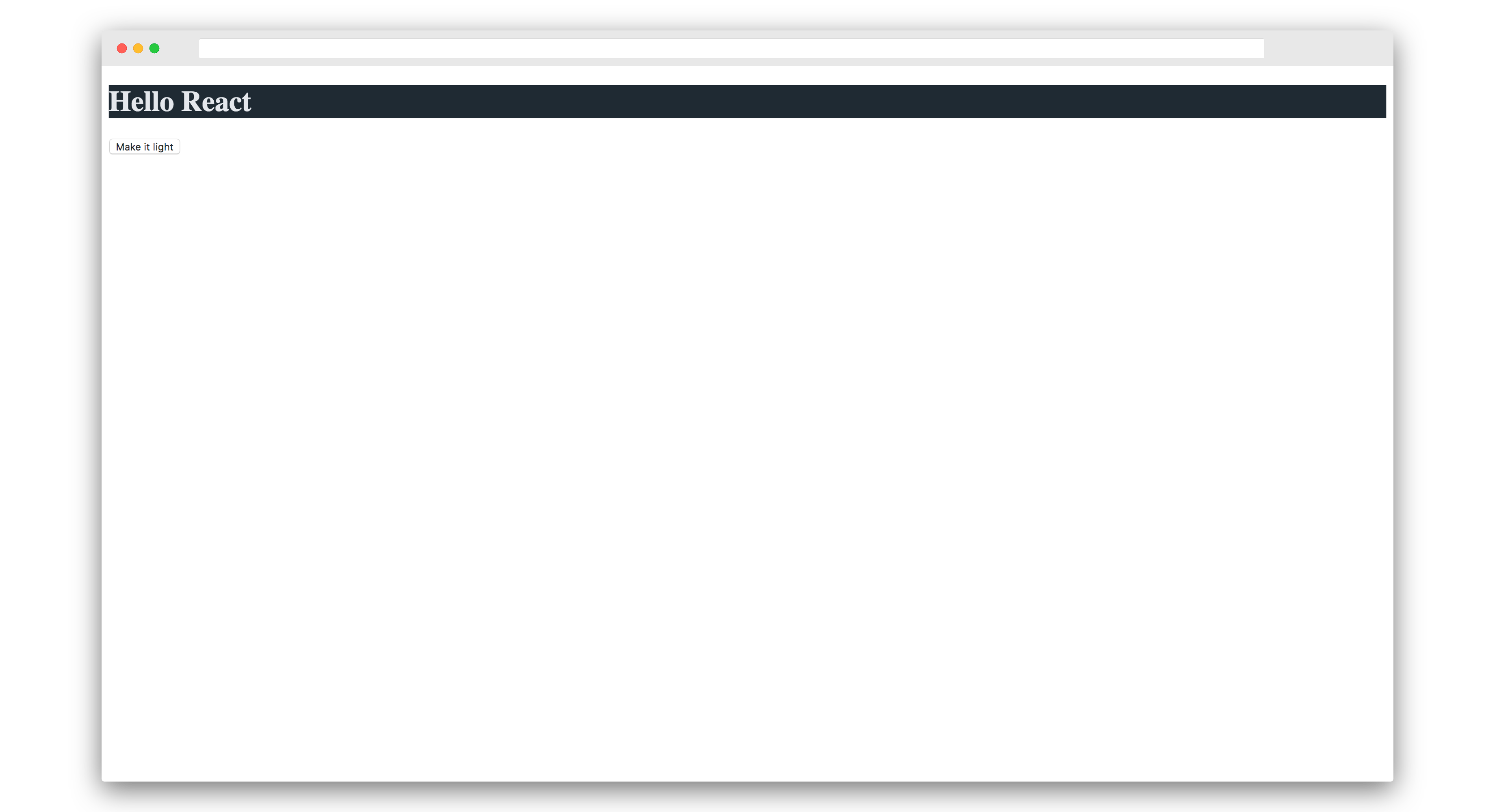
But for this to work, we need to change our Header component using themes. So change it to the following:
const Header = styled.h1`
    background-color: ${props => props.theme.bgColor};
    color: ${props => props.theme.color};
`
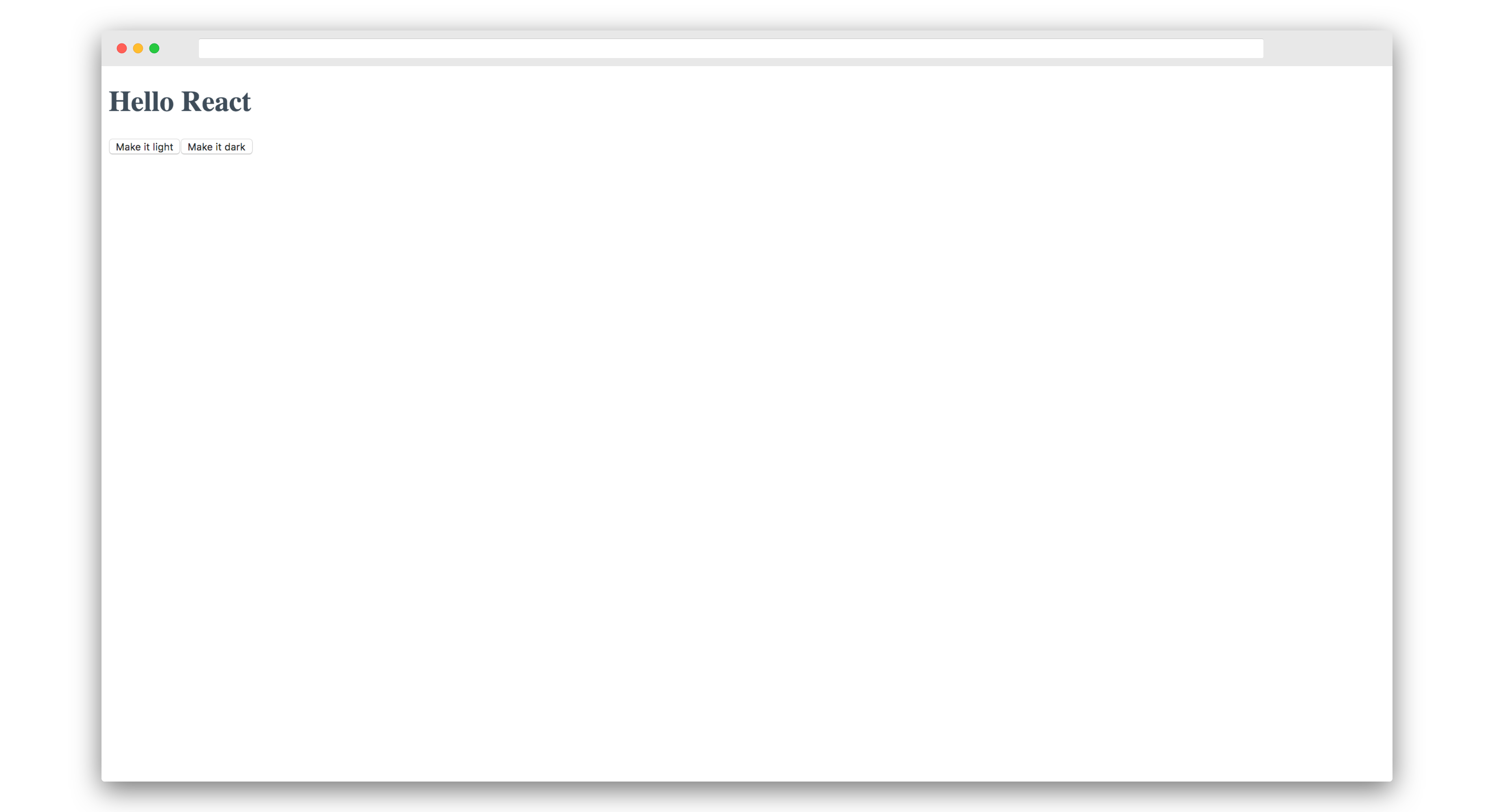
Now the light theme looks like this:
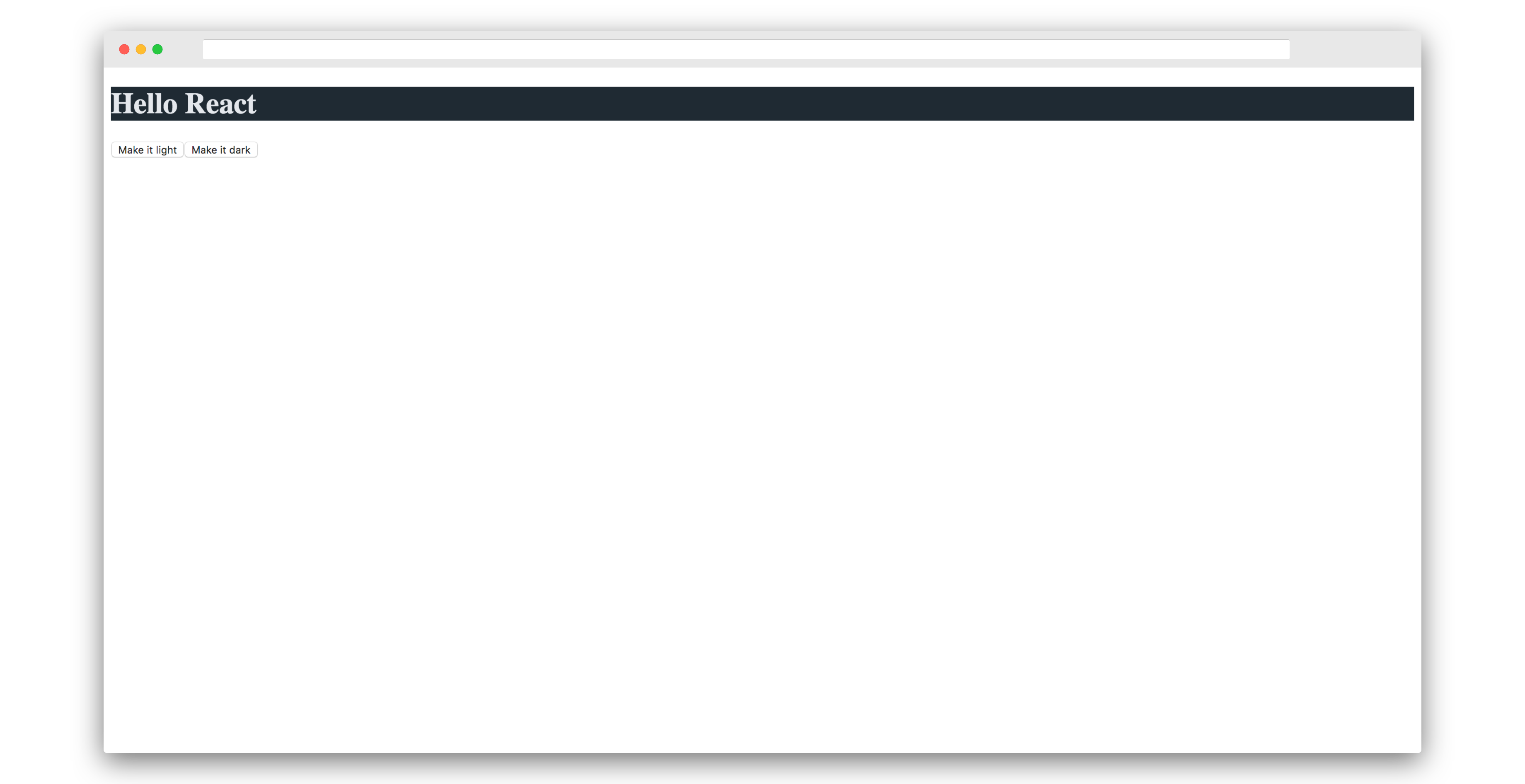
If you try clicking on the Dark Theme button, it will show the dark theme as follows:
Styled Components has a feature which lets you change your component styles dynamically using a prop. The background-color variable uses the prop theme.bgColor, while color uses the prop theme.color.
The theme variable mentioned here comes from ThemeProvider. The prop provided to ThemeProvider should be named theme. Otherwise it won’t work.
Now try clicking on the buttons to see themes changing.
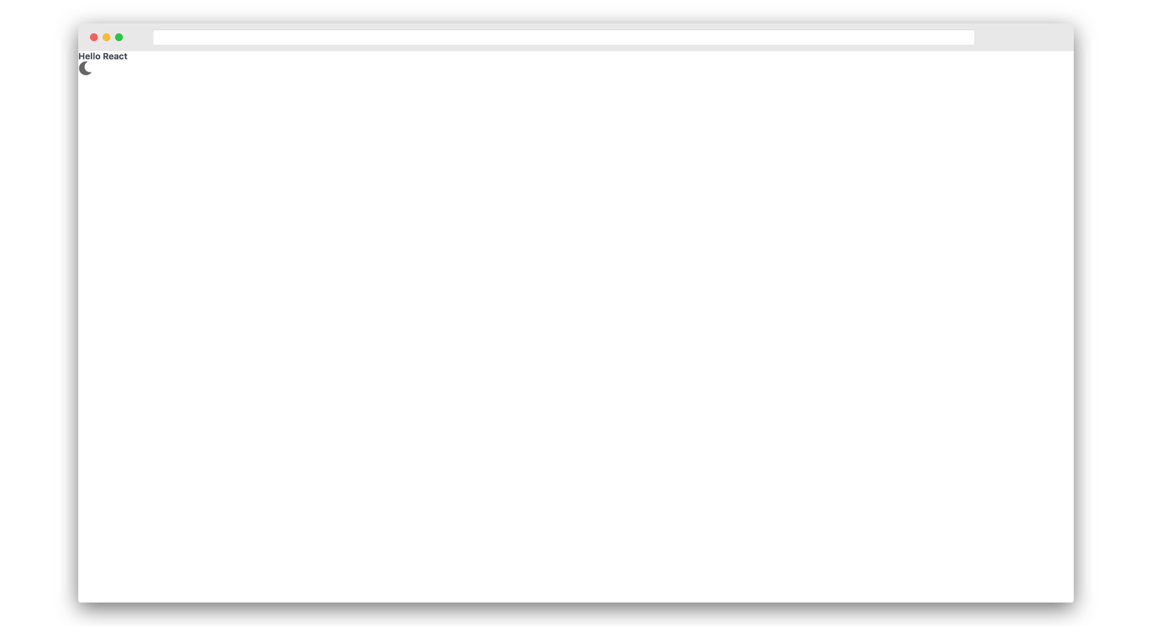
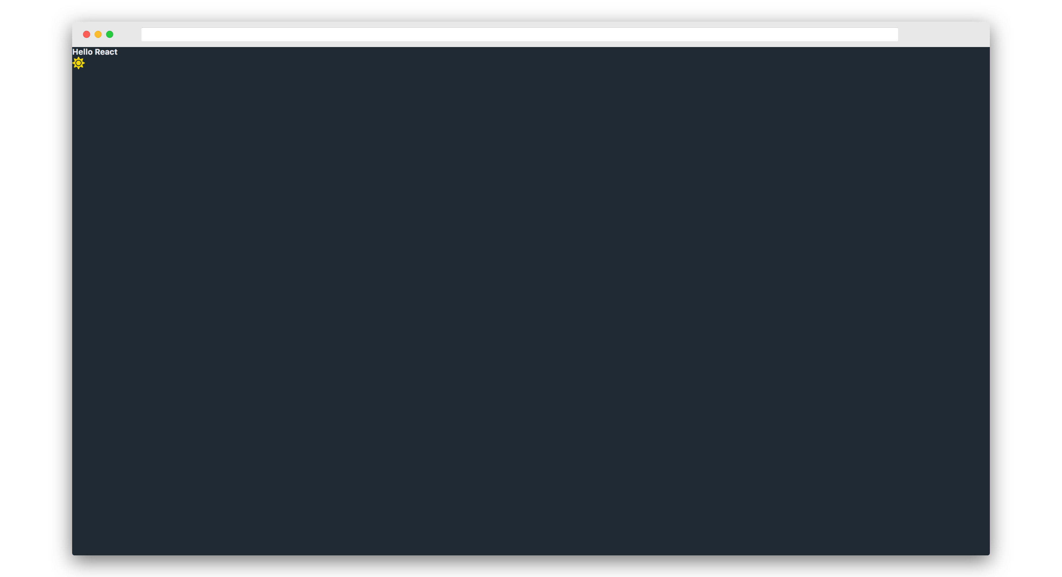
The themes change, but it’s confusing which button to click. Let’s add a conditional that shows the light theme button only when the dark theme is shown, and vice versa.
Change the buttons in App.js as follows:
{theme.type === 'dark' && <button onClick={setLightTheme}>Make it light</button>}
{theme.type === 'light' && <button onClick={setDarkTheme}>Make it dark</button>}
This conditional makes sure to only show the relevant button depending on the theme selected.
Only shows light button on dark theme:
Only shows dark button on light theme:

Go ahead and download the assets/ folder and paste it into the src/ directory.
This will ensure we have all the images and icons we need in this project.
Now let’s change the buttons to icons. We’ll make the light button as a sun icon and dark button as a moon icon.
Import the icons into App.js:
import { ReactComponent as MoonSVG } from './assets/logos/moon.svg'
import { ReactComponent as SunSVG } from './assets/logos/sun.svg'
Then style those icons by extending the SVG. The following adds styles to the svg tag:
const SunIcon = styled(SunSVG)`
  width: 2rem;
  height: 2rem;
  margin-left: auto;
  cursor: pointer;
`

const MoonIcon = styled(MoonSVG)`
  width: 2rem;
  height: 2rem;
  margin-left: auto;
  cursor: pointer;
`
Notice how we’re duplicating the code above in both SunIcon and MoonIcon. Styled Components supports reusing styles.
Reusable CSS in Styled Components
Styled Components lets us reuse styles using a special helper function named css. Go ahead and import it from styled-components as follows:
import styled, { css, ThemeProvider } from 'styled-components'
Now you can reuse styles using the css prop as follows:
const ThemeIcon = css`
  width: 2rem;
  height: 2rem;
  margin-left: auto;
  cursor: pointer;
`

const MoonIcon = styled(MoonSVG)`
  ${ThemeIcon}
`

const SunIcon = styled(SunSVG)`
  ${ThemeIcon}
`
Finally, change the buttons to the following:
{theme.type === 'light' && <MoonIcon onClick={setDarkTheme} />}
{theme.type === 'dark' && <SunIcon onClick={setLightTheme} />}
The App.js file should now like this:
import React, { useState } from 'react'
import styled, { css, ThemeProvider } from 'styled-components'
import { ReactComponent as MoonSVG } from './assets/logos/moon.svg'
import { ReactComponent as SunSVG } from './assets/logos/sun.svg'
import { themes } from './utils/themes'

const lightTheme = () => ({
  ...themes['common'],
  ...themes['light'],
})

const darkTheme = () => ({
  ...themes['common'],
  ...themes['dark'],
})

const ThemeIcon = css`
  width: 2rem;
  height: 2rem;
  margin-left: auto;
  cursor: pointer;
`

const MoonIcon = styled(MoonSVG)`
  ${ThemeIcon}
`

const SunIcon = styled(SunSVG)`
  ${ThemeIcon}
`

const App = () => {
    const [theme, setTheme] = useState(lightTheme())
  const setDarkTheme = () => setTheme(darkTheme())
  const setLightTheme = () => setTheme(lightTheme())
    return (
        <ThemeProvider theme={theme}>
            <>
                <Header>Hello React</Header>
                {theme.type === 'light' && <MoonIcon onClick={setDarkTheme} />}
                {theme.type === 'dark' && <SunIcon onClick={setLightTheme} />}
            </>
        </ThemeProvider>
    )
}

export default App
And the site should now look like the following. It only shows the moon icon on the light theme:
And it only shows the sun icon on the dark theme:
Global Styles in Styled Components
Now go ahead and create a components/ folder in src/ directory. Create a file named Global.js inside the components/ folder. Paste the following in it:
import { createGlobalStyle } from 'styled-components'

export const GlobalStyle = createGlobalStyle`
    *, *::before, *::after {
        box-sizing: border-box;
        margin: 0;
        padding: 0;
    }

    html, body {
        height: 100vh;
        max-width: 100%;
        font-size: 62.5%;
        background-color: ${props => props.theme.bgColor};
        color: ${props => props.theme.color};
        font-family: ${props => props.theme.fontFamily};
    }
`
We have imported createGlobalStyle from styled-components. This lets us create global styles. And we later export the GlobalStyle variable as a named export. Notice how we’re using themes in our GlobalStyle. To make sure theming works, we need to make GlobalStyle a child of ThemeProvider. Otherwise it won’t work.
Go ahead and import Global.js in App.js and use it as follows:
import { GlobalStyle } from './components/Global'

.
.
.

const App = () => {
    .
    .
    .
    return (
        <ThemeProvider theme={theme}>
            <>
                <GlobalStyle />
                <Header>Hello React</Header>
                {theme.type === 'light' && <MoonIcon onClick={setDarkTheme} />}
                {theme.type === 'dark' && <SunIcon onClick={setLightTheme} />}
            </>
        </ThemeProvider>
    )
}

.
.
.
Global styles should be applied to our web app.
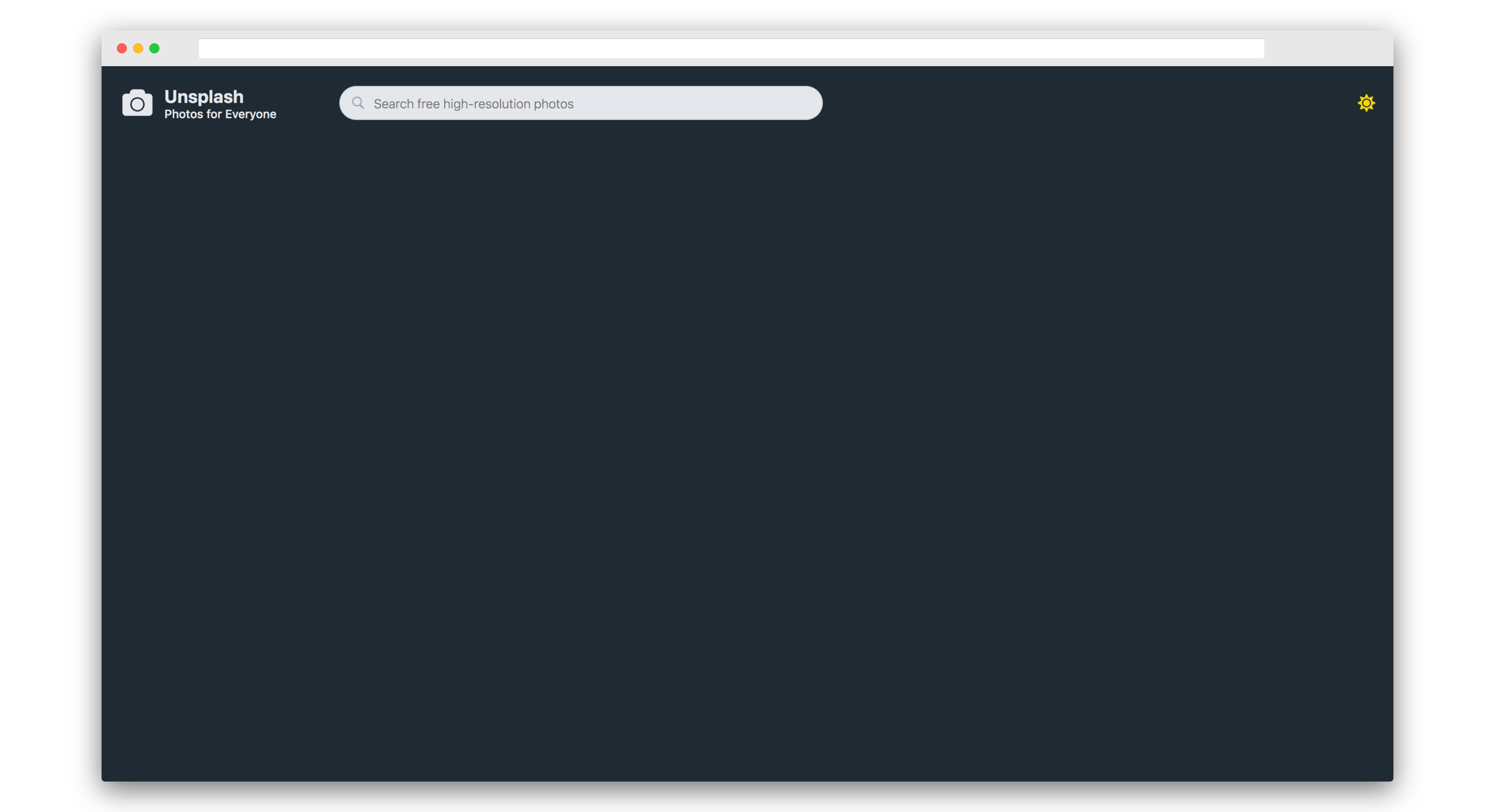
Global styles applied on the light theme:
Global styles applied on the dark theme:
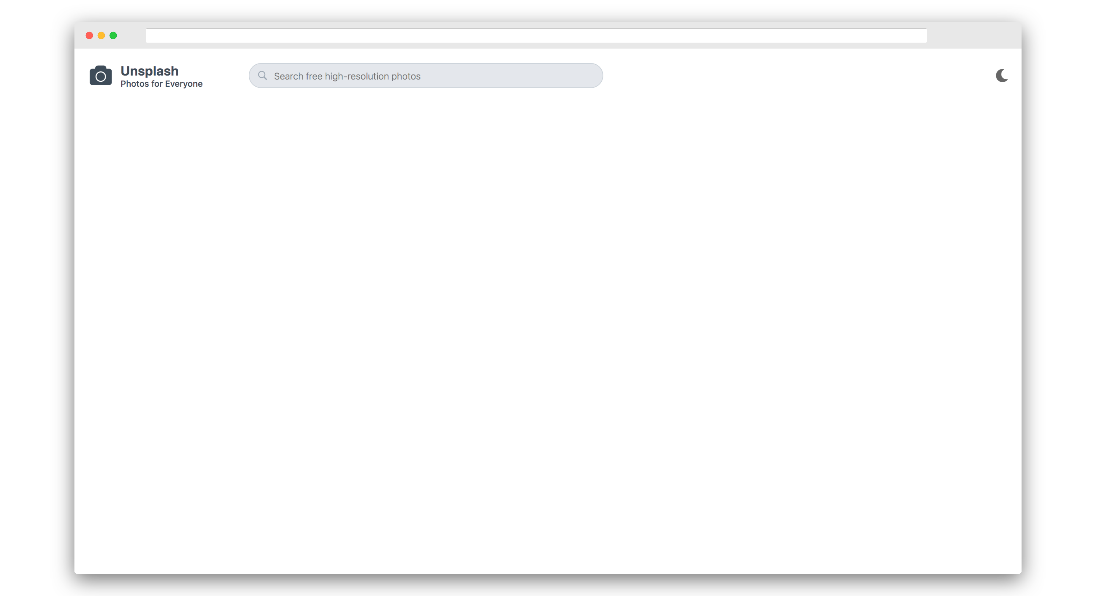
Now that we know the basics, let’s create the navbar for our Unsplash Redesign. Firstly, go ahead and remove the Header styled component from App.js.
Then go ahead and add the following in the App.js file:
import { ReactComponent as SearchSVG } from './assets/logos/search.svg'
import { ReactComponent as UnsplashLogoSVG } from './assets/logos/unsplash-logo.svg'
.
.
.

const Nav = styled.nav`
  display: flex;
  align-items: center;
  background-color: ${props => props.theme.bgColor};
  box-sizing: border-box;
  height: 8.2rem;
  padding-left: 2rem;
  padding-right: 2rem;
  position: fixed;
  width: 100%;
  z-index: 2;
`

const UnsplashLogo = styled(UnsplashLogoSVG)`
  fill: ${props => props.theme.color};
  width: 4rem;
  height: 4rem;
  backface-visibility: hidden;
  box-sizing: border-box;
  overflow: hidden;
  vertical-align: middle;
`

const TitleWrapper = styled.div`
  display: flex;
  flex-direction: column;
  margin-left: 1rem;
`

const Title = styled.h1`
  display: inline-block;
  font-size: 2rem;
  font-weight: 700;
  color: ${props => props.theme.color};
`

const Subtitle = styled.span`
  font-size: 1.3rem;
  font-weight: 500;
`

const SearchWrapper = styled.div`
  display: flex;
  align-items: center;
  background: ${props => props.theme.searchBgColor};
  border-radius: 3rem;
  border: 0.05rem solid #cbd2d9;
  margin-left: 7rem;
  box-shadow: none;
  :hover {
    border: 0.12rem solid #cbd2d9;
  }
`

const SearchIcon = styled(SearchSVG)`
  fill: #9aa5b1;
  width: 1.6rem;
  height: 1.6rem;
  margin-left: 1.2rem;
  margin-right: 1rem;
`

const SearchBar = styled.input`
  outline: none;
  border: none;
  width: 50rem;
  padding: 1rem 0;
  color: ${props => props.theme.categoryHoverColor};
  background: transparent;
  font-size: 1.4rem;
  font-weight: 300;
`

const App = () => {
  ..
  ..
  ..
  return (
    <ThemeProvider theme={theme}>
      <>
        <GlobalStyle />
        <Nav>
          <UnsplashLogo />
          <TitleWrapper>
            <Title>Unsplash</Title>
            <Subtitle>Photos for Everyone</Subtitle>
          </TitleWrapper>
          <SearchWrapper>
            <SearchIcon />
            <SearchBar placeholder="Search free high-resolution photos" />
          </SearchWrapper>
          {theme.type === 'light' && <MoonIcon onClick={setDarkTheme} />}
          {theme.type === 'dark' && <SunIcon onClick={setLightTheme} />}
        </Nav>
      </>
    </ThemeProvider>
  )
}

..
..
..
Notice that the only thing we’ve done differently is to add a :hover pseudo class on the SearchWrapper component. If you’ve come from Sass or SCSS, then Styled Components is pretty similar. You can even add child selectors inside a Styled Component just like Sass.
The nav should be properly displayed now.
The navbar on the light theme:
The navbar on the dark theme:
Let’s create a component for listing categories. Create a file categories.js in the utils/ folder and paste the following:
export const categories = [
  'Wallpapers',
  'Textures & Patterns',
  'Nature',
  'Current Events',
  'Architecture',
  'Business & Work',
  'Film',
  'Animals',
  'Travel',
  'Fashion',
  'Food & Drink',
  'Spirituality',
  'Experimental',
  'People',
  'Health',
  'Arts & Culture',
]
Also, create a component named CategoriesList.js in the components/ folder.
Paste the following code into it:
import React from 'react'
import styled from 'styled-components'
import { categories } from '../utils/categories'

const Categories = styled.div`
  padding-bottom: 2rem;
  padding-left: 2rem;
  position: fixed;
  margin-top: 8.2rem;
  top: 0;
  bottom: 0;
  overflow-y: scroll;
  width: 23rem;
  background: ${props => props.theme.bgColor};
  z-index: 2;
`

const CategoryName = styled.a`
  background-color: transparent;
  cursor: pointer;
  box-sizing: border-box;
  color: ${props => props.theme.categoryColor};
  display: block;
  font-size: 1.4rem;
  font-weight: 500;
  line-height: 1;
  padding-bottom: 1.7rem;
  padding-top: 2.1rem;
  text-decoration: none;
  white-space: nowrap;
  :hover {
    color: ${props => props.theme.categoryHoverColor};
    outline: none;
  }
`

const Category = ({ name }) => <CategoryName href="#">{name}</CategoryName>

export const CategoriesList = () => (
  <Categories>
    {categories.map((category, i) => (
      <Category name={category} key={i} i={i} />
    ))}
  </Categories>
)
Now go ahead and import it in App.js and paste it just below the Nav component:
import { CategoriesList } from './components/CategoriesList'
..
..
..

const App = () => {
  ..
  ..
  ..
  return (
    <ThemeProvider theme={theme}>
      <>
        <Nav>
          ..
          ..
          ..
        </Nav>
        <CategoriesList />
        ..
        ..
        ..
      </>
    </ThemeProvider>
  )
}

..
..
..
Now a list of categories will be shown in the sidebar.
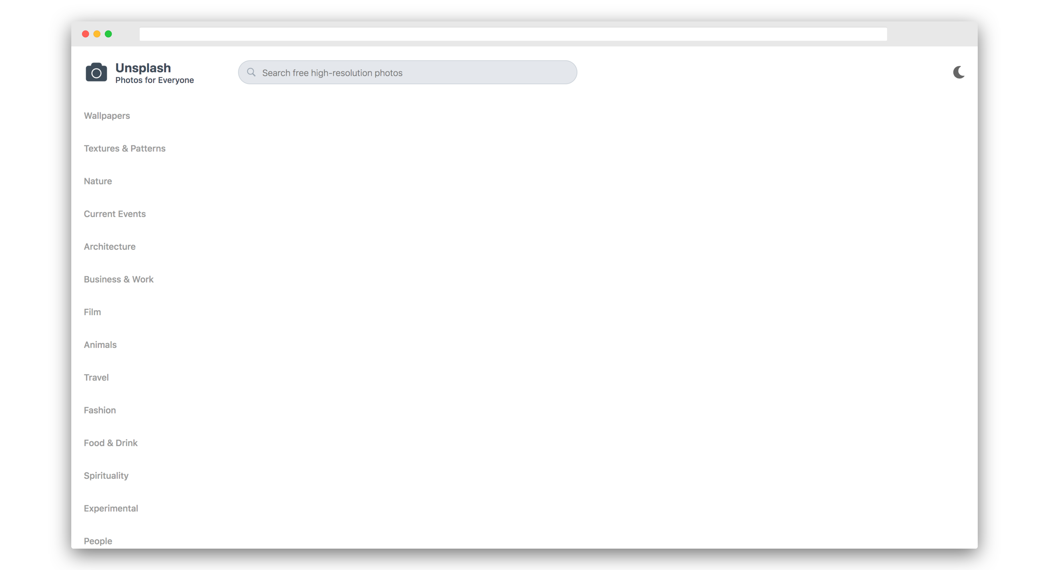
The list of categories on the light theme:
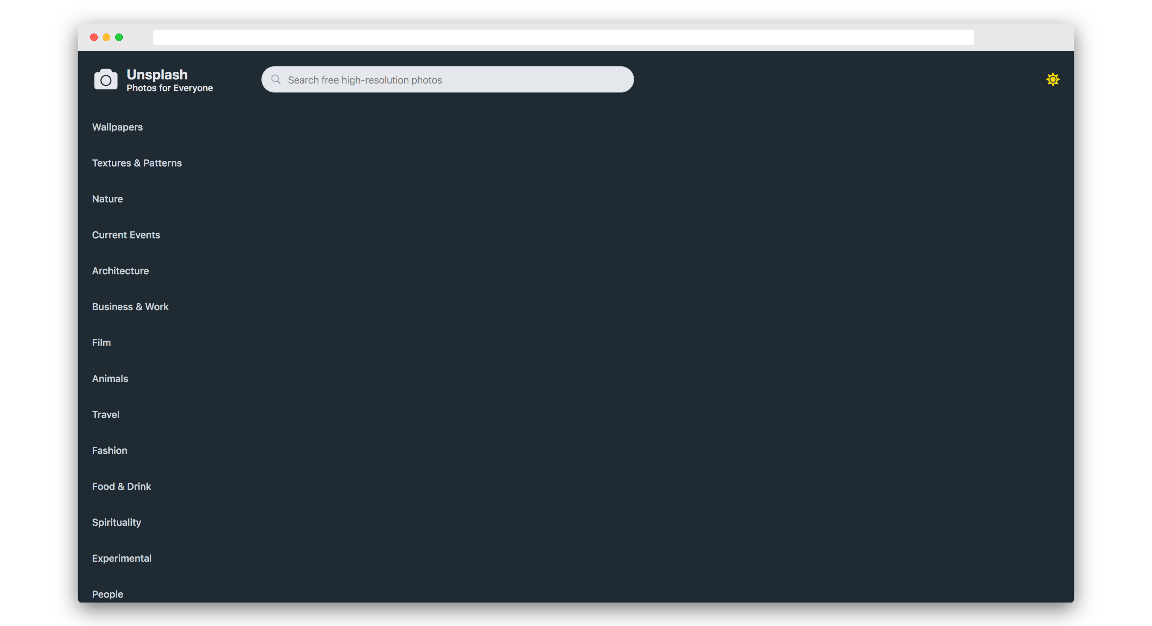
The list of categories on the dark theme:
Let’s create our final component that displays pics. Create a file named pics.js in the utils/ folder. Paste the following into it:
export const pics = [
  require('../assets/pics/asset 0.jpeg'),
  require('../assets/pics/asset 1.jpeg'),
  require('../assets/pics/asset 2.jpeg'),
  require('../assets/pics/asset 3.jpeg'),
  require('../assets/pics/asset 4.jpeg'),
  require('../assets/pics/asset 5.jpeg'),
  require('../assets/pics/asset 6.jpeg'),
  require('../assets/pics/asset 7.jpeg'),
  require('../assets/pics/asset 8.jpeg'),
  require('../assets/pics/asset 9.jpeg'),
  require('../assets/pics/asset 10.jpeg'),
  require('../assets/pics/asset 11.jpeg'),
  require('../assets/pics/asset 12.jpeg'),
  require('../assets/pics/asset 13.jpeg'),
  require('../assets/pics/asset 14.jpeg'),
  require('../assets/pics/asset 15.jpeg'),
  require('../assets/pics/asset 16.jpeg'),
  require('../assets/pics/asset 17.jpeg'),
  require('../assets/pics/asset 18.jpeg'),
  require('../assets/pics/asset 19.jpeg'),
  require('../assets/pics/asset 20.jpeg'),
  require('../assets/pics/asset 21.jpeg'),
  require('../assets/pics/asset 22.jpeg'),
  require('../assets/pics/asset 23.jpeg'),
  require('../assets/pics/asset 24.jpeg'),
  require('../assets/pics/asset 25.jpeg'),
  require('../assets/pics/asset 26.jpeg'),
  require('../assets/pics/asset 27.jpeg'),
  require('../assets/pics/asset 28.jpeg'),
  require('../assets/pics/asset 29.jpeg'),
  require('../assets/pics/asset 30.jpeg'),
  require('../assets/pics/asset 31.jpeg'),
  require('../assets/pics/asset 32.jpeg'),
  require('../assets/pics/asset 33.jpeg'),
  require('../assets/pics/asset 34.jpeg'),
  require('../assets/pics/asset 35.jpeg'),
  require('../assets/pics/asset 36.jpeg'),
  require('../assets/pics/asset 37.jpeg'),
  require('../assets/pics/asset 38.jpeg'),
  require('../assets/pics/asset 39.jpeg'),
  require('../assets/pics/asset 40.jpeg'),
  require('../assets/pics/asset 41.jpeg'),
  require('../assets/pics/asset 42.jpeg'),
  require('../assets/pics/asset 43.jpeg'),
  require('../assets/pics/asset 44.jpeg'),
  require('../assets/pics/asset 45.jpeg'),
  require('../assets/pics/asset 46.jpeg'),
  require('../assets/pics/asset 47.jpeg'),
  require('../assets/pics/asset 48.jpeg'),
  require('../assets/pics/asset 49.jpeg'),
  require('../assets/pics/asset 50.jpeg'),
  require('../assets/pics/asset 51.jpeg'),
  require('../assets/pics/asset 52.jpeg'),
  require('../assets/pics/asset 53.jpeg'),
]
Also create a Pic.js file in components/ folder and paste the following:
import React from 'react'
import ImageZoom from 'react-medium-image-zoom'
import styled from 'styled-components'

const ImageWrapper = styled.div`
  margin: 0.5rem;
  transition: all 200ms ease;
  :hover {
    box-shadow: ${props => props.theme.boxShadow};
    transform: scale(1.005);
  }
`

export const Pic = ({ src, i }) => {
  const alt = `Unsplash Redesign #${i}`
  const imageProps = { src, alt }
  return (
    <ImageWrapper>
      <ImageZoom
        image={imageProps}
        zoomImage={imageProps}
        defaultStyles={{
          image: { width: '37rem', height: '48rem' },
        }}
      />
    </ImageWrapper>
  )
}
We’re using react-medium-image-zoom, which lets you zoom in on an image like Medium.
Now go ahead and import Pic.js in App.js and paste it just below the CategoriesList component. Also, add Grid and GridWrapper styled components as follows:
import { Pic } from './components/Pic'
import { pics } from './utils/pics'

..
..
..

const GridWrapper = styled.div`
  display: flex;
  justify-content: center;
`

const Grid = styled.div`
  padding-top: 8.2rem;
  padding-left: 23rem;
  display: grid;
  grid-template-columns: repeat(3, 38rem);
  margin-bottom: 1.5rem;
`

const App = () => {
  ..
  ..
  ..
  return (
    <ThemeProvider theme={theme}>
      <>
        ..
        ..
        ..
        <CategoriesList />
        <GridWrapper>
          <Grid>
            {pics.map((pic, i) => (
              <Pic src={pic} key={i} i={i} />
            ))}
          </Grid>
        </GridWrapper>
      </>
    </ThemeProvider>
  )
}

..
..
..
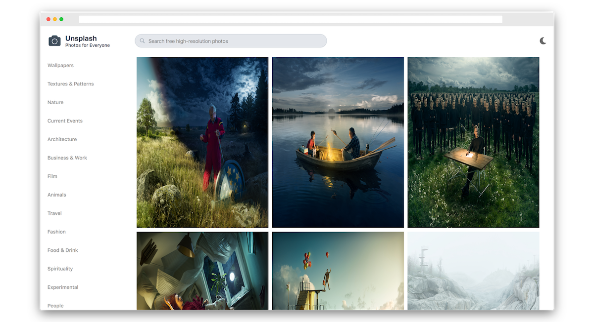
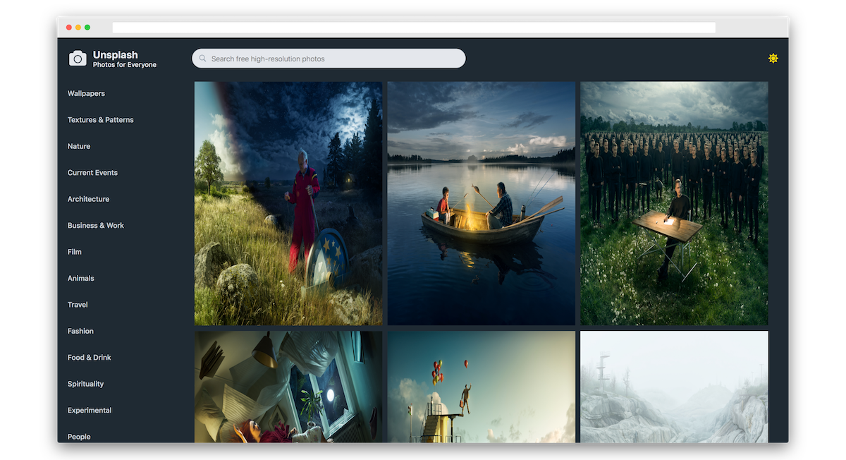
Now a grid with pics should appear.
The Unsplash redesign with the light theme:
The Unsplash redesign with the dark theme:
We just redesigned Unsplash using styled-components. Try zooming in on the image to see it working. You can check the live demo here.
Conclusion
Styled Components makes it easy to write plain ol’ CSS in your JS. It allows us to colocate styles with our components so that we can add styles, edit them or remove them easily.
We learned how to add Global Styles, reuse styles using a css prop and how to theme an application. We’ve only scratched the surface with styled-components; it has a lot more to offer. You can learn more about it on the official website.
We finally redesigned Unsplash using Styled Components. The complete code is available on GitHub and the demo is available here.
Frequently Asked Questions (FAQs) about Using Styled Components
What are the benefits of using styled components in my project?
Styled components offer a number of benefits for developers. Firstly, they allow for the encapsulation of styles, meaning that the styles you define for one component won’t accidentally affect another. This makes your code more predictable and easier to debug. Secondly, styled components promote the use of reusable components, which can significantly reduce the amount of code you need to write and maintain. Lastly, styled components make it easy to theme your application, allowing you to easily switch between different looks without having to change your component code.
How do I install styled components?
Installing styled components is straightforward. You can install it via npm or yarn. For npm, use the command npm install --save styled-components. For yarn, use yarn add styled-components. Once installed, you can import it into your project using import styled from 'styled-components'.
How do I create a styled component?
Creating a styled component is simple. First, import the styled function from ‘styled-components’. Then, call this function with the type of HTML element you want to create (e.g., div, button, etc.) and a template literal containing your CSS. For example, const Button = styled.buttonbackticksbackground: palevioletred; color: white;backticks`.
Can I use props in my styled components?
Yes, you can use props in your styled components. This allows you to create dynamic styles that can change based on the props passed to the component. To do this, you can use a function inside your template literal that receives the props of the component and returns the desired CSS.
How do I handle global styles with styled components?
Styled components provide a createGlobalStyle function that you can use to define global styles. You can define your global styles in a template literal and then use this component at the root of your application.
Can I use styled components with React Native?
Yes, styled components work seamlessly with React Native. The syntax is slightly different, but the principles are the same. Instead of using HTML tags, you use the names of React Native components.
How do I theme my application with styled components?
Styled components provide a ThemeProvider component that you can use to define a theme for your application. You can then access these theme values in your styled components using props.
Can I use media queries with styled components?
Yes, you can use media queries in your styled components just like you would in regular CSS. This allows you to create responsive designs that adapt to different screen sizes.
How do I handle animations with styled components?
Styled components allow you to define keyframes animations using the keyframes helper function. You can then use these animations in your styled components.
Can I use styled components with TypeScript?
Yes, styled components provide full TypeScript support. This allows you to benefit from static typing while using styled components, making your code more robust and easier to maintain.