

There was quite a bit of buzz online around the launch of the new logo for the New York Public Library.


Old Public library logo (left) and new.
The Redesign began in 2008 with the designers using photographs and sketches of lion statues on the steps of the library building. The lions outside the building are known as “Fortitude” and “Patience”. Influences are reported to have included Japanese woodcuts, stained glass and Art Noveau. The vector style artwork has been designed to be versatile enough to use in many formats and colors, as well as reproducing well at small sizes.
The new logo comes, as is often the case with a logo redesign, with a new mission for the library. They wanted to convey a more digital-friendly and modern feeling.
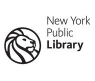
As a Leo and owner of a company with Lion in the title I have to admit I’m particularly drawn to this. Although I’m still debating with myself about whether I like this logo. I like the simplicity and the clean lines but is it a bit too cartoony for such a important keeper of knowledge? I’m not too keen on the placement of the text although I do like the sans-serif font. The font is called Kievit.
Some people are remarking that it looks like the MGM logo. I think they are referring to a very short lived MGM logo and not the well known classic. The blue and gold MGM logo was used in 1968 on a small number of films and the recording division of the company but was later replaced by the roaring lion we know and love.
![]()
Here’s an interesting video from the New York Public library outlining how the logo came about.
Check out other articles about the logo on Brand New and the New York Times web sites, both showing initial sketches and ideas for the logo.
So what do you think of the new logo? Is it an improvement or just more meddling with a classic?
Frequently Asked Questions about The New York Public Library Logo
What is the significance of the lion in the New York Public Library logo?
The lion has been a symbol of the New York Public Library (NYPL) since its establishment in 1895. The two marble lions that guard the entrance of the NYPL’s main branch on Fifth Avenue in Manhattan are iconic symbols of the library. They were named Patience and Fortitude during the Great Depression by Mayor Fiorello LaGuardia for the qualities he felt New Yorkers would need to survive the economic crisis. The lion in the NYPL logo represents these enduring symbols of the library’s strength and resilience.
Who designed the New York Public Library logo?
The current NYPL logo was designed by the design firm Pentagram. The logo, which features a stylized lion, was introduced in 2009 as part of a larger rebranding effort to modernize the library’s image while still honoring its history and tradition.
How has the New York Public Library logo evolved over time?
The NYPL logo has undergone several changes since the library’s establishment. The original logo featured a detailed depiction of one of the marble lions. Over time, the logo was simplified and stylized for a more modern look. The current logo, introduced in 2009, features a minimalist lion design that is both modern and reminiscent of the library’s historic symbols.
What does the New York Public Library logo represent?
The NYPL logo represents the library’s mission to inspire lifelong learning, advance knowledge, and strengthen communities. The lion symbolizes the strength, courage, and resilience that the library embodies. It also pays homage to the marble lions, Patience and Fortitude, that have guarded the library’s main branch since its opening.
Why was the New York Public Library logo redesigned in 2009?
The NYPL logo was redesigned in 2009 as part of a larger rebranding effort to modernize the library’s image. The new logo, designed by Pentagram, aimed to create a more contemporary and versatile visual identity for the library while still honoring its history and tradition.
How has the public reacted to the New York Public Library logo redesign?
The public’s reaction to the NYPL logo redesign has been largely positive. Many appreciate the modern, minimalist design and feel that it successfully represents the library’s mission and values. However, like any redesign, it has also faced some criticism from those who preferred the previous logo.
Can I use the New York Public Library logo for personal or commercial purposes?
The NYPL logo is a registered trademark of the New York Public Library and is protected by copyright laws. Unauthorized use of the logo for personal or commercial purposes is prohibited without the library’s express written permission.
Where can I find merchandise featuring the New York Public Library logo?
Merchandise featuring the NYPL logo can be purchased from the library’s online shop. The range of products includes apparel, accessories, home goods, and more.
What are some other symbols associated with the New York Public Library?
In addition to the lion, other symbols associated with the NYPL include the iconic Stephen A. Schwarzman Building, the library’s main branch, and the Rose Main Reading Room, one of the most beautiful public spaces in New York City.
How does the New York Public Library logo compare to other library logos?
The NYPL logo stands out for its simplicity and modern design. While many library logos feature books or other traditional symbols of knowledge and learning, the NYPL logo’s use of the lion is unique and memorable. It successfully combines tradition and modernity, reflecting the library’s mission to be both a historic institution and a forward-thinking resource for the community.

