
Key Takeaways
- Using a “mobile first” approach, where a simple mobile design is used as a baseline and desktop layout effects are only applied when the browser supports media queries, can help support older browsers like IE6, IE7, and IE8.
- A simple solution to support older browsers is to use two stylesheets – a basic one for mobile/legacy browser layout and another one to override simple styles for the desktop layout. The simpler styles are always loaded while the complex layout is loaded if the screen width exceeds 800px.
- With this method, older versions of IE which support the desktop layout will ignore the media query but will load the complex styles through a conditional stylesheet.
- While this solution won’t make the website look as pretty on older browsers, it will make it more usable. This technique requires minimal effort, especially if mobile devices are already being supported, and is easier than fixing old IE bugs or persuading users to upgrade their browsers.
In my previous article, Is Internet Explorer Development Really a Waste of Time?, I hinted that it’s possible to support older browsers without significant development effort. In this tutorial, we’re going to create a simple web page which works in all modern browsers as well as IE8, IE7, IE6 and possibly earlier versions.
Before we start, please note that we’re not aiming for pixel perfection or identical functionality. That will never be possible, so don’t even bother. However, we’re NOT going spend any time testing, fixing or hacking IE bugs and the page will still work.
The Objective
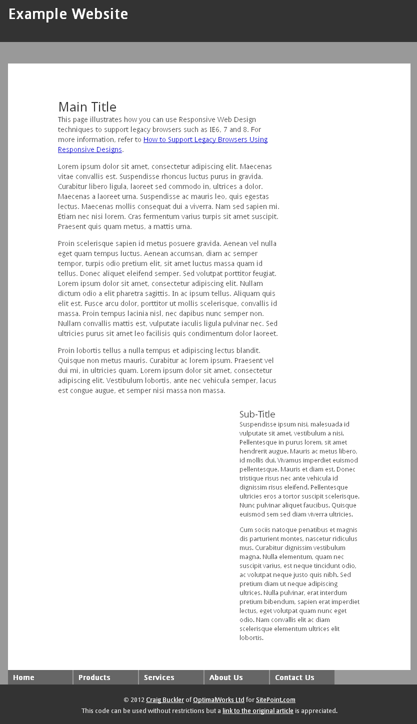
This is the design we’ll attempt to create in modern browsers:
 click any thumbnail to view the full-sized screenshot…
It’ll never win any awards, but contains typical components such as a header, footer, content, sidebar and drop-down CSS menu. Note that the header and menu are fixed at the top of the browser window.
 Assume we coded this page using standard HTML5 and CSS. IE9 and 10 will work as we expect but, even though this is a simple design, IE6 fails to render the page correctly. The layout breaks because the floated elements trigger IE6’s double-margin bug. The menu appears in the wrong place (
display: fixed is not supported) and it’s unusable because IE6 does not allow :hover or :focus on elements other than links.
While we’ve all encountered worse issues, the site is fundamentally broken.
 IE7 fares better but its weird margin handling causes the titles to be cropped.
We could fix this with conditional CSS or an IE7-specific hack, but life’s too short for that sort of nonsense!
 IE8 is acceptable. They layout and menu work as we expect and we’re only missing a few CSS3 effects such as rounded corners and drop shadows. I’m sure XP users stuck on that browser would be more than happy.
Responding to the Problem
Let’s consider Responsive Web Design. RWD uses media queries to apply styles depending on the browser’s width or height. For example, this link will apply the definitions in mystyles.css if the page width is 600px or greater:
<link rel="stylesheet" media="screen and (min-width:600px)" href="mystyles.css" />
RWD is generally used to support mobile browsers. Your desktop design is simplified for small screen devices, e.g. the layout is linearized into a single column and features which rely on hover effects are adapted for touch.
Unfortunately, some mobile browsers don’t implement media queries. This means we can’t rely on using a desktop design then simplify it when a small screen is detected. But we can switch it around, i.e. we start with a baseline mobile design and only apply desktop layout effects when the browser supports media queries and the screen dimensions become large enough to be practical.
This is referred to as “mobile first” and has become a best-practice technique for developers implementing responsive sites.
Guess which other browsers don’t support media queries? Why couldn’t we use a simpler mobile layout to support IE6, IE7, IE8 and any other legacy browser. Linearizing the layout will immediately solve most IE-specific issues.
The Solution
Let’s look at the demonstration page which supports IE6+, mobile devices and all modern browsers…
The page uses two stylesheets:
- simple.css — our basic mobile/legacy browser layout
- complex.css — overrides simple styles for the desktop layout
The simpler styles are always loaded:
<link rel="stylesheet" media="all" href="simple.css" />
We then use a media query to load the complex layout if the screen width exceeds 800px. IE6, 7 and 8 will ignore the declaration:
<link rel="stylesheet" media="screen and (min-width:801px)" href="complex.css" title="complex layout" />
Here’s where the magic comes in: we use a conditional stylesheet to load the complex styles in older versions of IE which support the desktop layout:
<!--[if (IE 8)]>
<link rel="stylesheet" media="screen" href="complex.css" title="complex layout" />
<![endif]-->
In this case, I’m only happy to support IE8. The layout won’t be responsive but, since IE8 does not run on mobile devices, we know this must be a desktop user with a reasonably large display. Were I prepared to live with the IE7 margin quirks, I could have used if (IE 8)|(IE 7) in the conditional comment.
That’s all we need other than the HTML5 shim…
<!--[if lt IE 9]>
<script src="http://html5shiv.googlecode.com/svn/trunk/html5.js"></script>
<![endif]-->
The result: our demonstration page works everywhere! Fire up your old copy of IE6 or IE7 and you’ll see this design…

It’s not as pretty, but it’s far more usable than before.
If you’re already supporting mobile devices, this technique won’t require additional development. If you don’t have a responsive design, you will require a simple mobile stylesheet but that’s a minimal effort for the number of mobile and legacy browsers you’ll be supporting.
Easy. Or certainly easier than fixing old IE bugs or persuading millions of users to upgrade their browsers.
If you enjoyed reading this post, you’ll love Learnable; the place to learn fresh skills and techniques from the masters. Members get instant access to all of SitePoint’s ebooks and interactive online courses, like A Crash Course in Mobile Web Design.
Frequently Asked Questions on Supporting Old Browsers in Responsive Web Design
Why is it important to support old browsers in responsive web design?
Supporting old browsers in responsive web design is crucial for several reasons. Firstly, not all users upgrade their browsers regularly, meaning a significant portion of your audience may be using older versions. If your website doesn’t support these versions, these users will have a poor experience, which can lead to a loss of potential customers or clients. Secondly, supporting old browsers can improve your website’s accessibility, as some users may rely on older technology due to personal preferences or accessibility needs. Lastly, it demonstrates professionalism and attention to detail, showing that you care about all users’ experience, regardless of their browser version.
How can I ensure my website is compatible with older browsers?
There are several strategies you can use to ensure your website is compatible with older browsers. One approach is to use progressive enhancement, which involves building your website with a basic level of user experience and functionality, then adding more advanced features for newer browsers. This ensures that all users can access your site’s core content and functionality, even if they can’t use the most advanced features. Another strategy is to use polyfills, which are scripts that provide modern functionality in older browsers. Lastly, you can use tools like Browsershots or BrowserStack to test your website in different browser versions and identify any compatibility issues.
What are the challenges of supporting old browsers in responsive web design?
Supporting old browsers in responsive web design can be challenging for several reasons. Older browsers often lack support for modern web standards, making it difficult to use newer CSS and JavaScript features. They may also have unique quirks and bugs that require specific workarounds. Additionally, testing your website in multiple browser versions can be time-consuming and complex, especially if you need to support a wide range of versions. Lastly, maintaining support for old browsers can limit your ability to use the latest and most efficient coding techniques, potentially leading to slower performance and higher development costs.
What is the role of CSS in supporting old browsers?
CSS plays a crucial role in supporting old browsers. It allows you to control the layout and appearance of your website across different browsers and versions. By using CSS features that are widely supported and providing fallbacks for newer features, you can ensure that your website looks and functions correctly in older browsers. Additionally, CSS can be used to implement responsive design techniques, allowing your website to adapt to different screen sizes and devices.
How can I decide which old browsers to support?
Deciding which old browsers to support can depend on several factors. One approach is to look at your website analytics to see which browsers your visitors are using. This can help you prioritize the most commonly used versions. You can also consider the global usage statistics for different browsers and versions. Lastly, you should consider the technical capabilities and limitations of different browsers, as well as the effort and resources required to support them. It may not be feasible or worthwhile to support very old or obscure browsers, especially if they are used by a small percentage of users.
What is progressive enhancement and how can it help in supporting old browsers?
Progressive enhancement is a web design strategy that involves building a basic version of your website that works in all browsers, then adding more advanced features for newer browsers. This ensures that all users can access your site’s core content and functionality, even if they can’t use the most advanced features. Progressive enhancement can be a useful approach for supporting old browsers, as it allows you to provide a good user experience for all users, regardless of their browser version.
What are polyfills and how can they be used to support old browsers?
Polyfills are scripts that provide modern functionality in older browsers. They work by detecting if a browser supports a certain feature, and if it doesn’t, the polyfill provides a fallback implementation that mimics the feature. Polyfills can be used to support a wide range of modern web features in old browsers, including HTML5 elements, CSS3 properties, and JavaScript APIs. However, they should be used judiciously, as they can add to the size and complexity of your code.
How can I test my website in different browser versions?
There are several tools and services available that allow you to test your website in different browser versions. These include Browsershots, which provides screenshots of your website in various browsers, and BrowserStack, which allows you to interactively test your website in real browsers running on different operating systems. You can also use the developer tools built into most modern browsers to simulate different screen sizes and device types.
Can supporting old browsers limit my ability to use modern web technologies?
Yes, supporting old browsers can sometimes limit your ability to use the latest web technologies. Older browsers often lack support for modern web standards, making it difficult to use newer CSS and JavaScript features. However, there are strategies you can use to work around these limitations, such as progressive enhancement and polyfills. These allow you to provide a good user experience for all users, while still taking advantage of the latest web technologies where possible.
Is it always necessary to support all old browsers?
No, it’s not always necessary to support all old browsers. The decision should be based on several factors, including your audience’s browser usage, the technical capabilities and limitations of different browsers, and the effort and resources required to support them. In some cases, it may be more practical and cost-effective to support only the most commonly used browsers, or to provide a basic level of functionality for older browsers while offering a more advanced experience for newer ones.