How to Design a Daring but Effective Split-Screen Layout

Key Takeaways
- Split-screen layouts work best in minimalist web designs, offering a supreme amount of focus on important areas. They are particularly effective for landing pages with two side-by-side selectable options, such as login and signup forms, paid and free subscriptions, or products with alternate colors.
- When designing split-screen layouts, consider mobile-friendliness, as they may not be very responsive and could require more coding. Don’t split the screen without a good reason, and make sure to effectively use negative space.
- Split-screen layouts can be used to define different identities for each column or to keep everything above-the-fold in minimal websites that don’t require the whole width of the viewport. They are attractive and offer a chance to experiment with new ways to display content.
Split-screen layouts are full-screen web components that are divided into two (or more) equal vertical columns.
However, despite the fact that split-screen layouts are white-hot trendy, it is a bold stylistic decision that can hurt the user experience if there isn’t a sound, logical reason behind your choice.
Saying that, when executed correctly it can offer users a wonderful viewing experience.
Why Use a Split-Screen Layout?
Split-screen components work best in minimalist web designs because the negative space combined with the bold vertical divide adds a supreme amount of focus on the important areas.
Aside from these advantages, the benefits to split-screen layouts extend way beyond visual aesthetics; they’re especially effective for landing webpages with two side-by-side selectable options.
Some obvious examples include:
- Login and signup forms
- Paid and free subscriptions
- Products that come in alternate colours
Great Examples of Split-Screen Components
First, let’s take a look at some terrific examples and discuss why they work so well for their use-case. Split-screen layouts can be used in many different ways, so the advantages vary from site-to-site, depending on what the website sets out to achieve.
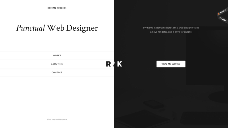
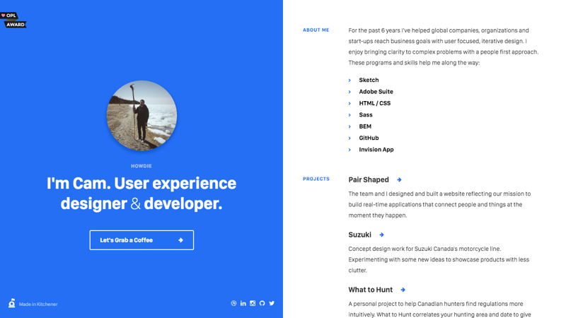
Cam Strobel
Not every website design needs access to the entire horizontal viewport. With ultra-minimal designs, like Cam Strobel’s website, splitting the screen into two vertical columns means that all of the content can be above-the-fold, completely eliminating the need for the user to scroll.
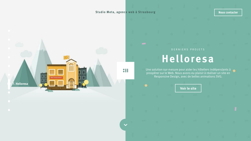
Studio Meta
Full-width “big header” designs are still quite common – it’s a huge trend and rightfully so, however, there’s rarely an opportunity to use bold imagery due to the lack of text legibility (we usually have to the blur the image or add a colour overlay). Split-screen layouts solve that, and Studio Meta shows us exactly how.
By having the image and content side-by-side, we can use images that are more colourful, more courageous, and with a much deeper meaning because we don’t have to obscure the image in any way.
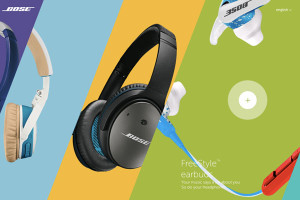
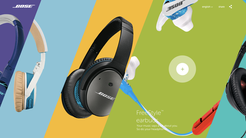
Bose
Split-screens don’t have to consist of two 50/50 components – Bose takes this trend to the limit, although I did notice that the website doesn’t even try to adapt to smaller screens. Regardless of how beautiful this looks, responsive design is something you have to consider, and it can be quite hard to adapt split-screen layouts to smaller devices.
Aside from that, this is my favourite split-screen example because the layout allows Bose to show off each item with a unique personality by using different colours. Combined with the edgy diagonal shapes, this website really catches my eye.
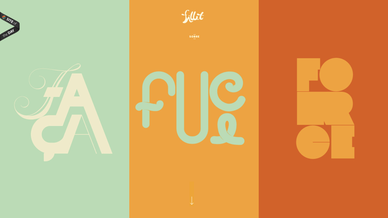
Fillet is another wonderful example of how split-screen layouts can inject individual personality into web components of equal importance. Plus, because there are only three vertical columns and almost no content (each column showcases artwork), this displays correctly on mobile devices.
3 Things to Remember when Designing Split-Screen Layouts
If you’re considering a split-screen component for your website, you should keep these three tips in mind when designing them.
1. Mobile-Friendliness
Split-screen components do have one *dis*advantage: they’re not very mobile-friendly. It’s difficult to make them responsive and adapt to smaller screens (with the exception of tablets in landscape view) – you’ll almost certainly have to scale back to something more modest and that may require a little more coding than usual, so make sure you take a mobile-first approach.
Note: since the Bose example above was split into five sections instead of two, it didn’t adapt to smaller screens *at** all.*
2. Don’t Split the Screen Without Good Reason
You should first consider whether your website even needs a split-screen component. Sure, it’s ‘on trend’, and it looks very cool, but that alone is not enough reason to implement it.
- Is it worth the extra work to make the component responsive?
- Are your users trend-conscious enough to appreciate the layout, or will it confuse them?
- Will there be enough negative space to make the layout work?
- Are you in danger of splitting your user’s attention in half when a more singular focus would be a better outcome for you?
If any of these answers are no, then you should vote against the idea.
3. Make Use of Negative Space
Desktop websites display horizontally, but when using split-screen layouts each component becomes a sort-of vertical viewport within the main viewport.
Because of this, there are many more chances to explore new ways to display content. It’s definitely an opportunity to be creative, so stick your creative cap on!
Conclusion
Split-screen layouts are attractive, and as we saw from the examples, the benefits of the trend differ depending on what the website is setting out to achieve; they can be used to define different identities for each column, or they can be used for a far simpler reason: to keep everything above-the-fold in minimal websites that don’t require the whole width of the viewport.
If you haven’t tried designing a split-screen layout before, what entices you to try it now? Is it the visual aesthetics, or the chance to experiment with new ways to display content?
Let me know in the comments below!
Frequently Asked Questions on Split-Screen Layout Design
What are the key principles to consider when designing a split-screen layout?
When designing a split-screen layout, it’s crucial to maintain balance. Both sides should be equally compelling and neither should overpower the other. The content on each side should be related and complement each other. Also, consider the visual hierarchy and ensure that the most important information is easily noticeable. Use contrasting colors to differentiate the two halves and guide the user’s eye. Lastly, ensure the design is responsive for different screen sizes.
How can I make my split-screen layout responsive?
To make a split-screen layout responsive, you can stack the two halves vertically on smaller screens. This ensures that the content remains legible and accessible on mobile devices. You can use CSS media queries to implement this change when the screen size reaches a certain threshold.
How can I use color effectively in a split-screen layout?
Color plays a crucial role in split-screen layouts. It can be used to differentiate the two halves of the screen and guide the user’s eye. Choose contrasting colors for each half to create a clear distinction. However, ensure the colors align with your brand and the mood you want to convey.
Can I use images in a split-screen layout?
Yes, images can be effectively used in split-screen layouts. They can add visual interest and help convey your message. However, ensure the image complements the content on the other half of the screen and doesn’t distract from it. Also, consider the load time of the image and optimize it for web use.
How can I guide the user’s eye in a split-screen layout?
You can guide the user’s eye in a split-screen layout through the use of visual hierarchy, color, and typography. The most important information should be the most noticeable. Use contrasting colors to guide the user’s eye and different font sizes to establish hierarchy.
Can I use animations in a split-screen layout?
Yes, animations can be used in split-screen layouts to add dynamism and engage users. However, they should be used sparingly and not distract from the content. Ensure the animations are smooth and don’t slow down the load time of the page.
How can I ensure the content on both halves of the screen is related?
The content on both halves of the split-screen layout should complement each other and work together to convey your message. This could be through related images and text, or through a continuation of a concept or story from one half to the other.
What are some common mistakes to avoid when designing a split-screen layout?
Some common mistakes to avoid include overpowering one side of the screen, not maintaining balance, using unrelated content on each half, and not considering responsiveness. Also, avoid using too many different colors or fonts, as this can make the design look cluttered and confusing.
How can I test the effectiveness of my split-screen layout?
You can test the effectiveness of your split-screen layout through user testing. This involves observing users as they interact with your design and gathering feedback. You can also use analytics to track user behavior and engagement.
Can I use a split-screen layout for any type of website?
While a split-screen layout can be used for many types of websites, it’s particularly effective for sites that want to highlight two key elements or choices. It’s also great for portfolio websites, product showcases, and sites with minimal content. However, it may not be suitable for sites with a lot of information or complex navigation.
Previously, design blog editor at Toptal and SitePoint. Now Daniel advocates for better UX design alongside industry leaders such as Adobe, InVision, Marvel, Wix, Net Magazine, LogRocket, CSS-Tricks, and more.