

The following is a short extract from our book, Designing UX: Forms, written by Jessica Enders. It’s the ultimate guide to form design, a key part of effective UX design. SitePoint Premium members get access with their membership, or you can buy a copy in stores worldwide.
We can subtly communicate with the user through a few tweaks of spacing.
Proximity
Human beings see things that are close to each other as being related. Conversely, things that are not related usually have some space between them.
These principles tell us to put the parts of a question—label, question-level help and answer fields—close together. Our form is pretty good for this so far, but let’s just move the labels a bit to the right, so they’re closer to their fields:
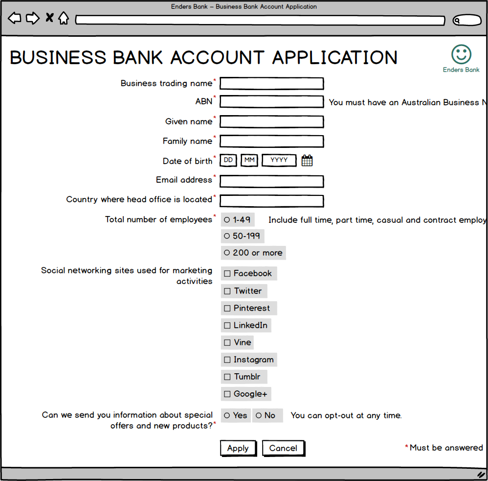
Flush right labels should be close to their fields.
On the other hand, there needs to be some distance between each question:

Questions should be far enough apart that it’s clear where one ends and the next one starts.
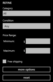
Remember how the focus of a user’s vision is about nine characters wide? Well, this means question-level help that’s on the right side of a field often won’t be seen:
Their focus on fields means many users won’t even see the question-level help in this form.
We could move the question-level help underneath the field, but that means users might not see it until after they’ve answered. It’s also less accessible.
Question-level help below the field is not especially usable or accessible.
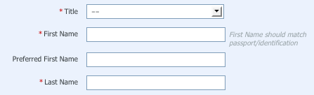
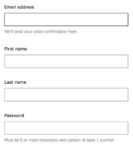
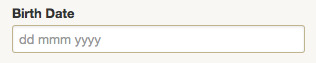
The best place for question-level help is between the label and the field (as shown in the image below). Formatting instructions—like the DD MM YYYY on date of birth—should go above the field:
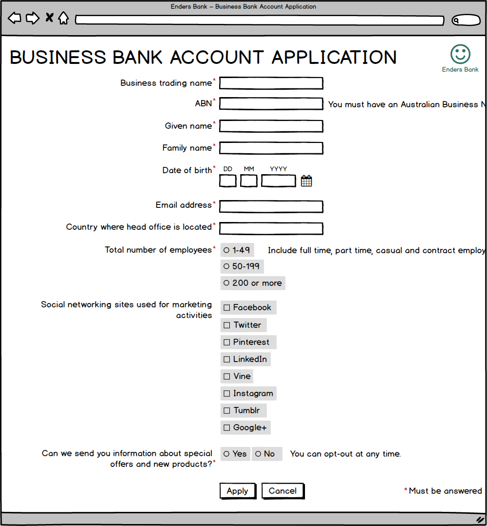
Formatting instructions positioned above the field
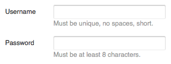
Other question-level help should go below the label. See the ABN, employee and marketing questions for examples of this:
Other question-level help positioned below the label.
Finally, when we use checkboxes and radio buttons, we need to make sure the labels are close to the right button or box. If they’re too far away, things get confusing, particularly if you aren’t shading the touch area:
The distance between the labels “Yes” and “No” and their respective radio buttons means the user has to stop and think.
Here’s an even more extreme illustration of poorly spaced labels on radio buttons:

It’s likely that many users will give an unintended rating, given the poor spacing here.
Text Box Widths
While we’re adjusting spacing, let’s fix up our text box widths.
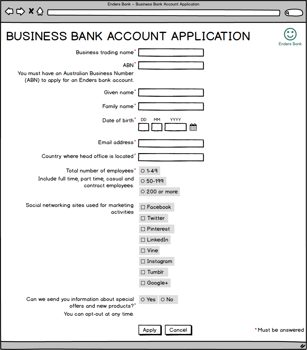
At the moment, aside from the text boxes for date of birth, all our text boxes are the same width:
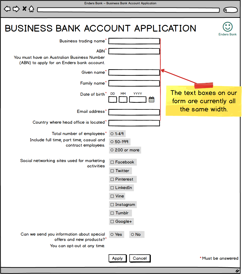
However, the width of a text box tells the user what sort of information is needed. The user experience will be better if we make the sizes proportional to the expected information (as we have, in fact, already done with date of birth):
Note we’re talking about visual width here, not acceptable number of characters. The email address field may have a visual width as shown, but should still accept up to 256 characters.
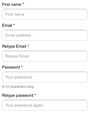
Empty Text Boxes
Another important aspect of text box spacing is the space they have inside. This empty space is how users know they need to type something in there.
Way too many forms have text boxes that aren’t empty. The two main culprits are:
- background color
- placeholder text.
No Background Color
Do not give your fields a background color. Background color in fields makes them look like buttons (just as buttons without background color look like fields):
On this form, background color makes fields look like buttons, and vice versa.
A simple border on four sides is enough to show users where to type:
You don’t need much to show users where their answers go.
Just make sure your border can be seen:
The field borders on this form are so light they’re nearly impossible to see.
No Placeholder Text
Even worse than a background color is putting text inside the field. The only text that should appear inside a field is the user’s answer!
Such text, also known as placeholder text, is unfortunately far too common. Sometimes it’s the field label:
This form’s labels appear inside fields.
Sometimes it’s question-level help:
Question-level help shown inside fields.
Sometimes it’s just downright useless:
Pointless information inside fields.
It’s so important not to do this, I’m going to say it again. Never include text inside your fields. It dramatically worsens the form filling experience, as many users will:
- think the question has already been answered, triggering errors
- leave the placeholder text there, messing up your data
- not see the placeholder text before it disappears (especially if they watch the keyboard when typing)
- not be able to see all of the placeholder text, because it’s limited by the visible width of the field
- forget what the label said
- forget what the question-level help said
- find the text too small to read
- be unable to review their answers
- have greater trouble correcting errors.
Furthermore, text inside fields is often not accessible, and the placeholder attribute is not accurately supported in all browsers. (It was once the case that placeholder text was needed for accessibility, because screen readers didn’t always announce the form field. Now screen readers consistently use the label element to indicate the purpose of a field.)
“But it saves space!” some designers will protest. That’s true. But that space is saved at the expense of being able to actually fill out the form. Don’t do it. Just put your text outside your fields.
Frequently Asked Questions on Designing Form Layout and Spacing
What is the importance of spacing in form design?
Spacing in form design is crucial as it improves readability and usability. It helps to group related elements together and separate unrelated ones, making the form easier to understand and navigate. Proper spacing can also reduce errors by preventing users from clicking on the wrong elements. It also enhances the overall aesthetic appeal of the form, making it more inviting to users.
How can I add space between a label and an input field in HTML?
In HTML, you can add space between a label and an input field using CSS. You can use the ‘margin’ or ‘padding’ properties to create space. For example, if you want to add 10px of space, you can use the following code:label {
margin-right: 10px;}
How can I ensure consistent spacing in my form design?
Consistent spacing can be achieved by using a grid system or a CSS framework that provides a consistent set of spacing utilities. You can also use CSS custom properties to define spacing values and use them consistently across your design.
What is the recommended space between form fields?
The recommended space between form fields can vary depending on the design guidelines you are following. However, a general rule of thumb is to have at least 16px of space between form fields to ensure they are easily distinguishable and clickable.
How does form spacing affect user experience?
Form spacing significantly impacts user experience. Proper spacing makes a form easier to read and understand, reducing the likelihood of errors. It also makes the form more visually appealing, which can encourage users to complete it.
How can I use spacing to group related form fields?
You can use larger spaces to separate different groups of related form fields. This helps users understand which fields are related and makes the form easier to navigate. You can also use borders or background colors to further distinguish between different groups.
What is the difference between margin and padding in form spacing?
Margin and padding are both used to create space in form design, but they serve different purposes. Margin creates space around an element, pushing other elements away. Padding, on the other hand, creates space within an element, pushing its content away from its border.
How can I adjust the space between a label and its associated input field?
You can adjust the space between a label and its associated input field using CSS. You can use the ‘margin’ or ‘padding’ properties on the label element to create the desired amount of space.
How can I use CSS to create responsive form spacing?
You can use CSS media queries to adjust form spacing based on the screen size. This allows you to create different spacing for different devices, ensuring your form is easy to use on all devices.
What are some common mistakes to avoid in form spacing?
Some common mistakes to avoid in form spacing include using inconsistent spacing, not grouping related fields together, using too much or too little space, and not considering the impact of spacing on mobile devices.