
The following is a short extract from our book, Designing UX: Forms, written by Jessica Enders. It’s the ultimate guide to form design, a key part of effective UX design. SitePoint Premium members get access with their membership, or you can buy a copy in stores worldwide.
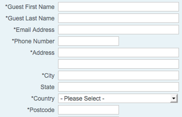
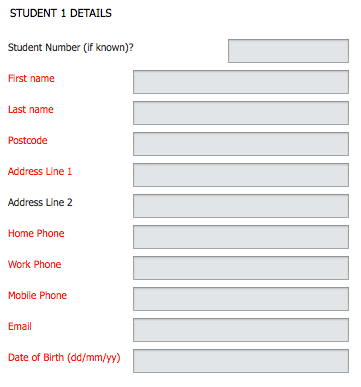
Currently, our form doesn’t have much color at all:
At this stage, the only color on the form is the logo and the red asterisks indicating questions that require an answer.
In terms of this part of the design, we’re on the right track. I’ll explain why.
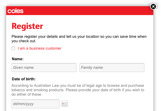
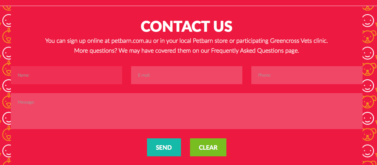
Often, using color in an attempt to make a form “fun” or “interesting” can actually make the user experience worse:
This very colorful form is more scary and confusing than fun.
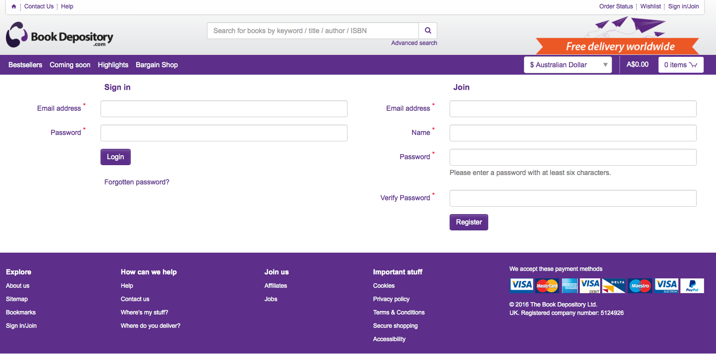
Some colors can even hurt people:
The fluorescent colors in this form may be hard for some people to look at.
Be Very Careful with Color
Human beings are incredibly sensitive to color. Our brains process it without us even realizing, and we can’t help noticing differences.
In our forms, we can use this feature of human biology to our advantage. Reserve color for things that need it, so they stand out in some way.
Here are some parts of a form that may benefit from color:
Buttons:

Key messages, like errors:
Links:

Progress indicators:

Headings:

Form backgrounds:
Branding, like logos and standard headers, may also use color:
You may have noticed that I didn’t include the red asterisk of required field indicators (*) in the list of things that may use color. This is because I don’t recommend the use of red asterisks to indicate required fields. See “Required Versus Optional Fields” below for more information.
Notice also how each of the examples above uses very little color overall. The more color you use, the less it succeeds in making things stand out:
This form uses color on almost every element, meaning none of them stand out.
What Colors Should You Use?
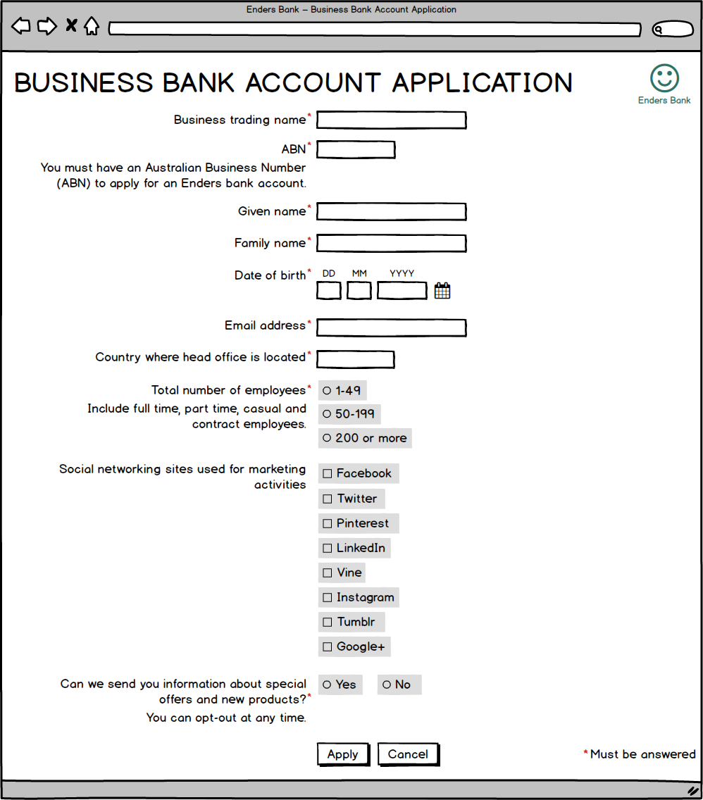
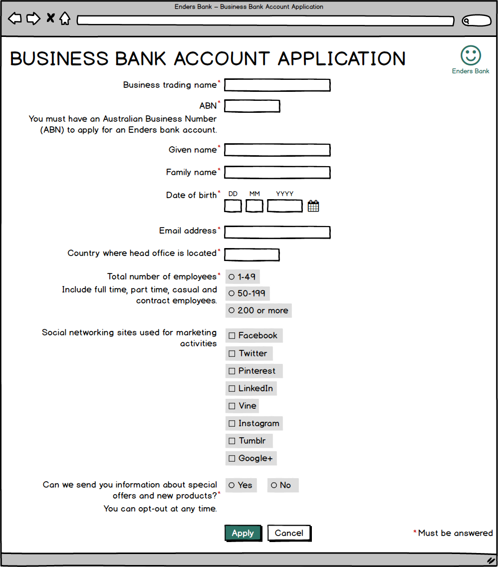
Usually, your organization will have a palette of colors that you can refer to. Like my form design business, Enders Bank has a teal green as its main color, as you can see in the logo in the image below. Let’s use that color to make the primary action button on our form distinctive:
Our form now has all the color it needs.
Color Blindness
Estimates vary, but it’s likely that 4–10% of your web form’s users will have some deficiency in their ability to perceive color (typically—but inaccurately—called color blindness). The most common form of color blindness is red–green, where distinguishing between these two colors is difficult.
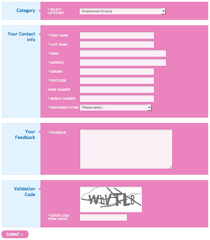
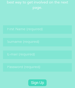
Given this, you should never want to rely solely on color to communicate something in your web form. The form shown below uses red text for the labels of required fields, and black text for the labels of optional fields. Shame if you can’t tell the red from the black! Not to mention how it makes the form look full of errors if you can see color well.
Color is the only way that required fields are indicated on this form, making it inaccessible to many users.
A much better approach would be simply to tell people which fields are optional (as discussed in “Required Versus Optional Fields” below):
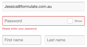
Similarly, error messages should be accompanied by a symbol or have background shading, instead of just red text “Validation” in Chapter 5):
The exclamation mark symbol means users can visually tell this is an error message, even if they have a problem seeing colors.
If you’d like to know more about color blindness, there are some great web resources out there, including simulations:
Color Contrast
There’s something even worse than relying on color to communicate to the user: insufficient color contrast. Not having enough contrast in your colors means even those of us with great vision can’t see the different elements of the form:
The green in the background of the form is too similar to the green in the background of fields, and both greens are too similar to the white used for text.
This is an example of going way too far down the aesthetic end of the spectrum, at significant cost to the user experience. And it’s popping up far too often these days:
You may be able to see the fields on this form, but reading the labels will be tough.
A particularly common contrast fail is the use of light grey on white backgrounds. Because it makes sites look clean and minimal, this color combination is quite popular at the moment. Pity it’s completely unusable:
Your form elements must have sufficient color contrast. For some really practical tips on ensuring this, I recommend:
- “Integrating Contrast Checks into your Web Workflow”
- “Three common pitfalls for developers: colour contrast”
In the meantime, stick with dark grey or black on a white background:
The colors in our example form have sufficient contrast.
Frequently Asked Questions (FAQs) on Form Layout and Color Design
What is the significance of color in form design?
Color plays a crucial role in form design. It not only enhances the aesthetic appeal but also influences the user’s interaction with the form. Different colors evoke different emotions and responses. For instance, red can signify importance or error, while green often indicates success. Therefore, choosing the right color can guide users through the form, highlight important sections, and improve overall user experience.
How can I choose the right color for my form design?
Choosing the right color for your form design depends on several factors. Firstly, consider your brand’s color scheme to maintain consistency. Secondly, consider the psychological impact of colors. For example, blue is often associated with trust and reliability, making it a popular choice for business and finance websites. Lastly, ensure there’s enough contrast between the form’s background and text for easy readability.
What are the best practices for form layout design?
Good form layout design should be intuitive and user-friendly. Keep the form as short as possible, only asking for necessary information. Group related fields together for logical flow. Use clear and concise labels for each field. Provide helpful error messages and feedback. Lastly, ensure your form is responsive and looks good on all devices.
How can I use color to highlight important form elements?
You can use color to draw attention to important form elements. For instance, you can use a contrasting color for the submit button to make it stand out. Error messages can be highlighted in red to grab the user’s attention. However, be careful not to overuse color as it can lead to visual clutter and confusion.
What is the role of white space in form design?
White space, or negative space, is the empty space between different elements in your form. It helps to separate different sections, making the form easier to read and navigate. It also gives your form a clean, uncluttered look. Therefore, don’t be afraid to leave some space in your form design.
How can I ensure my form is accessible to all users?
To ensure your form is accessible, use clear, readable fonts and ensure there’s enough contrast between text and background colors. Provide alternative text for images. Make sure your form can be navigated using the keyboard. Also, consider users with color blindness by not relying solely on color to convey information.
How can I test the effectiveness of my form design?
You can test your form design through user testing. This involves observing real users as they interact with your form. You can also use A/B testing to compare different design variations and see which performs better. Analyzing form abandonment rates and completion times can also provide valuable insights.
What is the impact of color on form conversion rates?
Color can significantly impact form conversion rates. For instance, a study found that changing the color of a call-to-action button increased conversions by 21%. However, there’s no one-size-fits-all answer as the impact of color can vary depending on the context, audience, and overall design.
How can I use color to reduce form abandonment rates?
You can use color to make your form more engaging and user-friendly, thereby reducing abandonment rates. For instance, use warm, inviting colors to create a positive mood. Highlight important fields or sections in a contrasting color. Use color to guide users through the form, such as using green for progress indicators.
How can I balance aesthetics and functionality in form design?
Balancing aesthetics and functionality in form design can be challenging. While a visually appealing form can attract users, it’s the functionality that keeps them engaged. Therefore, focus on usability first. Make sure your form is easy to use and understand. Once you’ve nailed the functionality, you can then enhance the aesthetics through color, typography, and other design elements.