
The SitePoint Desert Island Collection
There are so many publications out there on the subject of web design and development that it’s hard for a budding designer to know what to read first.
With that in mind, we’ll be looking at some of the most useful out there — out ‘Desert Island Collection’ — over the coming weeks to help you to choose books that are right for you.
Key Takeaways
- “Don’t Make Me Think” by Steve Krug is a classic resource for web designers, providing timeless advice on usability and user experience (UX) design.
- The first law of usability is that users should not have to think or puzzle out anything when they land on a website; everything should be immediately obvious and easily navigable.
- Even if a design trend is popular, it doesn’t necessarily mean it’s good or correct; designers should always prioritize clear, user-friendly design over following trends.
- “Don’t Make Me Think” is an extremely accessible book for beginners in web design, using simple language, humor, and practical examples to teach the basics of UX design.
Don’t Make Me Think – Steve Krug
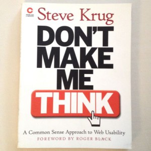
First up, a true classic: Steve Krug’s Don’t Make Me Think, a book which, though written in 2000, and revised twice, somehow remains highly relevant to today’s design landscape.
At the time it was written, web usability — which is what the book is concerned with — wasn’t even considered a legitimate field of its own.
Fifteen years later, UX is an industry, yet somehow every one of the tips contained in this book remain extremely useful and pertinent to beginner and even experienced designers alike.
Compare it with any HTML book from the same era (pitching the virtues of table layout), and you’ll realize what an amazing accomplishment that is.
I guess it proves that technology may change, but true common sense never goes out of fashion.
The First Law of Usability
The book’s title gives a very good clue as to its contents; as Steve points out, the first law of usability is that the user shouldn’t have to think about anything when they land on your website for the first time. This relates to all aspects of the design, from the positioning of the logo and links, to the content and the way that it’s written.
When you’re creating a site, your job is to get rid of the question marks.
So, what are the question marks?
Well, these are the things that people think about when they arrive at the site that they really shouldn’t have to.
So when designing, it’s your job to ensure that everything on the page is immediately obvious to the user, they don’t have to think about where they need to click as they are already being subtly directed there.
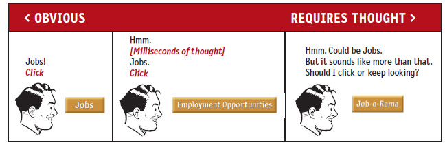
This is the entire principle of the book and of usability itself, or UX (User Experience) as it’s more commonly known today.
On reading, the first thing that you’ll notice is that many of the example sites that Steve uses are now completely out-of-date … but it doesn’t matter, because all of the things discussed with regard to the sites are not.
In the opening chapters, one interesting thing that I noted was that Steve gives an example of a flat button, which can make the user think it’s not a button.
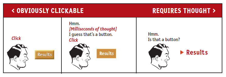
This is intriguing in view of the recent trend towards flat design. The book suggests that a flat button will make the user question it, even if it’s just for a millisecond.
With this in mind, this is something that perhaps bears thinking about when designing towards a fad or current trend; just because it’s popular, it doesn’t necessarily mean that it’s correct, or even good.
I was thinking about this in relation to the recent move towards minimalism in design too. A site that is bare bones can reveal no navigation and make it confusing for the user, so if you are designing using these trends, it bears thinking hard about the user during the planning process.
Don’t get me wrong, there are some beautiful minimalist sites around that are easy to use and have been well-crafted, but if you’re a beginner, then it’s vital that you understand how the user will see it and of course, use it.
This is because, as Steve points out, even if it’s obvious to you where you should click, users don’t want to have to puzzle it out. They like the steps to be immediately apparent when they have come to the site for something and they don’t want to have to hunt too hard for what they need.
Your job is to direct them and if you don’t know where to start, then I would strongly suggest that you get hold of a copy of Don’t Make Me Think as it’s packed with actionable tips and advice.
A Quick Overview
This book is ideal for beginners because it doesn’t dive into anything overly confusing but is written in clear, simple language that is also peppered with humor. It’s highly accessible thanks to the conversational tone that the author takes and there’s absolutely nothing intimidating about it. This will be refreshing for many newbies, as there are plenty of books on the market that make you want to run for the hills and wonder why you ever wanted to be a designer in the first place.
For example, in the opening chapter, Steve puts a footnote by the term ‘average user’ which reads:
The actual Average User is kept in a hermetically sealed vault at the International Bureau of Standards in Geneva. We’ll get around to the best way to think about the “average user” eventually.
Oh yeah? Here we are fourteen years following the first release of the book and we still bang on about the average user. This made me giggle I have to say and is a good example of what an easy and accessible read the whole book is. Let’s face it, we might all love learning, but anything that can do it and put a smile on our chops has to be a good thing.
The book is twelve chapters long, around 200 pages, with a list of recommended reading at the back. It’s a breezy and fun read.
The chapters are broken up into the following:
- 1: Don’t make me think is concerned with basic principles and the first rules of usability
- 2: How we really use the web looks at how people scan a page when they arrive at it and the human ability to muddle through, rather than take a logical approach.
- 3: Billboard design 101 looks further into how a page can best be constructed to catch the scanning eye and direct the user where you want them to go
- 4: Animal, vegetable, or mineral tells us why users like to be given mindless choices
- 5: Omit needless words takes a look at reducing noise by cutting down the copy on a site and the dreaded ‘welcome’ happy speak that can (and should) be eliminated – this chapter is especially useful for those designers who don’t necessarily possess great writing skills
- 6: Street signs and breadcrumbs introduces the reader to designing navigation and the reasons it should be logical and straightforward, but above all, planned out right from the initial sketching stages
- 7: The first step in recovery is admitting that the Home page is beyond your control – I think that says it all … obviously this is concerned with Home page design
- 8: The Farmer and the Cowman should be Friends talks about the futile exercise that is getting in ‘religious’ arguments about usability
- 9: Usability testing on 10 cents a day is an extremely useful chapter that gives a good overview and some excellent tips on testing
- 10: Usability as a common courtesy is concerned with how you create goodwill in the user by creating a site that has everything they would expect
- 11: Accessibility, cascading style sheets and you takes a dive into accessibility and why you should always consider it a part of your design (because it’s the right thing to do, folks). This chapter also takes a look at CSS and why you should use them too
- 12: Help! My boss wants me to ___ talks about how you can address it when your boss or client comes up with an idea that you think is terrible
Why You NEED This Book
Whilst some of the references in this book may hint at its birth era — Steve talks about some people thinking that Yahoo! actually is the internet (Google occupies that role for many today) — it’s stood the test of time incredibly well because it is so very useful.
Taking you through the basics on every aspect of UX for beginners, this is a great starting point for those who may feel a little bewildered by the discipline.
You can give it a read through very quickly, it’s easy to understand and won’t blind you with overly technical terms and science. You can then refer to the book again and again when starting on any site.
Notes on UX Design
The internet has become an integral part of our lives, much more so than when Don’t Make Me Think was first written and printed. Technology has raced along at a dizzying pace and we now access the web on smartphones, tablets and even our televisions.
However, one thing hasn’t changed very much at all and that’s how users perceive the sites that we build and how they make decisions based on those perceptions.
Websites that allow the user to gain value and find what they want without any fuss, or without making them think, are the ones which will be the most successful.
UX is all about giving the user value and a good experience when they interact with our designs. Whilst it’s tempting to dive in and create something that you think is a work of art, if the user can’t find their way around, if there’s no search function, or if the navigation is not logical, then it’s likely that you’ll be one of a handful of people that visit it.
There’s a lot been written about UX since this book was penned, it’s a discipline that’s risen hugely in popularity in recent years.
However, it doesn’t have to be something that you study in depth in order to be able to get it right, just read this book and you have an excellent starting point.
I found the usability testing chapter very interesting and useful, and reading the book again has given me that strange urge that makes me want to go out and study as many websites as possible (especially Amazon, which Steve uses liberally as examples).
I also found the chapter on writing copy very interesting, not least because it’s something that I have a vested interest in myself.
Many people, even great designers, make the mistake of using too many words, or worse, really convoluted words which will just alienate the user.
Bearing this in mind, it’s great to see something which essentially teaches you the basics when it comes to web copy and the effect it has on users.
You don’t have to be a UX consultant or expert like Steve is in order to understand usability, nor do you have to become one.
Following such basic principles as those set out in Don’t Make Me Think will stand you in good stead when it comes to creating sites that users will love for many years into the future.
Frequently Asked Questions (FAQs) about “Don’t Make Me Think”
What is the main premise of “Don’t Make Me Think”?
The main premise of “Don’t Make Me Think” is that a good software, website, or app should let users accomplish their intended tasks as easily and directly as possible. The title itself is a metaphor for the user’s desire for an intuitive and effortless user experience. The book emphasizes the importance of usability and user-centered design, arguing that users shouldn’t have to think or make decisions unnecessarily when interacting with your design.
Who is the author of “Don’t Make Me Think” and what is his background?
“Don’t Make Me Think” is written by Steve Krug, a highly respected usability consultant who has worked in the field for over two decades. He has consulted for a range of companies, from Fortune 500 companies to emerging startups, helping them improve the usability of their digital products. His expertise and practical approach to user experience design have made him a sought-after speaker and consultant in the industry.
What are some key takeaways from “Don’t Make Me Think”?
Some key takeaways from “Don’t Make Me Think” include the importance of eliminating unnecessary decisions for users, the value of clear and concise communication in design, and the need for regular usability testing. The book also emphasizes that good usability is good business – it improves user satisfaction, increases user engagement, and can even boost conversion rates.
How does “Don’t Make Me Think” differ from other books on usability?
“Don’t Make Me Think” stands out for its practical, no-nonsense approach to usability. It’s written in a clear, engaging style, with plenty of real-world examples and illustrations. Unlike some other books on the subject, it’s not overly technical or academic, making it accessible to a wide range of readers, from beginners to experienced professionals.
Is “Don’t Make Me Think” suitable for beginners in the field of usability?
Absolutely. “Don’t Make Me Think” is written in a straightforward, easy-to-understand style, making it an excellent introduction to the field of usability. It covers fundamental concepts and principles in a clear, concise manner, making it a great resource for beginners. However, it also offers valuable insights for experienced professionals, making it a worthwhile read for anyone interested in usability and user experience design.
What is the format of “Don’t Make Me Think”?
“Don’t Make Me Think” is a book that combines theory with practical advice. It’s divided into several chapters, each focusing on a specific aspect of usability. The book includes numerous examples, case studies, and illustrations, making it a highly engaging and informative read.
Has “Don’t Make Me Think” been updated since its original publication?
Yes, “Don’t Make Me Think” has been updated and revised since its original publication in 2000. The latest edition, “Don’t Make Me Think, Revisited”, was published in 2014 and includes updated examples and a new chapter on mobile usability.
How can “Don’t Make Me Think” help me improve my website or app?
“Don’t Make Me Think” provides practical advice and strategies for improving the usability of your website or app. By applying the principles outlined in the book, you can make your digital products more user-friendly, leading to increased user satisfaction and engagement.
Where can I buy “Don’t Make Me Think”?
“Don’t Make Me Think” is widely available for purchase online, including on Amazon and other major book retailers. You can also find it in many physical bookstores.
Are there any other resources you recommend for learning about usability?
In addition to “Don’t Make Me Think”, there are many other great resources for learning about usability. These include other books, such as “The Design of Everyday Things” by Don Norman, online courses, and blogs and websites dedicated to the topic.