Build Responsive, Real-Time Graphs in WordPress: Introduction

Key Takeaways
- This tutorial guides WordPress beginners through creating a responsive, real-time graphing system within their WordPress site, using a basic workout tracker as an example.
- Key requirements for this project include a basic understanding of WordPress, administrative rights to your WordPress site, access to phpMyAdmin, and FTP access to upload files to WordPress folders.
- The tutorial utilizes the Flot for WordPress plugin, which includes a stripped-down version of Flot, a graph and chart library, to make the process easier. It also involves creating a custom PHP file and connecting it to WordPress using the INCLUDE call.
- Basic knowledge of WordPress — how to get around the admin tools, etc
- Administrative rights to your WordPress site
- Access to phpMyAdmin (which you can get through your domain host)
- FTP access — we’re going to upload some files to your WordPress folders
Caveats
First of all, I know there are better, more secure ways of doing this entire process, but I will refer you to the second sentence is this post — I want this to be easy. Once in place, you can make the process far more secure and adapt it as you need it. Second, everybody has a slightly different WordPress site. Your site may have a different theme or be on a different host than mine, so the admin view might look different. As long as you haven’t modified core WordPress files, this whole process will still work. I start with a fresh install and a blank WordPress site. I’m using WordPress version 3.4.2 for this tutorial, so all screenshots will have that particular look and feel. I’m also using the TwentyEleven theme that comes stock with a fresh WordPress installation. The only changes I made to my site are in the “Settings” > “Permalink” menu where I selected “Post Name” as the URL structure. I also changed the “Settings” > “General” site title for the sake of this tutorial. So, without further ado, let’s jump into this series!Step 0: Install the Flot for WordPress Plugin
I created this plugin to make the process a whole lot easier. The plugin includes a stripped-down version of Flot, an excellent graphing and charting library. But Flot doesn’t work well with WordPress out of the box. So, this plugin helps you by getting the files you need onto your WordPress site. If you’re a novice, I highly recommend you install this plugin. Flot for WordPress You may also want the PHP files I created for this series. For you newbies, I recommend you build these files from scratch along with me. You’ll learn a lot more this way, and you’ll be much better equipped to troubleshoot issues. Resource Files These files will eventually be uploaded to your plugins folder:wp-content/plugins/flot-for-wp/flot
Step 1: Upload a File
One thing I try to always do when creating new functionality in WordPress is make sure it’s going to work reliably, even if I update my themes. That’s where the Flot for WordPress plugin above comes in really handy. But, if you do want to use Flot without the plugin, just make sure you don’t store all of your work in the wp-content/themes folders. As soon as you change themes you’ll lose everything. So, create a blank custom PHP file. You can use a text editor. Just open a new file and save the blank document. I call mine “custom-workout.php”. Upload this to your wp-content/plugins/flot-for-wp/flot folder. I use Filezilla, which is a free FTP tool that’s easy to use. You might use your hosting provider’s file uploader tool. You can’t move forward without getting that PHP file into your plugins folder, though. To be clear, here’s the approximate path to the folder I recommend you upload this file:yoursite.com/wp-content/plugins/flot-for-wp/flot/If you want to upload the files somewhere else, that’s fine. But you’ll have to modify the paths and URLs in the PHP files that we’ll be creating. You should now have the custom-workout.php uploaded.
Step 2: Connecting the Custom Files
Now, we need to tell WordPress where in the world to look for all this fancy code that we’re going to create. After you’ve uploaded your file, in the WordPress Admin panel, cruise over to the “Plugins” > “Editor” page: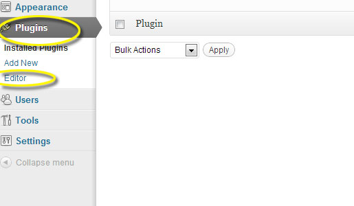 Select the Flot for WordPress plugin from the drop down menu in the right corner:
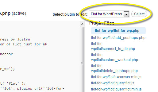 Make sure the flot-for-wp.php file has been selected. This is where we need to be to let WordPress know about your new files.
In the flot-for-wp.php file, you will see a section just for adding your own files.
[sourcecode language=”php”]
/*
Here’s where you add your custom files for pulling and adding data for flot.
Remember that you can NOT use a URL to point to any files you want to
include. You have to use a PATH. So you can stick these files anywhere
you want in your WP install, just use a PATH to point to them.
The plugin_dir_path call will use a PATH from the WP wp-content/plugins
folder: http://codex.wordpress.org/Function_Reference/plugin_dir_path
*/
include ( plugin_dir_path( __FILE__ ) . ‘flot/custom_workout.php’);
[/sourcecode]
Sorry for the long-winded PHP comment, but these are the details that will make troubleshooting much easier for you later should you have any problems. We’re using the INCLUDE call to tell WordPress about the file we uploaded.
Make sure the flot-for-wp.php file has been selected. This is where we need to be to let WordPress know about your new files.
In the flot-for-wp.php file, you will see a section just for adding your own files.
[sourcecode language=”php”]
/*
Here’s where you add your custom files for pulling and adding data for flot.
Remember that you can NOT use a URL to point to any files you want to
include. You have to use a PATH. So you can stick these files anywhere
you want in your WP install, just use a PATH to point to them.
The plugin_dir_path call will use a PATH from the WP wp-content/plugins
folder: http://codex.wordpress.org/Function_Reference/plugin_dir_path
*/
include ( plugin_dir_path( __FILE__ ) . ‘flot/custom_workout.php’);
[/sourcecode]
Sorry for the long-winded PHP comment, but these are the details that will make troubleshooting much easier for you later should you have any problems. We’re using the INCLUDE call to tell WordPress about the file we uploaded.
Recap
So, let’s stop and check our work. For the absolute beginner, you’ve likely interfaced with some things you’ve never seen before; FTP, PHP files, and the plugin editor can all be intimidating. But, you’ve now laid the groundwork for building out this functionality. In the next article in this series, we will create some custom shortcodes and create a new database table for this tool. If thinking about that makes you start to have a panic attack… good! Power through this and stick with me!Frequently Asked Questions (FAQs) about Responsive Real-Time Graphs in WordPress
How can I create responsive real-time graphs in WordPress?
Creating responsive real-time graphs in WordPress involves using plugins that support this feature. One such plugin is Visualizer, a simple, easy-to-use WordPress plugin that allows you to create, manage and embed interactive charts into your WordPress posts and pages. You can choose from a variety of chart types, including line graphs, area graphs, bar graphs, column graphs, pie graphs, geo charts, table charts, and scatter charts. Once you’ve installed and activated the plugin, you can create a new chart by going to the Visualizer Library and clicking on “Add New”. From there, you can select the type of chart you want to create, upload or input your data, and customize the chart’s appearance and settings.
Can I use real-time data for my graphs?
Yes, you can use real-time data for your graphs in WordPress. Some plugins, like Visualizer, support the use of real-time data. This means that your graphs will automatically update whenever the data changes. This is particularly useful for displaying dynamic data, such as stock prices or website traffic statistics. To use real-time data, you’ll need to link your chart to a data source that updates in real-time. This could be a Google Sheets document, a CSV file hosted on your website, or a third-party API.
How can I make my graphs responsive?
Making your graphs responsive means that they will automatically adjust their size and layout to fit different screen sizes. This is important for ensuring that your graphs look good on all devices, including desktop computers, laptops, tablets, and smartphones. Most WordPress chart plugins, including Visualizer, have built-in responsive design features. When creating your chart, look for settings or options related to responsiveness or mobile layout. You may be able to adjust these settings to fine-tune how your chart looks on different devices.
Can I customize the appearance of my graphs?
Yes, you can customize the appearance of your graphs in WordPress. Most chart plugins offer a range of customization options, allowing you to change things like the colors, fonts, labels, axes, gridlines, and tooltips. In Visualizer, for example, you can customize your chart’s appearance by going to the “Settings” tab when creating or editing your chart. From there, you can adjust a variety of settings to make your chart look exactly the way you want it to.
How can I embed my graphs into my posts or pages?
Embedding your graphs into your WordPress posts or pages is usually a straightforward process. Once you’ve created your chart using a plugin like Visualizer, the plugin will generate a shortcode for the chart. You can then copy this shortcode and paste it into the editor of any post or page where you want the chart to appear. When you preview or publish the post or page, the shortcode will be replaced with the actual chart. This allows you to easily insert your charts anywhere on your website.
Can I use multiple data sources for a single graph?
Yes, some WordPress chart plugins allow you to use multiple data sources for a single graph. This can be useful if you want to compare or combine data from different sources. However, the exact process and capabilities can vary depending on the plugin you’re using. In some cases, you may need to merge your data into a single file or document before you can use it in your chart.
Can I use interactive features in my graphs?
Yes, many WordPress chart plugins support interactive features. This means that users can interact with your graphs, for example by hovering over data points to see more information, clicking on legend items to hide or show data series, or zooming in and out. Interactive features can make your graphs more engaging and useful for your visitors. In Visualizer, you can enable or disable various interactive features in the “Settings” tab when creating or editing your chart.
Can I use real-time graphs in WordPress without coding?
Yes, you can create real-time graphs in WordPress without any coding knowledge. Most chart plugins, including Visualizer, are designed to be user-friendly and do not require any coding skills. You can create, customize, and embed your charts using simple point-and-click interfaces. However, if you do have some coding knowledge, you may be able to use it to further customize your charts or integrate them with other parts of your website.
Are there any limitations to using real-time graphs in WordPress?
The main limitations to using real-time graphs in WordPress are related to the capabilities of the plugin you’re using and the data source you’re connecting to. Not all plugins support all types of charts or all types of data sources. Additionally, some plugins may have limitations on the amount of data you can use, the frequency of updates, or the customization options available. It’s important to carefully review the features and limitations of any plugin before you start using it.
Can I use real-time graphs in WordPress for free?
Yes, many WordPress chart plugins, including Visualizer, offer free versions. These free versions often include a range of basic features, allowing you to create a variety of chart types and use different data sources. However, some features may only be available in the paid versions of the plugins. If you need advanced features, such as additional chart types, real-time data updates, or advanced customization options, you may need to consider upgrading to a paid version.
When he's not being a complete goofball, “they” drag Justyn into the office where he pretends to be a Senior Editor and Content Engineer at Creative Content Experts — a content marketing firm out of NW Arkansas. He has 10+ years’ experience in technical writing and geek-related fields. He loves WordPress, coffee, and peanut butter a little too much.