Responsive CSS Patterns without Media Queries

Key Takeaways
- Media queries are a useful tool, but they don’t solve all responsive design problems. Instead, changes can often be more effectively made based on the dimensions of a container, rather than the viewport.
- Flexbox with flex-wrap is a simple and effective technique to solve a multitude of problems related to responding to container dimensions. By understanding flex-grow, flex-shrink, and flex-basis, this technique can be applied effectively.
- The Fab Four Technique’ uses width, min-width, max-width, and calc to create a breakpoint-based width-switch. This technique was originally created for responsive emails but can easily be applied to normal web pages, creating self-adapting modules.
- Other useful techniques for responsive CSS patterns without media queries include the use of floated images, text and image overlays, truncating lists, and smart text alignment. The flex-grow 9999 hack is also a useful trick.

Let me start by saying that despite the title, this article is not about doing away with media queries or media query bashing in any way. Media queries are incredibly useful and I use them all the time for all sorts of things. However, they don’t solve all our responsive design problems.
It’s often desirable to effect changes to an arrangement of elements based on the dimensions of their container, rather than the viewport. To solve this problem, the concept of element queries was born. However, element queries aren’t really a thing yet, and Mat Marquis has demonstrated some problems with the concept and reformulated them as container queries.
But these aren’t a thing yet either, unfortunately.
Hopefully they will be one day, but in the meantime, I’ve presented here a few tricks and techniques you can use to address some of the problems container queries will one day solve.
Flexbox with flex-wrap
Flex-wrap can solve a multitude of problems when it comes to responding to container dimensions. For example, it’s common to want two elements to appear side-by-side if there’s enough space, but to stack one on top of the other if there isn’t. In the following demo we can see this behavior in action:
See the Pen Responsive module – flexbox by SitePoint (@SitePoint) on CodePen.
No fancy tricks here, just flexbox with flex-wrap but it works a treat. Flexbox can be used for many more things than just creating two columns, of course, but I’ve kept things simple for this demo. The essential parts of this technique are simply:
<div class="container">
  <div class="img">...</div>
  <div class="content">...</div>
</div>
...
.container {
  display: flex;
  flex-wrap: wrap;
  flex-direction: row;
}
.container .content,
.container .img {
  flex: 1 0 12em;
  /* Change 12em to your breakpoint. */
}
Understanding flex-grow, flex-shrink and flex-basis is an important part of getting this right; I find this flexbox tip from Zoe Gillenwater really useful in understanding the relationship between these properties.
‘The Fab Four Technique’
The use of width, min-width, max-width and calc to create a breakpoint-based width-switch — dubbed ‘The Fab Four technique’ — was the brain-child of Rémi Parmentier. Originally created to help with responsive emails, it can easily be used for normal web pages and has really opened up some new possibilities in creating self-adapting modules, as demonstrated by Thierry. For example,
{
  min-width: 50%;
  width: calc((25em - 100%) * 1000);
  max-width: 100%;
  /* Change 25em to your breakpoint. */
}
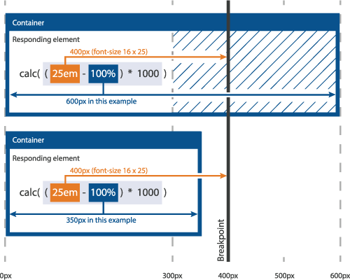
This works because when width is a percentage, it is a percentage of the element’s container width. The calc function then compares this value to the desired breakpoint and then generates a really large positive number (if the width is less than the breakpoint), or a really large negative number (if the width is greater than the breakpoint), or zero if there’s an exact match. A large positive width is capped by max-width and a large negative or zero width is set to the value of min-width.
So, in the example above, we set a breakpoint of 25em. This resolves to 400px if the font-size is 16px. If the container is 400px or above (in other words equal-to or greater-than the breakpoint), the width resolves to 0 or a large negative number:
(400 - 400 = 0) * 1000 = 0 or (400 - 401 = -1) * 1000 = -1000
With values like these, min-width kicks in so the resultant width of the element in the example above will be 50%. However, if the container is 399px or below (in other words smaller than the breakpoint), the width resolves to a large positive number:
(400 - 399 = 1) * 1000 = 1000
In this case max-width kicks in and the resultant width is 100%. The following diagram should help to visualize this process:

The next four demos all use this technique in different ways to switch the width of an element in response to the width of its container.
Floated Image – Full Width / Partial Width
In this demo I’ve used the ‘Fab Four Technique’ combined with float to switch an image between full- and half-width depending on the width of the container:
See the Pen Responsive module – float by SitePoint (@SitePoint) on CodePen.
Similar to the flexbox example above, this technique allows the elements to switch between a stacked arrangement at small widths, and floated/wrapped arrangement if there’s enough space.
Floated Image – Visible / Hidden
Adapted from the previous technique, I inverted the result of the calculation and removed the min-width declaration to create an on/off switch. This is useful for hiding decorative elements in smaller containers where they may take up valuable space:
See the Pen Responsive module – float / hidden by SitePoint (@SitePoint) on CodePen.
And for the sake of clarity:
{
  /* Removed min-width since we want the width to be zero at this point and negative widths are treated as zero */
  /* Inverted the multiplier: */
  width: calc((25em - 100%) * -1000);
  max-width: 100%;
  /* Change 25em to your breakpoint. */
}
Text and Image – Overlaid / Stacked
See the Pen Responsive module – overlaid / stacked by SitePoint (@SitePoint) on CodePen.
In a similar vein to the previous techniques, I’ve used an extra div to pull the text up over the image, but where the image is too small and would otherwise be obscured by the text, the text snaps underneath instead. This part of the technique is a little complicated, so I’ll attempt to clarify it.
.pull {
  /* Pull the text up over the image by this much: */
  margin-bottom: -10em;
}
Here, the negative margin pulls subsequent content upwards so that it overlays the image. However, we need to turn this off when the container width crosses the breakpoint but since there’s no min/max-margin property, we can’t use the ‘Fab Four Technique’ here to achieve this.
As luck would have it, though, if padding is given a percentage, it’s a percentage of the container’s width, and padding-top and -bottom will affect the height of an element. With this knowledge we can use calc to create a padding-bottom value that switches between zero or ‘really large’ based on the container’s width:
padding-bottom: calc((30em - 100%) * 1000);
We can’t apply this to the .pull div directly as there’s no min/max-padding property to restrict these values; the solution is to put the padding switch on a pseudo-element to force the change in height and use max-height on the .pull element to restrict the height to the same value as the negative margin so that we effectively negate that margin.
.pull {
  /* Pull the text up over the image by this much: */
  margin-bottom: -10em;
  /* Don't allow this container to be larger than the same amount: */
  max-height: 10em;
  /* and hide any overflow, just to be on the safe side: */
  overflow: hidden;
}
.pull::before {
  content: "";
  display: block;
  padding-bottom: calc((30em - 100%) * 1000);
  /* Change 30em to your breakpoint */
}
The overlay gradient effect is achieved by applying an ‘on/off’ switch as described earlier to a pseudo-element to which the background gradient has been applied:
.image::after {
  content: "";
  display: block;
  position: absolute;
  left: 0;
  top: 0;
  /* Gradient to make the text more legible: */
  background-image: linear-gradient(to bottom, rgba(0,20,30,0) 0%,rgba(0,20,30,0) 50%,rgba(0,20,30,1) 100%);
  /* Extra .5% to prevent bleed due to rounding issues: */
  height: 100.5%;
  /* Toggle gradient overlay at the same breakpoint as the 'pull': */
  width: calc((30em - 100%) * -1000);
  /* Change 30em to your breakpoint */
  max-width: 100%;
}
Truncating List
The final technique I developed was inspired by a version of the Priority Plus pattern on CSS tricks. Though not as sophisticated as that, this one doesn’t require any JavaScript:
See the Pen Truncating List by SitePoint (@SitePoint) on CodePen.
Again, this uses the ‘The Fab Four technique’, only this time based on the height of the container, rather than the width.
<div class="outer">
  <div class="inner">
    <div class="item">...</div>
    ...
    <div class="control">...</div>
  </div>
</div>
...
.outer {
  height: 2.25em;
  overflow: hidden;
}
.outer:target {
  height: auto;
}
The outer container has a fixed height and hides any overflow unless the element is :target-ed.
.inner {
  display: flex;
  flex-wrap: wrap;
}
The inner container is a flex container with flex-wrap turned on, so it will increase in height as the elements wrap, but elements below the first line will be hidden by the .outer container’s overflow:hidden, creating the truncating effect.
.control {
  height: calc((2.25em - 100%) * -1000);
  max-height: 2.25em;
}
:target .control--open {
  display: none;
}
:target .control--close {
  display: block;
}
The ‘more/less‘ controls are only made visible if the height of the container exceeds the breakpoint (which is the same as the height of the main links), and the :target state determines which control is visible.
Aligning Text Smartly in CSS
See the Pen Responsive Text Align by SitePoint (@SitePoint) on CodePen.
Aligning text centrally or on the left depending on the space available in the container compared to the length of the text is a really useful thing to be able to do. This technique was created by Vijay Sharma makes achieving this very easy.
Bonus: Flex-grow 9999 Hack
A great trick from Joren Van Hee that fits nicely into this collection is the flex-grow 9999 hack.
Praise: Look, No Media Queries by Vasilis van Gemert
Vasilis van Gemert’s talk Look, no media queries provided me with the impetus to investigate media query-less responsive design, which in turn led me to write this article. His talk is well worth a watch and includes some other ideas which, although really useful, didn’t quite fit into the theme of what I’ve presented here.
Conclusion
There are lots of things that can’t be done without element/container queries. Things like color values, font-size and line-height, borders and box-shadows, margins and paddings – the list is long. Adjusting all of these things in response to the state of a parent container should be possible with element/container queries, but, alas, there doesn’t appear to be any sign of those becoming a reality any time soon. However, I hope that in the meantime some of what I’ve presented here will be of use to you.
If you’d like to know what designing with Element Queries might be like, Writing Element Queries Today Using EQCSS will help you to get started.
If you want to know more about element/container queries here are some useful resources:
- EQCSS – A CSS Extension for Element Queries & More
- Why Element Queries Matter
- Container Queries: Once More Unto the Breach
- The Search For The Holy Grail: How I Ended Up With Element Queries, And How You Can Use Them Today
- Use Cases and Requirements for Element Queries Editor’s Draft
- Use cases for container queries
- How Style Scoping Works with Element Queries
Frequently Asked Questions (FAQs) on Responsive CSS Patterns Without Media Queries
What are the benefits of using responsive CSS patterns without media queries?
Using responsive CSS patterns without media queries offers several benefits. Firstly, it simplifies the code, making it easier to read and maintain. It also reduces the reliance on device-specific breakpoints, which can make your website more future-proof as new devices with different screen sizes are released. Additionally, it can improve performance as the browser doesn’t have to evaluate media queries.
How can I create a responsive layout without media queries?
You can create a responsive layout without media queries by using CSS properties like flexbox, grid, and calc(). These properties allow you to create flexible layouts that adapt to different screen sizes without the need for media queries. For example, flexbox allows you to create flexible layouts where the items can shrink or grow to fill the available space.
Can I use pseudo-elements for responsive design?
Yes, pseudo-elements can be used in responsive design. They can be used to add decorative elements to your layout without adding extra HTML elements. This can help to keep your HTML clean and semantic, which can improve accessibility and SEO.
What are the limitations of using responsive CSS patterns without media queries?
While using responsive CSS patterns without media queries can simplify your code and improve performance, it does have some limitations. For example, it may not provide as much control over the layout as media queries. Also, some older browsers may not fully support CSS properties like flexbox and grid.
How can I ensure my design is truly responsive without media queries?
To ensure your design is truly responsive without media queries, you should test it on a variety of devices and screen sizes. You should also consider using a mobile-first approach, where you design for the smallest screen size first and then gradually enhance the design for larger screens.
Can I combine media queries with responsive CSS patterns?
Yes, you can combine media queries with responsive CSS patterns. While it’s possible to create a responsive layout without media queries, you may find that using a combination of both provides the best results. Media queries can provide more control over the layout, while responsive CSS patterns can simplify the code and improve performance.
How can I use calc() for responsive design?
The calc() function can be used in responsive design to calculate values for various CSS properties. For example, you can use it to calculate widths, heights, margins, and padding. This can provide more flexibility and control over your layout, allowing it to adapt to different screen sizes.
What is the role of viewport units in responsive design?
Viewport units, such as vw (viewport width) and vh (viewport height), can play a crucial role in responsive design. They allow you to size elements relative to the viewport size, which can make your layout more flexible and adaptable to different screen sizes.
How can I use flexbox for responsive design?
Flexbox is a powerful CSS property that can be used for responsive design. It allows you to create flexible layouts where the items can shrink or grow to fill the available space. You can control the direction, alignment, order, and size of the items using various flexbox properties.
What are some best practices for creating responsive layouts without media queries?
Some best practices for creating responsive layouts without media queries include using a mobile-first approach, testing your design on a variety of devices and screen sizes, using CSS properties like flexbox and grid, and using calc() and viewport units for more control over your layout.
Andy is a full-time web developer for the University of Oxford and occasional freelancer. His interests include all things web-related but with a focus on front-end technologies and development. (Any views expressed in this article are those of Andy Kirk and do not represent the views of the University of Oxford.)

Published in
·Design·Design & UX·Illustration·Patterns & Practices·Statistics and Analysis·UX·March 18, 2015


