
Key Takeaways
- The design of Call To Action (CTA) buttons plays a crucial role in conversion rates. Poorly designed CTAs can deter users and reduce conversions.
- The positioning of the CTA button is not as important as the quality and relevance of the content preceding it. Good copy can lead to better conversions, regardless of the position of the CTA.
- The shape, color, language, size, and continuity of CTA buttons can significantly influence their clickability. The design should be intriguing, easily spotted, and in harmony with the overall site design.
- Despite adhering to design tips, the CTA button must look like a button and be clearly clickable. Tactics such as subtle drop shadows, hover actions, borders, and appropriate use of whitespace can help achieve this.
Design bias. We are all perpetrators of looking at something and automatically coming up with an opinion simply based on colors, layouts, word choice and so on. I know I am.
Shiny, glossy buttons are a turn off for me, distracting color choices make me hit the back button and, while I’m not a button aficionado, I am a user. So, if your design is a turn off for one user, chances are, they aren’t an isolated hater.
Sure, bad designs might make us cringe, but poorly constructed call to action (CTA) buttons can really hurt your conversions.
According to an article (http://blog.hubspot.com/marketing/personalized-calls-to-action-convert-better-data) by Anum Hussain, when a colleague ran a test on user-targeted CTAs, those specific CTAs had a whopping 42% higher view-to-submission rate than CTAs that were not target specific.
So, what do you do?
Just copy your competitors and hope for the same results? It’s tempting, I know, but no, that’s not the answer. Instead, we need to look at case studies and understand what makes those buttons oh-so clickable.
So, if you want to increase your conversions, or just see if you’ve got it right? Then continue reading for some tips to improve your CTAs.
The Proof is In the Pudding
There is no better way to understand how much damage a poorly constructed CTA button can do to your site, than seeing where the damage has already been done.
Luckily there have been many a site that has stumbled into the traps of bad CTAs. What’s more, there are people who’ve studied these issues and find solutions to help others avoid future CTA failures.
Michael Aagaard has served up 10 great case studies. There are a lot of great examples and takeaways in his article but one of the most crucial and extreme conversion rates goes to a conversion lift of 304%.
Here Michael analyzed the good old “above the fold” theory. You know, the one that says that an effective CTA needs to be above the fold. It turns out that this isn’t necessarily true.
When he created a test and placed his CTA at the bottom of a very long landing page as opposed to the top there was a 304% increase in performance. Aagaard does note however that not all the credit can be attributed to the simple adjustment.
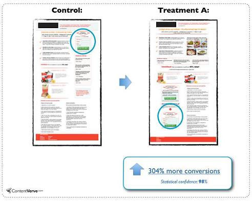
Regardless, the fact is that the variant outperformed that of a CTA that followed the “golden rule”. If you are interested in this study, the takeaway or similar studies I encourage you to check out his article. (http://contentverve.com/10-call-to-action-case-studies-examples-from-button-tests/)
Aagaard isn’t the only one to see good results with going below the fold. You can see similar results with various conversion rates from the guys at Certified Knowledge (http://certifiedknowledge.org/blog/when-best-practices-fail/) and the MarketingExperiments Blog. (http://www.marketingexperiments.com/blog/marketing-insights/call-to-action-errors.html)
First Isn’t Always Best
Before we get into our tips, let’s first talk about one of the reasons why CTAs below the fold seem to have a better conversion rate.
Firstly, it really has nothing to do with its position in relation to the fold. Remember that a lot of internet readers are scanners. Not only that but they tend to not actually “read” anything.
Jakob Neilsen notes that 80% of user attention is directed to above the fold (Source: http://www.nngroup.com/articles/scrolling-and-attention/). While that is fine and dandy we can’t forget that we humans are motivated creatures and we like things of interest.
That said, conversion rates aren’t increased because of their position but by the amount and type of copy that precedes it. Good copy means better conversions and when you think about it the concept makes sense. You wouldn’t automatically buy the first smartphone that is shoved in your face would you?
Small Changes Big Results
Now that you have seen how simple changes can create better conversion rates, let’s talk about some ways you can edit your CTAs.
Shape
https://spellup.withgoogle.com/
The shape of your CTAs can be a deciding factor on whether or not someone clicks on them. Shapes can be psychological motivators depending on which geometric you decided to choose.
Not only this but if you decide to use a shape that isn’t commonly used you can very well prompt people to click just because of your out-of-the-box aesthetic.
When deciding on what shape you are going to go with you should first understand your site’s purpose and what type of visitors your site is geared towards. Your overall site design will also be a factor in shape choice.
Circular CTAs are perfect when trying to promote caring, supportive and friendly feelings. Square & Rectangle shapes evoke familiarity, reliability and strength while vertical lines are more masculine opposed to the more feminine horizontal lines.
Colors
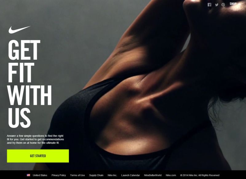
https://www.nike.com/cdp/nikepro360fit/us/en_us/#/
Color is big in design. It’s a powerful tool and when it comes to your CTA a bad choice can be everything between a click and an escape.
When designing your CTAs one thing you want to make sure to do is make those buttons easily spotted. This can be easily achieved by using contrast colors. Contrast colors will make your button not only recognizable against the background but also readable.
While using bright colors are ideal you want to make sure that your colors are not too bright. Too bright of colors can come off unattractive and garish which automatically diminishes its clickability.
If you aren’t certain on which colors to choose then create multiple versions and get feedback. A good rule of thumb when it comes to your CTA colors is darker button, lighter text or lighter button, darker text.
Language
Words are needed to actually get people to click your CTAs so that means you need good copy. Note that there is a difference between cliche or sterile copy as opposed to exciting and motivating copy.
You must always remember who it is you’re trying to get to click on your button and while creating custom targeted CTAs is a challenge you can still make your actual button text more interesting than the next guys.
Boring CTA copy like “Click Here” and “Download” are lackluster compared to more compelling triggers like “Get Me Started” and “Show My Results”. These are more personal and a lot more clickable without being too wordy.
Not sure if your copy works? Ask yourself would you click on the button with the copy presented. If the answer is no then it’s time to revise.
Size
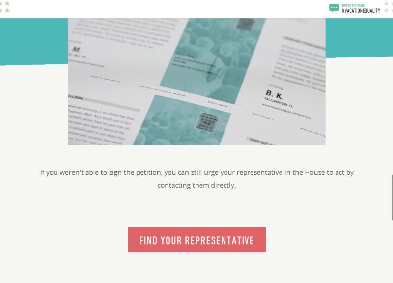
http://www.vacationequalityproject.com/
They say size doesn’t matter but with your CTAs that just isn’t the case which means you need to give deliberate consideration on not just where you put your button but how big it is.
Typically the bigger the better but sometimes that isn’t always the wisest choice as a too large of a button can seem “pushy” and “out of place”. You don’t want your visitors to feel uncomfortable because of a bad choice on your part.
Paul Olyslager suggests in his article (http://www.paulolyslager.com/five-quick-easy-ways-improve-websites-usability/) to do a 5px blur screenshot test. This trick is supposed to help you note key standouts or those lack of standouts. If your CTA is hard to detect then chances are you should increase the size.
Do make sure that the the size of your CTA does not alter the layout of your design. If it does then it’s either way too big or the placement needs to be adjusted.
Continuity

Other than color, continuity takes a huge front seat in design so that makes your CTAs no exception. Because your buttons are designs you need to make sure you craft them with your site in mind.
There is a reason why designers use contrasting and complementary colors throughout their design work. It’s not because they think they have to but because it works. Not only does it work but it brings the entire piece together at the end of the day.
If you have a site that boasts earthy type colors and uses a lot of circular elements then the last thing you want to do is create sharp edged CTAs in bold reds and electric oranges. Not only is the color choice unexpected but it breaks the overall design of the site.
Should you have this problem then check each page of your site to see if you can either incorporate your CTA design choices in small areas like headers, footers and menus or just redesign your button altogether.
Clickable
To be honest you can adhere to 10 or 20 different tips and tricks on how to generate your CTA buttons but it doesn’t matter if your button doesn’t look like what it’s supposed to be, a button.
When people think of buttons they think of beveled edges, glossy covers and the like but that isn’t a look that everyone is going for.
You can create clickable buttons regardless if you are going for a flat look or something else entirely. Some potential choices are using a subtle drop shadow to give it some dimension and separation from your page. Another choice is to create hover actions or some other type of animation once the mouse is over the element.
Borders and appropriate use of whitespace are also great tactics to let people know that your button is in fact a button and can be clicked on.
Conclusion
These are but only a handful of tips when it comes to designing the perfect clickable CTA. If you are in need of button modification I highly recommend that you start with the simple steps listed above and see if you have any increase of your conversions before attempting a complete design rehaul.
Remember that your button’s shape, color, language, size, continuity degree and readable clickability can be the difference maker to your users.
Frequently Asked Questions (FAQs) about CTA Button Design
What are the key elements to consider when designing a CTA button?
The key elements to consider when designing a CTA button include color, size, shape, position, and text. The color should be contrasting and eye-catching, while the size should be large enough to be noticeable but not overwhelming. The shape should be simple and familiar, and the position should be in a prominent place on the page. The text should be clear, concise, and action-oriented, encouraging users to click.
How does the psychology behind CTA buttons work?
The psychology behind CTA buttons is based on the principles of persuasion and motivation. A well-designed CTA button can trigger an emotional response in users, prompting them to take action. This can be achieved through the use of compelling language, appealing visuals, and strategic placement.
What are some best practices for UX design for CTA buttons?
Some best practices for UX design for CTA buttons include making them large and easy to click, using contrasting colors to make them stand out, placing them in a prominent position on the page, and using clear, action-oriented language. It’s also important to test different designs to see what works best for your audience.
How can I make my CTA buttons more accessible?
To make your CTA buttons more accessible, ensure they have a high contrast ratio for visibility, use clear and concise language, and make them large enough to be easily clicked or tapped. Additionally, make sure they can be navigated to and activated using a keyboard for users with mobility impairments.
What are some common mistakes to avoid when designing CTA buttons?
Common mistakes to avoid when designing CTA buttons include making them too small, using colors that blend in with the background, placing them in less visible areas of the page, and using vague or confusing language. It’s also a mistake to have too many CTA buttons on one page, which can overwhelm users and dilute the main call to action.
How can I test the effectiveness of my CTA buttons?
You can test the effectiveness of your CTA buttons through A/B testing, where you create two versions of a page with different CTA buttons and see which one performs better. You can also use heat maps to see where users are clicking on your page, and user testing to get direct feedback.
How important is the text on a CTA button?
The text on a CTA button is extremely important. It should be clear, concise, and action-oriented, telling users exactly what will happen when they click. The language should also be persuasive and compelling, encouraging users to take action.
Can the shape of a CTA button affect its performance?
Yes, the shape of a CTA button can affect its performance. Research has shown that rounded corners are more effective than sharp corners, as they draw the eye towards the center of the button. However, the most important thing is that the shape is familiar and recognizable as a button.
Where should I place my CTA button for maximum visibility?
For maximum visibility, your CTA button should be placed in a prominent position on the page. This could be above the fold (the part of the page visible without scrolling), at the end of a piece of content, or in a sticky header or footer. The exact position will depend on the layout and content of your page.
How can I use CTA buttons to guide users through a process?
You can use CTA buttons to guide users through a process by clearly indicating the next step they should take. This could be signing up for a newsletter, adding a product to their cart, or proceeding to the next stage of a form. The key is to make the process as easy and intuitive as possible, with clear and consistent CTA buttons throughout.