
Key Takeaways
- The CSS aspect-ratio property allows developers to specify the width-to-height ratio of an element in a single line of code, simplifying the process of creating responsive elements on a webpage.
- The aspect-ratio property can be used to make YouTube videos responsive, maintain consistent avatar sizes, and create a responsive image gallery. It eliminates the need for complex CSS tricks and hacks.
- The aspect-ratio property works well with other CSS properties like object-fit, which can be used to ensure a consistent avatar size regardless of the original image ratio, without distorting the image.
- The aspect-ratio property can be used in conjunction with var() and calc() functions, and can include floating-point numbers. It sets a “preferred” constraint, rather than a fixed one, which can be overridden by setting overflow to auto on the container.
- The aspect-ratio property is well supported in all modern browsers, making it safe to use. However, for older browser versions, the padding hack can be used as a reliable fallback option.
There are times when we really need to maintain a specific ratio between the width and height of responsive elements on a web page. This has been possible for a long time via various CSS tricks. The CSS aspect-ratio property is a game changer, meaning we can now specify the aspect ratio of an element in a single line of code. Let’s look at how to use aspect-ratio.
Examples of Where Aspect Ratio is Important
By its nature, the Web is a fluid medium, and it’s usually better to allow elements on a web page to be as fluid and flexible as possible.
However, there sometimes are reasons to set limitations on the size of elements. For example, we might want to maintain the width-to-height ratio of certain elements — such as responsive YouTube videos, items in an image gallery, or rounded avatars.
Let’s first look at three practical uses of aspect-ratio, and then cover some useful things to know about how it works.
Responsive YouTube Videos
If you’ve ever embedded a YouTube video in a web page, you’ll know that the embed code comes as an <iframe> with fixed width and height. That’s okay, but it could be better. Chances are it’s not as wide as your container, which isn’t lovely. Worse, though, is that some of it might be lost offscreen on small viewports.
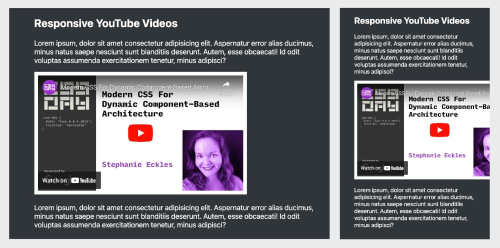
How a fixed-width YouTube embed appears on desktop (left) and mobile (right).
What we really want is for the embedded video to fill a certain amount of space within our design and be responsive to different viewport widths. For simplicity, let’s say we want it to fill 100% of the width of its container.
Let’s look at two ways to achieve this — firstly, the old way, using CSS trickery, and then the new way, with aspect-ratio.
Making a YouTube video responsive with the padding hack
YouTube provides us the following embed code (simplified to save space):
<iframe width="560" height="315" src=""></iframe>
A traditional trick for making our embed responsive is with the “padding hack”. The first thing we have to do is divide the width of the iframe by the height, which will give us a ratio of width to height. YouTube videos are typically sized 560 by 315 pixels, so we need to divide 315 by 560, which gives us .5625. That means the height of our YouTube iframe is 56.25% of its width. This represents a ratio of 16:9, so keep that in the back of your mind.
We can now set up our responsive YouTube embed in a few steps. Firstly, we wrap an element around the iframe, such as a div:
<div>
  <iframe></iframe>
</div>
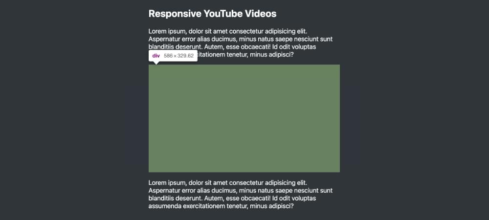
We then set the div to position: relative and give it a bottom padding of 56.25%. The browser will calculate this percentage value based on the div’s width:
div {
  position: relative;
  padding-bottom: 56.25%;
}
The image below shows the div’s padding, highlighted in green via the browser’s developer tools.
Note: if you don’t want the bother of calculating the percentage of padding, you can let the browser work it out for you. Simply insert the width and height of the iframe like so: padding-bottom: calc(315 / 560 * 100%).
Next, we set the iframe to position: absolute and set its width and height to 100%:
iframe {
  position: absolute;
  width: 100%;
  height: 100%;
}
Now our YouTube embed will be responsive, filling 100% of the width of the container no matter what the screen size, while still maintaining its aspect ratio, as shown below.
See the Pen
Responsive YouTube Video with the Padding Hack by SitePoint (@SitePoint)
on CodePen.
Note: there are lots of other ways to achieve the padding hack, such as using ::before or ::after instead of an extra div. They’re easy to find online by searching for “padding hack”.
Making a YouTube video responsive with aspect-ratio
We can make our YouTube video responsive with a lot less code using the aspect-ratio property. We no longer need the surrounding div. We can just set the following styles on the iframe:
iframe {
  width: 100%;
  aspect-ratio: 16/9;
}
Ooh la la. Nice. Check it out on CodePen.
See the Pen
Responsive YouTube Video with aspect-ratio by SitePoint (@SitePoint)
on CodePen.
If you don’t know the aspect ratio of an element and don’t feel like getting out your calculator, you could let the browser work it out for you, using the width and height of the element. Here’s a variation of the CSS above:
iframe {
  --ratio: calc(315 / 560);
  width: 100%;
  aspect-ratio: 1/var(--ratio);
}
We know the original width and height of our iframe, so we plug them into a custom property (--ratio), dividing height by width with the calc() function. Then we use our custom property in a CSS variable as part of aspect-ratio. Our aspect ratio value is now, effectively, 1/0.5625. So we can use floating-point numbers in our aspect-ratio values. (Of course, if you want to apply this ratio to other elements, then declare the custom property on a parent higher up the tree, or on the :root element itself.)
Yet another variation on this theme is just to use calc() without the custom property:
iframe {
  width: 100%;
  aspect-ratio: 1/calc(315 / 560);
}
This is fine if we’re only using this aspect ratio value on iframes.
Have a bit of fun and try out these variations in the CodePen demo above.
A Responsive Image Gallery
Let’s say we want to display a gallery of images in a series of flexible, square boxes. We could use the padding hack to keep the boxes square, but we can use aspect-ratio instead. (The images are from my recent hiking trip through the Unsplash website.)
Here’s our HTML:
<ul>
  <li><img src="1.jpg" alt=""></li>
  <li><img src="2.jpg" alt=""></li>
  ⋮
  <li><img src="11.jpg" alt=""></li>
  <li><img src="12.jpg" alt=""></li>
</ul>
Here’s the key CSS:
ul {
  display: grid;
}

li {
  aspect-ratio: 1/1;
}

img {
  object-fit: cover;
}
The following CodePen demo shows this code in action.
See the Pen
Responsive Image Gallery using aspect-ratio by SitePoint (@SitePoint)
on CodePen.
It’s a very basic demo. The grid columns are set to a width of 1fr, and the aspect-ratio: 1/1 ensures the cells remain perfectly square, no matter how wide or narrow the browser. This is a really handy way to control the height of Grid rows.
The images all have random dimensions (none are square), so they’re made to fit within their grid cell with object-fit: cover. (Check out how to use CSS object-fit if it’s new to you. The gallery is also centered with Grid.)
Try playing around with the aspect-ratio property in the demo above. What happens if you change the value from 1/1 to 2/1, and so on?
To learn more about grid layout, check out our beginner’s guide to CSS Grid.
Maintaining Consistent Avatar Sizes with aspect-ratio
In her recently released book Unleashing the Power of CSS, Stephanie Eckles demonstrates the use of the aspect-ratio property to ensure consistent avatar sizes. With aspect-ratio, in conjunction with the object-fit property, we can ensure a consistent avatar size regardless of the original image ratio and without distorting the image.
Here’s the key CSS:
img {
  aspect-ratio: 1; /* same as aspect-ratio: 1/1 — see below */
  object-fit: cover;
  border-radius: 50%;
  width: 100%;
  height: 100%;
}
The following Pen shows this in action.
See the Pen
Avatar list with aspect-ratio and object-fit by SitePoint (@SitePoint)
on CodePen.
As an experiment, try commenting out the aspect-ratio: 1; line in the Pen above to see what happens without it! (You can disable it by just adding a / at the front: /aspect-ratio: 1;.)
To take another example, let’s place an avatar beside some text and set the image to scale with the amount of text while maintaining its aspect ratio. Here’s our HTML:
<article>
  <div class="content">
    <div class="avatar">
      <img src="avatar.jpg">
    </div>
    <div class="inner">
      <p>Paragraph 1</p>
      <p>Paragraph 2</p>
      <p>Paragraph 3</p>
    </div>
  </div>
</article>
Here’s our key CSS:
.avatar {
  aspect-ratio: 1;
  position: relative;
  height: 100%;
}
Here’s a live CodePen demo. Click on the Add Text button to see the avatar grow as the content grows.
See the Pen
Scaling Avatar with aspect-ratio by SitePoint (@SitePoint)
on CodePen.
Without aspect-ratio in the demo above, it would be far more difficult to achieve a layout like this.
Note: in Chrome-based browsers, the demo works without the content and inner divs, using grid-template-columns: auto 1fr;. Thanks to the SitePoint forum team for sorting out a cross-browser solution.
We can do something similar without an image. Let’s create an avatar holder
that sits beside a navigation menu. (Try toggling the display of the menu from horizontal to vertical to see the avatar box grow and shrink.)
See the Pen
Scaling Menu Avatar with aspect-ratio by SitePoint (@SitePoint)
on CodePen.
Useful Things to Know about aspect-ratio
Every element has an aspect ratio. If we don’t set an aspect ratio on an element, its aspect ratio defaults to auto. If that element is a replaced element such as an image, its aspect ratio is determined by its natural width and height. (That aspect ratio will be preserved even if we set a different width or height via CSS.)
Aspect ratio compares width (x) with height (y), with a / between when there are two values: x/y. There can be spaces either side of the slash: x / y. Where only one value is specified, it represents x, and the y value is considered to be 1. So aspect-ratio: 1 is the same as aspect-ratio: 1/1, and aspect-ratio: 2 is the same as aspect-ratio: 2/1.
The aspect-ratio value can include the word auto — such as aspect-ratio: auto 1/2. The auto value will apply to replaced elements such as images and videos. (In other words, the element will keep its natural aspect ratio.) The 1/2 ratio will apply to non-replaced elements such as divs.
Values can include floating-point numbers such as 0.5, as we saw above. So aspect-ratio: 1.5/1 is valid, and is equivalent to aspect-ratio: 3/2.
We can also use var() and calc() as part of aspect-ratio values, as seen above.
For non-replaced elements like divs, we don’t need to set a width for aspect-ratio to take effect. If a width or height is set, aspect ratio will be based on that. If both width and height are set on an element, any aspect-ratio setting will be ignored. We can also run into unexpected results when applying combinations of width, height, max-width and min-width to containers along with aspect-ratio, as discussed in this SitePoint forum thread.
It’s always dangerous to set heights on container elements, as this can easily lead to content spilling out of the container. Interestingly, if we apply aspect-ratio to a container and the content can’t fit, the container will expand. So, as the specification says, aspect-ratio sets a “preferred” constraint, rather than a fixed one. We can override this by setting overflow to auto on the container.
Conclusion
The aspect-ratio property is well supported in all modern browsers now, so it’s safe to use. But if you want to be ultra conservative and cater to some of the older browser versions still floating around, the padding hack is a reliable fallback option.
To read more about the aspect-ratio property, check out the MDN reference, as well as the W3C specification.
If you’re keen to explore more of the exciting things CSS can do these days, I recommend you check out Unleashing the Power of CSS, where Stephanie Eckles presents all of the amazing, time-saving innovations that have landed in CSS of late.
Frequently Asked Questions about CSS Aspect Ratio
What is the purpose of the CSS aspect-ratio property?
The CSS aspect-ratio property is used to specify the width-to-height ratio of an element. This property is particularly useful when you want to maintain a specific ratio as the viewport or element size changes, such as in responsive design. It helps to ensure that the content scales properly and maintains its proportions, providing a consistent user experience across different screen sizes and resolutions.
How does the CSS aspect-ratio property work?
The CSS aspect-ratio property works by defining the ratio between the width and height of a box. The value is specified as a ratio, such as 16/9 or 1/1. The first value represents the width, and the second value represents the height. For example, an aspect-ratio of 1/1 would create a square, while an aspect-ratio of 16/9 would create a rectangle that is wider than it is tall.
Can I use the CSS aspect-ratio property with all elements?
The CSS aspect-ratio property can be used with any element that accepts width and height properties. However, it’s important to note that the aspect-ratio property does not directly set the width and height of an element. Instead, it controls the ratio between the width and height. The actual dimensions of the element are still controlled by other properties, such as width, height, or flex.
How is the CSS aspect-ratio property different from using width and height properties?
While the width and height properties set the exact dimensions of an element, the aspect-ratio property only sets the ratio between these dimensions. This means that the element can scale up or down while maintaining the same proportions. This is particularly useful in responsive design, where the exact dimensions of an element may change depending on the viewport size.
How can I use the CSS aspect-ratio property in responsive design?
In responsive design, the CSS aspect-ratio property can be used to maintain the proportions of an element as the viewport size changes. For example, you might want an image or video to maintain a 16:9 aspect ratio regardless of the screen size. By setting the aspect-ratio property to 16/9, the element will automatically adjust its height based on its width, ensuring that the proportions remain consistent.
What are the limitations of the CSS aspect-ratio property?
The CSS aspect-ratio property is a relatively new addition to the CSS specification, and as such, it may not be fully supported in all browsers. Additionally, the aspect-ratio property only controls the ratio between the width and height of an element, not the actual dimensions. This means that other properties may still be needed to control the size of the element.
Can I use the CSS aspect-ratio property with media queries?
Yes, the CSS aspect-ratio property can be used in conjunction with media queries to create responsive designs that adapt to different screen sizes and orientations. For example, you might use a media query to change the aspect ratio of an element based on the viewport width.
How does the CSS aspect-ratio property affect the layout of a page?
The CSS aspect-ratio property can significantly impact the layout of a page by controlling the proportions of individual elements. By maintaining a consistent ratio between the width and height of an element, the aspect-ratio property can help to create a balanced and harmonious layout.
Can I use the CSS aspect-ratio property with flexbox or grid layout?
Yes, the CSS aspect-ratio property can be used with both flexbox and grid layout. When used with these layout methods, the aspect-ratio property can help to control the proportions of flex items or grid items, ensuring that they maintain a consistent ratio even as the container size changes.
What are some practical examples of using the CSS aspect-ratio property?
The CSS aspect-ratio property can be used in a variety of situations. For example, it can be used to maintain the proportions of images or videos in a responsive design, to control the size of flex items or grid items in a flexible layout, or to create geometric shapes with specific proportions.