
Key Takeaways
- Ratchet, a framework developed by the team behind Bootstrap, simplifies the process of prototyping mobile apps using CSS, JS, and HTML. It allows developers to create prototypes that closely resemble native mobile apps, and its themes replicate the behavior of iOS and Android apps.
- Unlike frontend frameworks like Bootstrap and Foundation, Ratchet supports push.js, enabling the creation of a “Single Page Application” with pages loaded using AJAX technology. It also provides special icons for iOS and Android devices and extensive support to create title bars just like in native mobile apps.
- To get started with Ratchet, developers need to download the package from its official page, extract all the files from the downloaded .zip file, and copy them to the project folder. Ratchet comes with three folders of files: css, js, and fonts.
- Ratchet provides a range of pre-designed components that can be customized using CSS. However, it primarily focuses on static prototyping and does not support interactive prototyping. While it is a powerful tool for mobile app prototyping, it lacks advanced design features found in other prototyping tools and requires a basic understanding of HTML, CSS, and JavaScript.
It is difficult to prototype native Mobile applications using responsive web design technologies as they do not simulate native behavior.
Developers often need to write tons of JavaScript to create single page architecture or use technologies such as Angular.js and Ember.js.
There were a few developers who took this issue seriously and started working on a framework to make prototyping Mobile apps easier. These developers belonged to the team behind Bootstrap.
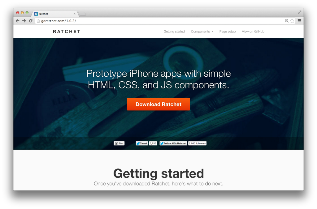
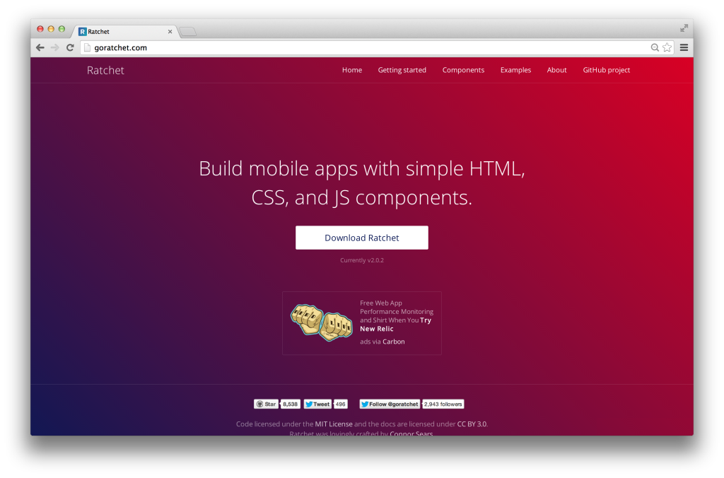
The framework they came up with was Ratchet. Using web technologies like CSS, JS and HTML, you can create powerful prototypes for mobile apps. Up until Ratchet 1.0.2, support only existed for iOS apps. Now, the themes with Ratchet 2.0 support both Android and iOS apps. Using these themes you can make a prototype for one platform and easily switch to the other.
Why should you consider using Ratchet for creating mobile web apps when we already have frameworks like Bootstrap and Foundation? Here are few comparisons between them.
Ratchet vs Frontend Frameworks
- Frontend Frameworks like Bootstrap and Foundation create web apps. As these web apps are responsive in nature they dynamically redraw their layout on mobile screens. Ratchet creates prototypes for Mobile platforms. These prototypes closely resemble native mobile apps, they are not suitable for desktop screens.
- Front end frameworks do not have themes that replicate the behavior of iOS and Android apps. These themes come out of the box with Ratchet.
- Ratchet comes with support for
push.js. This makes the app a “Single Page Application” with pages loaded using AJAX technology throughpush.js. Such support is not present in Bootstrap and Foundation. - Ratchet has special icons for iOS and Android devices. These icons help create a better mobile prototype. Such icons are not present in front end frameworks, they have to be explicitly included.
- Ratchet has extensive support to create Title bars just like in native mobile apps. The title bar behaves exactly like a native platform title bar.
- Finally, Ratchet prototypes are generally much lighter than responsive web apps. This leads to faster page loads on actual mobile devices.
If you think that using a front end framework will suit your project better, head over to our tutorial on Bootstrap 3 for more details.
Github for examples in this article
Getting started with Ratchet
To use Ratchet, you need to download the package from its official page. The version used in this article is v2.0.2. It’s an open source project hosted in GitHub as one of the repositories of the Bootstrap account.
Extract all the files from the downloaded .zip file and copy them to your project folder.
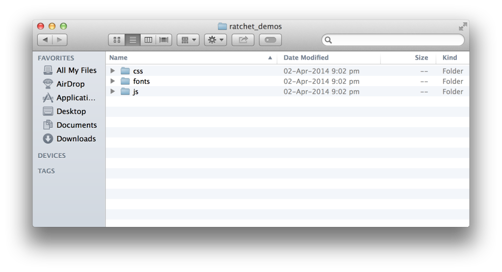
Ratchet comes with 3 folders of files: css, js and fonts. Let’s explore each one of them.
The css folder contains 3 different pairs of CSS files. Each pair contains an un-minified version and a minified version. The ratchet.css and ratchet.min.css are the main Ratchet CSS files. They contain default CSS styles which are not platform specific.
To apply particular platform styles, you need to use the themes files. You will find 2 different pairs of theme files that start with ratchet-theme-android.* and ratchet-theme-ios-*. You need to use a particular theme as per your requirement. The un-minified version contains comments and is more readable while the minified version is a compressed version. There are no comments or extra spaces in the minified version. It’s used when deploying the project.
The js folder contains 2 files, ratchet.js and ratchet.min.js. Again, the former is an un-minified version whereas the later is the minified version. It is the main and only JS file needed for Ratchet to work.
The fonts folder contains all the Ratchet fonts. These files are internally linked from the CSS files. Make sure to keep both css and fonts folder in the same structure so that the CSS can find the fonts files.
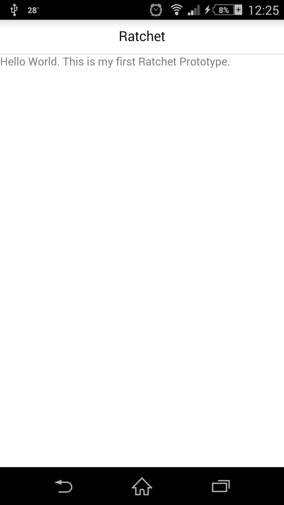
Let’s create our first HTML file, index.html, and use Ratchet in it. There’s a basic HTML template which Ratchet recommends. Here it is:
<!DOCTYPE html>
<html>
  <head>
    <meta charset="utf-8">
    <title>Ratchet template page</title>

    <!-- Sets initial viewport load and disables zooming  -->
    <meta name="viewport" content="initial-scale=1, maximum-scale=1, user-scalable=no, minimal-ui">

    <!-- Makes your prototype chrome-less once bookmarked to your phone's home screen -->
    <meta name="apple-mobile-web-app-capable" content="yes">
    <meta name="apple-mobile-web-app-status-bar-style" content="black">
    <meta name="mobile-web-app-capable" content="yes">

    <!-- Include the compiled Ratchet CSS -->
    <link href="ratchet.css" rel="stylesheet">

    <!-- Include the compiled Ratchet JS -->
    <script src="ratchet.js"></script>
  </head>
  <body>

    <!-- Make sure all your bars are the first things in your <body> -->
    <header class="bar bar-nav">
      <h1 class="title">Ratchet</h1>
    </header>

    <!-- Wrap all non-bar HTML in the .content div (this is actually what scrolls) -->
    <div class="content">
       <p>Hello World. This is my first Ratchet Prototype.</p>
    </div>

  </body>
</html>
In the above code, you will find some unfamiliar meta tags. These are needed by Ratchet to make prototypes look close to native mobile apps while using mobile browsers. The first meta tag named viewport is used to disable the zooming feature of a browser. It also advises the web app to cover the whole available browser screen space by setting initial-scale to 1.
Next we have a set of 3 meta tags to force the browser go chromeless (or full screen mode). In this particular application, the first two meta tags are iOS specific (Safari Browser) and the last is for Android devices (Google Chrome for Mobile).
Once all the meta tags are properly set, we link Ratchet’s main CSS and JS files. As you can see above, we haven’t used any theme files in this prototype. We are using the default Ratchet template.
In the body tag, you need to follow a particular architecture as suggested by Ratchet. If your prototype needs a top fixed bar, you have to include it’s markup in the top most level inside the HTML file. Ratchet uses the <header> tag to create this fixed navigation bar. It should have classes bar and bar-nav. If you want to display a title in all pages of the application, put it inside this bar using an <h1> tag with the class set as title.
All the non-header content should be placed inside a <div> element that has a class content. This content element is the only scrollable area of the whole application. We will soon fill this space with various Ratchet components.
Running Ratchet Prototypes
Ratchet Prototypes are web apps and can be run just like any other web application. You need to make sure that they are accessible from the Mobile device you are building the prototype for. Here are few options to make that possible.
Using Wi-Fi connection and localhost on a Mac
If you are using a Mac, you can run the default python server to access the prototype app. You also need to connect both the mobile device and mac to the same Wi-Fi connection.
- Open terminal.
- Navigate to your Ratchet project.
- Paste the following command to run a python server.
python -m SimpleHTTPServer - Open
System Preferences, go toNetwork, note down the IP address.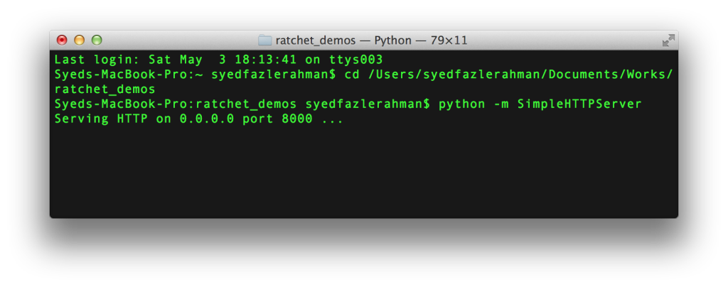
- Open your mobile device’s and enter the following url.
http://[YOUR IP ADDRESS]:8000/.
The above prototype should look as below on a mobile device:
Using Wi-Fi connection and localhost on Windows
If you have installed WAMP or XAMPP on your Widows Machine, you need to move the Ratchet project into the deployment folder (www folder in WAMP). After starting the server you can access the project at the following URL: http://localhost/[project name].
Open command prompt and type ipconfig to get the IP Address of your machine. Access this project on your mobile device using the following URL: http://[YOUR IP ADDRESS]/[project name]. Make sure both the mobile device and windows machine are using the same Wi-Fi connection.
Hosting on LIVE server
If you have a web server and a domain associated with it, then you can directly upload the Ratchet project into the hosting server. You need to upload to the same folder where the domain name is pointed. You can find your prototype live at the following URL: http://yourdomainname.com/[project name].
Google Chrome’s Emulation Mode in Desktop
An emulation mode has been added to Google Chrome v32 onwards. It comes with support for both Android and iOS devices. Head to Craig’s How to Use Mobile Emulation Mode in Chrome article to find out more. This can be the easiest way to run the prototype on a desktop screen.
Adding components to the Prototype
Now that we know how to create a Ratchet project and run it on a mobile browser, let’s fill the index.html with some cool Ratchet components.
Let’s start by filling the top navigation with some cool navigation buttons. As seen already, the base markup for top navigation bar is as follows:
<header class="bar bar-nav">
    <h1 class="title">Ratchet</h1>
</header>
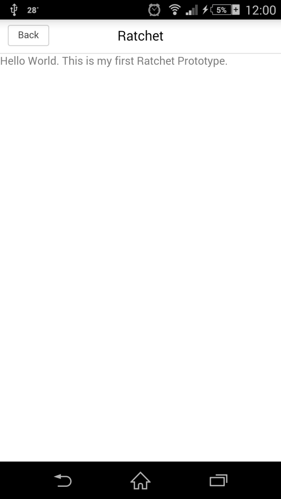
Let’s add a back button to it.
<header class="bar bar-nav">
    <button class="btn pull-left">
        Back
    </button>
    <h1 class="title">Ratchet</h1>
</header>
To create a button, you need to add a <button> element with class btn. To make it appear on the left hand side, you need to add an additional class pull-left. Ratchet also has a class pull-right to make it appear on the right hand side.
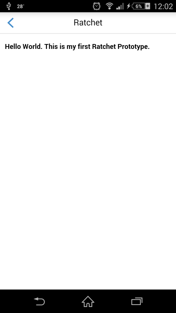
Let’s replace the text “back” on the back button and display an icon to represent the back action.
<header class="bar bar-nav">
    <a class="icon icon-left-nav pull-left"></a>
    <h1 class="title">Ratchet</h1>
</header>
You need to use the <a> element instead of a <button> element and add the following classes: icon, icon-left-nav and pull-left.
Ratchet comes with a set of icons. To use those icons, you need to add an icon class to an element. Next, you need to also specify the icon you want to use such as icon-left-nav. You can see all the icons and their respective class in Ratchet’s documentation.
There’s an issue in the app prototype that we have developed so far. You can see that the content added below the top navigation bar is not properly placed. It sticks to the left side of the screen. Use the following markup to fix this issue.
<div class="content-padded">
    <h5>Hello World. This is my first Ratchet Prototype.</h5>
</div>
The <div> element with class content-padded can be used whenever you want to add content to the scrollable area.
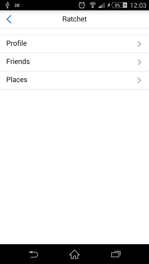
In many situations you need to create a list of links which should slide away and load a new page. This is referred to as chevrons in Ratchet. To create a chevrons component use the following markup inside the scrollable area.
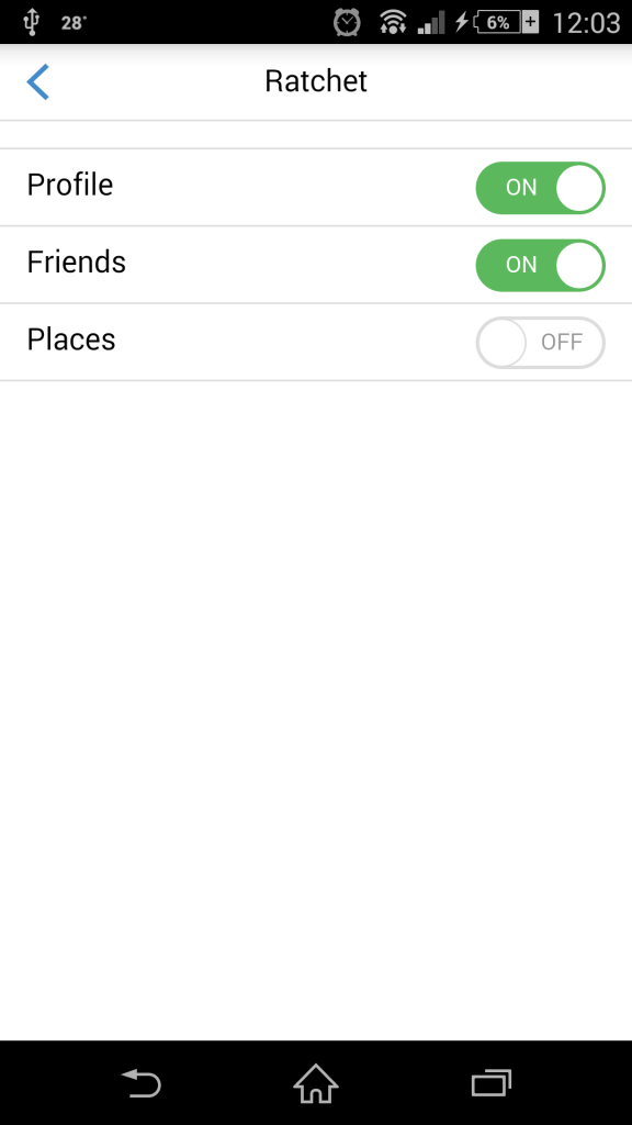
<ul class="table-view">
  <li class="table-view-cell">
    <a class="navigate-right">
      Profile
    </a>
  </li>
  <li class="table-view-cell">
    <a class="navigate-right">
      Friends
    </a>
  </li>
  <li class="table-view-cell">
    <a class="navigate-right">
      Places
    </a>
  </li>
</ul>
The table-view is used to create a list of things in Ratchet. It’s children should have class table-view-cell. Finally place the link using the <a> tag. Using navigate-right or navigate-left adds a directional icon to the link elements.
Let’s add some fancy toggle buttons to the above chevrons. For toggle buttons you need to add the following markup.
<div class="toggle">
  <div class="toggle-handle"></div>
</div>
The full markup for a chevron with toggle buttons is as follows:
<ul class="table-view">
    <li class="table-view-cell">
        Profile
        <div class="toggle">
            <div class="toggle-handle"></div>
        </div>
    </li>
    <li class="table-view-cell">
        Friends
        <div class="toggle">
            <div class="toggle-handle"></div>
        </div>
    </li>
    <li class="table-view-cell">
        Places
        <div class="toggle">
            <div class="toggle-handle"></div>
        </div>
    </li>
</ul>
There are many components available in Ratchet to play with, find them here: goratchet.com/components.
Changing Themes in Ratchet
In the above demos, we used the default Ratchet theme. To add a platform specific theme you need to add an additional theme file alongside the default css file. This theme should be placed just below the default CSS file to make it work properly.
To add an iOS Style theme, you need to use the following CSS files:
<link href="css/ratchet.css" rel="stylesheet">
<link href="css/ratchet-theme-ios.css" rel="stylesheet">
For Android:
<link href="css/ratchet.css" rel="stylesheet">
<link href="css/ratchet-theme-android.css" rel="stylesheet">
Conclusion
Ratchet is a great tool to develop mobile prototypes using web technologies, with a good number of cool components pre-built out of the box. These component could consume lots of time if built from scratch.
I can see Ratchet growing in the near future as it comes from one of the most reputed development teams on the Internet, the Bootstrap team.
Head over to Stackoverflow’s Ratchet 2 section for more support.
I hope you enjoyed reading this article. Leave your suggestions or appreciations (if any) below. I would love to hear from you.
Frequently Asked Questions about Prototyping Mobile Apps with Ratchet
How does Ratchet compare to other mobile app prototyping tools?
Ratchet is a unique mobile app prototyping tool that stands out for its simplicity and efficiency. Unlike other tools such as Proto.io, Ratchet is open-source and primarily uses HTML, CSS, and JavaScript, making it accessible for developers with basic coding knowledge. It also offers a variety of pre-designed components that can be easily customized, saving time and effort in the design process. However, it may lack some advanced features found in other tools, such as interactive prototyping and user testing capabilities.
Can I use Ratchet for building a fully functional mobile app?
While Ratchet is an excellent tool for prototyping and designing the user interface of a mobile app, it is not designed to build fully functional apps. It lacks the necessary backend capabilities and advanced features required for full-fledged app development. For building a complete mobile app, you might need to use additional tools or platforms.
Is Ratchet suitable for beginners in mobile app development?
Yes, Ratchet is a great tool for beginners in mobile app development. Its simplicity and the use of common web technologies like HTML, CSS, and JavaScript make it easy to learn and use. However, a basic understanding of these technologies is required to effectively use Ratchet.
How can I customize the pre-designed components in Ratchet?
Ratchet’s pre-designed components can be customized using CSS. You can modify the styles, colors, sizes, and other properties of these components to suit your design needs. However, it’s important to note that excessive customization might affect the consistency and usability of your design.
Does Ratchet support interactive prototyping?
Ratchet primarily focuses on static prototyping, allowing you to design the user interface and layout of your mobile app. It does not support interactive prototyping, which involves creating interactive mockups that simulate the functionality of the final app. For interactive prototyping, you might need to use other tools like Proto.io.
Can I use Ratchet for prototyping web apps?
Ratchet is specifically designed for prototyping mobile apps and provides a mobile-first design approach. While you can use it for prototyping web apps, it might not provide the best results due to its focus on mobile interfaces.
Is Ratchet compatible with other app development tools?
Ratchet is a standalone tool for mobile app prototyping and does not directly integrate with other app development tools. However, the designs created with Ratchet can be used as a reference or starting point in other development tools.
How can I share my Ratchet prototypes with others?
Ratchet does not provide a built-in feature for sharing prototypes. However, since Ratchet prototypes are essentially web pages, you can host them on a web server and share the URL with others.
Can I use Ratchet for commercial projects?
Yes, Ratchet is open-source and free to use for both personal and commercial projects. However, it’s important to note that it is primarily a prototyping tool and may not be suitable for building fully functional commercial apps.
What are the limitations of using Ratchet for mobile app prototyping?
While Ratchet is a powerful tool for mobile app prototyping, it has some limitations. It does not support interactive prototyping or user testing, and it lacks advanced design features found in other prototyping tools. Additionally, it requires a basic understanding of HTML, CSS, and JavaScript, which might be a barrier for non-technical users.