Fundamentals of Logo Design Part 4: Symbol-Only Logos
So far in this series we’ve taken a look at Typographic Logos and Type and Symbol logos. Today it’s the turn of those logos which are bold enough to go without accompanying type. The third category of logo design is “symbol-only” logos. These are the Madonna or Britney of logo design – so famous they don’t need a surname, or in the case of a logo, so recognizable they don’t need to have the company name attached.
This type of logo is generally reserved for the really big boys and often results after a redesign when the company is so large that it can be recognized by a symbol alone. It’s probably not a great idea to use a symbol-only logo as part of your branding when you’re first launching. It helps enormously if the public are aware of the company name. The main idea or advantage of the symbol logo is that “a picture tells a thousand words.” A good design along with the power of repetition can make a big impact. Symbols and icons are powerful. They can convey a lot of information rapidly.
A symbolic logo uses an image to convey an authentic or abstract representation of a business. Without any text to explain the symbol, the logo can be open to a broad interpretation of what the company is about, which of course can be a good thing or a bad thing. Probably one of the most famous symbol-only logos is the Nike “swoosh.” It is instantly recognizable on clothes and sports equipment and has a solid tribe of followers. I wonder how many people would buy the exact same product if it didn’t have the swoosh on it?
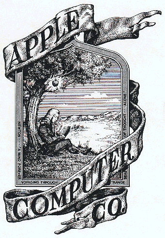
Many symbols are not necessarily a direct illustration of the subject matter or “here’s what we do,” but rather a representational idea. Apple doesn’t grow apples. The first Apple logo depicted Isaac Newton sitting under a tree with an apple dangling over his head. The phrase on the outside border reads, “Newton… A Mind Forever Voyaging Through Strange Seas of Thought … Alone.” The Apple logo now looks very different, but there is a throwback to this original idea.
The disadvantage is, as already mentioned, if a symbol is separated from the company name or word mark, it can be difficult to recognize or make the connection. Here’s a group of well-known logos that represent companies and organizations and even icons in popular culture that are recognizable by their symbol alone. Do you recognize them all?
Are any of these logos a favorite of yours? What other symbol-only logos do you like?
Next week we’ll take a look at some of the questions that should be asked when thinking about designing a logo.
Frequently Asked Questions about Symbol-Only Logos
What are the key elements to consider when designing a symbol-only logo?
When designing a symbol-only logo, it’s crucial to consider simplicity, memorability, versatility, and relevance. The logo should be simple enough to be easily recognized, yet unique enough to be memorable. It should also be versatile, meaning it can be scaled to different sizes and used in various contexts without losing its impact. Lastly, the logo should be relevant to the brand it represents, reflecting its values, mission, and target audience.
How can I make my symbol-only logo unique and memorable?
To make your symbol-only logo unique and memorable, focus on creating a design that is simple yet distinctive. Avoid using generic shapes or symbols. Instead, try to incorporate elements that are unique to your brand or industry. Also, consider the use of colors and typography to add personality and character to your logo.
What are some examples of successful symbol-only logos?
Some examples of successful symbol-only logos include the Apple logo, the Nike swoosh, and the McDonald’s golden arches. These logos are simple, distinctive, and instantly recognizable, making them effective in representing their respective brands.
How can I test the effectiveness of my symbol-only logo?
You can test the effectiveness of your symbol-only logo by conducting market research. This can involve showing your logo to a focus group and asking for their feedback, or conducting online surveys to gather a larger sample of opinions. You can also test your logo’s versatility by applying it to different mediums and seeing how well it maintains its impact.
Can a symbol-only logo work for any type of business?
While a symbol-only logo can be effective for many types of businesses, it may not be suitable for all. Businesses that are new or less established may benefit more from a logo that includes their name, as this can help build brand recognition. However, once a brand becomes well-known, it may choose to use a symbol-only logo for its simplicity and versatility.
How can I incorporate my brand’s values into my symbol-only logo?
Incorporating your brand’s values into your symbol-only logo can be achieved through the use of symbolism, color, and design elements. For example, a brand that values sustainability might use green in their logo, or a brand that values innovation might use a forward-pointing arrow.
What are the benefits of using a symbol-only logo?
The benefits of using a symbol-only logo include simplicity, versatility, and memorability. A symbol-only logo can be easily recognized and remembered, and it can be used in a variety of contexts without losing its impact.
How can I ensure my symbol-only logo is versatile?
To ensure your symbol-only logo is versatile, it should be designed in a way that it can be scaled to different sizes and used in various contexts without losing its impact. This means avoiding overly complex designs and ensuring the logo is legible at both small and large sizes.
How can I update my symbol-only logo without losing brand recognition?
Updating your symbol-only logo without losing brand recognition can be achieved by making subtle changes that modernize the logo while maintaining its key elements. This could involve updating the color scheme, simplifying the design, or refining the shape.
How can I use my symbol-only logo to build brand recognition?
You can use your symbol-only logo to build brand recognition by consistently using it across all your marketing materials, including your website, social media profiles, and print materials. The more frequently your logo is seen, the more recognizable it will become.
Jennifer Farley is a designer, illustrator and design instructor based in Ireland. She writes about design and illustration on her blog at Laughing Lion Design.


